The iOS 7 Review
by Brian Klug & Saumitra Bhagwat on September 19, 2013 1:25 AM ESTSettings
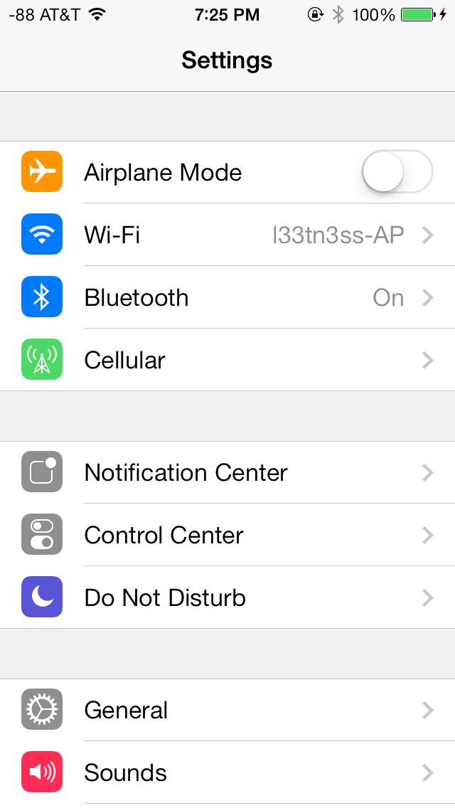
The changes in Settings.app are primarily visual at a high level. The application icon is perhaps the most curious change, since it looks like a sprocket for a bicycle or the gears inside a watch now, but I digress. This new UI pretty much just has visual style that matches the rest of iOS 7, and doesn’t really fundamentally change organizational structure very much. Settings are still grouped together in a couple of logical little bunches, with a bunch of third party application-specific settings options at the very bottom.
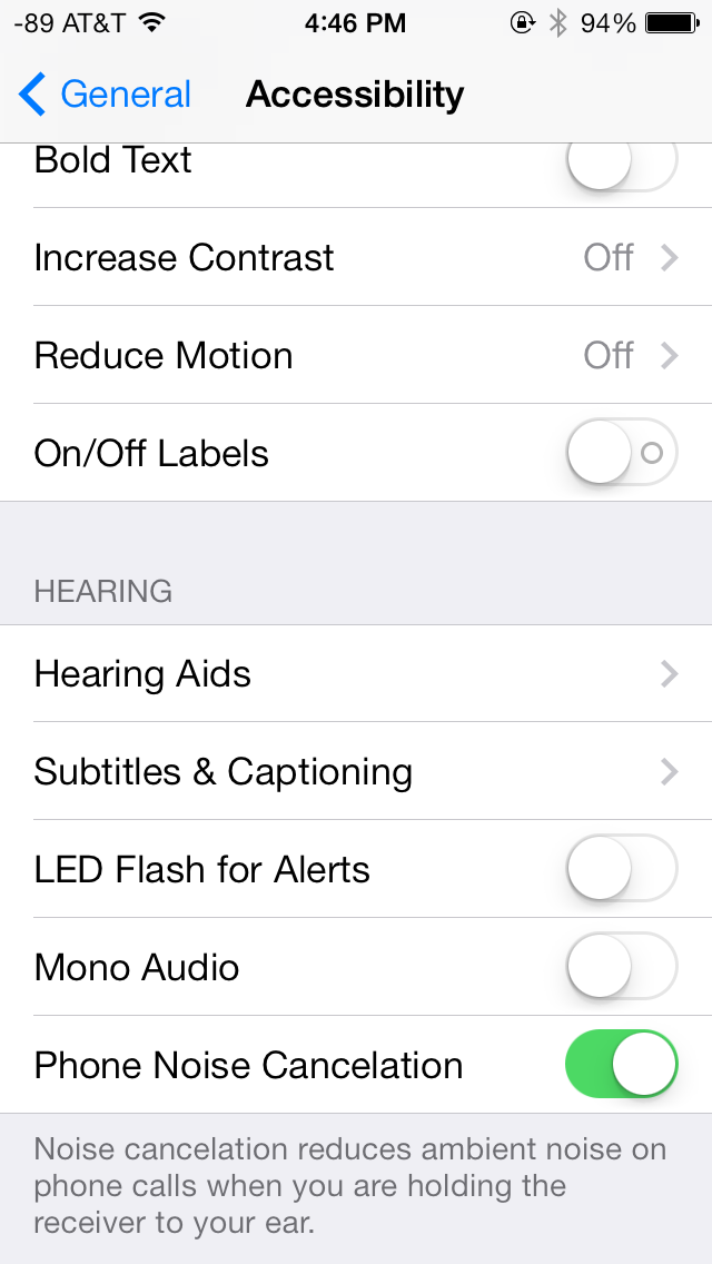
There’s obviously the addition of control center inside settings, and do not disturb comes outside of notifications. There are also the appropriate toggles for the today view under notification center. Under general and accessibility there are new options for the dynamic font size functionality, and a new toggle for disabling noise cancelation which proved somewhat controversial on the iPhone 5 (this setting also carries over to the 5s but not the 5c which I suspect lacks earpiece noise cancelation).
Safari
iOS 7 brings mobile safari version 7, which gets a huge set of functional changes and improvements to the JavaScript engine. Safari has been around for a while without many big changes to the interface, so this is big one.
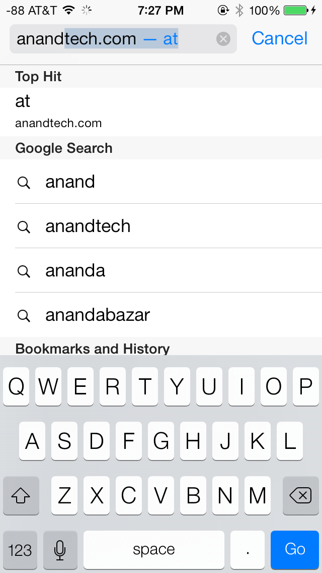
There’s now a unibar at the top of the page for both URLs and search terms, this is a long overdue and welcome change that makes a ton of sense. Safari also now preloads the first result in the list while you’re typing, which has the side effect of making loading feel much faster regardless of what device you’re coming from.

The unibar also looks through bookmarks that are either synced through iCloud or exist on the iDevice and exposes those as options. It’s a bit confusing though since there are both the bookmarks under that appropriate menu, and bookmarks from the bookmarks bar that appear when you tap on the unibar on an empty tab before you start typing. I didn’t realize I even had some of those bookmarks still around until iOS 7 swung around and exposed them.
The new mobile safari gets the same transparent overlays and sense of depth that the rest of the OS conveys, the pages render below most of the UI and there’s a bit of hinting from elements that peek through. A big change is that the bottom menu now also slides away as you scroll down a page, expanding the viewport accordingly. The top bar gets smaller but retains the domain of the page being visited. Tweaks like these do help the iPhone feel bigger than it used to feel.
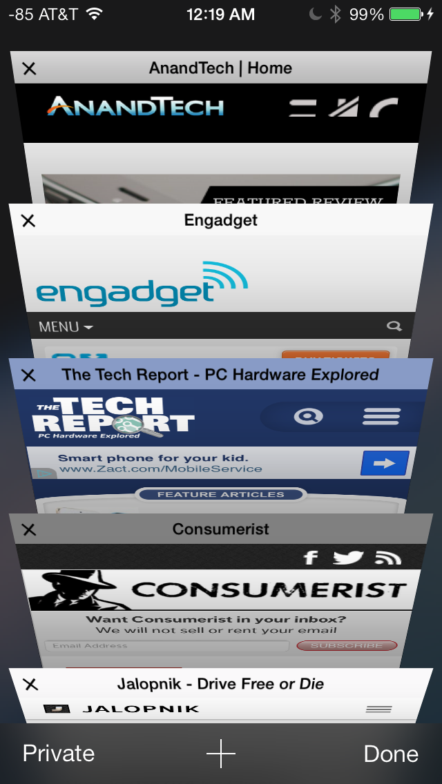
In addition you can now have more than 8 pages open at the same time, and safari seems a lot better at keeping tabs around and not reloading their contents every time you switch between them. The tab switching interface is also a lot better, with a card-like metaphor that allows for tabs to be quickly closed by just swiping them off the left of the display. The only slightly unnerving issue here is that the tabs aren’t antialiased during the animation and for a slight moment or two after it stops, then suddenly the edges no longer have jaggies. It’s a disconcerting subtle thing I can’t stop seeing every time I change tabs in the new mobile safari.
If the signal dots are my least favorite part of iOS, then the changes made in mobile safari and the addition of control center are my favorite.
Benchmarks
Apple usually makes improvements to its JavaScript engine (Nitro) whenever it can, and the iOS 7 mobile safari release is no exception. There’s a 15 percent difference in sunspider and browsermark, and a larger one closer to 50 percent in kraken and google octane, webxprt sees a 30 percent jump. This is comparing two iPhone 5 models running iOS 6.1.4 and the iOS 7.0 GM. HTML5 score increases as well with the addition of a few new features, and WebKit moves from 536.26 to 537.51.1.
| iOS 6.1.4 | iOS 7 GM | |
| Sunspider 1.0 (ms) | 836.6 | 721.1 |
| Browsermark 2.0 (score) | 2587 | 2998 |
| Kraken 1.1 (ms) | 20388.0 | 14050.6 |
| Google Octane (score) | 1706 | 2856 |
| WebXprt (score) | 176 | 231 |
| HTML5test.com (score) | 386+9 | 399+9 |


144 Comments
View All Comments
Hinotori - Thursday, September 19, 2013 - link
How does iOS7 fare with iPad 2 and iPad Mini? One friend told me that he was under impression that his iPad 2 is faster with iOS7 than iOS6, but then I read here that iPad 3 is having a hard time running it...tipoo - Thursday, September 19, 2013 - link
I have a Mini, same SoC as the 2. It feels slower. The UI FPS clearly drops below 30FPS very often, and there's a general feeling of it having to think a bit longer about everything.tipoo - Thursday, September 19, 2013 - link
It seems a bit pudgy on my nearly new Mini, and presumably anything else with A5. UI clearly drops below 30FPS with the default paralex on.justaviking - Thursday, September 19, 2013 - link
Not a fan of "FLAT" UI themes.Call me old-fashioned, but I do NOT like the "flat" look that seems to be all the rage lately, whether on Windows8 or on a smart phone.
As Brian alluded to, widgets that give a "raised" appearance actually look like something you can push or slide. In Windows, for example, I mourn the change in something as simple as the vertical scroll bar in my browser. Gone are the "grips" I used to see. Now the scrolling handle and the vertical slot it slides in are visually the same. Ugh.
With no frames or borders, you don't know if it's a decoration within a window, or if it's a separate window.
It's a regression, in my mind.
At least on a smart phone, with limited screen real estate, I can understand saving some space by not having drop shadows and stuff. But I'd be happier if things I'm supposed to push actually look like things I'm supposed to push.
I'm also not sure about the translucency. I'm looking at the picture of the keyboard in this article. This is better? Why do I want a translucent keyboard? It's probably not horrible, but I'm not sure I see that as a value-added improvement.
In the interest of full disclosure, I tend to roll my eyes at all the holographic or transparent computer displays in the movies too (like "Minority Report" or "Iron Man"). Wouldn't it be a bit distracting and confusing to have text and images floating in front of a distracting background that consists of windows (made of glass, in the wall of the building), people walking, and other people's displays? Looks cool, but try using the window in your office instead of a white board for a while, and let me know how you like it.
Lastly, I'll echo another poster's comments about animations. AGREE, I do not need icons and things to "fly in" and entertain or dazzle me. Just do what you're supposed to do, without the fanfare please. It's only cool once, and after that you're just wasting my time.
Impulses - Thursday, September 19, 2013 - link
I think they typically use animations to mask load times and other waits, though many seem unnecessary on the new hardware and they're actually having the opposite effect on older hardware. Jobs definitely wouldn't be happy... :sDaniel Egger - Friday, September 20, 2013 - link
> Not a fan of "FLAT" UI themes.> Call me old-fashioned, but I do NOT like the "flat" look that seems to be all the rage lately, whether on Windows8 or on a smart phone.
Actually I really do like Metro UI but only because it is *completely* flat and has been so from the start; no crazy trying to make everything flat and then giving it back some depth by adding layers and parallax effects as Apple now does. Or said short: I think Metro is an improvement compared to class Windows and a fresh new start for WP but for iOS I totally agree that it's a step back because they already had a very good UI concept.
beepboy - Thursday, September 19, 2013 - link
It seems like Apple is copying but in reality SBSettings and Cydia has been out since the first days of iOS - and these settings have been available, just not through the approved channels.prophet001 - Thursday, September 19, 2013 - link
There's definitely some Kool-aid drinking going on here. You mention:"The core of the interface hadn’t really changed in either visual appearance or function. With iOS 7, those pundits get their wishes granted, as almost every part of the OS gets some kind of change."
However, if you had not told me which screenshot was iOS 7 and which was 5 in the second picture on the first page I would not have known.
solipsism - Thursday, September 19, 2013 - link
How does your inability to tell two things apart mean that 1) nothing has changed, and 2) Brian and & Saumitra are "drinking Kool-aid"? As noted in the very sentence you quote the /core/ of the OS design hasn't changed but almost every aspect of it does get updated.Was Apple suppose to no longer have icons that open up apps? Was Apple suppose to not allow personal background images or let 3rd-party developers choose their own icon images so you would be able to tell the new and old OSes apart more easily?
Guspaz - Thursday, September 19, 2013 - link
You're misreading Brian's statement. "The core of the interface hadn’t really changed in either visual appearance or function." refers to iPhone OS 1.0 through iOS 6, the statement isn't referring to iOS 7.