The iOS 7 Review
by Brian Klug & Saumitra Bhagwat on September 19, 2013 1:25 AM ESTSettings
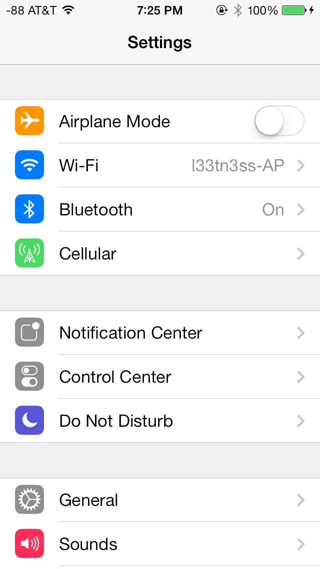
The changes in Settings.app are primarily visual at a high level. The application icon is perhaps the most curious change, since it looks like a sprocket for a bicycle or the gears inside a watch now, but I digress. This new UI pretty much just has visual style that matches the rest of iOS 7, and doesn’t really fundamentally change organizational structure very much. Settings are still grouped together in a couple of logical little bunches, with a bunch of third party application-specific settings options at the very bottom.
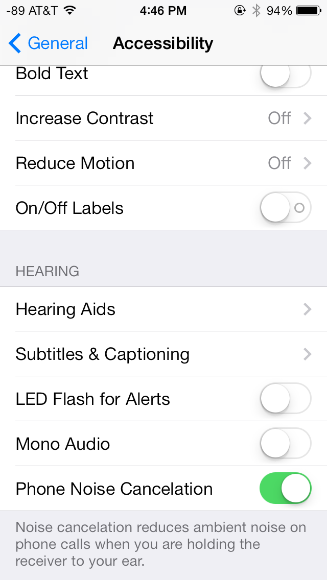
There’s obviously the addition of control center inside settings, and do not disturb comes outside of notifications. There are also the appropriate toggles for the today view under notification center. Under general and accessibility there are new options for the dynamic font size functionality, and a new toggle for disabling noise cancelation which proved somewhat controversial on the iPhone 5 (this setting also carries over to the 5s but not the 5c which I suspect lacks earpiece noise cancelation).
Safari
iOS 7 brings mobile safari version 7, which gets a huge set of functional changes and improvements to the JavaScript engine. Safari has been around for a while without many big changes to the interface, so this is big one.
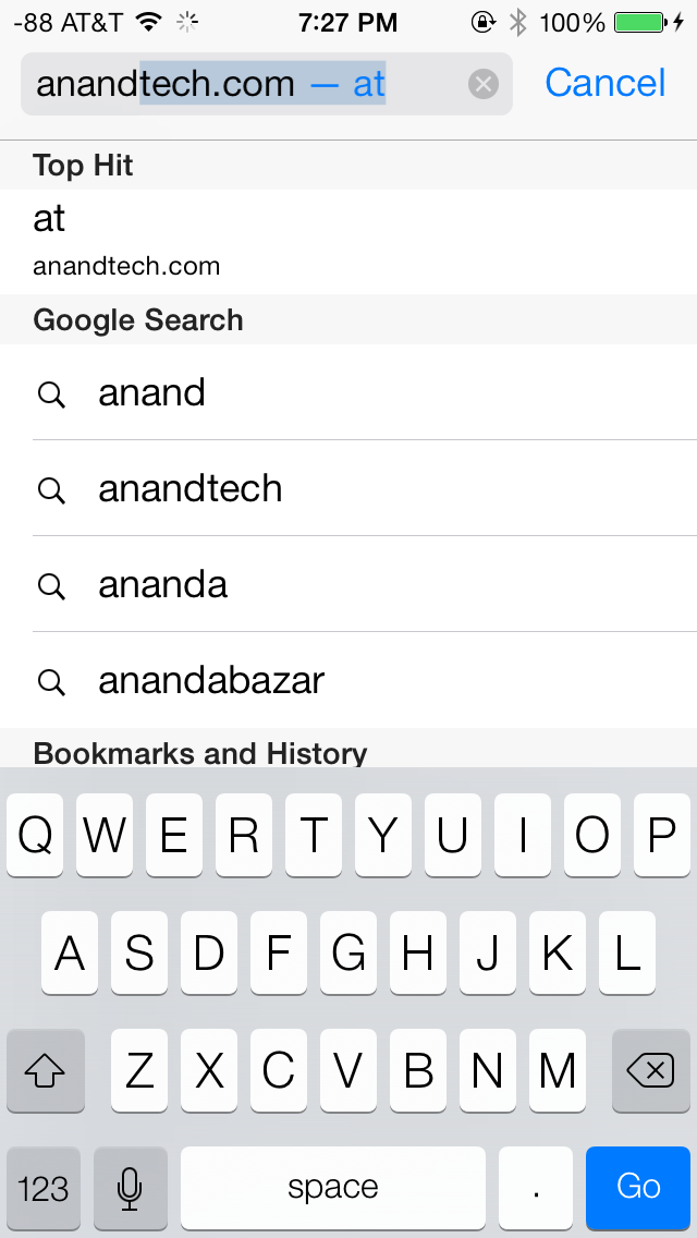
There’s now a unibar at the top of the page for both URLs and search terms, this is a long overdue and welcome change that makes a ton of sense. Safari also now preloads the first result in the list while you’re typing, which has the side effect of making loading feel much faster regardless of what device you’re coming from.

The unibar also looks through bookmarks that are either synced through iCloud or exist on the iDevice and exposes those as options. It’s a bit confusing though since there are both the bookmarks under that appropriate menu, and bookmarks from the bookmarks bar that appear when you tap on the unibar on an empty tab before you start typing. I didn’t realize I even had some of those bookmarks still around until iOS 7 swung around and exposed them.
The new mobile safari gets the same transparent overlays and sense of depth that the rest of the OS conveys, the pages render below most of the UI and there’s a bit of hinting from elements that peek through. A big change is that the bottom menu now also slides away as you scroll down a page, expanding the viewport accordingly. The top bar gets smaller but retains the domain of the page being visited. Tweaks like these do help the iPhone feel bigger than it used to feel.
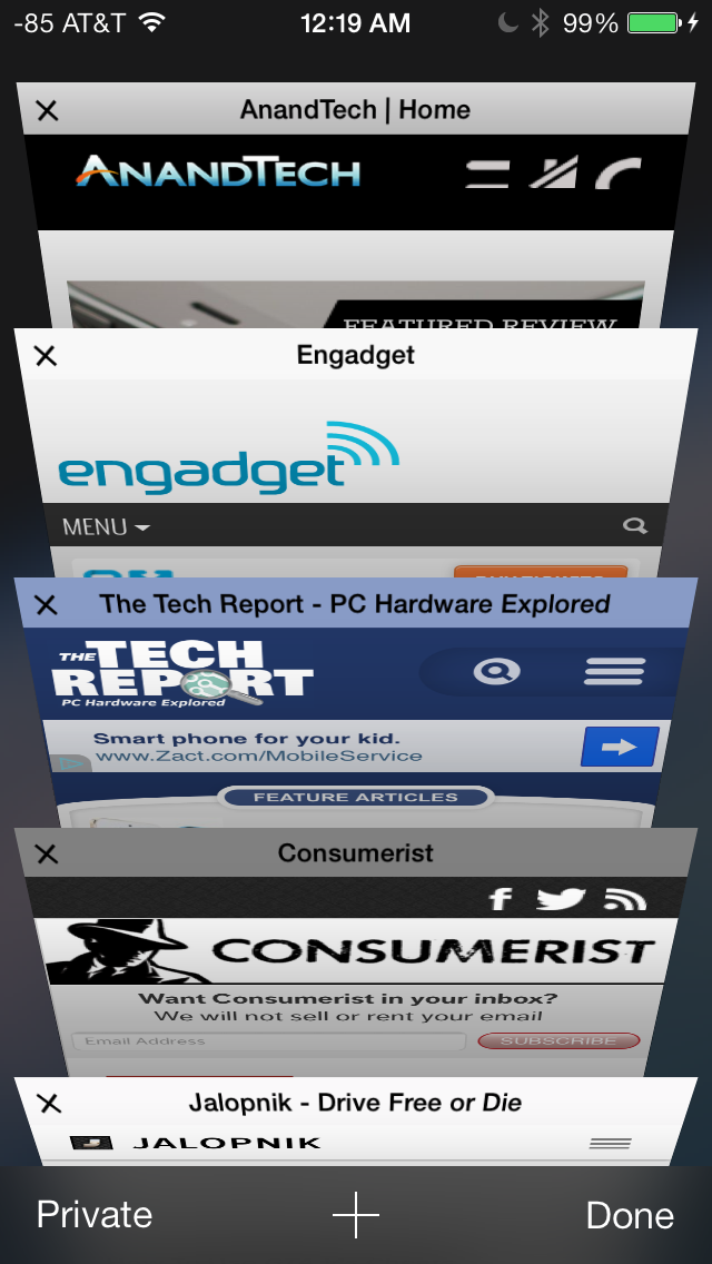
In addition you can now have more than 8 pages open at the same time, and safari seems a lot better at keeping tabs around and not reloading their contents every time you switch between them. The tab switching interface is also a lot better, with a card-like metaphor that allows for tabs to be quickly closed by just swiping them off the left of the display. The only slightly unnerving issue here is that the tabs aren’t antialiased during the animation and for a slight moment or two after it stops, then suddenly the edges no longer have jaggies. It’s a disconcerting subtle thing I can’t stop seeing every time I change tabs in the new mobile safari.
If the signal dots are my least favorite part of iOS, then the changes made in mobile safari and the addition of control center are my favorite.
Benchmarks
Apple usually makes improvements to its JavaScript engine (Nitro) whenever it can, and the iOS 7 mobile safari release is no exception. There’s a 15 percent difference in sunspider and browsermark, and a larger one closer to 50 percent in kraken and google octane, webxprt sees a 30 percent jump. This is comparing two iPhone 5 models running iOS 6.1.4 and the iOS 7.0 GM. HTML5 score increases as well with the addition of a few new features, and WebKit moves from 536.26 to 537.51.1.
| iOS 6.1.4 | iOS 7 GM | |
| Sunspider 1.0 (ms) | 836.6 | 721.1 |
| Browsermark 2.0 (score) | 2587 | 2998 |
| Kraken 1.1 (ms) | 20388.0 | 14050.6 |
| Google Octane (score) | 1706 | 2856 |
| WebXprt (score) | 176 | 231 |
| HTML5test.com (score) | 386+9 | 399+9 |


144 Comments
View All Comments
bplewis24 - Thursday, September 19, 2013 - link
And Apple has been suing Android handset manufacturers on the premise of those very analogies. Now they have the audacity (well, they always have, really) to do the same thing they sued for.KoolAidMan1 - Thursday, September 19, 2013 - link
And Android was nothing but a Blackberry clone until iOS came along.The circle of life, yada yada...
Sufo - Thursday, September 19, 2013 - link
Look, they're both turds so what does it matter. IOS is still a waste of good hardware and Android is still risibly unstable.If this level of quality was served to the desktop market it would not last long. I can't remember the last time my PC crashed and I run many more "apps" on a completely custom hardware configuration for many more hours per day of active use than my smartphone (and I'm not claiming win7 as some bastion of stability).
Were it not for all the privacy issues I'd be creaming myself over the thought of proper windows8 on an x86 smartphone - it would be the first acceptable and generation appropriate mobile OS since symbian :E (ok I admit when iOS was new it was pretty good).
Impulses - Thursday, September 19, 2013 - link
If current and future OS didn't crib from each other we'd be stuck in the dark ages... It's a natural evolution, all desktop OS started off stealing from each other too (or from Xerox's PARC R&D!). Hell OS X and Windows are still copying each other (full maximize took how long to get to OS X? Win 7's new taskbar was in response to what other dock? exactly).Guspaz - Thursday, September 19, 2013 - link
Does OSX even have full maximize? I had to install a utility to add that to my mac. Otherwise the maximize button in OSX doesn't actually make the window take up all the available non-menu/non-dock space.Glindon - Thursday, September 19, 2013 - link
Windows maximize to the size of the content instead of wasting space. If you want full screen, there's a separate button for that.Arbee - Thursday, September 19, 2013 - link
Yes, because Allah forbid anyone implement useful features from other platforms *rolls eyes*.That picture misattributes everything anyway: the multitasking is from WebOS, notification bars have existed in Cydia since before Android shipped, and Google certainly didn't invent streaming music services (I think Pandora was the first in that form, and Winamp's ShoutCast has been around since 1998 or so and is still going).
helloworldv2 - Thursday, September 19, 2013 - link
People keep saying how iOS7 is such a dramatic departure from the previous visual style, but to me it looks like the same old grid of static icons. Granted, the icons have changed, but is that really such a big thing? Also, don't you think that it's piss-poor work from Apple that already a year after it's launch, iPad 3 is basically a huge pain to use thanks to a software update?CBone - Friday, October 4, 2013 - link
If the same old grid of static icons is what you have, even a minor change seems huge. "Aww, snap! The background moves!"uhuznaa - Thursday, September 19, 2013 - link
The new functionality is great (although you still can't change the default apps and if you open one app from within another pressing the home button still throws you back to the home screen instead of the former app), but the design is jarring and many apps are hideous.Anyway, for me this removes one thing that made me stick with Apple. Both Android and WP8 now look like great alternatives to that. Probably a good thing, any sentimental attachment to iOS (which was back then in 2007 a true revelation for me as far as UIs on a tiny screen go) is just erased now.
And hey, in the calendar you can't tap-and-hold a day in the month view and go straight into the new event screen for that day anymore.
The Notification Center in iOS 6 was a very concise list of things with great information density and still easy to read. All of this has been fluffed up and spread over three tabs now and events and even the weather are spelled out in huge and bland paragraphs of contrived text.
I don't know the target group for that but me it isn't. I've downgraded again.