The iOS 7 Review
by Brian Klug & Saumitra Bhagwat on September 19, 2013 1:25 AM ESTSettings
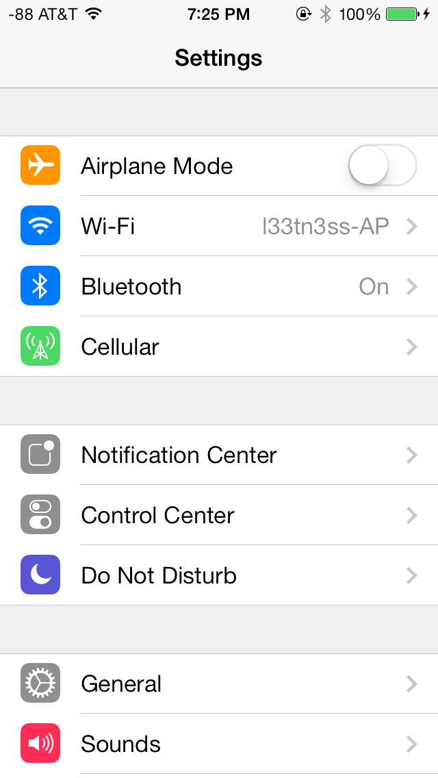
The changes in Settings.app are primarily visual at a high level. The application icon is perhaps the most curious change, since it looks like a sprocket for a bicycle or the gears inside a watch now, but I digress. This new UI pretty much just has visual style that matches the rest of iOS 7, and doesn’t really fundamentally change organizational structure very much. Settings are still grouped together in a couple of logical little bunches, with a bunch of third party application-specific settings options at the very bottom.
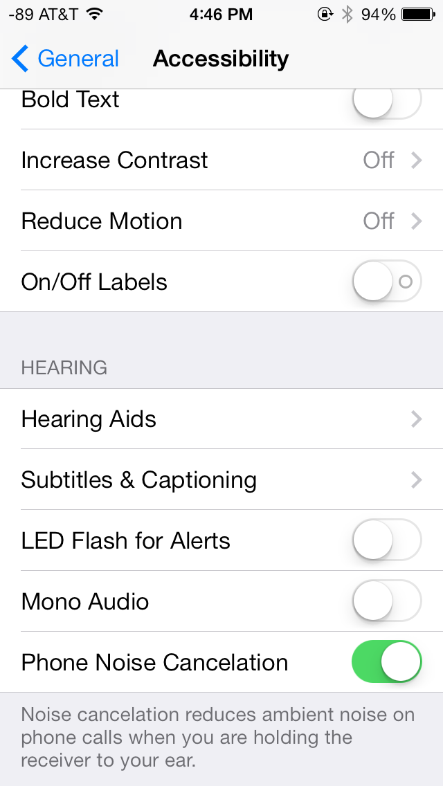
There’s obviously the addition of control center inside settings, and do not disturb comes outside of notifications. There are also the appropriate toggles for the today view under notification center. Under general and accessibility there are new options for the dynamic font size functionality, and a new toggle for disabling noise cancelation which proved somewhat controversial on the iPhone 5 (this setting also carries over to the 5s but not the 5c which I suspect lacks earpiece noise cancelation).
Safari
iOS 7 brings mobile safari version 7, which gets a huge set of functional changes and improvements to the JavaScript engine. Safari has been around for a while without many big changes to the interface, so this is big one.
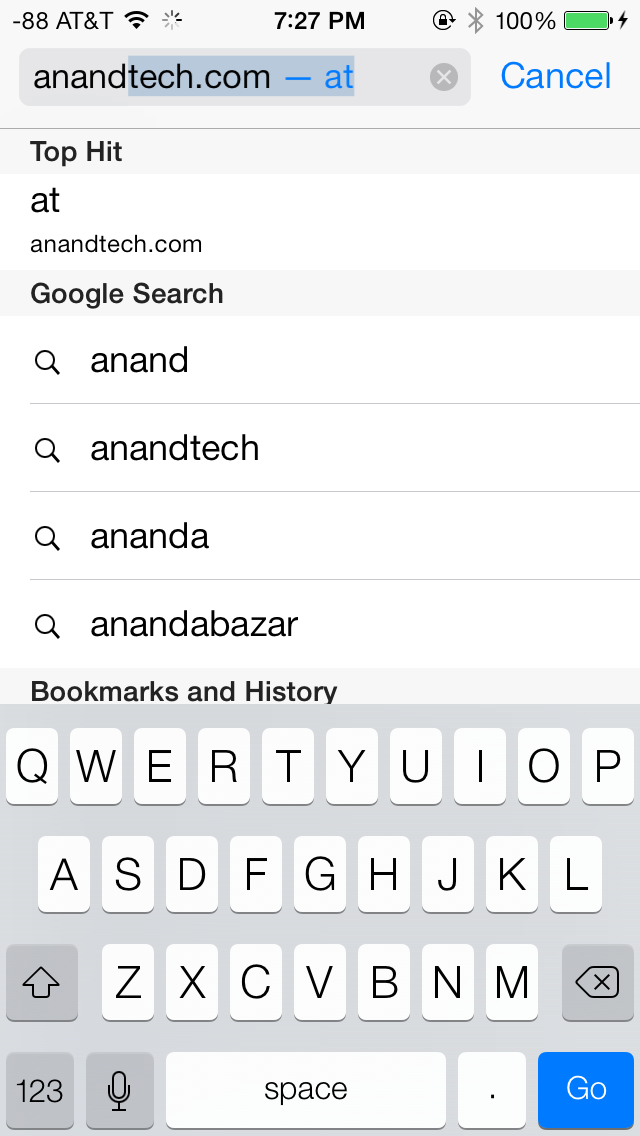
There’s now a unibar at the top of the page for both URLs and search terms, this is a long overdue and welcome change that makes a ton of sense. Safari also now preloads the first result in the list while you’re typing, which has the side effect of making loading feel much faster regardless of what device you’re coming from.

The unibar also looks through bookmarks that are either synced through iCloud or exist on the iDevice and exposes those as options. It’s a bit confusing though since there are both the bookmarks under that appropriate menu, and bookmarks from the bookmarks bar that appear when you tap on the unibar on an empty tab before you start typing. I didn’t realize I even had some of those bookmarks still around until iOS 7 swung around and exposed them.
The new mobile safari gets the same transparent overlays and sense of depth that the rest of the OS conveys, the pages render below most of the UI and there’s a bit of hinting from elements that peek through. A big change is that the bottom menu now also slides away as you scroll down a page, expanding the viewport accordingly. The top bar gets smaller but retains the domain of the page being visited. Tweaks like these do help the iPhone feel bigger than it used to feel.
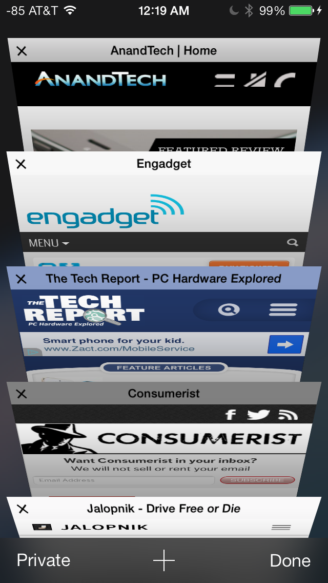
In addition you can now have more than 8 pages open at the same time, and safari seems a lot better at keeping tabs around and not reloading their contents every time you switch between them. The tab switching interface is also a lot better, with a card-like metaphor that allows for tabs to be quickly closed by just swiping them off the left of the display. The only slightly unnerving issue here is that the tabs aren’t antialiased during the animation and for a slight moment or two after it stops, then suddenly the edges no longer have jaggies. It’s a disconcerting subtle thing I can’t stop seeing every time I change tabs in the new mobile safari.
If the signal dots are my least favorite part of iOS, then the changes made in mobile safari and the addition of control center are my favorite.
Benchmarks
Apple usually makes improvements to its JavaScript engine (Nitro) whenever it can, and the iOS 7 mobile safari release is no exception. There’s a 15 percent difference in sunspider and browsermark, and a larger one closer to 50 percent in kraken and google octane, webxprt sees a 30 percent jump. This is comparing two iPhone 5 models running iOS 6.1.4 and the iOS 7.0 GM. HTML5 score increases as well with the addition of a few new features, and WebKit moves from 536.26 to 537.51.1.
| iOS 6.1.4 | iOS 7 GM | |
| Sunspider 1.0 (ms) | 836.6 | 721.1 |
| Browsermark 2.0 (score) | 2587 | 2998 |
| Kraken 1.1 (ms) | 20388.0 | 14050.6 |
| Google Octane (score) | 1706 | 2856 |
| WebXprt (score) | 176 | 231 |
| HTML5test.com (score) | 386+9 | 399+9 |


144 Comments
View All Comments
Guspaz - Thursday, September 19, 2013 - link
One big improvement to the settings app that was missed in the review: per-application bandwidth summaries. Previously, this was all lumped under the "Usage" section, and all you got was a breakdown of cellular data versus tethered data. Especially painful was tracking roaming usage (with carriers often charging insane fees to roam outside the country).This is now handled under the Cellular section. The top-level summary is one line for general data usage total, and one line for roaming data usage. Below that is a list of applications, how much bandwidth each of them has used, and a toggle to disable cellular data usage for that application. Tethered usage is now placed under a "System Services" submenu, which on the top-level screen gives you a total of all system services, but when expanded gives you a breakdown of the bandwidth usage of individual services, including one entry for "Personal Hotspot". It really is rather detailed, even telling you how much bandwidth you've consumed for DNS queries versus Siri versus software updates versus voicemail (and so on).
Impulses - Thursday, September 19, 2013 - link
I'm surprised iOS didn't have that already, pretty good and useful audition. I rarely worry about data usage as my use is pretty darn consistent and I have an unlimited plan anyway... But that should be super helpful for a non-techie on a metered plan who's suddenly worried how much bandwidth he/she may have consumed after an hour of Facetime etc (one of the first things my mother fretted able after finally getting her first smartphone).Impulses - Thursday, September 19, 2013 - link
*useful additionrchan016 - Thursday, September 19, 2013 - link
Back in ios6, when a notification slid in from the top of the screen, you could dismiss it; you would just slide your finger right to left, and then when you let go, the notification is dismissed.althaz - Thursday, September 19, 2013 - link
Love the changes, but the lack of a hardware back button is still hurting the OS, IMO (I won't personally consider one with an LCD screen either, but that's just me). Also, several of these screenshots look ripped straight from Windows Phone (not a bad thing at all).Samus - Thursday, September 19, 2013 - link
Still no live tiles or gadgets to feed you information.So you still need to go into an app for everything. Photo gallery, running tasks, flashlight, weather, alarm, reminders/calendar, shortcuts like shazam, navigate home, quick dials, and so on...
And the multitasking hasn't improved at all. They could at least do what Blackberry did and copy WebOS' card-style tasks interface...
This is the same damn OS all over again with a new font. It's getting ridiculous. No wonder their stock got downgraded by four agencies. Apple makes this ridiculously awesome hardware running an OS from 2007.
Impulses - Thursday, September 19, 2013 - link
Didn't they add some widgets to the notification shade or was that not expanded much? I love that high degree of customization on Android but I find that most non-techies just don't bother with it, in that sense the more seamless tile integration of WP still seems more approachable and generally useful (tho me it still looks like a lot of wasted space).App icons flying in and out seems reminiscent of older Android launcher animations... I don't know that scrolling thru cards was the epitome of task switching paradigms either, HTC did something similar (minus the stacking) on the previous version of Sense and I found it slower than Android's stock thumbnail strip which necessitates less scrolling. Maybe I've forgotten some particularly compelling aspect of this on WebOS (RIP).
Arbee - Thursday, September 19, 2013 - link
Did you actually read the review? It *does* copy WebOS's card-style task list. As a former Palm Pre owner, iOS 7's implementation feels like coming home again :)And you don't need to go into an app for everything, that's the point of the new Control Center.
Daniel Egger - Friday, September 20, 2013 - link
Hopefully without the lag. I don't miss that at all from my 2 Pres...twochoicestom - Thursday, September 19, 2013 - link
Although I see what they were trying to do, after using it for a while, I don't like the animations at all. They slow everything down. I don't care where on the OS I'm zooming into. I care how fluid my device feels.It definitely needs refinement, but it's a very good starting point.