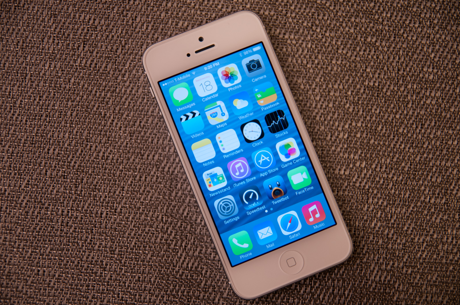
The iOS 7 Review
by Brian Klug & Saumitra Bhagwat on September 19, 2013 1:25 AM ESTLike any major design change, iOS 7 definitely takes getting used to. My initial reaction to a lot of iOS 7 was honestly more surprise and aversion than I thought it would be, but over time the changes have grown on me. I like to think that we're pretty open to change, especially as enthusiasts, but it's a natural human response to want things to be familiar and closer to what came before. Considerable time spent running the beta and watching parts of the platform change over time in response to feedback from developers and other third parties makes me optimistic that the new iOS 7 UI will continue to change and evolve the same way previous versions did.
The flip side is that I can't shake the feeling that some of the iOS 7 design is reactionary. Pundits lambasted Apple with iOS 6 and the iPhone 5 release for being pretty much the same OS with minor tweaks and very few stylistic changes. Those vocal members wanted dramatic change in visual appearance just for the sake of having it, and like the idiom goes, be careful what you wish for because sometimes it actually does come true. No matter how you sugar coat it, iOS 7 is a dramatic departure from the visual style that came before.
I like the use of translucency and transparency, and the new eye candy and visual effects in iOS 7 did initially solicit a bit of the same "wow" reaction that I had the first time looking at iOS on the original iPhone. The use of parallax and the translucency really does convey a sense of depth and order without being as garish as drop shadows or the shiny faux-3d buttons of yesterday's iOS.
The downside is that after a few weeks of it, some animations are really just a lot more gratuitous than they need to be – after the thousandth time watching the tiles fly in or application zoom out into the multitasking interface you want it to just happen instantly. I have no doubt that iOS will go the route of OS X and Windows Phone and gradually increase the speed of these animations to make the platform feel faster. They're also bound to have a power penalty at some point.
I guess that's the ironic part – the flagship devices don't drop frames during the transitions, they just feel long. I can speak to iOS 7 performance which is good on the iPhone 4S and above and newest generation of iPads, performance however on the iPhone 4 and iPad 3 leaves a lot to be desired. The iPhone 4 stutters through all of its animations, has sparse use of transparency, and generally feels like it's on its last legs. The iPad 3 unfortunately is much of the same – sparse transparency, occasional stuttery parts throughout, although a lot more usable than the iPhone 4. I guess I'm just surprised to see the iPad 3 get to that point of feeling slow so fast.
Although a lot of iOS 7 is visual, the functional changes and new features that are standouts really do make a difference. Control center is a long overdue functional improvement that makes controlling a subset of commonly used settings very fast. There's still more Apple could do here to smooth over a few more friction points, but it's a welcome addition. Notification center also feels a lot more well thought out, with logical separation of information that's useful and notifications themselves, even if there's still no "clear all" button.


144 Comments
View All Comments
Impulses - Sunday, September 22, 2013 - link
I just read the Verge's review and while they don't go anywhere as in depth as Anandtech (really, who does?) it did seem more cohesive at a high level. It drew far less direct comparisons between OS yet you always knew when David seemed to think iOS was ahead or behind the competition in any aspect. I won't say it seemed more objective cause I think this kinda review is inherently subjective, but less enthusiastic about minor cosmetic changes for sure.akdj - Tuesday, October 1, 2013 - link
It's 2013 and you're running a new OS from late 2013 on a almost three year old device. It's bound to run a bit slower and show its 'age'. We've got an iPad 2 and we won't be updating from iOS 6.Krysto - Thursday, September 19, 2013 - link
How can translucency be a "step in the right direction"? I think it belongs more in the past, right there with gradients. Same for the parallax effect, which is just cheese, and has always been cheesy.B3an - Thursday, September 19, 2013 - link
I agree. iOS 7 looks very cheesy. But pretty much everything Apple design looks cheesy as they've always had tons of gradients and tacky effects (atleast they've got rid of drop shadows now), all that stuff came from the early to mid 2000's. As a designer i used to design stuff like it myself, but this was around 7 - 12 years ago and things have moved on. Funny how Microsoft now lead in modern design, who would have thought.star-affinity - Tuesday, September 24, 2013 - link
”But pretty much everything Apple design looks cheesy as they've always had tons of gradients and tacky effects”Don't agree at all. Especially in OS X I don't think there's much ”tackiness”. And the only really thing I found really tacky in iOS 6 was Game Center.
What in Microsoft's designs are better you mean? A few examples?
CBone - Friday, October 4, 2013 - link
OSX looks pretty slick. iOS 7 still looks tacky to me. I still don't like the "every app ever barfed up on the screen so it looks like my mother-in-law's XP desktop ultra busy this-is-just-an-app-drawer" look.Wolfpup - Wednesday, September 25, 2013 - link
That's nonsense. Those ideas were developed for a reason, not arbitrarily. Removing them is fad, fashion, and has nothing to do with functionality, which is diminished.akdj - Thursday, October 3, 2013 - link
'Functionality....diminished?' How so?I'm incredibly blown away by the incessant negativity to iOS 7. It's unreal. It's amazing how just a month ago....thru the past three years Apple's taken constant flack on skeumorphism and 'cheese'. iOS 7, while completely different than 6 is one HELL of a makeover. Perhaps it's because we are using an iPhone 5 and 5s...iPad 4s and minis...but I've lost absolutely NO functionality. The minimalist design UI is a HUGE breath of fresh air and it's apparent to me why so many design 'experts' on this board and many others are crying foul. 'So yesterday'. 'Dated'. Blah blah blah blah blah
What an absolute joke. To decry the new UI, it's incredible fluidity....even on two year old hardware, the simplicity...added functionality (control center, camera, notifications, background updates...there are literally DOZENS of examples of extended functionality....it truly makes me question and wonder who these anonymous design experts are behind the anonymity do their keyboard. Ridiculous.
I guarantee Apple will win not one, two or even six awards for this UI overhaul/design. They'll win a dozen or more. A TRUE design expert would realize this. Is there areas of improvement to be made? Sure! Absolutely....but that's been the same since iOS 1.0 (was that a version? I can't remember even after owning each iPhone). The complaints of 'boring' and analog symbols and UI with the skeumorphic design through iOS 6 was tiring. And ubiquitous. And everywhere...all the time. Now, they change it and it's not what you want. Hilarious. There are plenty of choices on the market if you don't like it. android isn't android. It's TouchWiz, Sense, and dozens of other launchers to set it up the way you like it. If Windows crappy UI is so intriguing, why are you slamming iOS 7? Why aren't you buying a Lumia?
It's tiring. And boring. Especially reading all the bullshit from the so called and most likely unemployed 'design experts'. I don't suppose anyone has explored so many of the other excellent updates, ala error and spelling correction, fast swipe to rid a reminder, excellent new options for sounds, font size and 'thickening' if you find it bothersome....and to call parallax effects cheesy just exemplifies the thin knowledge some posters have when it comes to UI design, simplicity and fluidity. It's easy to put out a crappy, glitchy and slow UI. Look at Samsung and the new S4 (I have one. We develop for both Android and iOS and have just started to learn the ins and outs with Windows mobile). That is a phone with some of the fastest hardware on the market and in comparison with either the '5' or the '5s' it's obliterated when it comes to speed, fluency and doing what it's designed to do...a springboard, launching platform for your apps and software.
Rant over...sorry, just tired of all the bullshit. Pardon my Cantonese
akdj - Thursday, October 3, 2013 - link
I meant to also mention, Apple designing this new UI and as trouble free and fluent as it is...is almost miraculous. It's hard as HELL to create a simple user experience. One that's easy to understand and operate. As mentioned before...TouchWiz is a perfect example of how tough it is even with current hardware to achieve this level of performance.CBone - Friday, October 4, 2013 - link
If all you want to do is ultraslurp Apple UI and react poorly to people giving opinions contrary to yours on it, you probably shouldn't read many opinions. Why is it so hard to accept that people might love the phone but hate the UI?