The iOS 7 Review
by Brian Klug & Saumitra Bhagwat on September 19, 2013 1:25 AM ESTSettings
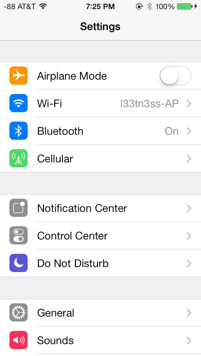
The changes in Settings.app are primarily visual at a high level. The application icon is perhaps the most curious change, since it looks like a sprocket for a bicycle or the gears inside a watch now, but I digress. This new UI pretty much just has visual style that matches the rest of iOS 7, and doesn’t really fundamentally change organizational structure very much. Settings are still grouped together in a couple of logical little bunches, with a bunch of third party application-specific settings options at the very bottom.
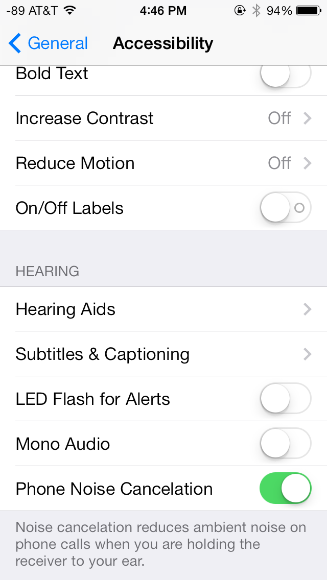
There’s obviously the addition of control center inside settings, and do not disturb comes outside of notifications. There are also the appropriate toggles for the today view under notification center. Under general and accessibility there are new options for the dynamic font size functionality, and a new toggle for disabling noise cancelation which proved somewhat controversial on the iPhone 5 (this setting also carries over to the 5s but not the 5c which I suspect lacks earpiece noise cancelation).
Safari
iOS 7 brings mobile safari version 7, which gets a huge set of functional changes and improvements to the JavaScript engine. Safari has been around for a while without many big changes to the interface, so this is big one.
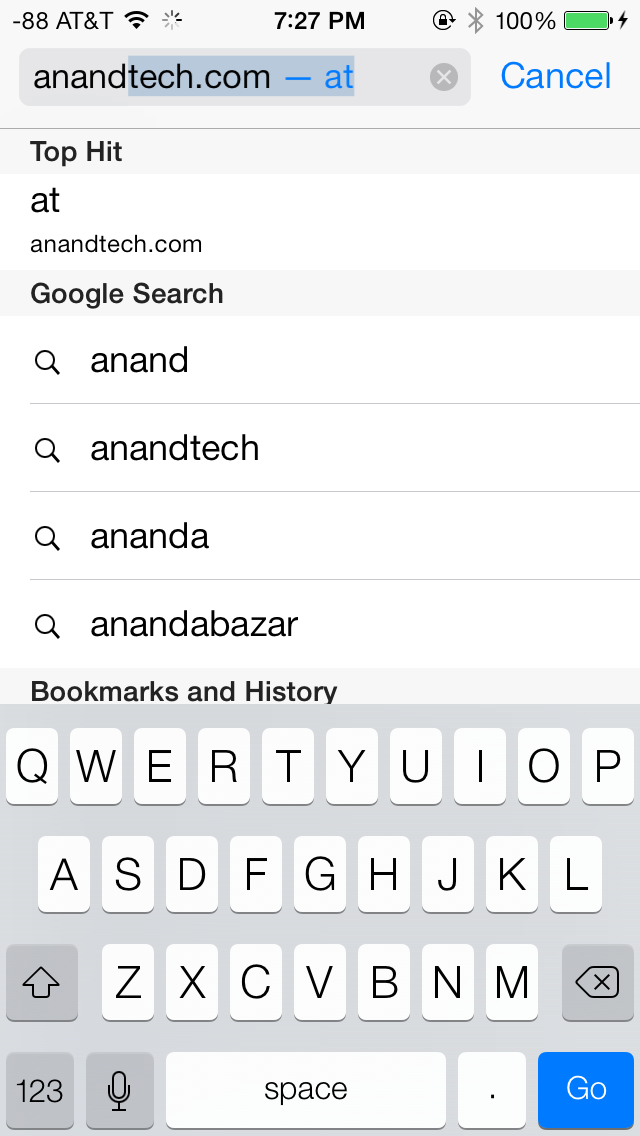
There’s now a unibar at the top of the page for both URLs and search terms, this is a long overdue and welcome change that makes a ton of sense. Safari also now preloads the first result in the list while you’re typing, which has the side effect of making loading feel much faster regardless of what device you’re coming from.

The unibar also looks through bookmarks that are either synced through iCloud or exist on the iDevice and exposes those as options. It’s a bit confusing though since there are both the bookmarks under that appropriate menu, and bookmarks from the bookmarks bar that appear when you tap on the unibar on an empty tab before you start typing. I didn’t realize I even had some of those bookmarks still around until iOS 7 swung around and exposed them.
The new mobile safari gets the same transparent overlays and sense of depth that the rest of the OS conveys, the pages render below most of the UI and there’s a bit of hinting from elements that peek through. A big change is that the bottom menu now also slides away as you scroll down a page, expanding the viewport accordingly. The top bar gets smaller but retains the domain of the page being visited. Tweaks like these do help the iPhone feel bigger than it used to feel.
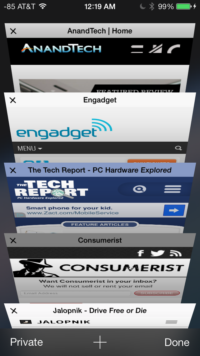
In addition you can now have more than 8 pages open at the same time, and safari seems a lot better at keeping tabs around and not reloading their contents every time you switch between them. The tab switching interface is also a lot better, with a card-like metaphor that allows for tabs to be quickly closed by just swiping them off the left of the display. The only slightly unnerving issue here is that the tabs aren’t antialiased during the animation and for a slight moment or two after it stops, then suddenly the edges no longer have jaggies. It’s a disconcerting subtle thing I can’t stop seeing every time I change tabs in the new mobile safari.
If the signal dots are my least favorite part of iOS, then the changes made in mobile safari and the addition of control center are my favorite.
Benchmarks
Apple usually makes improvements to its JavaScript engine (Nitro) whenever it can, and the iOS 7 mobile safari release is no exception. There’s a 15 percent difference in sunspider and browsermark, and a larger one closer to 50 percent in kraken and google octane, webxprt sees a 30 percent jump. This is comparing two iPhone 5 models running iOS 6.1.4 and the iOS 7.0 GM. HTML5 score increases as well with the addition of a few new features, and WebKit moves from 536.26 to 537.51.1.
| iOS 6.1.4 | iOS 7 GM | |
| Sunspider 1.0 (ms) | 836.6 | 721.1 |
| Browsermark 2.0 (score) | 2587 | 2998 |
| Kraken 1.1 (ms) | 20388.0 | 14050.6 |
| Google Octane (score) | 1706 | 2856 |
| WebXprt (score) | 176 | 231 |
| HTML5test.com (score) | 386+9 | 399+9 |


144 Comments
View All Comments
Impulses - Sunday, September 22, 2013 - link
I just read the Verge's review and while they don't go anywhere as in depth as Anandtech (really, who does?) it did seem more cohesive at a high level. It drew far less direct comparisons between OS yet you always knew when David seemed to think iOS was ahead or behind the competition in any aspect. I won't say it seemed more objective cause I think this kinda review is inherently subjective, but less enthusiastic about minor cosmetic changes for sure.akdj - Tuesday, October 1, 2013 - link
It's 2013 and you're running a new OS from late 2013 on a almost three year old device. It's bound to run a bit slower and show its 'age'. We've got an iPad 2 and we won't be updating from iOS 6.Krysto - Thursday, September 19, 2013 - link
How can translucency be a "step in the right direction"? I think it belongs more in the past, right there with gradients. Same for the parallax effect, which is just cheese, and has always been cheesy.B3an - Thursday, September 19, 2013 - link
I agree. iOS 7 looks very cheesy. But pretty much everything Apple design looks cheesy as they've always had tons of gradients and tacky effects (atleast they've got rid of drop shadows now), all that stuff came from the early to mid 2000's. As a designer i used to design stuff like it myself, but this was around 7 - 12 years ago and things have moved on. Funny how Microsoft now lead in modern design, who would have thought.star-affinity - Tuesday, September 24, 2013 - link
”But pretty much everything Apple design looks cheesy as they've always had tons of gradients and tacky effects”Don't agree at all. Especially in OS X I don't think there's much ”tackiness”. And the only really thing I found really tacky in iOS 6 was Game Center.
What in Microsoft's designs are better you mean? A few examples?
CBone - Friday, October 4, 2013 - link
OSX looks pretty slick. iOS 7 still looks tacky to me. I still don't like the "every app ever barfed up on the screen so it looks like my mother-in-law's XP desktop ultra busy this-is-just-an-app-drawer" look.Wolfpup - Wednesday, September 25, 2013 - link
That's nonsense. Those ideas were developed for a reason, not arbitrarily. Removing them is fad, fashion, and has nothing to do with functionality, which is diminished.akdj - Thursday, October 3, 2013 - link
'Functionality....diminished?' How so?I'm incredibly blown away by the incessant negativity to iOS 7. It's unreal. It's amazing how just a month ago....thru the past three years Apple's taken constant flack on skeumorphism and 'cheese'. iOS 7, while completely different than 6 is one HELL of a makeover. Perhaps it's because we are using an iPhone 5 and 5s...iPad 4s and minis...but I've lost absolutely NO functionality. The minimalist design UI is a HUGE breath of fresh air and it's apparent to me why so many design 'experts' on this board and many others are crying foul. 'So yesterday'. 'Dated'. Blah blah blah blah blah
What an absolute joke. To decry the new UI, it's incredible fluidity....even on two year old hardware, the simplicity...added functionality (control center, camera, notifications, background updates...there are literally DOZENS of examples of extended functionality....it truly makes me question and wonder who these anonymous design experts are behind the anonymity do their keyboard. Ridiculous.
I guarantee Apple will win not one, two or even six awards for this UI overhaul/design. They'll win a dozen or more. A TRUE design expert would realize this. Is there areas of improvement to be made? Sure! Absolutely....but that's been the same since iOS 1.0 (was that a version? I can't remember even after owning each iPhone). The complaints of 'boring' and analog symbols and UI with the skeumorphic design through iOS 6 was tiring. And ubiquitous. And everywhere...all the time. Now, they change it and it's not what you want. Hilarious. There are plenty of choices on the market if you don't like it. android isn't android. It's TouchWiz, Sense, and dozens of other launchers to set it up the way you like it. If Windows crappy UI is so intriguing, why are you slamming iOS 7? Why aren't you buying a Lumia?
It's tiring. And boring. Especially reading all the bullshit from the so called and most likely unemployed 'design experts'. I don't suppose anyone has explored so many of the other excellent updates, ala error and spelling correction, fast swipe to rid a reminder, excellent new options for sounds, font size and 'thickening' if you find it bothersome....and to call parallax effects cheesy just exemplifies the thin knowledge some posters have when it comes to UI design, simplicity and fluidity. It's easy to put out a crappy, glitchy and slow UI. Look at Samsung and the new S4 (I have one. We develop for both Android and iOS and have just started to learn the ins and outs with Windows mobile). That is a phone with some of the fastest hardware on the market and in comparison with either the '5' or the '5s' it's obliterated when it comes to speed, fluency and doing what it's designed to do...a springboard, launching platform for your apps and software.
Rant over...sorry, just tired of all the bullshit. Pardon my Cantonese
akdj - Thursday, October 3, 2013 - link
I meant to also mention, Apple designing this new UI and as trouble free and fluent as it is...is almost miraculous. It's hard as HELL to create a simple user experience. One that's easy to understand and operate. As mentioned before...TouchWiz is a perfect example of how tough it is even with current hardware to achieve this level of performance.CBone - Friday, October 4, 2013 - link
If all you want to do is ultraslurp Apple UI and react poorly to people giving opinions contrary to yours on it, you probably shouldn't read many opinions. Why is it so hard to accept that people might love the phone but hate the UI?