The iOS 7 Review
by Brian Klug & Saumitra Bhagwat on September 19, 2013 1:25 AM ESTSettings
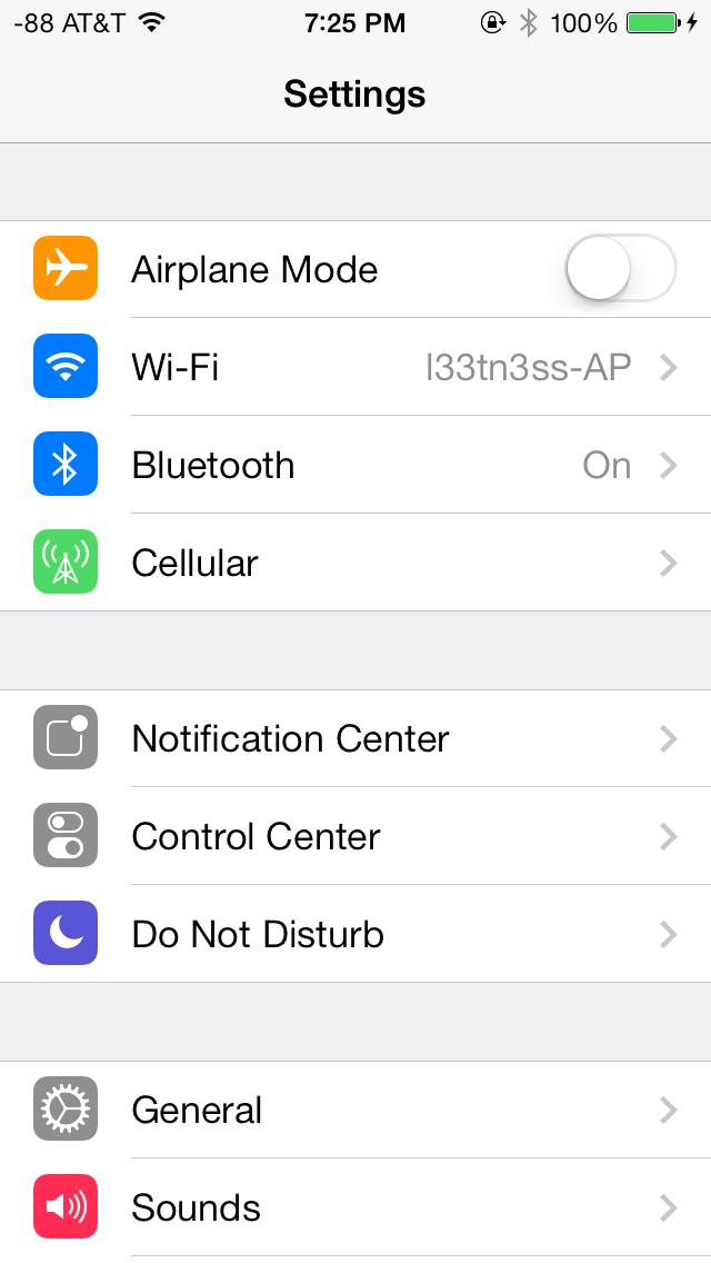
The changes in Settings.app are primarily visual at a high level. The application icon is perhaps the most curious change, since it looks like a sprocket for a bicycle or the gears inside a watch now, but I digress. This new UI pretty much just has visual style that matches the rest of iOS 7, and doesn’t really fundamentally change organizational structure very much. Settings are still grouped together in a couple of logical little bunches, with a bunch of third party application-specific settings options at the very bottom.
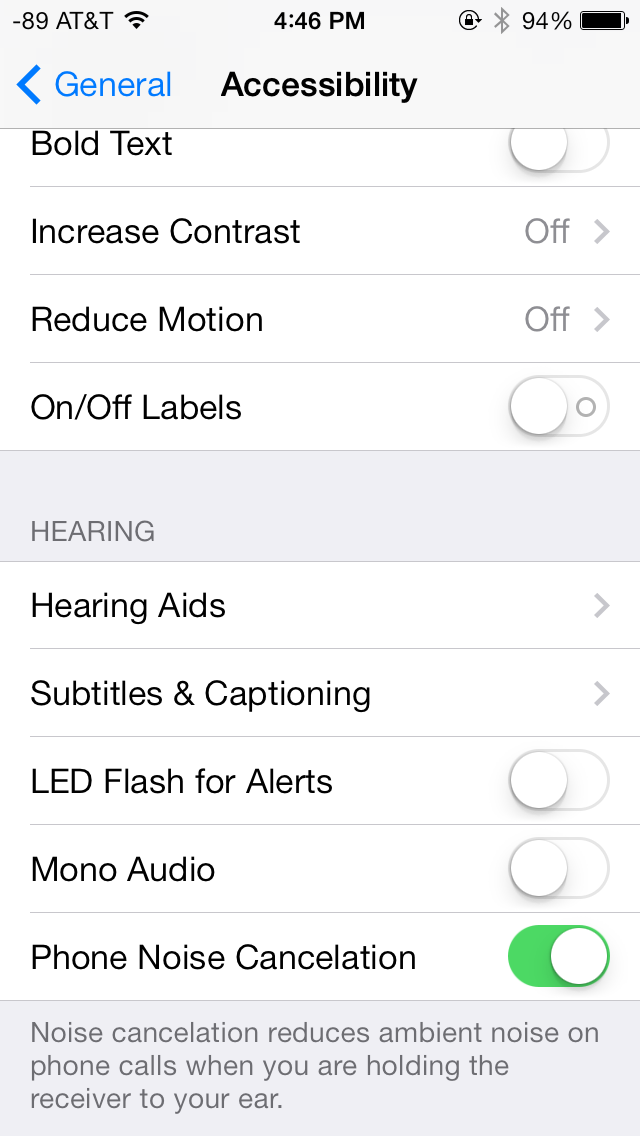
There’s obviously the addition of control center inside settings, and do not disturb comes outside of notifications. There are also the appropriate toggles for the today view under notification center. Under general and accessibility there are new options for the dynamic font size functionality, and a new toggle for disabling noise cancelation which proved somewhat controversial on the iPhone 5 (this setting also carries over to the 5s but not the 5c which I suspect lacks earpiece noise cancelation).
Safari
iOS 7 brings mobile safari version 7, which gets a huge set of functional changes and improvements to the JavaScript engine. Safari has been around for a while without many big changes to the interface, so this is big one.
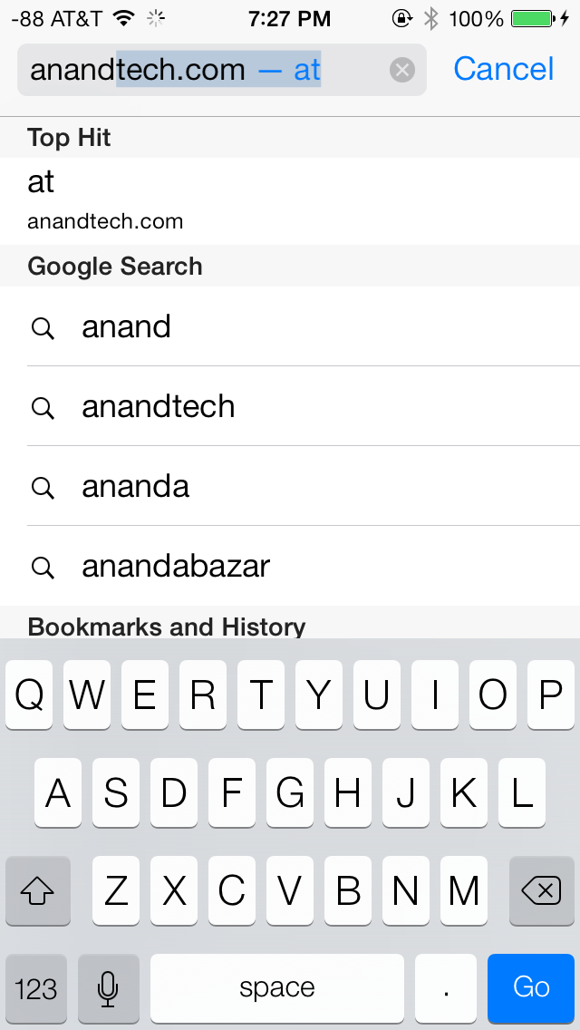
There’s now a unibar at the top of the page for both URLs and search terms, this is a long overdue and welcome change that makes a ton of sense. Safari also now preloads the first result in the list while you’re typing, which has the side effect of making loading feel much faster regardless of what device you’re coming from.

The unibar also looks through bookmarks that are either synced through iCloud or exist on the iDevice and exposes those as options. It’s a bit confusing though since there are both the bookmarks under that appropriate menu, and bookmarks from the bookmarks bar that appear when you tap on the unibar on an empty tab before you start typing. I didn’t realize I even had some of those bookmarks still around until iOS 7 swung around and exposed them.
The new mobile safari gets the same transparent overlays and sense of depth that the rest of the OS conveys, the pages render below most of the UI and there’s a bit of hinting from elements that peek through. A big change is that the bottom menu now also slides away as you scroll down a page, expanding the viewport accordingly. The top bar gets smaller but retains the domain of the page being visited. Tweaks like these do help the iPhone feel bigger than it used to feel.
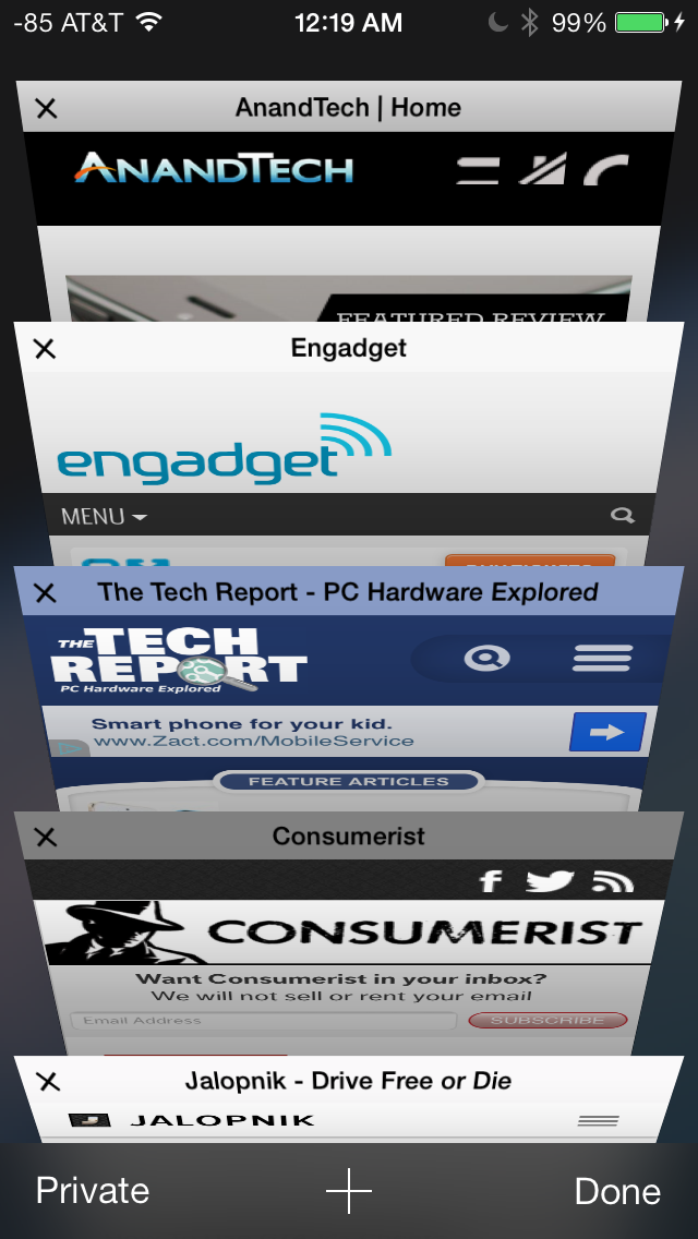
In addition you can now have more than 8 pages open at the same time, and safari seems a lot better at keeping tabs around and not reloading their contents every time you switch between them. The tab switching interface is also a lot better, with a card-like metaphor that allows for tabs to be quickly closed by just swiping them off the left of the display. The only slightly unnerving issue here is that the tabs aren’t antialiased during the animation and for a slight moment or two after it stops, then suddenly the edges no longer have jaggies. It’s a disconcerting subtle thing I can’t stop seeing every time I change tabs in the new mobile safari.
If the signal dots are my least favorite part of iOS, then the changes made in mobile safari and the addition of control center are my favorite.
Benchmarks
Apple usually makes improvements to its JavaScript engine (Nitro) whenever it can, and the iOS 7 mobile safari release is no exception. There’s a 15 percent difference in sunspider and browsermark, and a larger one closer to 50 percent in kraken and google octane, webxprt sees a 30 percent jump. This is comparing two iPhone 5 models running iOS 6.1.4 and the iOS 7.0 GM. HTML5 score increases as well with the addition of a few new features, and WebKit moves from 536.26 to 537.51.1.
| iOS 6.1.4 | iOS 7 GM | |
| Sunspider 1.0 (ms) | 836.6 | 721.1 |
| Browsermark 2.0 (score) | 2587 | 2998 |
| Kraken 1.1 (ms) | 20388.0 | 14050.6 |
| Google Octane (score) | 1706 | 2856 |
| WebXprt (score) | 176 | 231 |
| HTML5test.com (score) | 386+9 | 399+9 |


144 Comments
View All Comments
akdj - Tuesday, October 1, 2013 - link
@rrecine...glad you're digging your Note. My contract can't mature fast enough. Of all the smartphones we've purchased for development (Android, iOS and Windows)---it's hands down my least favorite. I just bought the 5s and can honestly tell you the new iPhone bests the GNote 2. The SD card. What an absolute joke. And no wonder Google is trying to get the OEMs to get rid of it. Can't put apps on it. Can't store any app info on it. Media essentially only. I bought in hook line and sinker. I'll never buy another Samsung or TouchWiz device as long as I live. Like I said though...glad you're digging yours. The iPhone 5s is definitely a big step up so don't go playing with one. You may just end up coming to the dark side. Removable battery isn't necessary on a phone capable of excellent and often all day use. That's one of the biggest downfalls of the Note 1 & bit less so on the 2. Battery life (stock) absolutely sucks!Crono - Thursday, September 19, 2013 - link
iOS 7 needs less transparency/translucency elements, a slightly darker color or solid color palette, and less animations. Otherwise the UI changes are a step in the right direction as far as lessening skeumorphic icons and moving toward a flatter look.tim851 - Thursday, September 19, 2013 - link
The color palette was probably chosen to hide the extend to which WP7/8 was copied.As a WP7/8 hater, I don't like this iOS 7 look. On the iPad, there's too much (literal) white space. It starts with the greeting screens, which are just big black text on white. Looks like a no-nonsense powerpoint presentation. And at times, iOS 7 appears unpolished.
I disliked some of the skeumorphism in iOS 6, but generally preferred the look-and-feel. But as Brian said, there were lots of people who called for change - for change's sake. And that's what they got.
Also, on the iPad 2, performance is borderline. Every once in a while an animation stutters. Temple Run 2 now stutters all the time. Might be an app issue, might not be. But it's 2013 people, the operating system should NOT do things that slow down the interface. Another thing I have to grudgingly give to Windows Phone.
nathanddrews - Thursday, September 19, 2013 - link
Maybe it's just a hold over from the old days, but the first thing I do with any OS is disable every animation possible. Much like disabling startup videos on games. When I click something, I just want it to work immediately.Ain't nobody got time fo dat. /mandatory
Impulses - Thursday, September 19, 2013 - link
OTOH, aren't WP app load times still behind everyone else? I don't know that they necessarily emulated WP too much, seems like they took interesting bits from both it and stock Android (roboto font was a big deal on ICS, etc).OzedStarfish - Friday, September 20, 2013 - link
Yeah they are still quite long. It's especially frustrating for me, a developer for WP8 because it seems it's a deeper problem than what can be addressed with smart application design.It's most evident when looking at the settings app, launching is effectively instant (animations withstanding) while any third party app takes noticeably longer. To Microsoft's credit, it is far better than it used to be with WP7, switching from JIT to MDIL as well as other back end changes have definitely helped.
NeXTguy2 - Friday, September 20, 2013 - link
It's interesting. Load times can be slow to the point of being seriously annoying. I'm looking at you, WhatsApp. At the same time, though, there are enough apps that launch in 0.5 seconds or so, even on my old Lumia 800 with WP7.5, which indicates to me that there is no fundamental "penalty" in the OS itself.Maybe it has to do with the number of resources an app depends on? The apps with fast launch times include 1Password, the Blizzard and RSA authenticator apps, while stuff the needs an internet status, Twitter and TripIt for example, are slowish. Worst seem to be apps that have a lot of local data. This is all suspicion, I have not tested any of this. Maybe I should...
OzedStarfish - Friday, September 20, 2013 - link
There is a huge correlation between loading data and launch time, especially when developers are lazy and run their routines on the UI thread. But I think the difference between first party and third party apps is most clear comparing 'music+video' or 'photos' or any other complex native panorama app to even the SDK sample, the sample drops frames on opening whilst the native ones are smooth and seamless.Just comparing the settings apps from my Lumia 920 and Nexus 7 (2013) I swore that the phone opened quicker from general usage, but comparing side by side the nexus is noticeably quicker, the animations on the phone really did well at masking the loading while I felt that looking at the grey screen on the nexus made it feel slow. I can see how it takes an adjustment period when switching platforms.
Wolfpup - Wednesday, September 25, 2013 - link
Windows Phone feels fast to me. Both iOS and Windows Phone generally feel really fast, while Android (even on better hardware) feels sluuuuuggish (still, as of 4.3).Daniel Egger - Friday, September 20, 2013 - link
Really not sure where all the WP7/8 references are coming from; one Windows-affine techsite suddenly confesses liking iOS 7 because they copied so many good parts from WP and others start hating iOS 7 because they only copied the worst parts. As a WP7 and 8 user I cannot see at all where this is coming from because the few things they have in common now (like the task switcher which is still quite rudimentary in 8, to be improved in 'Blue' to an iOS 7ish level) or a sans serif font (which is still quite a different choice between the two) are not coming from WP originally at all.