The iOS 7 Review
by Brian Klug & Saumitra Bhagwat on September 19, 2013 1:25 AM ESTSettings
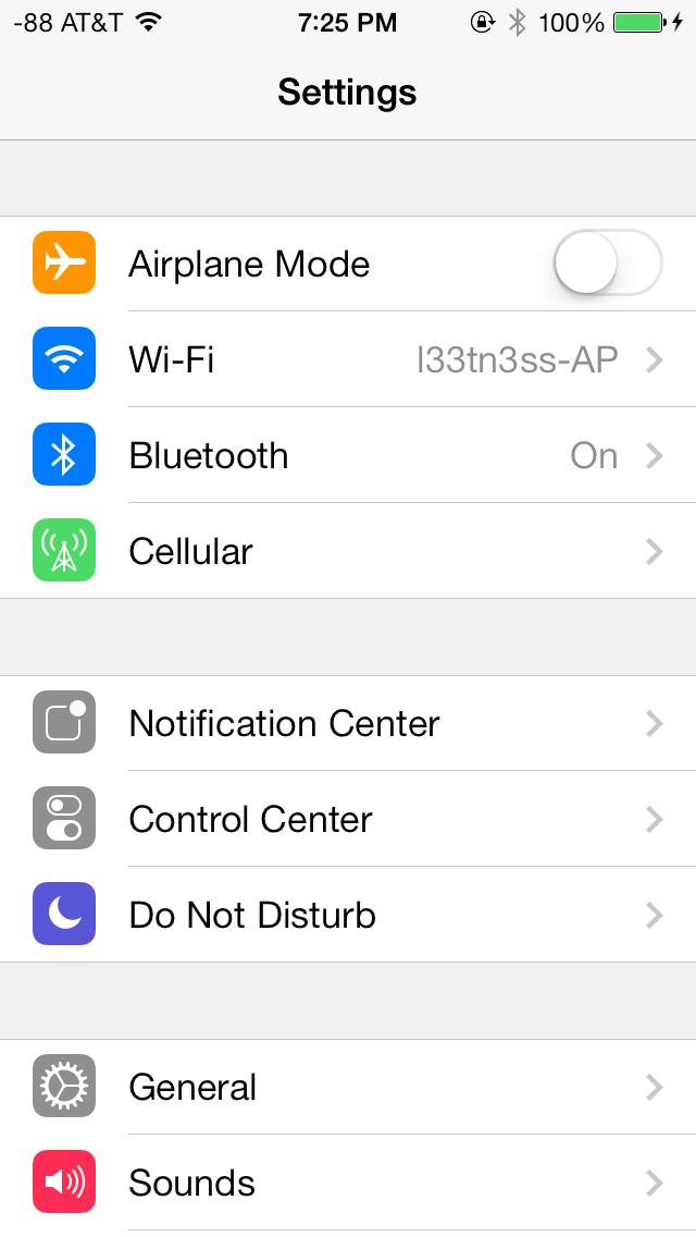
The changes in Settings.app are primarily visual at a high level. The application icon is perhaps the most curious change, since it looks like a sprocket for a bicycle or the gears inside a watch now, but I digress. This new UI pretty much just has visual style that matches the rest of iOS 7, and doesn’t really fundamentally change organizational structure very much. Settings are still grouped together in a couple of logical little bunches, with a bunch of third party application-specific settings options at the very bottom.
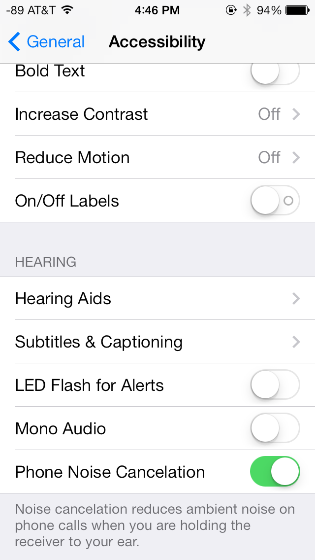
There’s obviously the addition of control center inside settings, and do not disturb comes outside of notifications. There are also the appropriate toggles for the today view under notification center. Under general and accessibility there are new options for the dynamic font size functionality, and a new toggle for disabling noise cancelation which proved somewhat controversial on the iPhone 5 (this setting also carries over to the 5s but not the 5c which I suspect lacks earpiece noise cancelation).

Safari
iOS 7 brings mobile safari version 7, which gets a huge set of functional changes and improvements to the JavaScript engine. Safari has been around for a while without many big changes to the interface, so this is big one.

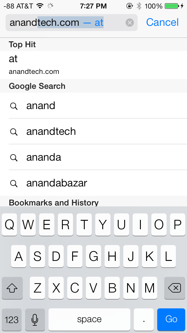
There’s now a unibar at the top of the page for both URLs and search terms, this is a long overdue and welcome change that makes a ton of sense. Safari also now preloads the first result in the list while you’re typing, which has the side effect of making loading feel much faster regardless of what device you’re coming from.
The unibar also looks through bookmarks that are either synced through iCloud or exist on the iDevice and exposes those as options. It’s a bit confusing though since there are both the bookmarks under that appropriate menu, and bookmarks from the bookmarks bar that appear when you tap on the unibar on an empty tab before you start typing. I didn’t realize I even had some of those bookmarks still around until iOS 7 swung around and exposed them.
The new mobile safari gets the same transparent overlays and sense of depth that the rest of the OS conveys, the pages render below most of the UI and there’s a bit of hinting from elements that peek through. A big change is that the bottom menu now also slides away as you scroll down a page, expanding the viewport accordingly. The top bar gets smaller but retains the domain of the page being visited. Tweaks like these do help the iPhone feel bigger than it used to feel.
In addition you can now have more than 8 pages open at the same time, and safari seems a lot better at keeping tabs around and not reloading their contents every time you switch between them. The tab switching interface is also a lot better, with a card-like metaphor that allows for tabs to be quickly closed by just swiping them off the left of the display. The only slightly unnerving issue here is that the tabs aren’t antialiased during the animation and for a slight moment or two after it stops, then suddenly the edges no longer have jaggies. It’s a disconcerting subtle thing I can’t stop seeing every time I change tabs in the new mobile safari.
If the signal dots are my least favorite part of iOS, then the changes made in mobile safari and the addition of control center are my favorite.
Benchmarks
Apple usually makes improvements to its JavaScript engine (Nitro) whenever it can, and the iOS 7 mobile safari release is no exception. There’s a 15 percent difference in sunspider and browsermark, and a larger one closer to 50 percent in kraken and google octane, webxprt sees a 30 percent jump. This is comparing two iPhone 5 models running iOS 6.1.4 and the iOS 7.0 GM. HTML5 score increases as well with the addition of a few new features, and WebKit moves from 536.26 to 537.51.1.
| iOS 6.1.4 | iOS 7 GM | |
| Sunspider 1.0 (ms) | 836.6 | 721.1 |
| Browsermark 2.0 (score) | 2587 | 2998 |
| Kraken 1.1 (ms) | 20388.0 | 14050.6 |
| Google Octane (score) | 1706 | 2856 |
| WebXprt (score) | 176 | 231 |
| HTML5test.com (score) | 386+9 | 399+9 |


144 Comments
View All Comments
Cyrax89721 - Friday, September 20, 2013 - link
It looks like the 'Field Test force quit' no longer works. I just tried it, and after holding down the home button, the Field Test app just reloads itself.cbrownx88 - Thursday, September 26, 2013 - link
I struggled to get past that too - once you forcequit fieldtest, basically time a home button click with when the app is about to relaunch itself.Took me 2-3 tries, but got it to stick.
cwolf - Friday, September 20, 2013 - link
As a parent of a young teen I just discovered one of my favorite new features of iOS 7 - improved parental controls for Safari. I don't place a lot of faith in it's ability to block "adult content" but I do like that it also prevents clearing the browser history or browsing in "private" mode.Ofmyi - Friday, September 20, 2013 - link
My apps don't fly and I do not have the translucent control center...I do however have the i4s. Your article pics represent differently. Please explain.choirbass - Saturday, September 21, 2013 - link
There is some complaining, as always. For myself, the overall adjustments are a nice change, especially on a newer iOS device that's able to properly take advantage of what's offered :). For the claim of copying, I'm sure it's true. If it's working well for others, jumping on a bandwagon of sorts isn't always a bad thing.batongxue - Saturday, September 21, 2013 - link
My poor iPad 3= =
They said it was a powerhouse when they first launch the iPad 3.
dreamofsunnydays - Saturday, September 21, 2013 - link
I am still adjusting to my decision to upgrade to iOS 7 early on.The control center is great, it has meant I can de-clutter my home page from now unnecessary icons like a flashlight and camera, and it does have all the controls I use on a daily basis, easily accessible in one place. The notification center is also laid out more logically so as to be of real use, I hadn't really ever thought there was much point to it before.
So in terms of substance, I'm quite impressed.
Unfortunately when it comes to style, which lets face it is half the reason we all choose apple products I feel like I am stuck in hotmail circa 1999. It is common knowledge hotmail is no longer cool, and a screen full of primary colours and pointless animation when you unlock does not do it for me.
The loss of texture and shadow particularly from the icons makes everything feels a bit cheaper, and more windows - if I had wanted a windows phone that is what I would have bought.
Impulses - Sunday, September 22, 2013 - link
Hotmail i.e. Windows Live Mail i.e. Outlook.com (MS really needs to stop renaming their webmail...) is actually kind of cool again. The latest redesign is pretty quick and fresh looking. I only know this out of necessity, I use Gmail for personal use, an old Yahoo address for bills and subscriptions (old habit and an eggs not on same basket kind of thing), and then Outlook.com because I have two old college addresses that are run thru there.shank123k - Saturday, September 21, 2013 - link
is there is any battery fully charged indication in ios7?i never can be sure when i have to unplug my iphone because ios7 don't have the battery full indicator like previous ios..
androticus - Saturday, September 21, 2013 - link
One of my biggest pet peeves with Contacts is that you can't sort by date of entry (recent first). Like most people, I end up adding a lot of casual acquaintances into Contacts and sometimes want to try to find someone just by searching through recent contacts. This to me is an example where Apple has dumbed it down too much.