The iOS 7 Review
by Brian Klug & Saumitra Bhagwat on September 19, 2013 1:25 AM ESTSettings
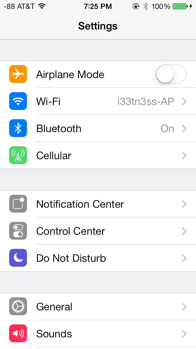
The changes in Settings.app are primarily visual at a high level. The application icon is perhaps the most curious change, since it looks like a sprocket for a bicycle or the gears inside a watch now, but I digress. This new UI pretty much just has visual style that matches the rest of iOS 7, and doesn’t really fundamentally change organizational structure very much. Settings are still grouped together in a couple of logical little bunches, with a bunch of third party application-specific settings options at the very bottom.
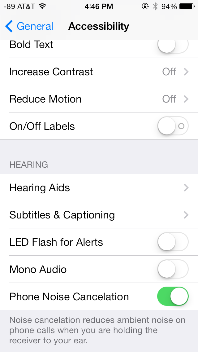
There’s obviously the addition of control center inside settings, and do not disturb comes outside of notifications. There are also the appropriate toggles for the today view under notification center. Under general and accessibility there are new options for the dynamic font size functionality, and a new toggle for disabling noise cancelation which proved somewhat controversial on the iPhone 5 (this setting also carries over to the 5s but not the 5c which I suspect lacks earpiece noise cancelation).
Safari
iOS 7 brings mobile safari version 7, which gets a huge set of functional changes and improvements to the JavaScript engine. Safari has been around for a while without many big changes to the interface, so this is big one.
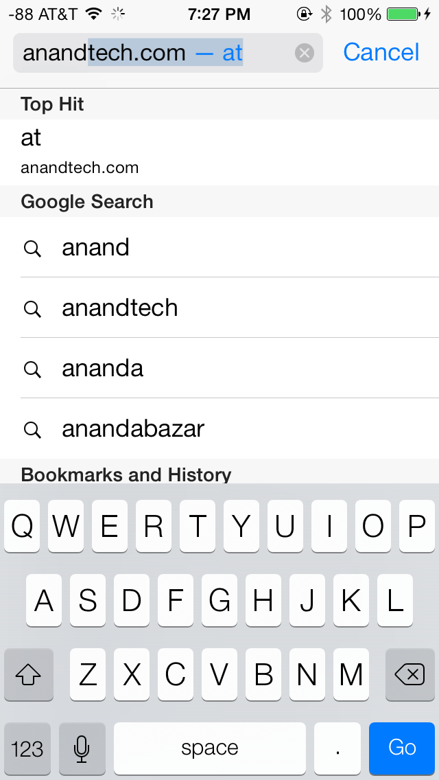
There’s now a unibar at the top of the page for both URLs and search terms, this is a long overdue and welcome change that makes a ton of sense. Safari also now preloads the first result in the list while you’re typing, which has the side effect of making loading feel much faster regardless of what device you’re coming from.

The unibar also looks through bookmarks that are either synced through iCloud or exist on the iDevice and exposes those as options. It’s a bit confusing though since there are both the bookmarks under that appropriate menu, and bookmarks from the bookmarks bar that appear when you tap on the unibar on an empty tab before you start typing. I didn’t realize I even had some of those bookmarks still around until iOS 7 swung around and exposed them.
The new mobile safari gets the same transparent overlays and sense of depth that the rest of the OS conveys, the pages render below most of the UI and there’s a bit of hinting from elements that peek through. A big change is that the bottom menu now also slides away as you scroll down a page, expanding the viewport accordingly. The top bar gets smaller but retains the domain of the page being visited. Tweaks like these do help the iPhone feel bigger than it used to feel.
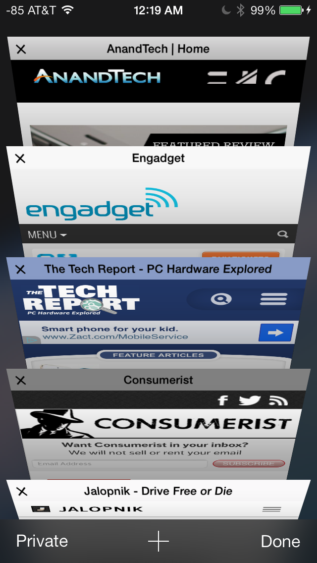
In addition you can now have more than 8 pages open at the same time, and safari seems a lot better at keeping tabs around and not reloading their contents every time you switch between them. The tab switching interface is also a lot better, with a card-like metaphor that allows for tabs to be quickly closed by just swiping them off the left of the display. The only slightly unnerving issue here is that the tabs aren’t antialiased during the animation and for a slight moment or two after it stops, then suddenly the edges no longer have jaggies. It’s a disconcerting subtle thing I can’t stop seeing every time I change tabs in the new mobile safari.
If the signal dots are my least favorite part of iOS, then the changes made in mobile safari and the addition of control center are my favorite.
Benchmarks
Apple usually makes improvements to its JavaScript engine (Nitro) whenever it can, and the iOS 7 mobile safari release is no exception. There’s a 15 percent difference in sunspider and browsermark, and a larger one closer to 50 percent in kraken and google octane, webxprt sees a 30 percent jump. This is comparing two iPhone 5 models running iOS 6.1.4 and the iOS 7.0 GM. HTML5 score increases as well with the addition of a few new features, and WebKit moves from 536.26 to 537.51.1.
| iOS 6.1.4 | iOS 7 GM | |
| Sunspider 1.0 (ms) | 836.6 | 721.1 |
| Browsermark 2.0 (score) | 2587 | 2998 |
| Kraken 1.1 (ms) | 20388.0 | 14050.6 |
| Google Octane (score) | 1706 | 2856 |
| WebXprt (score) | 176 | 231 |
| HTML5test.com (score) | 386+9 | 399+9 |


144 Comments
View All Comments
uhuznaa - Thursday, September 19, 2013 - link
One point Steve Jobs argued about with the old Apple and that lead to him being fired was that he didn't want the Mac to have more RAM. His way of thinking was that programmers should look for ways to make their apps solve problems by thinking through the problem deep enough to come up with simple solutions that didn't need lots of code or memory. All this "we have actually no idea what the people want to do, so just let's throw raw hardware power at it and give them everything" never was his vision.And everybody who ever designed an app or any software solution to something knows that really diving to the bottom what you want to solve is the crucial part. If you do this right you may end up with incredibly simple solutions that go a very long way. The Wiki idea is a good example here.
Jumangi - Thursday, September 19, 2013 - link
2013 and its still just screens of static icons...boring Apple.kyuu - Thursday, September 19, 2013 - link
Personally, I think the iOS 7 aesthetic is pretty ugly. I like Metro, but you can't simply Metro-ize the old grid-of-chiclets and expect it to look good. The propensity for bright, pastel colors doesn't help either.And then that translucency effect is downright bad, especially if you have a dark background. The simple transparency you get with the iPhone 4 is much, much better and should be the default. There is a (rather obfuscated) setting to turn the translucency off labeled "Increase Contrast".
Also, the contrived text in the notifications pane (it says "It is now X degress. The high today was Y degrees" or some such instead of just showing the current temperature and today's high/low) is a huge space waster and offers nothing over simply showing the numbers.
While the move away from skeumorphism to more modern design was necessary, Apple did it in a pretty poor way, IMO. If I had any inkling to move back to iOS before, Apple pretty much killed it with iOS 7.
mfenn - Thursday, September 19, 2013 - link
Capital letters. Use them please.HardwareDufus - Thursday, September 19, 2013 - link
I'm surprised by the use of bright pastel like colors. I don't like it. I can't stand Kelly Green, Magenta, Cyan and Baby Blue used so extensively. It's like the pulled a 'ME TOO' and adopted Windows8 Crayola color palette.That said, I use Phone8 and I can only stand 2 of the color scheme's available. So perhaps I am well in the minority.
The Von Matrices - Thursday, September 19, 2013 - link
After reading through the article, I'm surprised that the new operating system brings no new software features that make me think "wow, I wish my Android phone did that." From an overall view it seems that more than ever that the only real difference between IOS 7 and Android is their colors, font, and icon graphics. It seems that smartphone operating systems are converging on one UI design, just like desktop operating systems have done in the past few years.Sandiamom1 - Thursday, September 19, 2013 - link
I have always considered myself part of that Loyal Apple fan base. I have owned Apple computers, iPods, iPads, iPhones...I have given them as gifts, etc. I have raved about my phone so much, many of my friends have gotten the iPhone. Yes, I am that middle aged woman, not terribly tech savvy & enjoyed the immediate tech support of Apple & ease of use. Since upgrading to the iPhone 5 in June 2013, I have experienced nothing but frustration! This iPhone 5 is basically a very UNSMART, expensive piece of junk! I tried going to the Apple store for tech support, but they won't talk to me for 4 days! Guess that fast tech support service is a relic of the past. Went to AT&T, but they say it's a hardware problem so I'm at the mercy of a slow to respond Apple service system. Since upgrading to the 5 (had the 4s), some contacts get no texts from me, others it may be delayed by hours or days & vice versa; it frequently won't pick up the wi-fi & won't switch to my data plan so I just can't access the internet at all; it drops calls; Find My iPhone app will not work on this; touch screen & scrolling are frequently unresponsive; other things I can't remember now. A couple family members just got the android Galaxy 4S. I am seriously thinking of dropping all Apple products. Told my friends. They're interested in hearing my thoughts on the 4s if I switch. Apple store didn't seem concerned about losing a longtime, dedicated customer, which makes me think it's time to go.kwrzesien - Friday, September 20, 2013 - link
You got a lemon, get Apple to swap it out. Don't restore your 4S profile to it, start from scratch, re-download the apps you still need/want from the App Store, let the contacts sync with iCloud and/or Gmail and/or Facebook, etc. Every few weeks kill all the running apps from the task manager (double-click the home button, hold an app until the "x's" appear) and then reboot. The friends that aren't getting your texts probably have iPhones on Verizon, switch to sending to them as SMS - there is much more delay between AT&T and Verizon then there is internally, I think Apple has different server clusters for each and the interconnect can either get bogged down or jammed. I think the iMessage servers for Verizon in general seem to be slow.The iPhone 5 hardware is very good, but the key is that you did an UPGRADE. I think the software just gets screwy with this and I recommend doing a fresh install. If that doesn't fix your issues then get it replaced.
dcost11 - Friday, September 20, 2013 - link
The apps move when you tilt your device on the ipad, has anyone else noticed this? its like they are on a layer above the wallpaper and as you move the device you see more or less of the wall paper. It doesn't seem to work on my iphone 4Gorgenapper - Friday, September 20, 2013 - link
Updated my iPad 3 to iOS 7 last night.1) Apple fans complain so much about the occasional lag on Android devices, well now they can have some of it too. But of course, Apple lag is in fact a built-in value-added feature. I'm just using the iPad wrong.
2) I think I can hire a chimpanzee to design and draw better icons than most of the ones that have been updated. I mean, sure, the iOS 6 sunflower icon for photos has been around for roughly a million years or more and was due for replacement, but they couldn't draw up one or two abstract representations of photos and instead gave us this Wheel-O-Colors that makes no sense whatsoever? Some of the other icons are so hilariously minimalistic and juvenile in execution that it cheapens the entire experience of using the iPad.
3) No calculator for the iPad? Really? Seriously? Most of the free ones out there are full of ads.
4) Movies on my iPad no longer have titles, I'm supposed to know which movie it is by looking at the thumbnail. Let's see... I have... "A Movie shot in Black", "The Terrifying Darkness", "Noire", "Black Screen of Death II", "Random Face Caught in Motion" and "Unidentified Body Part". Another value added feature from Apple, thanks!