The iOS 7 Review
by Brian Klug & Saumitra Bhagwat on September 19, 2013 1:25 AM ESTWeather
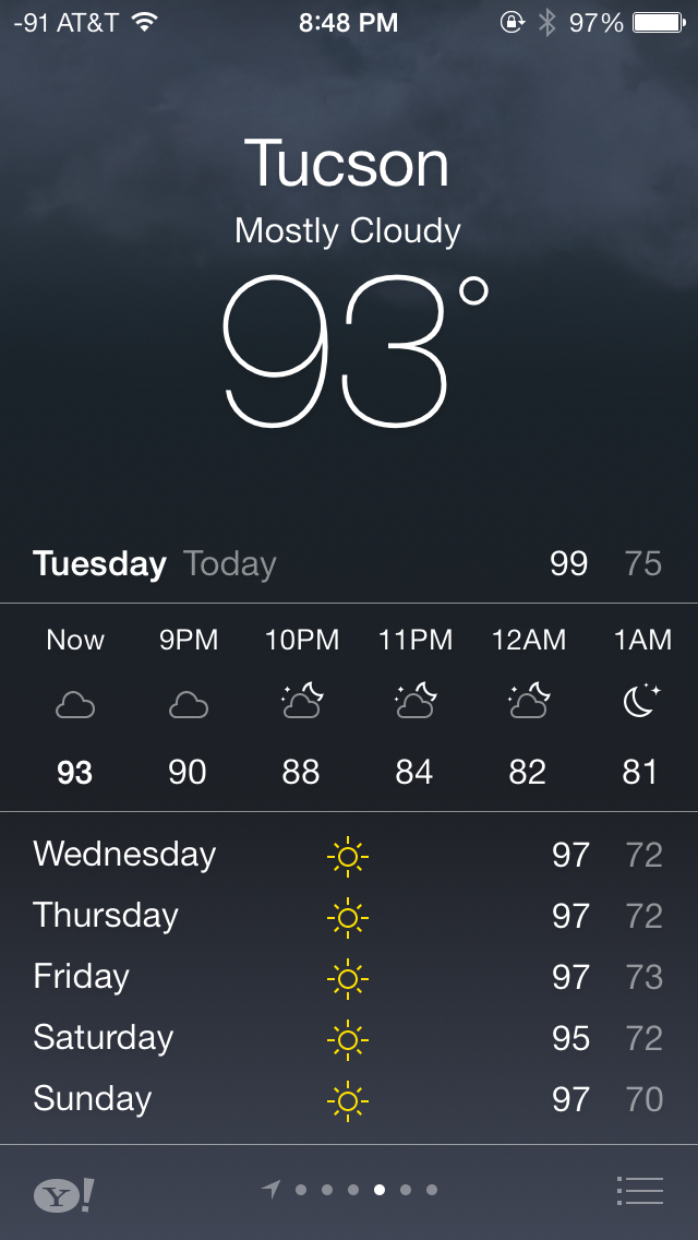
The weather app is probably the purest expression of the design elements that Apple wants to convey with iOS 7. There’s parallax, edge to edge views, and the same typographic emphasis that exists elsewhere. Where the previous weather app was really an extension of the long-forgotten dashboard widget from OS X, the weather app in iOS 7 is something of a style guide example app from Apple for third party developers.
What’s more, gone are the rules and icons that used to hint at things like deleting elements or rearranging them. Instead swiping or dragging does exactly what it should do. Functionality doesn’t change much, but it’s visually very different from what came before.
Compass and Level
Another first party app with a dramatic change is the compass application and level indicator. In iOS 7 Apple turns what was a marginally useful demo application added to showcase the MEMS compass added a long time ago to the iPhone platform into a useful level and location tool.
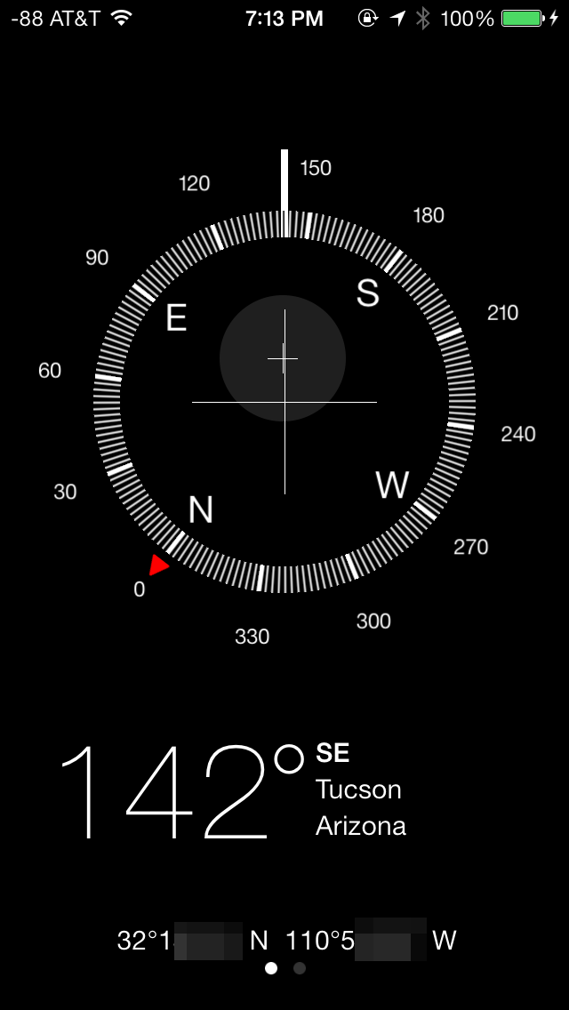

Apple made a big deal about the weather.app changes, but I’m more excited about seeing more designs that follow the kind of design that the compass app lays out. It’s shocking how different the new design looks when compared to the old one.
Calendar
The redesigned Calendar app is quite possibly my favorite app in iOS 7. The interface is extremely clean and makes great use of a red and white color scheme. The animations to transition between portrait and landscape mode are fluid and in general, the new Calendar app is very pleasing to use.
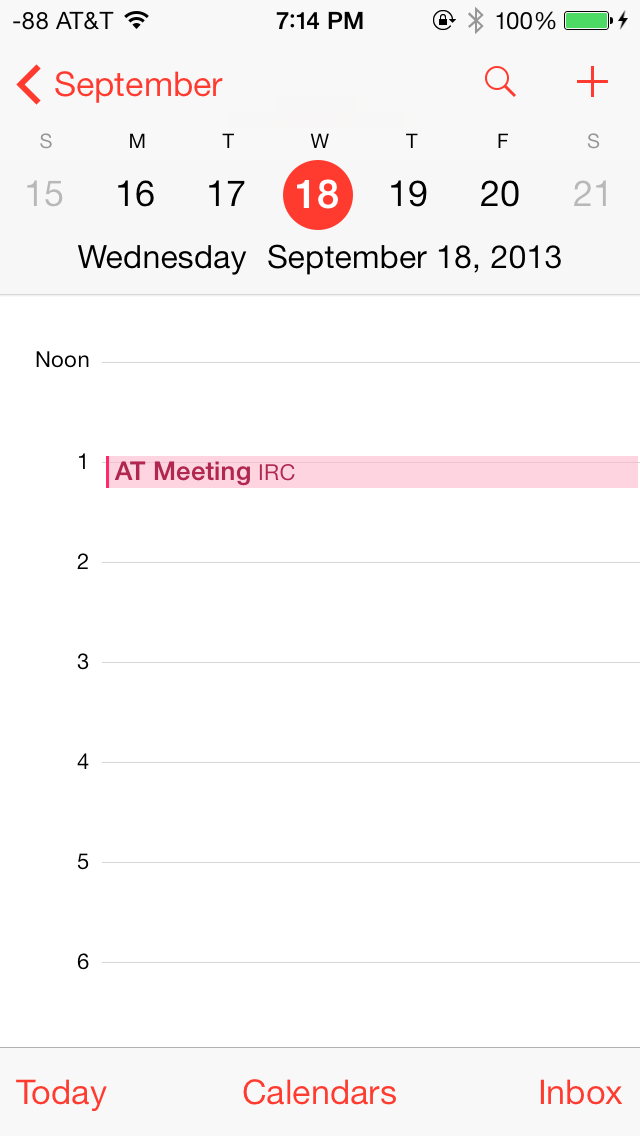
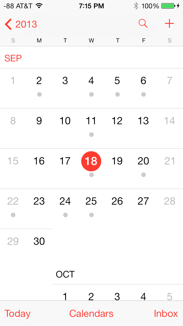
In portrait mode, today’s date is highlighted in red, and days with scheduled appointments can be easily discerned by the gray dot underneath the date. The bottom bar lets users select their calendars and manage their appointments through the inbox, whereas the top bar can be used to quickly search for appointments and create new appointments.
In landscape mode, the app defaults to a 5-day week view. Swiping horizontally across the top bar scrolls through the days, whereas scrolling horizontally shows the appointments on a particular day in that week. The day view in portrait mode is similar, but only shows appointments for that particular day.
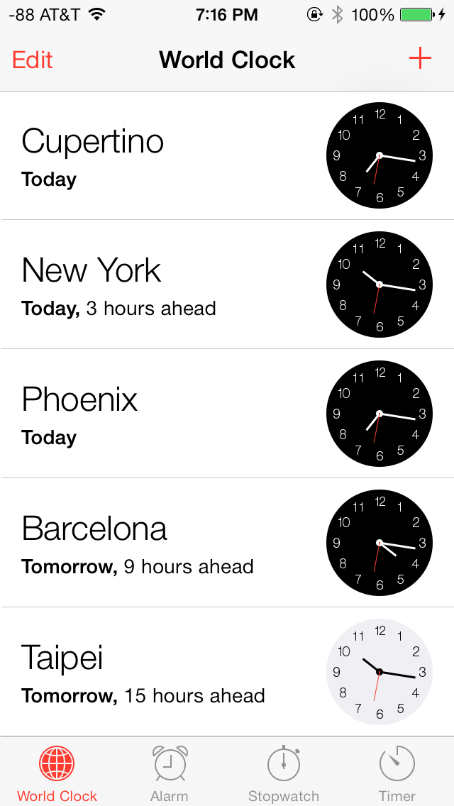
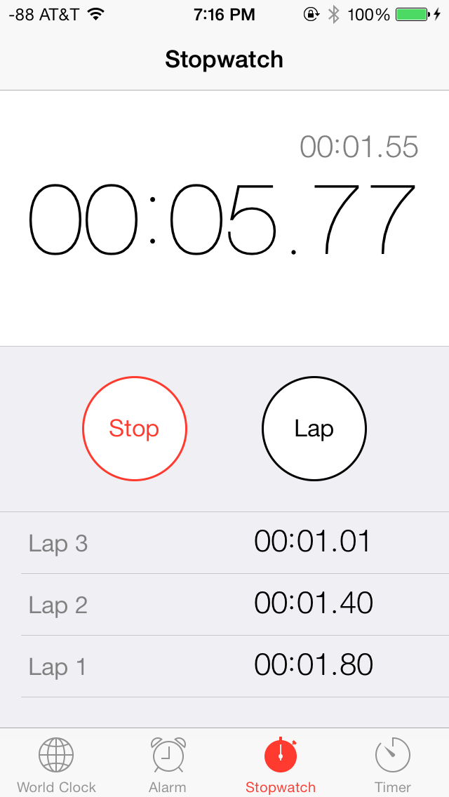
Clock
The Clock app has also received an aesthetic facelift and shares a red and white color scheme with the Calendar app. The World Clock tab can display up to five cities on one screen on iOS devices with 4” screens. The city names appear in a large font and are very easy to read. Based on the current location, the relative date and the time difference is displayed below each clock, which is an extremely useful addition to the app. The time display can be toggled between analogue and digital by tapping anywhere on the screen. The analogue clock faces also change color depending on the time in that particular city.
The Alarm tab is largely unchanged and has only been updated with iOS 7 UI elements. The fonts again are large and easy to read, and the alarm mechanism has been beautifully integrated with the lock screen. When an alarm goes off, it can be snoozed by tapping on the home screen, or dismissed by sliding across. If the alarm is snoozed, a 9-minute snooze timer automatically appears as an active countdown on the home screen. This is yet another example of an ingeniously implemented feature in iOS 7, one which has given me the ability to snooze with confidence.
The Stopwatch and Timer tabs have also received a facelift, but retain their core functionality.
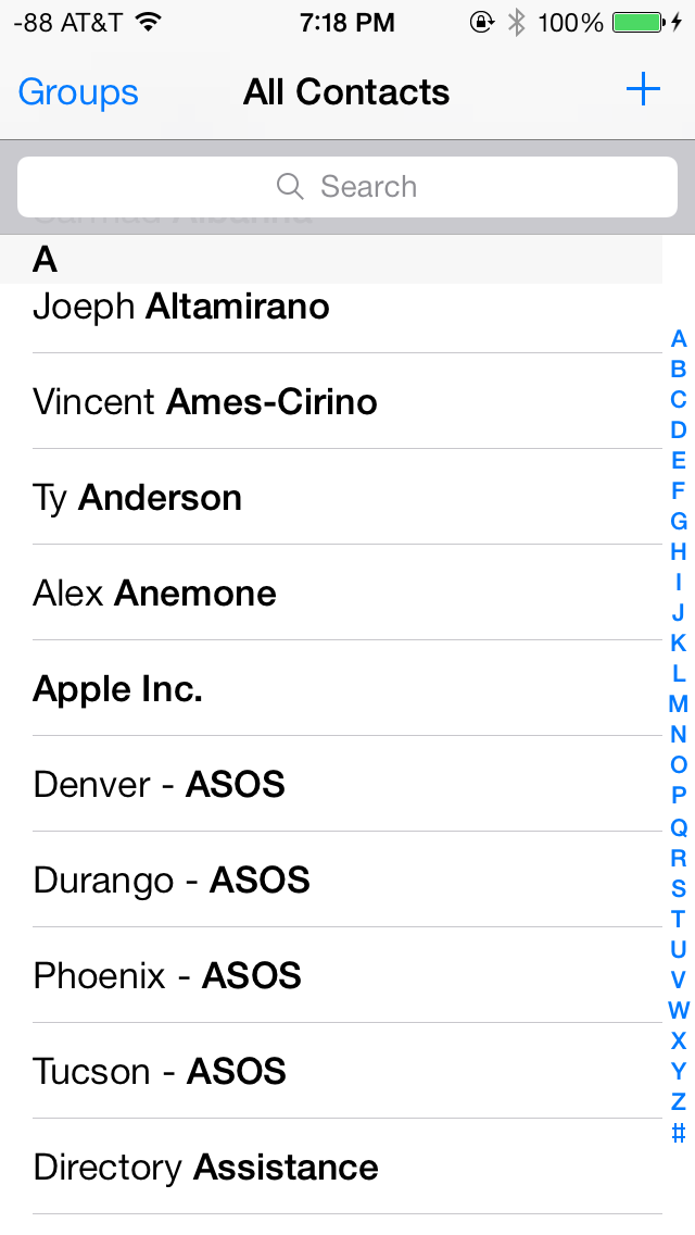
Contacts
The Contacts app has seen steady refinement and new features in each release of iOS, and as such, is an already robust app. The standalone Contacts app and its counterpart in the Phone app feature a blue and white interface in iOS 7. The layout for “All Contacts” remains unchanged, but the individual contact pages now feature a cleaner and more simplified layout. The top is dominated by the contact name and rounded portrait, which is displayed next to the contact name in the Favorites tab of the Phone app.
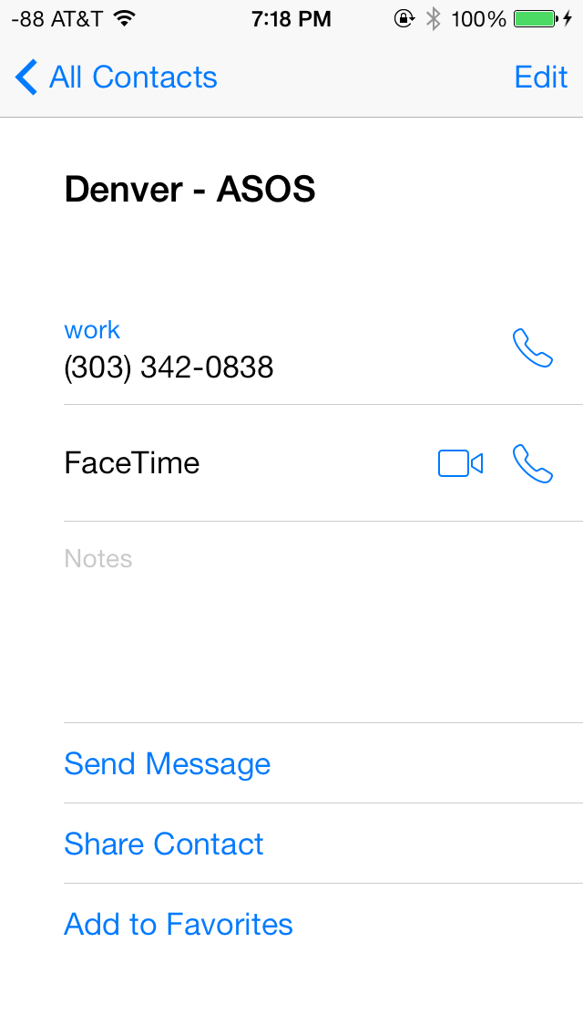
Phone numbers have a call and text icon next to them, to quickly initiate either, directly from the contact page. The edit page also has a clean layout, with bright red and green buttons to add and delete fields. One notable addition is the ability to link LinkedIn contacts, which have now been fully integrated into iOS 7.
Notes & Reminders
The Notes app takes on white and yellow color scheme, and retains an identical interface to its iOS 6 counterpart. The background is white and has a slightly textured look, updated with the usual iOS 7 UI elements.
The Reminders app also shares a textured white background, but also has some transparent gray UI elements. The app has a card interface and lets users toggle between lists and scheduled tasks. List and scheduled tasks stack up, and can be navigated similar to navigating Passbook. A search bar on top lets users search for tasks and reminders. New lists can be color coded.
Game Center
Perhaps the one thing that immediately stood out after looking at the Game Center app is its icon, its unique to say the least. Apple has gone with an indigo and white color scheme for Game Center. The Me tab has your username and portrait at the top and bright neon colored blobs hovering on the screen. These look great against the flush white background, but do not serve any other purpose, other than letting users toggle between the tabs below.
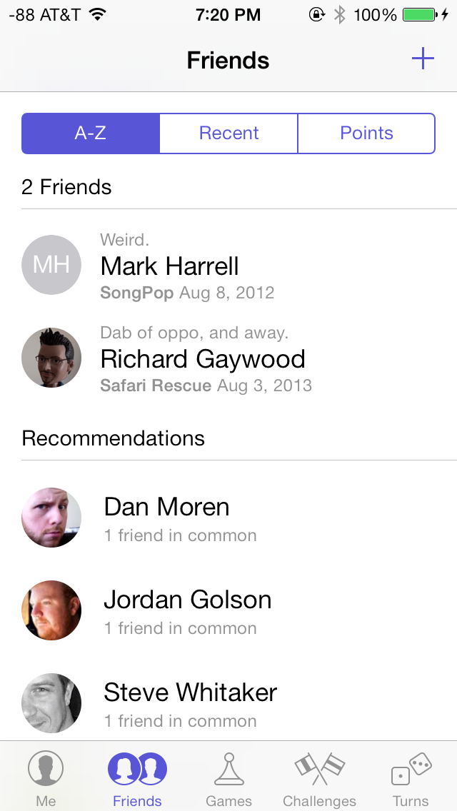
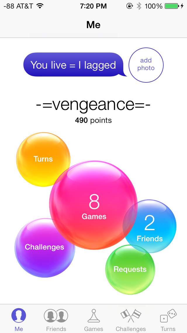
The Friends tab shows your friends (duh) and recommended friends based on your contacts and Facebook friends. The Games tab shows all your current Game Center games, and recommendations based on downloaded games and App Store top lists. Challenges from other friends and notifications from turn-based games show up in the Challenges and Turns tabs respectively, moving on.
Music
The Music app also uses a red and white color scheme and has been completely revamped in iOS 7, making extensive use of transparencies and featuring a new album art wall in landscape mode.
The top bar in the Music app always displays a link the Music Store and Now Playing, regardless of the current tab. Of course, the track details, volume and navigation controls are also available at anytime in the Control Center. The Playlist tab shows local playlists on the device, and playlists on shared iTunes libraries. Creating new playlists is easy, and tracks can be mass added in one go. The Playlist tab only displays the name of the playlist, but does not give details about the number of songs or the total duration of the playlist. This could be a helpful addition in a subsequent release. Local playlists cannot be created if connected to a shared iTunes library.
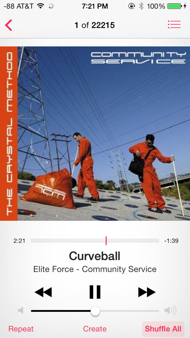
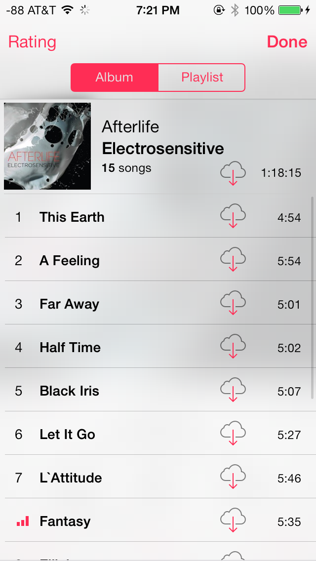
The Artists tab has been revamped with large album art, which is now omnipresent. Albums without album art just show a gray box with the album and artist name. The number of albums and songs display below the artist name, which is a useful addition. The Songs tab also displays album art, but smaller, compared to the Artists tab. The currently playing track shows a cool three bar equalizer animation, in addition to a download icon, in case you are streaming from iCloud. The Albums tab is similar to the Artists tab. The More tab lets you customize tabs and tab layout with Genres, Compilations and Composers.
The Now Playing screen is dominated by album art, and features the usual controls in the bottom half of the screen. However, the perfectly familiar icons for Repeat and Shuffle popularized by iTunes, have been replaced with text labels. I don’t quite understand the rationale behind this change. The Create button is also present to quickly create a Genius Playlist based on the current track.
App Store/Music Store
iOS 7 introduces a number of new features for the App Store, but Apple has not tampered too much with the app’s design. The UI has obviously been updated with a cleaner white and blue interface, and featured frosty white transparencies, similar to the Messaging app. With the new App Store on iOS 7, Apple has finally addressed one of the most requested features, which is to enable automatic updating for apps. Apps now update automatically, and the updates tab provides an informative log of the updated apps, new features and bug fixes in that release, and the date on which the app was updated. The home screen also has a new animation while apps are updating, and recently updated apps can be easily spotted by a blue dot next to their names. Newly downloaded apps no longer have a ribbon on their names.
The App Store also lets users maintain a Wish List, which can be easily accessed from within the app. This has been universally rolled across all three stores. Everything offered for sale across the App, iTunes and iBook stores can now be added to a Wish List. Finally, there’s also a new location-based feature to see apps that a popular nearby, which is a pretty nifty feature to access popular apps, especially if you are traveling.
Messaging
The Messaging app looks beautiful on iOS 7. The bright green and blue colors for text messages and iMessage, coupled with subtle transparencies and the new keyboard make the Messaging app the benchmark for how native iOS 7 apps should look.
The top bar lets users quickly call the contact or look up their contact page and swiping left across a message reveals its time stamp, which is quite useful. Message bubbles also change color gradients depending on their position on the screen, which is looks great on the white background. Finally, swiping right from the left edge of the screen takes you back to the messages list, something we saw more recently on BB10. Finally, the Messaging app supports nicknames, which can be defined from Settings under Mail, Contacts, Calendars.
The Mail app has gained some very useful features in iOS 7 along with a brand new interface. Perhaps the biggest new feature is the ability to add smart mailboxes. On the Mailboxes screen, tapping the Edit button now allows users to display flagged or unread emails, emails with attachments and sent, draft and trashed emails across all accounts. This is a huge improvement from iOS 6 and one that users will truly appreciate. The pull down to refresh animation is replaced with something much more subtle. Search is now universal across all mailboxes, regardless of the mailbox where the search is initiated and seems snappier. The Mail app now highlights the search string in the search results as well, which is a very welcome addition. Moving messages is also easier, displaying a preview thumbnail of the message, and the account it was sent to.
Share Screen
iOS 7 has also implemented a brand new share screen which adapts based on the app being used and the content being shared. It takes up the entire screen, and offers numerous options to share content. For example, in the Photos app, the share screen lets users select multiple photos and videos and share them via AirDrop, or other apps such as Messaging, Mail, iCloud Photo Stream, Facebook, YouTube or Flickr. Also included are contextual, app and content-specific options such as ability to start slideshows, stream via Airplay, copy, assign to contact and many more. For example, the assign to contact option only is available if a single picture is selected, and not when multiple pictures, or a video is selected.
Phone
As with other apps, the Phone app has seen a steady stream of updates and new features in past releases, but has received its biggest update yet in iOS 7.
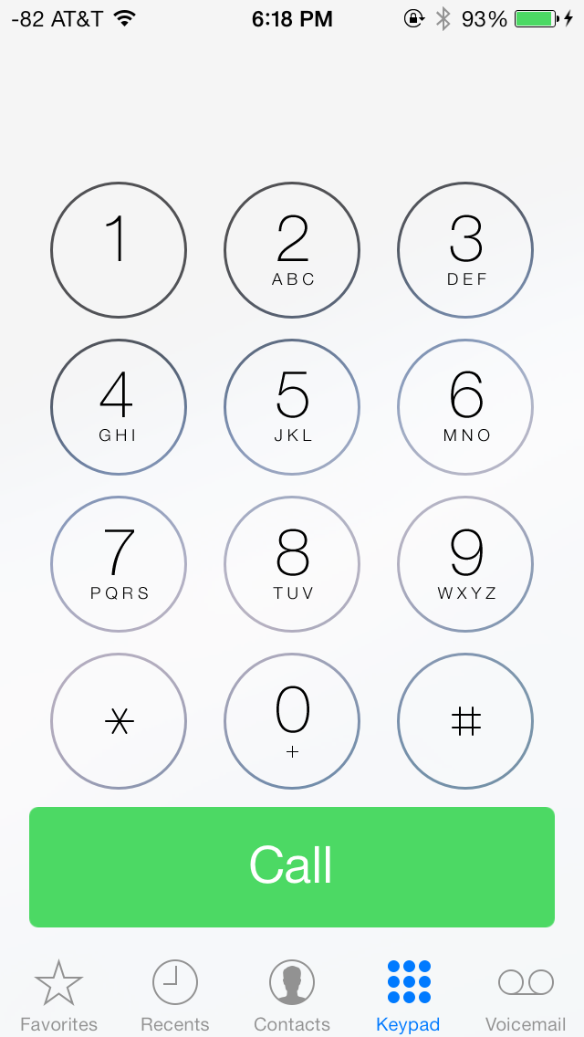
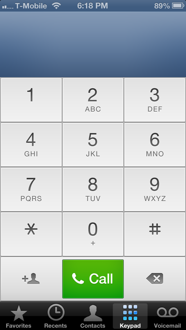
iOS 7 (left), iOS 6 (right)
Like a lot of the other core apps, the Phone app also has a predominantly blue and white interface. The Favorites tab now shows circular portraits for people with pictures, or just an abbreviation of their first and last name for those who don’t. This is also applies to search results in Spotlight. Apart from changes to the Contacts app, covered earlier in this review, Phone app is functionally largely unchanged. The biggest change is to the Keypad tab, where the dialer has been replaced with round buttons with transparent borders that show the wallpaper underneath when tapped.
Once a call is made, the six familiar in-call options have also been replaced with rounded buttons. Contacts with pictures look great during incoming calls, but feature a frosted transparent overlay while making calls. Incoming calls have bright decline and answer buttons, with the remind and text back options above them. I’m not a big fan of the bold font used for the call, decline and answer buttons, it just doesn’t gel with the non-bolded font used elsewhere in the Phone app.
App Store
A major thankful change in iOS 7 is the ability to have applications automatically update as updates are pushed to the store.
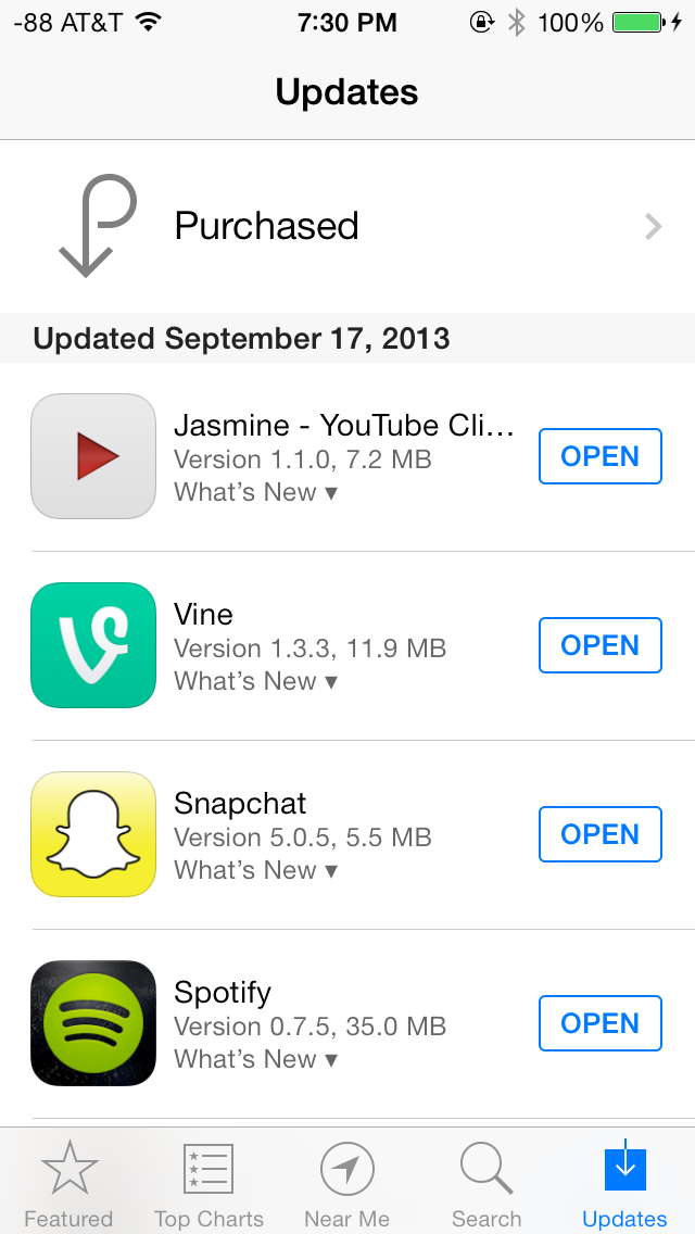
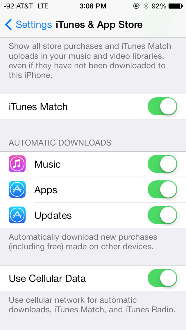
Rather than just let these pile up and procrastinate, if you enable this feature apps update on their own. Users can still browse the changelogs by going into App Store and clicking on the drop down, or viewing version history under the application listings themselves. This is an awesome change I'm very happy to finally get in iOS.
Finally iDevices associated with an iCloud account now require users to enter their iCloud password upon recovery or restore as part of the activation process. If you wipe or DFU mode restore an iDevice without signing out first, you'll get a prompt during setup. This feature does diminish the ability for would-be theives to be able to quickly turn around stolen iDevices, as they simply won't ever activate without the password.


144 Comments
View All Comments
uhuznaa - Thursday, September 19, 2013 - link
One point Steve Jobs argued about with the old Apple and that lead to him being fired was that he didn't want the Mac to have more RAM. His way of thinking was that programmers should look for ways to make their apps solve problems by thinking through the problem deep enough to come up with simple solutions that didn't need lots of code or memory. All this "we have actually no idea what the people want to do, so just let's throw raw hardware power at it and give them everything" never was his vision.And everybody who ever designed an app or any software solution to something knows that really diving to the bottom what you want to solve is the crucial part. If you do this right you may end up with incredibly simple solutions that go a very long way. The Wiki idea is a good example here.
Jumangi - Thursday, September 19, 2013 - link
2013 and its still just screens of static icons...boring Apple.kyuu - Thursday, September 19, 2013 - link
Personally, I think the iOS 7 aesthetic is pretty ugly. I like Metro, but you can't simply Metro-ize the old grid-of-chiclets and expect it to look good. The propensity for bright, pastel colors doesn't help either.And then that translucency effect is downright bad, especially if you have a dark background. The simple transparency you get with the iPhone 4 is much, much better and should be the default. There is a (rather obfuscated) setting to turn the translucency off labeled "Increase Contrast".
Also, the contrived text in the notifications pane (it says "It is now X degress. The high today was Y degrees" or some such instead of just showing the current temperature and today's high/low) is a huge space waster and offers nothing over simply showing the numbers.
While the move away from skeumorphism to more modern design was necessary, Apple did it in a pretty poor way, IMO. If I had any inkling to move back to iOS before, Apple pretty much killed it with iOS 7.
mfenn - Thursday, September 19, 2013 - link
Capital letters. Use them please.HardwareDufus - Thursday, September 19, 2013 - link
I'm surprised by the use of bright pastel like colors. I don't like it. I can't stand Kelly Green, Magenta, Cyan and Baby Blue used so extensively. It's like the pulled a 'ME TOO' and adopted Windows8 Crayola color palette.That said, I use Phone8 and I can only stand 2 of the color scheme's available. So perhaps I am well in the minority.
The Von Matrices - Thursday, September 19, 2013 - link
After reading through the article, I'm surprised that the new operating system brings no new software features that make me think "wow, I wish my Android phone did that." From an overall view it seems that more than ever that the only real difference between IOS 7 and Android is their colors, font, and icon graphics. It seems that smartphone operating systems are converging on one UI design, just like desktop operating systems have done in the past few years.Sandiamom1 - Thursday, September 19, 2013 - link
I have always considered myself part of that Loyal Apple fan base. I have owned Apple computers, iPods, iPads, iPhones...I have given them as gifts, etc. I have raved about my phone so much, many of my friends have gotten the iPhone. Yes, I am that middle aged woman, not terribly tech savvy & enjoyed the immediate tech support of Apple & ease of use. Since upgrading to the iPhone 5 in June 2013, I have experienced nothing but frustration! This iPhone 5 is basically a very UNSMART, expensive piece of junk! I tried going to the Apple store for tech support, but they won't talk to me for 4 days! Guess that fast tech support service is a relic of the past. Went to AT&T, but they say it's a hardware problem so I'm at the mercy of a slow to respond Apple service system. Since upgrading to the 5 (had the 4s), some contacts get no texts from me, others it may be delayed by hours or days & vice versa; it frequently won't pick up the wi-fi & won't switch to my data plan so I just can't access the internet at all; it drops calls; Find My iPhone app will not work on this; touch screen & scrolling are frequently unresponsive; other things I can't remember now. A couple family members just got the android Galaxy 4S. I am seriously thinking of dropping all Apple products. Told my friends. They're interested in hearing my thoughts on the 4s if I switch. Apple store didn't seem concerned about losing a longtime, dedicated customer, which makes me think it's time to go.kwrzesien - Friday, September 20, 2013 - link
You got a lemon, get Apple to swap it out. Don't restore your 4S profile to it, start from scratch, re-download the apps you still need/want from the App Store, let the contacts sync with iCloud and/or Gmail and/or Facebook, etc. Every few weeks kill all the running apps from the task manager (double-click the home button, hold an app until the "x's" appear) and then reboot. The friends that aren't getting your texts probably have iPhones on Verizon, switch to sending to them as SMS - there is much more delay between AT&T and Verizon then there is internally, I think Apple has different server clusters for each and the interconnect can either get bogged down or jammed. I think the iMessage servers for Verizon in general seem to be slow.The iPhone 5 hardware is very good, but the key is that you did an UPGRADE. I think the software just gets screwy with this and I recommend doing a fresh install. If that doesn't fix your issues then get it replaced.
dcost11 - Friday, September 20, 2013 - link
The apps move when you tilt your device on the ipad, has anyone else noticed this? its like they are on a layer above the wallpaper and as you move the device you see more or less of the wall paper. It doesn't seem to work on my iphone 4Gorgenapper - Friday, September 20, 2013 - link
Updated my iPad 3 to iOS 7 last night.1) Apple fans complain so much about the occasional lag on Android devices, well now they can have some of it too. But of course, Apple lag is in fact a built-in value-added feature. I'm just using the iPad wrong.
2) I think I can hire a chimpanzee to design and draw better icons than most of the ones that have been updated. I mean, sure, the iOS 6 sunflower icon for photos has been around for roughly a million years or more and was due for replacement, but they couldn't draw up one or two abstract representations of photos and instead gave us this Wheel-O-Colors that makes no sense whatsoever? Some of the other icons are so hilariously minimalistic and juvenile in execution that it cheapens the entire experience of using the iPad.
3) No calculator for the iPad? Really? Seriously? Most of the free ones out there are full of ads.
4) Movies on my iPad no longer have titles, I'm supposed to know which movie it is by looking at the thumbnail. Let's see... I have... "A Movie shot in Black", "The Terrifying Darkness", "Noire", "Black Screen of Death II", "Random Face Caught in Motion" and "Unidentified Body Part". Another value added feature from Apple, thanks!