The iOS 7 Review
by Brian Klug & Saumitra Bhagwat on September 19, 2013 1:25 AM ESTSettings
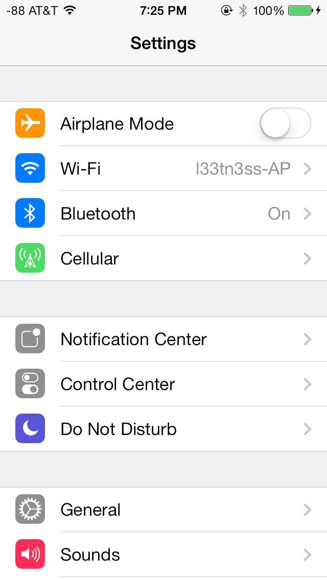
The changes in Settings.app are primarily visual at a high level. The application icon is perhaps the most curious change, since it looks like a sprocket for a bicycle or the gears inside a watch now, but I digress. This new UI pretty much just has visual style that matches the rest of iOS 7, and doesn’t really fundamentally change organizational structure very much. Settings are still grouped together in a couple of logical little bunches, with a bunch of third party application-specific settings options at the very bottom.
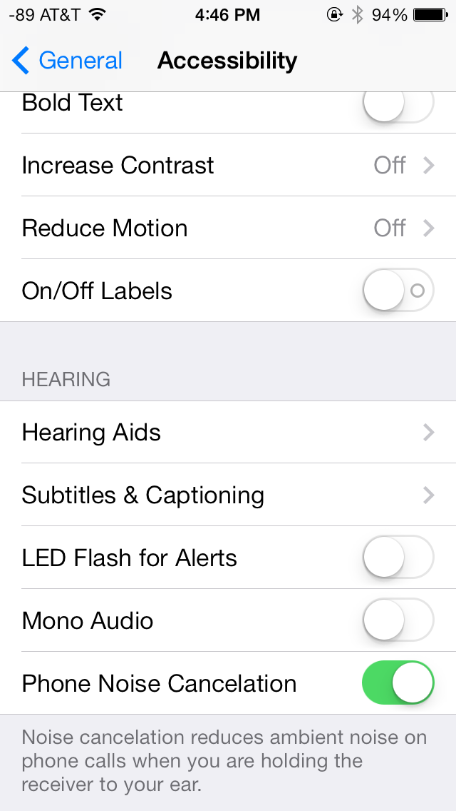
There’s obviously the addition of control center inside settings, and do not disturb comes outside of notifications. There are also the appropriate toggles for the today view under notification center. Under general and accessibility there are new options for the dynamic font size functionality, and a new toggle for disabling noise cancelation which proved somewhat controversial on the iPhone 5 (this setting also carries over to the 5s but not the 5c which I suspect lacks earpiece noise cancelation).
Safari
iOS 7 brings mobile safari version 7, which gets a huge set of functional changes and improvements to the JavaScript engine. Safari has been around for a while without many big changes to the interface, so this is big one.

There’s now a unibar at the top of the page for both URLs and search terms, this is a long overdue and welcome change that makes a ton of sense. Safari also now preloads the first result in the list while you’re typing, which has the side effect of making loading feel much faster regardless of what device you’re coming from.

The unibar also looks through bookmarks that are either synced through iCloud or exist on the iDevice and exposes those as options. It’s a bit confusing though since there are both the bookmarks under that appropriate menu, and bookmarks from the bookmarks bar that appear when you tap on the unibar on an empty tab before you start typing. I didn’t realize I even had some of those bookmarks still around until iOS 7 swung around and exposed them.
The new mobile safari gets the same transparent overlays and sense of depth that the rest of the OS conveys, the pages render below most of the UI and there’s a bit of hinting from elements that peek through. A big change is that the bottom menu now also slides away as you scroll down a page, expanding the viewport accordingly. The top bar gets smaller but retains the domain of the page being visited. Tweaks like these do help the iPhone feel bigger than it used to feel.
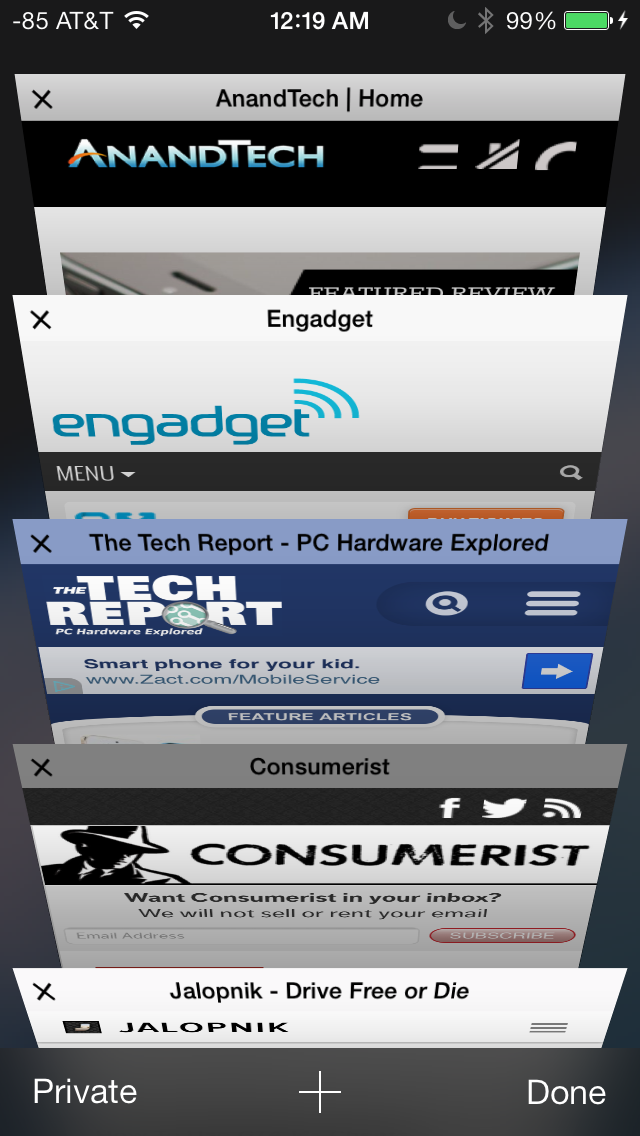
In addition you can now have more than 8 pages open at the same time, and safari seems a lot better at keeping tabs around and not reloading their contents every time you switch between them. The tab switching interface is also a lot better, with a card-like metaphor that allows for tabs to be quickly closed by just swiping them off the left of the display. The only slightly unnerving issue here is that the tabs aren’t antialiased during the animation and for a slight moment or two after it stops, then suddenly the edges no longer have jaggies. It’s a disconcerting subtle thing I can’t stop seeing every time I change tabs in the new mobile safari.
If the signal dots are my least favorite part of iOS, then the changes made in mobile safari and the addition of control center are my favorite.
Benchmarks
Apple usually makes improvements to its JavaScript engine (Nitro) whenever it can, and the iOS 7 mobile safari release is no exception. There’s a 15 percent difference in sunspider and browsermark, and a larger one closer to 50 percent in kraken and google octane, webxprt sees a 30 percent jump. This is comparing two iPhone 5 models running iOS 6.1.4 and the iOS 7.0 GM. HTML5 score increases as well with the addition of a few new features, and WebKit moves from 536.26 to 537.51.1.
| iOS 6.1.4 | iOS 7 GM | |
| Sunspider 1.0 (ms) | 836.6 | 721.1 |
| Browsermark 2.0 (score) | 2587 | 2998 |
| Kraken 1.1 (ms) | 20388.0 | 14050.6 |
| Google Octane (score) | 1706 | 2856 |
| WebXprt (score) | 176 | 231 |
| HTML5test.com (score) | 386+9 | 399+9 |


144 Comments
View All Comments
KPOM - Thursday, September 19, 2013 - link
Regarding battery life, I'd say I've noticed a slight drop, but it's hard to tell from one day. I recall that happened last year, too, but was fixed in one of the first bug fixes. I expect it will be the same this year.ltcommanderdata - Thursday, September 19, 2013 - link
What about graphics benchmarks? Are the newer GPU drivers faster?blacks329 - Thursday, September 19, 2013 - link
"Swipe to delete has also been reversed in iOS 7. Rather than a left to right swipe to bring up a delete button, it’s now a right to left swipe."Actually swiping both ways worked pre-iOS 7, swipe left to right or right to left, would present you with the delete button. The delete button would animate in from right to left anyways, so I don't know why they even let you swipe left to right to delete.
Surrept - Thursday, September 19, 2013 - link
Good review Brian. Been beta testing for awhile now and I really do like the changes.Icehawk - Thursday, September 19, 2013 - link
Did I miss it - where was AirDrop discussed?apertotes - Thursday, September 19, 2013 - link
"The other reality is that smartphone users no longer need a UI that emulates real-world analogues to real objects for them to be able to discover and learn the interface. Things like controls (switches, sliders, and buttons) that emulated actual buttons no longer have to appear that way to be immediately obvious. Textures and other surfaces no longer need to mimic the real world either. Instead these can now give way to something that’s minimalist and new."Welcome to 2005. But as always, nothing is cool until Apple does it.
solipsism - Thursday, September 19, 2013 - link
What changed in 2005? Where did these sweeping changes take place that somehow left Apple out in the cold despite being 2 years before the original iPhone launched?Impulses - Thursday, September 19, 2013 - link
Revisionism 101uhuznaa - Thursday, September 19, 2013 - link
I think this is totally wrong. Emulating real-world analogues (including things like inertia and friction) leverages things you not only have learned by dealing with the world but even things that are hard-wired in every animal. Even cats have an easier time to tap on things that appear like things and not an abstract symbol.Doing away with that is just another fad, that's all. Things like clear borders, shadows and raised buttons are not only a fad, they carry a meaning that goes much deeper than things you learn by using an interface.
Skeuomorphism got a bad reputation for all the wrong reasons. UNNECESSARY decoration is bad (maybe, it may still look nice) but not everything from the real world is skeuomorphism. You just need to look at the physics model of inertia and friction when scrolling that is still pretty much nailed down in iOS and a bad emulation in Android (and this is not meant as a jab, you'll find no combination of mass and friction that will work like the model in Android tries to do, it's just wrong from a physics POV). These are things that are rooted in physics. It's not only a good idea, it's the law...
Because of that I still like things I can press to look as if they're standing out. There's something in my animal layers that understands these hints even before I do. Apple throwing this away for no good reason is a sign of them being helpless and without a real clue. They're just fumbling around.
By the way, using large areas in clear colors for that may be fine too, and this is what MS is doing. Apple just using strings of colored text is by far a third-rate choice, but it was the only choice left for them. This is important to understand: iOS 7 is all about what was left and nobody did before for very good reasons. Apple was complacent for far too long, they did nothing for 6 years and thus they gave up the freedom of leading.
One day all of this will be written down in IT history books and it will be clear as day.
LordConrad - Thursday, September 19, 2013 - link
I don't like the new look, seems like it was designed for teenage girls. I will not be upgrading my iPad 4.