The iOS 6 Review: Maps Thoroughly Investigated and More
by Brian Klug & Saumitra Bhagwat on September 19, 2012 2:21 PM ESTApp Store UI Changes
Apple hasn’t made a huge deal about it, but in iOS 6 the App Store UI changes in a dramatic way. The new interface appears to offer greater flexibility for Apple to customize the layout on the fly and change the order of menu items or other features. In addition there are a host of subtle but welcome changes.
The individual app listing page is different, adopting a three-tab system for details about the app, reviews, and a related column with apps by the same developer. There’s a lot more whitespace in the new layout as a whole, and although the changes make the app description pages more inviting I can’t help but shake a suspicion that information density took a hit as a result.
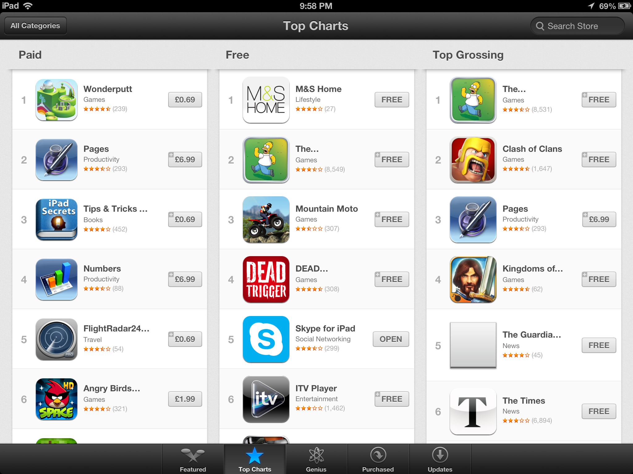
App discovery traditionally has been a challenge for mobile platforms, partly because it’s hard to come up with a good visualization for lots and lots of apps and partly because of the limited display area inherent in a mobile device. Unsurprisingly it seems as though the App Store redesign tries to tackle that problem head-on. First, the bottom bar places Genius dead center and offers a horizontally paginated nearly infinite scrolling list of recommended apps. This basic view also gets copied on the search page – there are pages of apps matching the search term with a big screenshot and install button. Featured gets changed dramatically and Top becomes Charts.
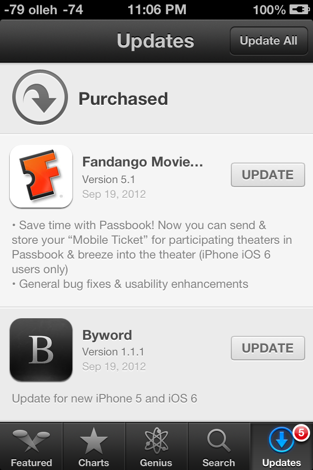

Updates with individual changelogs (Left), New search view (Right)
There are a few friction points which have also been smoothed over. A hugely welcome change is that app updates can now take place without requiring an Apple ID password. Likewise, free applications can be installed from the store without entering a password. Only purchases require a sign-on. The update screen also now has an expandable region under each app for viewing many changelogs at a glance as well. There’s update progress displayed in this menu in addition to on springboard. Newly installed applications also now get a new badge on them which goes away after a first launch.


105 Comments
View All Comments
crankerchick - Thursday, September 20, 2012 - link
The overwhelming theme I keep seeing as I read the various iOS 6 reviews is a tendency to make excuses for Apple. This article and Rene Ritchie's both say things to the nature of "It took a lot for Apple to do [x] so that is why this feature was [y]."I can't help but point out that when it comes to Android, reviewers are a lot quicker to point out something that sucks and offer no excuse for why it's excusable, yet when it comes to Apple releasing another boring update to iOS, with the exception of Maps, all is more or less excused because, "Maps took a lot of work and time."
When I'm on Android-centric site, I get excuses for why Android is still the best. On an Apple-centric site, I get excuses for why Apple is the best. On AnandTech, I expect (and usually receive) more unbiased opinions. In this case, I don't get the bipartisan vibe though. It reaks of excuses. Just my opinion.
UsernameAlreadyExists - Thursday, September 20, 2012 - link
This is not the only article I've had this problem with. I had the same feeling while reading the article about the data&voice support. The worst thing is that I've used to rely on Anandtech being rather objective and declaring things as they are. I just hope that they won't invent a completely new camera into iPhone 5 when they review it like SlashGear did (unlike Engadget and Digital Photography Review).mrandross - Thursday, September 20, 2012 - link
Does anyone know how they changed the wifi signal to display in dBs?They're not jailbroken with SBsettings on iOS6...
yticolev - Saturday, September 22, 2012 - link
I'd like to know that too, especially if it represents the cell tower data signal and not just wifi. I love having my iPhone voice bars represented in dB and would like the same for data as I do use data more often than voice.mrandross - Saturday, September 22, 2012 - link
I found a couple different ways. If you had it previously from a jailreak and restored from that backup, then it'll appear again.If you don't have that available there's a plist edit
http://idevicecentral.com/viewtopic.php?f=8&p=...
yticolev - Saturday, September 22, 2012 - link
Thanks! I saved the page for future use.I've never done a jailbreak. I used this method to hack the bars into dB:
FieldTest dial *3001#12345#* - you can then keep numerics instead of bars in the top left by force quitting FieldTest after launching it (hold down power/lock until power off appears, then hold the home button).
IndyJaws - Thursday, September 20, 2012 - link
Perhaps I overlooked it at the iOS 6 announcement, but I'll admit to being disappointed for the lack of two main features for iPhone 4 (not 4S) owners - turn by turn navigation and panorama photos. I understand the graphical horsepower needed for 3D flyby, but sad that Apple chose to leave those of us out for the other two features, especially when there are a plethora of apps that do provide those abilities. Yes, I realize I can use them instead (in fact, must), but would prefer OS integration for convenience. Brian (or Saumitra) mentioned that there might be additional horsepower needed for the panorama feature, but there's nothing special about it that makes me think it's just a way to Apple to prod users to the latest phone.Stas - Sunday, September 23, 2012 - link
Solution: give Apple more money for new device.Sind - Thursday, September 20, 2012 - link
iOS 6 maps are terrible period. I'm starting to believe the hype that AnandTech is putting an Apple spin on things instead of one that is aimed for the consumer. Terrible biased review of a bad product that lowers user experience. What happened to "it just work's"? Don't release something until it is ready. Apple has put their corporate intentions ahead of the user experience and that is wrong, and Anand's failure to mention that is damning.ciparis - Sunday, September 23, 2012 - link
Have you personally had trouble with Maps?