The iOS 6 Review: Maps Thoroughly Investigated and More
by Brian Klug & Saumitra Bhagwat on September 19, 2012 2:21 PM ESTApp Store UI Changes
Apple hasn’t made a huge deal about it, but in iOS 6 the App Store UI changes in a dramatic way. The new interface appears to offer greater flexibility for Apple to customize the layout on the fly and change the order of menu items or other features. In addition there are a host of subtle but welcome changes.
The individual app listing page is different, adopting a three-tab system for details about the app, reviews, and a related column with apps by the same developer. There’s a lot more whitespace in the new layout as a whole, and although the changes make the app description pages more inviting I can’t help but shake a suspicion that information density took a hit as a result.
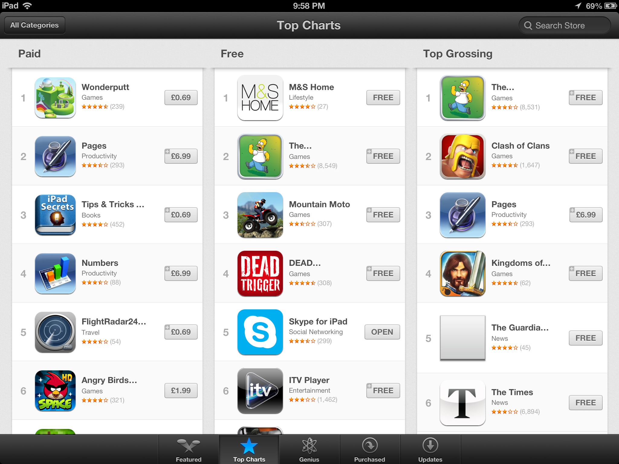
App discovery traditionally has been a challenge for mobile platforms, partly because it’s hard to come up with a good visualization for lots and lots of apps and partly because of the limited display area inherent in a mobile device. Unsurprisingly it seems as though the App Store redesign tries to tackle that problem head-on. First, the bottom bar places Genius dead center and offers a horizontally paginated nearly infinite scrolling list of recommended apps. This basic view also gets copied on the search page – there are pages of apps matching the search term with a big screenshot and install button. Featured gets changed dramatically and Top becomes Charts.


Updates with individual changelogs (Left), New search view (Right)
There are a few friction points which have also been smoothed over. A hugely welcome change is that app updates can now take place without requiring an Apple ID password. Likewise, free applications can be installed from the store without entering a password. Only purchases require a sign-on. The update screen also now has an expandable region under each app for viewing many changelogs at a glance as well. There’s update progress displayed in this menu in addition to on springboard. Newly installed applications also now get a new badge on them which goes away after a first launch.


105 Comments
View All Comments
darwiniandude - Thursday, September 20, 2012 - link
Melbourne Australia also has excellent 3D mappingender8282 - Thursday, September 20, 2012 - link
Try Monkey Burger they have much better burgers.mezz - Thursday, September 20, 2012 - link
Stockholm and Copenhagen both get the 3D-treatment.secretmanofagent - Thursday, September 20, 2012 - link
You might want to grey out the additional four digits of the zip code (i.e. 85711-****) on the maps page. This can still be used to derive an address.secretmanofagent - Thursday, September 20, 2012 - link
Same page, turn-by-turn: "Voice guidance volume, label size, and units are really the only options here — there seen any options for preferring highways or surface streets, avoiding tolls (though you are warned when given routes to select from) or other common standalone GPS options."I'm assuming it's "there doesn't seem to be any options" or the like?
AbhorApple - Thursday, September 20, 2012 - link
Alright, this morning upgraded the iPad 3 to i OS 6. Tested out the much touted Apple Maps. Pig in a poke, that's what it is. I could have as well bought a Bartholomew's maps and carried with me. This wretched thing won't show half the places even within 100 miles of Bangalore. Hmm... should have learnt the lessons... Apple cares two hoots for customers and foolish Apple buyers in this geographysilverblue - Thursday, September 20, 2012 - link
It's not just India. Check this article out:http://www.bbc.co.uk/news/technology-19659736
steven75 - Tuesday, September 25, 2012 - link
Direct your iOS web browser to maps.google.com until the Google Maps app makes it to iOS.Should be quite a decent workaround for those who live in areas that Apple Maps doesn't have good data on.
rash1d - Thursday, September 20, 2012 - link
"What iOS 6, Android 4.1 or Windows 8/RT/Phone 8 fail to do however is establish a single dominant winner in the market. This war is far from over, which is a great thing for pushing innovation."ayembee - Thursday, September 20, 2012 - link
Transit routing gone, no good replacements yet, location-search pretty bad (I tried a number of tests searches and found literally NOTHING I looked for). Now, taken as a whole, iOS6 is a nice upgrade, and there are plenty of features I find myslef really liking -- however, Maps needed to bake for longer...Think about it. You use a map to
1) find something (data now terrible, fails)
2) to find a route to the thing you just found (can't route via the metro, so total fail here too)
In other words, the single two most important use-cases for using maps ina major metropolitan area (the areas where you'll find the highest density of iOS users) are now awful. Turn-by-turn directions are a nice addition IF you actually spend most opf your day driving somewhere. Which most city-dwellers in non-US countries don't, as public transport is usually pretty good...
Marks awarded for effort and ambition, and even looks.
BUT... needs a ton of follow-through.