The iOS 6 Review: Maps Thoroughly Investigated and More
by Brian Klug & Saumitra Bhagwat on September 19, 2012 2:21 PM ESTOther UI Changes
In each iOS release it always seems like Apple makes some subtle UI changes, similar to what it has done in OS X for years now. In iOS 5, Apple changed the toggles from a rectangular switch to circular, now in iOS 6 the status bar can change color depending on the app you’re inside. This color changes to either the average color of the bottom row of pixels in an application’s top bar, or to a specified value. It’s initially a jarring change since previously the status bar was this immutable iOS feature nobody could touch. It seems those barriers have come down in iOS 6, as now apps can change its color, and others like the official Twitter for iPhone app can even populate it with custom status text when sending a tweet.
The top status bar can now change colors
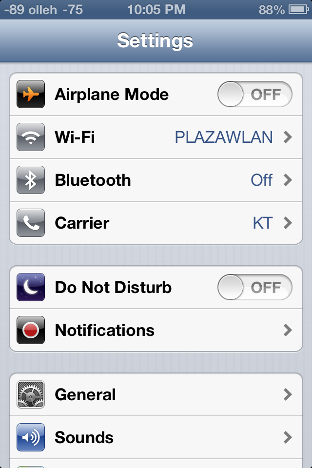
Settings.app gets a big makeover, with a few new items on the front page view and new organization as well. Bluetooth gets brought out of general and placed below the WiFi toggle how it always should have been. Facebook and twitter integration single sign on are grouped together, as are the new do not disturb and notifications center settings. This is just a lot of housekeeping for a settings app that was starting to get crufty as new features compounded over time.
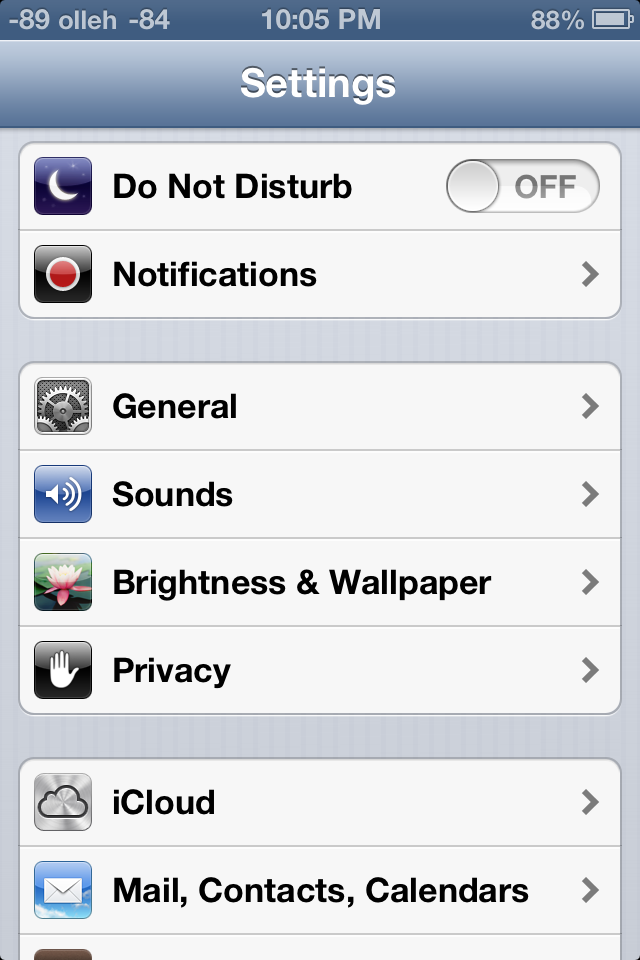
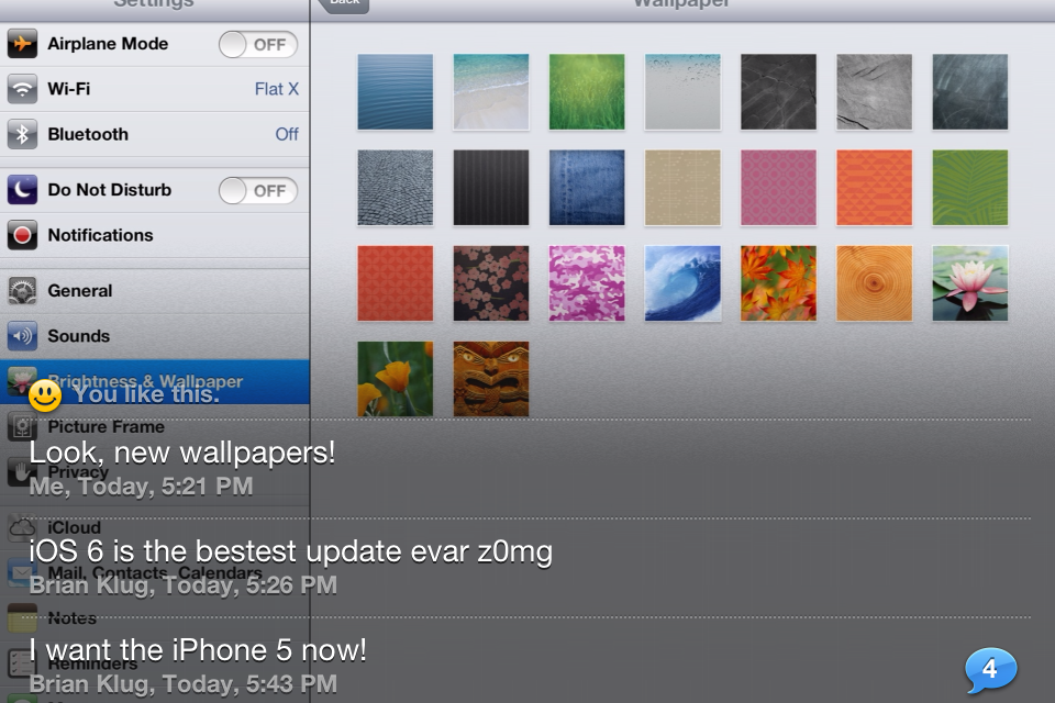
Brightness and wallpaper hasn’t changed (with the addition of a few new wallpapers), but iOS 6 fundamentally changes the functionality and curves for auto brightness. Brightness now seems to be more of a log scale, and the slider seems to set a lower bound rather than a window for the auto brightness function. Where previously I would set brightness to around 50%, I now set it on iOS 6 to around 10% to get similar behavior. There’s a much longer hysteresis for change as well, and though this was initially disconcerting for me, I’ve found less blinding happening with iOS 6 than past releases.
That being said, the auto brightness on the 3rd generation iPad doesn’t seem to function very well. While the brightness is keenly revised upwards under extremely bright environments, it doesn’t seem to show the same enthusiasm to adjust downwards in darker environments. People elsewhere seem to be facing a similar issue on their 3rd generation iPads as well, so I fully expect a fix to be in the works.
Data Isolation
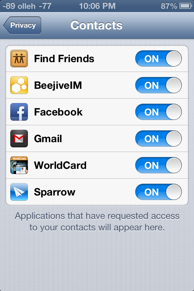
There’s a new privacy tab which now aggregates all the new iOS 6 data isolation stores. This is Apple’s response to both Android’s permissions system and recent discovery by users that apps frequently send off your entire address book. The system basically extends how iOS treated location services data permissions to contacts, calendars, reminders, photos, and the single sign on Facebook and Twitter tokens. Inside this settings page you can individually see what apps have been granted access, and revoke it.
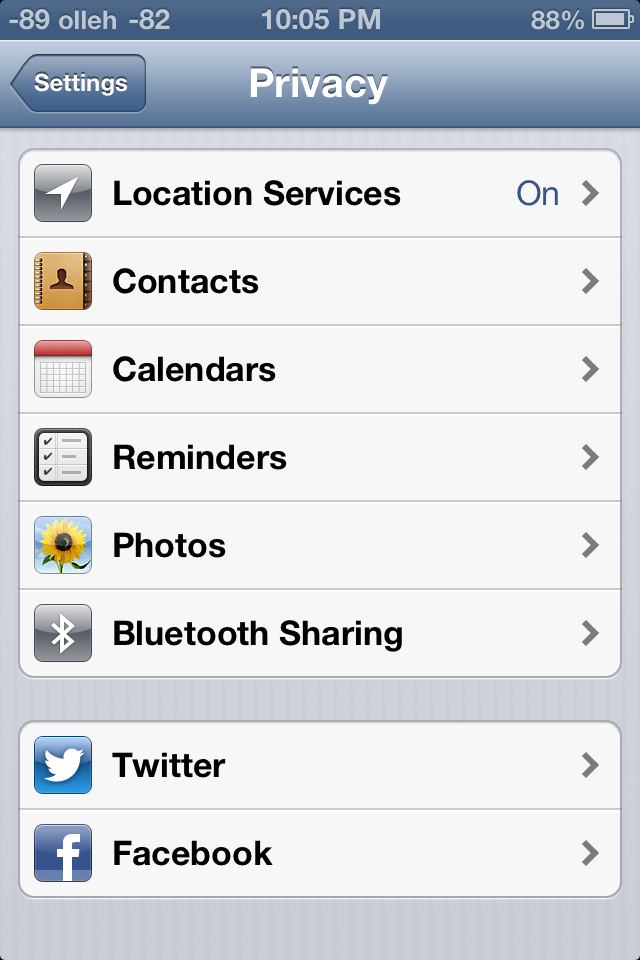
Under location services is the same menu which was introduced in iOS 5. As we touched on earlier there’s a few new items under system services including the “traffic” process which contributes to Apple’s new traffic crowd source database. As usual you can disable these for privacy reasons or to save some power, though traffic seems to only fire up when the phone is plugged into a power source.
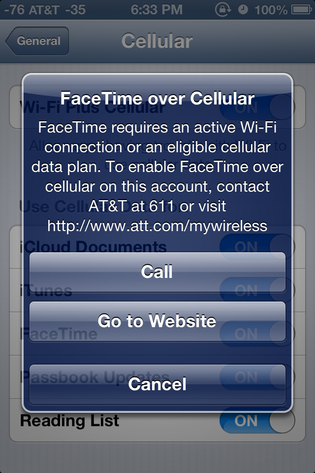
FaceTime over Cellular
Under FaceTime at the very bottom is a new toggle for cellular data. Toggle this and you’ll be able to make and receive FaceTime calls over the cellular air interface, if your carrier supports it. At present this menu appears to implement the same provisioning checks as the tethering pane. I wish I could say I tested FaceTime over cellular, but thanks to AT&T and my unwillingness to change to one of their supported plans I haven't done so.
Panorama for Camera.app
The camera interface in iOS 6 is largely the same as it was with previous versions, in fact this only really makes a significant departure for the iPhone 5 where it now has a larger black bar due to the fact that the camera imaging area is 4:3 and the display is now 16:9.

What's new is the inclusion of Panorama for the iPhone 4S (in addition to the iPhone 5), which oddly enough has been lurking inside iOS configuration plists for some time now. The iPhone 4 and 3GS get left out, however this feature does leverage the ISP and SoC strongly so some of that makes sense.
Instead of taking a few discrete captures at different positions in the panorama, the iOS 6 panorama feature integrates over a strip continuously which definitely helps minimize distortion and edge matching artifacts which normally plague panorama applications. The number of panoramas we've had a chance to make have turned out pretty well thus far. Panoramas can also be shot vertically in addition to horizontally.
Shared Photo Streams
Finally, as a logical extension of Photo Stream introduced with iOS 5, Shared Photo Streams lets you share your your photo albums with friends and family. Shared Photo Stream lets you share only with other iCloud users, so it’s a much more controlled environment for sharing your personal albums. There is however an option to publish the album on iCloud.com that lets anyone with a link to view the album. Photo Stream and Shared Photo Stream are mutually exclusive options; so you can choose to disable one and enable the other, depending on your requirement. Personally, I’ve never kept Photo Stream enabled, primarily due to data and other privacy concerns. But Shared Photo Streams is a nice way to selectively share content without having it publicly scrutinized on Facebook.
Sharing is easy; just create a new album (or choose an existing album) to share from the Photo Stream tab in the Photos app, enter the iCloud addresses that you’d like to share with and you’re done. Invited people receive an email asking them to join. Thereafter, they should be able to see the album on their iOS devices. Shared Photo Stream albums currently do not show up under iPhoto. The shared album naturally also appears on any other devices associated with the Apple ID used to share. Then the spree of endless liking and juvenile comments can commence.
Once an album is created, it’s easy to share it with new people or change other album settings. On the iPad, the interface is somewhat confusing; you have to tap Edit, and then tap any image in the album to being up the settings. On an iPhone/iPod touch, just click on the bright blue arrow next to the album name to bring up the settings. Under notifications for the Photos app, you can toggle Photo Stream alerts to show for everyone, or only from people in your contacts. This should be quite handy if you’ve subscribed to other people’s shared photo streams and don’t want to be bothered with incessant alerts.
Publicly shared albums are hosted on iCloud. The web interface is quite nice and builds heavily on the MobileMe Gallery UI. Unlike MobileMe Gallery though, there’s currently no option to bar people from downloading photos from public albums. Commenting and liking is disabled on the web interface, and for good reason.
Of course as we touched on earlier there’s a new Facebook single sign on function which integrates the service into iOS much the same way Twitter has been. Login here and notification center will include an option to update Facebook status, in addition to syncing with contacts and exposing Facebook as a share endpoint in some dialogs.
iPad Clock.app
A surprising addition to iOS 6 is a slick new Clock app for the iPad. As the icon suggests, the app has a sliver and frosted white interface featuring a world clock, alarm, stopwatch and a timer. The world clock lets you add 6 clocks at the very top, while the map below displays those locations with their weather. The alarm page is also split up, with the top half showing the current alarm time, while the bottom half displays a week's calendar that shows all your alarms. Active alarms are highlighted blue and the inactive ones are gray. You can also tap and hold any of the set alarms and drag them on the calendar to set them manually. Very impressive indeed.
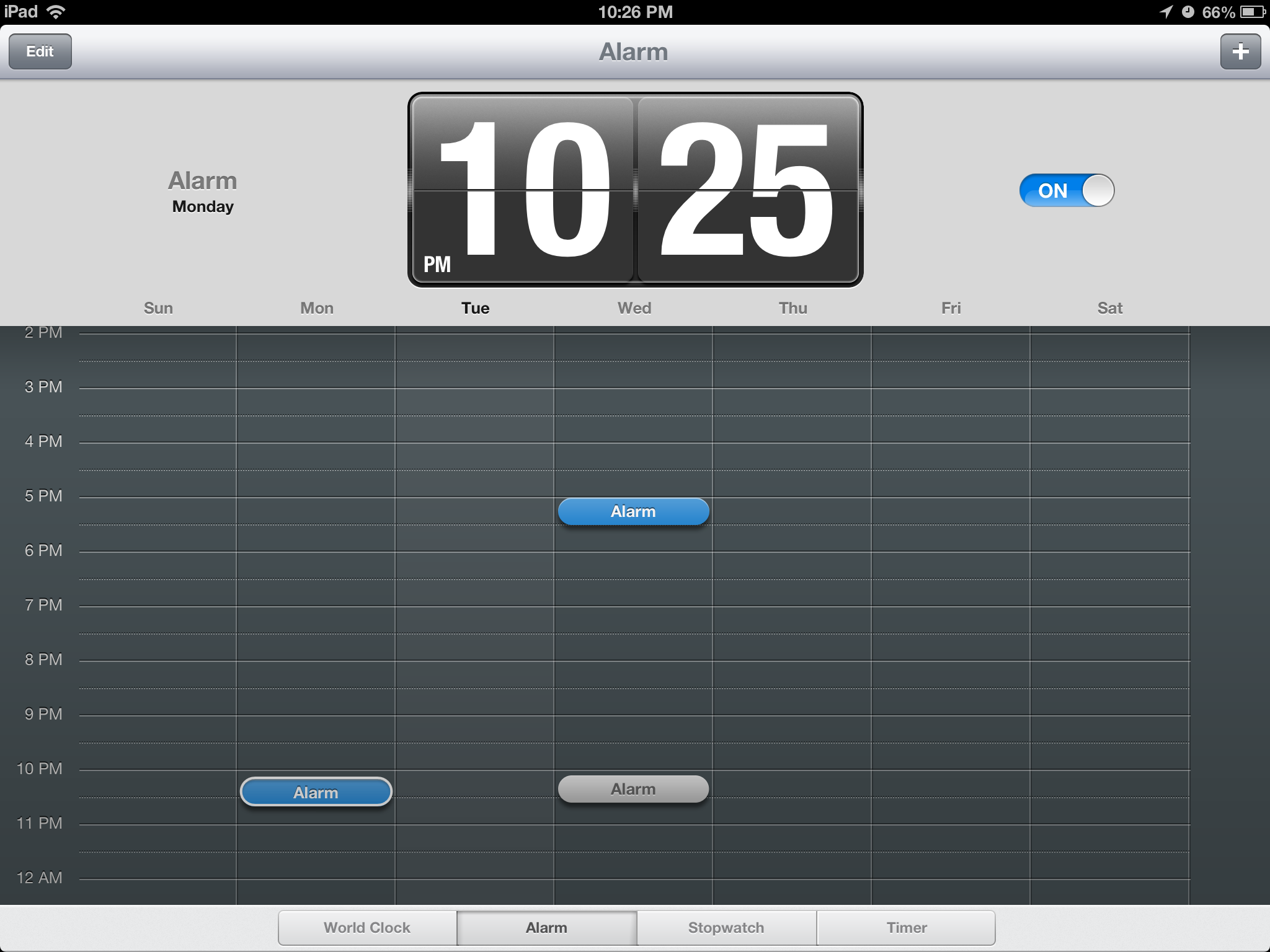
Similarly, the stopwatch shows the timer in the top pane and a list below populates all your lap times. The timer interface feels the oddest, because quite frankly doesn't require a 9.7" screen. Apple's literally gone ahead and pasted the iPhone timer UI and added the Start and Pause buttons around that. Kinda looks like Mickey Mouse with tiny ears. The new Clock app is a fantastic addition to the iPad, and users will enjoy its intuituve UI immensely.
YouTube
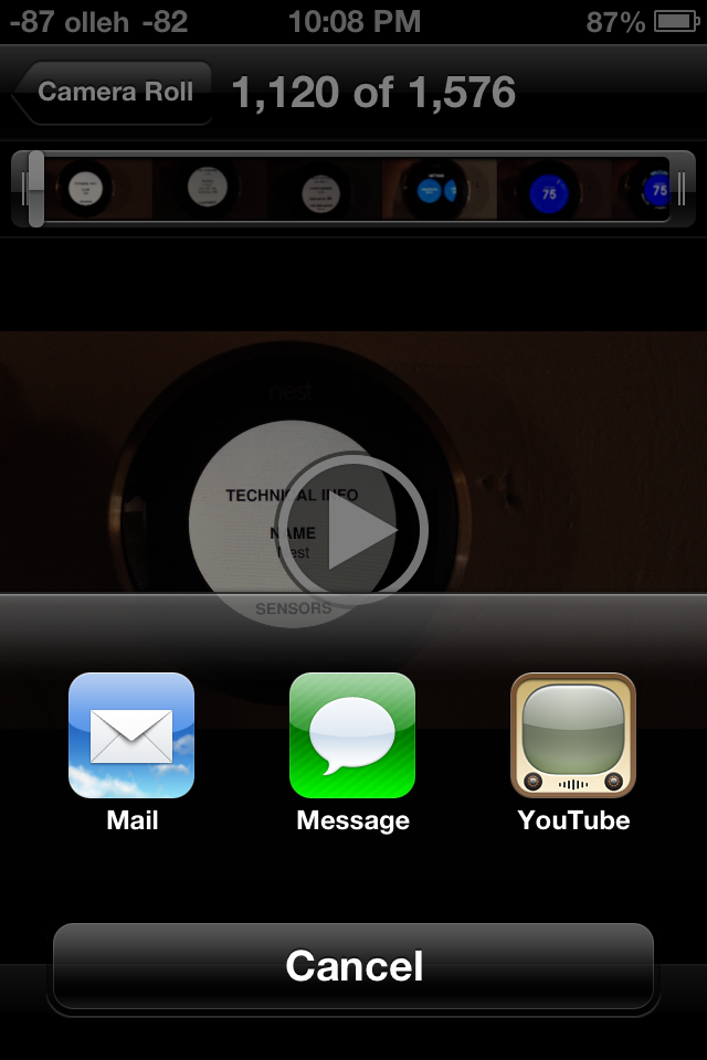
While the big news in iOS 6 is the substitution of Apple-supplied maps instead of Google maps, YouTube is the other Google product to get the boot this release. Though the standalone application is gone in iOS 6, YouTube itself remains an upload target from Photos.app and other places in iOS, but the familiar and oh-so-skeumorphic TV logo is now just a distant memory.
First, a little bit of history. Originally the only way to get to YouTube videos on iOS was through the YouTube app. The reason was actually pretty simple – the app served as a curated gateway to a small but growing subset of the YouTube catalog which was encoded using H.264 (as opposed to FLV). Recall that back in more innocent days, Google and Apple were such great lovers that Google was not only willing to dedicate tons of Xeons to transcoding from FLV to H.264, but hard drives as well to storing a bunch of different versions of the same video. Since then H.264 has pretty much won as the lowest common denominator encode target, though Google also steadfastly makes FLVs and added its own WebM/VP8 video as well. But back then, YouTube.app was the way iPhone users got to H.264 video content that the iPhone’s video decode block could play back. Remember that on mobile, hardware blocks dedicated to some particular use case are the way to achieving power efficiency. Oh, there also was obviously no HTML5 video element.
Since the iPad, Apple has employed a more direct approach, playing back the H.264 stream either in the browser or breaking you out of it directly in to a player. The YouTube app started getting more and more crufty, tied to iOS releases for any minor changes. Google began making its mobile interface better and better, and for years now you could largely view YouTube content on the iPhone or iPad without once launching YouTube.app.
What functionality did remain there were things like quickly browsing subscriptions and other tasks. In its stead, Google has built a replacement native YouTube app whose appearance and functionality almost completely mirrors the Android equivalent. Google has begun directing YouTube videos opened from MobileSafari and other apps to open and play back using their YouTube app as well. Unfortunately what gets lost is that at present there's no iPad application, and also AirPlay from the YouTube player appears to be completely broken. There’s really not much to say beyond that – there's a loss of features at the outset, but if you factor in the fact that Google can now maintain YouTube, freely decoupled from iOS, there's the potential for huge improvements. Of course, their motivations aren’t entirely benign, they want to serve mobile ads, but hey, nothing is perfect.


105 Comments
View All Comments
Hyper72 - Wednesday, September 19, 2012 - link
Mobile Safari reports as:Mozilla/5.0 (iPad; CPU OS 6_0 like Mac OS X) AppleWebKit/536.26 (KHTML, like Gecko) Version/6.0 Mobile/10A403 Safari/8536.25
iCab Mobile reports:
Mozilla/5.0 (iPad; U; CPU OS 5_0 like Mac OS X) AppleWebKit/534.46 (KHTML, like Gecko) Version/5.1 Mobile/9A334 Safari/7534.48.3
anandtech02148 - Wednesday, September 19, 2012 - link
gotta disagree with the author on the tablet web browsing.The convenience of web browsing on a tablet is one factor, instant access, easy finger gestures, it should be enhanced in the future so that we do away with the uneccessarry luggage like a keyboard and mouse. Even cutting and pasting have improved, i'm not sure what the author is talking about copying multiple links, mass email etc, the point of Ipad internet browsing is purely entertainment and should be improved upon. IOS does an amazing job on memory management, especially these websites that invades your browser with crazy advertising pop ups. Sinces Android foundation is from Java it might as well be the devil's advocate in crashing and freezing your device.
mikato - Thursday, September 27, 2012 - link
What if you are away from your tablet and are browsing the web, but then you have to stop or you want to save something for later. Then later you want to browse on your tablet instead, and you'd like to pick up where you left off or go back to what you'd saved. It seems like that's the point of the new Reading List syncing feature. How else would you do it besides emailing the links?Some typing is still required when using the web, right? Typing on a touchscreen has improved a lot but is still like a bit like using a keyboard with gloves on. I don't know what my WPM is on a tablet but it must be must be at least cut by 70% or something. I have still occasionally switched to using my desktop when I need to figure something out on the web since it is just much faster. Also, depending on what I'm doing, I may need to look at several web pages, my own notes, or something else why writing an email or a writing something. This is more than just web browsing and although a tablet screen is bigger than a phone and closer to a desktop/laptop, the functionality just isn't there for doing something like that with a tablet. If you're really just "browsing" then a tablet is comfortable for that.
JeremysBrain - Wednesday, September 19, 2012 - link
Only been using nav for 1 day, but the one annoyance that could likely drive me (no pun intended) back to Waze or Navigon is that when the voice guidance comes on, it talks on top of music and podcasts. Other navigation applications will stop playback from other applications, then resume when voice guidance is done.it's frustrating when I'm listening to Brian and Anand, then having to rewind every time new voice guidance comes on in then middle of one of Brian's tangents!
I would like this feature when I'm listening to music, but not when I'm listening to talking heads.
faizoff - Wednesday, September 19, 2012 - link
Just upgraded my iphone 4 to iOS6. The maps app is nowhere close to what google offers so far. I knew there would be issues during the initial release due sheer volume I suppose.Even without turn by turn directions or 3D flyover, the larger direction signs that show up are pretty good for navigation.
The standard maps are very ill configured and barely show any info. I'd have thought that with Tom Tom being a GPS company would have a rather comprehensive database already. My scaling is wrong and many areas are missing. No streetview means by default means I have to wait for google to release their app.
I think I was very impressed with the updates going from iOS4 to iOS5. Going from 5 to 6 however hasn't impressed overall that much yet.
The autobrightness is weird and isn't the same as before for some reason. I had issues with home sharing when it worked flawlessly before, infact was a huge improvement between updates up till now.
I do love the options now present when getting a call.
PPalmgren - Wednesday, September 19, 2012 - link
I'm dissapointed that this article completely glosses over the fact that the maps themselves look like absolute garbage. The way the roads are rendered and the colors used is god-awful compared to google maps, UI being Apple's main selling point. Its hard to tell road types apart close up and hard to read the map in general because of the way its rendered, with thin roads and all. I find it to be a piss-poor implementation and am dissapointed at the soft-white tinted glasses that appeared to be the filter this article went through.MykeM - Thursday, September 20, 2012 - link
I'm comparing what I'm seeing on iOS Map and Google Map- limiting to my milieu since I'm familiar with it- but what I'm seeing is quite comparable.There are a few things on the iOS6 map that seems incomplete. For example, rail track- yes it's much, much narrower than the street but missing the required lines that cut across the track.
But the street itself- the iOS6 version seems better at replicating and differentiating the various width of the main thoroughfares and side-streets. When toggling between the layers of Standard and the Satellite maps, I can clearly see that Google map does a poorer job- it seems to replicate the traffic flow rather than the road itself (resulting in curvier turns when it's actually right-angled). Expectedly, it does a better job at marking various businesses around the neighbourhood. One area where the iOS version will improve over time.
Colour choice and preference are completely subjective but again except for a few choices of colours, both maps seems to me more similar than they're different (Skeuomorphism aside).
robinthakur - Thursday, September 20, 2012 - link
I disagree completely I'm afraid. I was quite worried updating to iOS 6 that the maps would be awful as many early previews of the dev version said, but on my device it runs really fast, we have brilliant 3D flyovers and the maps are accurate and scale nicely. I especially like the rotation and elevation two finger controls like on Android Google maps. Since using G Maps on Android I always though the iOS implementation was a poor cousin, so I think it is good that Apple have finally come up with something comparable and slick which will hopefully grow swiftly. Navigation is much less confusing and busy than the Android version from what I have seen so far. The Siri integration is the icing on the cake.I do miss street view, buit rarely used the public transport navigation bit as Transport for London has a superior service available. At least now when Google release a mapping app it can be as Google want it to be and it will be up to the user whether they want Google tracking their every move and making money off of their browsing/map use.
bunga28 - Wednesday, September 19, 2012 - link
I really enjoy reading the article. It is very informative. Thank you.1. There are 2 authors listed for this piece. I just wanted to know who is the "I," "me," "mine," ... in this. That is very confusing.
2. "at present [Google] literally is the 9000 pound gorilla for maps." Literally? Literally? That is like a friend of mine said to me "I literally haven't seen you for a million years."
ciparis - Sunday, September 23, 2012 - link
Well, considering:1) they do weigh 9000 pounds (or more)
2) at least a few of them strongly resemble a gorilla, so who can say that they aren't?
I don't see the problem. Plus, your friend might just be a time traveller.