Samsung Galaxy Nexus & Ice Cream Sandwich Review
by Brian Klug & Anand Lal Shimpi on January 18, 2012 1:34 PM ESTDisplay
Another huge axis of improvement lately has been the mobile display category. It’s an ironic turn of events which has led to the mobile side being where all the improvement is taking place for displays in general. On one side of the industry we have the PC display market, which is currently locked in a dramatic race to the bottom (1080p 27" displays, decline of the 16:10 aspect ratio, etc.), and on the other side we have mobile displays where OEMs are rushing to outdo each other every major product cycle. In fact, 2012 might go down as the year when mobile display resolution eclipses the desktop.
Back on topic however is the Galaxy Nexus display - it’s a 4.65" diagonal, Super AMOLED HD 1280x720 affair. If you’ve followed Samsung’s AMOLED naming scheme, you can pretty much tell everything that there is to superficially know about the display just from the name. Super connotes an optical bonding (read: no air gaps or their pesky 4% Fresnel reflections) of the display and the entire stack above it, consisting of capacitive layer and top glass.
HD connotes, well, 720p HD, and finally the absence of Plus connotes the presence of PenTile RGBG. On that last note, we made a prediction that PenTile would be very hard to see on the Galaxy Nexus based on some pixel pitch calculations, and this turns out to be the case.

Decently close to the Galaxy Nexus display with a macro lens - hard to make out any subpixels
For me at least, the Galaxy Nexus display exceeds my visual acuity - I cannot pick out subpixels at all on the Galaxy Nexus. Quite literally, the RGBG subpixel stripe is now small enough that it is beyond visual acuity at standard viewing distance (1 foot).
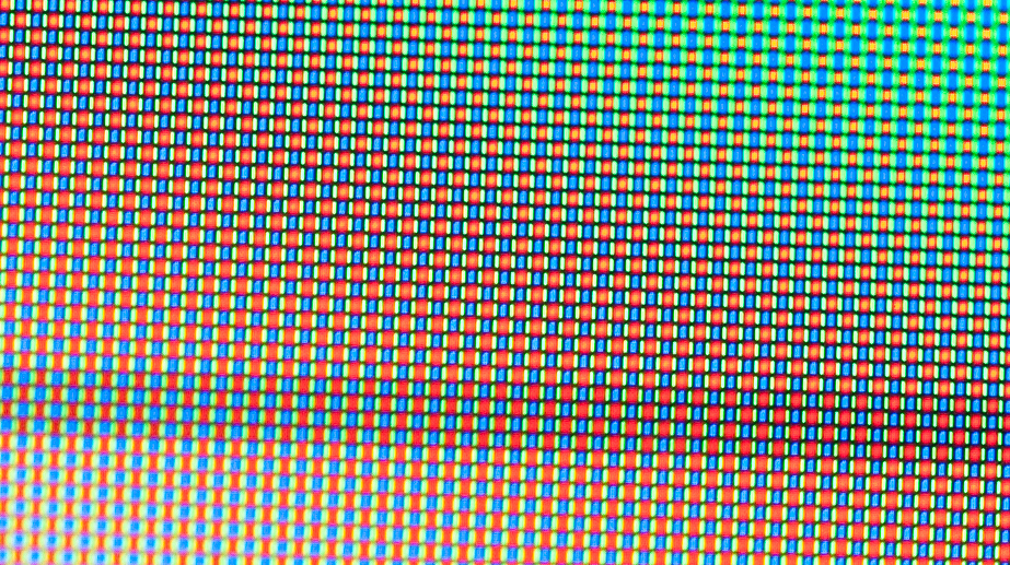
Extreme macro shot of the Galaxy Nexus' display for illustrative purposes showing PenTile RGBG
If 2011 was the year where OEMs countered the iPhone’s retina display with qHD panels, 2012 is the year where they finally start to exceed that 330 ppi number. It seems as though 1280x720 WXGA will be the new WVGA or qHD for 2012, and already there are a bunch of 720p devices arriving on the market - phones like the HTC Rezound, LG Nitro HD, Galaxy Note.
Last time we compared pixels and subpixels per inch in the diagonal on a few phones. Many people pointed out alternative ways to compute everything, but in the end the aim was to set expectations for how visible PenTile would be, and the conclusion was: not very. This time, I think it makes sense to compare the actual angular subtense of the subpixels so we can appreciate whether they’re visible or not, rather than deal with another back and forth about whether measuring along the diagonal is valid or not anymore. It's easy to be lazy and just do things entirely wrong, but the actual angular subtense of a subpixel should be the canonical measure we use to determine whether you can see pixels or not, since that's the annoyance after all. Visual acuity for the average human eye is 1 arcminute (something drilled into my head from endless optical engineering classes), and perfect human vision is just below that at around 0.7 arcminutes. I have 20/15 which puts me around 0.75 arcminutes, and I can't see subpixels on the Galaxy Nexus unless I really, really try.
It’s actually a challenging thing to codify whether or not you’ll be able to see PenTile, since color (wavelength) makes a huge difference. Further, visual acuity is itself a hard thing to qualify - for example, consider how much resolution is enough to identify versus detect something, and then how human vernier acuity (aligning something) is very good, and all of this is a function of the light's wavelength. For example, the on-off pattern when looking at solid green is just about the worst case possible - it’s a square wave (100% modulation) in the green right where the eye is most sensitive. In the past, it struck me that other members of the tech press were perhaps unconsciously taking photos of the green battery indicator to show the presence of PenTile or not since that's where subpixels are most visible. As an aside, most of the UI is now blue in 4.x (including battery indicator) which the eye does not have very good sensitivity to - just try focusing on something entirely blue - is this a coincidence or conscious decision to mask bad displays? For comparison, when displaying white obviously subpixels largely disappear into a sea of light. If you look at a green solid region now, you’d be hard pressed to make out the individual subpixels, and the table explains why:
| Display Subpixel Angular Subtense lower is better, human eye ~1 arcmin) | |||||||
| Phone | X subpixel angular subtense at 12" | Y pixel angular subtense at 12" | |||||
| HTC Rezound | 0.280 | 0.839 | |||||
| iPhone 4/4S | 0.290 | 0.869 | |||||
| LG Nitro HD | 0.293 | 0.878 | |||||
| Motorola Droid | 0.361 | 1.082 | |||||
| Motorola Atrix 2 | 0.373 | 1.118 | |||||
| Galaxy S II | 0.440 | 1.320 | |||||
| Galaxy Nexus | 0.454 | 0.907 | |||||
| Infuse 4G | 0.461 | 1.382 | |||||
| Droid 3 | 0.520 | 1.040 | |||||
| Droid RAZR | 0.559 | 1.118 | |||||
| Droid Incredible | 0.568 | 1.136 | |||||
| Nexus One | 0.568 | 1.136 | |||||
| Galaxy S / Nexus S | 0.614 | 1.228 | |||||
The interesting thing about the table is that it very much backs up my subjective impressions of just how visible subpixels were on previous phones. The Nexus S / Galaxy S had comparatively gigantic subpixels, and I can't stand looking at those displays to this day. Move up the line and you get increasingly better (I've sorted by x/horizontal angular subtense), with the HTC Rezound exceeding the iPhone 4S. Note that you have to consider the adjacent unlit subpixels as well to really arive at a conclusion for how visible things are going to be - on the PenTile RGBG displays, that means one adjacent unlit subpixel, and on RGB stripe, two unlit subpixels (assuming we're talking worst case 100% Green, 0% Blue, 0% Red).
While Samsung has been able thus far to increase its AMOLED pixel pitch considerably, it has come with one unintended effect. That effect is a bit of pixel inhomogeneity which results in a somewhat grainy look to the display under certain circumstances. While neither device we tested had it, others have reported lines or splotches. There’s a word for these inhomogeneities in display luminance, and it’s “mura.” The variance is no doubt very minor, but the eye is great at picking out these small changes, and it’s particular visible in certain contexts, like the grey loading screen on the Android Market. So far getting a good photo of this effect has eluded me, however, it looks like a light film grain. Stated another way, it's like a fixed pattern noise that exists at all times on the display, which seems particularly visible at some brightness levels. To be honest, it doesn’t annoy me any more than IPS display “grain” annoys me - you just get used to it after a while.

Photographing the mura on the Galaxy Nexus' display has proven a challenge
These inhomogeneities also sometimes manifest themselves as visible strips of different luminance. I haven't seen any on either of the Galaxy Nexi we have, but if you do get hardware with annoying inhomogeneities, I recommend just swapping. Again, getting photographs of the grain has proven challenging.
The display’s surface is curved, though the radius of curvature is nowhere near as curved as some of the early teaser photos would’ve had you believe. Total sag ends up being around 1.5 mm, giving a radius of curvature around 1.5 m - needless to say, it’s a very gentle curve. The other noteworthy thing about the Galaxy Nexus is Samsung’s choice of glass. Lots of people have noted that the Galaxy Nexus isn’t adorned with Corning’s popular Gorilla Glass, though it’s still a kind of fortified (and no doubt alkali-aluminosilicate) glass. It’s impossible to tell exactly what kind of glass is on the Galaxy Nexus without destructive testing on either Samsung’s or Google’s review unit. That said, if anyone breaks a display, send me the broken top glass and I’ll be able to do some compositional analysis. As an aside, compositional analysis of the top glass from different phones is something I’ve wanted to do for a while now, but requires sourcing broken glass.
We’ve also done all the usual measurements on the Galaxy Nexus - luminance and color temperature at different brightnesses selected in settings, and a run through HCFR using Francois’ excellent Screen Test Patterns app.
First off are the display charts taken at a number of different brightness settings by dragging the slider around in settings. Traditionally AMOLED has struggled to keep a flat white point. Here the Galaxy Nexus isn't bad at all, hovering just below 6500K.
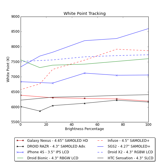
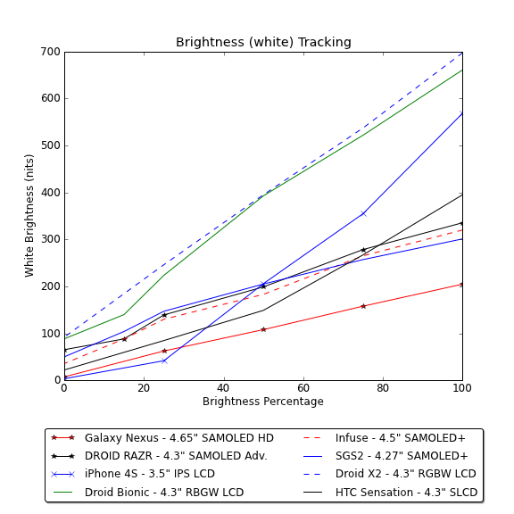
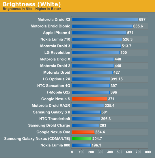
The Galaxy Nexus manages to stay reasonably close to 6500K even as brightness changes across its full range. The brightness curve is also nice and linear, though it tops out at just over 200 nits at maximum brightness.


The HCFR plot and color.chc file tell an even more interesting story. The CIE chart shows how AMOLED continues to have a gamut much larger than sRGB (which is the inner triangle). It’s awesome to have more spectrum, but bad when mapping sRGB to this color space without more management, and leads to AMOLED’s oversaturation stigma.
There are more interesting things inside, too. Color temperature at 100% brightness and displaying different shades of Gray stays pretty close to 6500K as well. Gamma ends up almost all over the place, unfortunately.


The nice thing about ICS on the Galaxy Nexus is also increased color depth in many places. Previously Android’s gallery many times appeared in RGB 565, leading to visible banding. This is now almost entirely gone as well.
Viewing angles on the Galaxy Nexus, like other AMOLED devices, is superb as well. There’s practically no shift in either horizontal or vertical angles. Outdoor viewing has gotten better on AMOLED with a bunch of improvements - better AR coatings, no more air gaps, and other coatings. Out in the brightest of sunlight it can still be hard to read, however.


185 Comments
View All Comments
zorxd - Wednesday, January 18, 2012 - link
The Skyrocket is also 1.5 GHz so the CPU helps.sprockkets - Wednesday, January 18, 2012 - link
There's a very small bit of lag on the bottom buttons. Quite frankly I think the delay is just the OS making sure you are holding down the home button for the task manager instead of just going home.Using ICS on a HTC Sensation. The status of it is beta - HTC still has work to do on it to make it as good as the 2.3.4 ROM.
webmastir - Wednesday, January 18, 2012 - link
Love my Galaxy Nexus. Best phone I've ever had & have no DOUBT in my mind that I'll be happy until my next Phone.Thanks Google!
OCedHrt - Wednesday, January 18, 2012 - link
Since I can't get the HTC keyboard working on AOSP ICS...I have to make this comment: I prefer the HTC keyboard much much more than even the ICS keyboard. It is ridiculously easy to mistype on the ICS keyboard.vithee05 - Wednesday, January 18, 2012 - link
Can you guys tell me how the accessibility is in ICS? It's supposed to be better for those of us who are visually impaired. I am debating between the galaxy nexus, the razr, or waiting on the droid 4 to get the keyboard. Do you think the accessibility is good enough to not need the keyboard?secretmanofagent - Friday, January 20, 2012 - link
I have a Droid RAZR (2.3.5) in my hands, and looking at the accessibility settings, it's pretty paltry. If you're considering a RAZR or Droid 4, I would wait until ICS shows for it.tipoo - Wednesday, January 18, 2012 - link
I agree that its worlds better than the Gingerbread browser, but scrolling on image heavy pages still lags a bit compared to Opera Mobile (not to be confused with Mini). AFAIK Opera Mobile uses GPU acceleration as well and seems to do it better than Google at their own game. Just an idea, but a comparison of all the Android browsers would be nice :)tipoo - Wednesday, January 18, 2012 - link
*on my Nexus S. Maybe on newer/faster phones it would be a toss up.bjacobson - Wednesday, January 18, 2012 - link
Really? interesting. Opera seems to get everything right. Their browser is blazing fast for Netbooks too. Everything in the UI and foreground tab gets processing priority, everything else (like background tabs rendering) gets delayed. It's a flawless design, much more responsive than Chrome when loading multiple tabs.tipoo - Thursday, January 19, 2012 - link
Yeah, and as far as I know its the only browser that dynamically adjusts its memory use depending on how much your using for other tasks, so it scales up or down to more powerful or less powerful systems, another reason its good on netbooks. It has addons now too which are rapidly gaining traction. If it wasn't for some compatibility niggles I would say its hands down the best browser, but I keep Chrome around for the 1 in 1000 site it might break. Oddly enough the Mobile version seems to be the opposite, its the only mobile browser that I've never seen break a site.