Samsung Galaxy Nexus & Ice Cream Sandwich Review
by Brian Klug & Anand Lal Shimpi on January 18, 2012 1:34 PM ESTThe UI: Holo Evolved
When I first met Holo, Google's Honeycomb theme, I wasn't convinced that it was something that would last. It was different, which earned Google points for sure, but it wasn't exactly comfortable. I was surprised to see an evolution of Holo used in ICS, but the theme has grown on me.
Ice Cream Sandwich feels a lot like Android meets Windows Phone. Part of that surely has to do with the very contrasty nature of the theme, but it's also the choice of font (Android 4.0 replaces Droid Sans with Roboto) and hard edges sprinkled throughout the UI. Holo is still distinctly Android in that there are still multiple home screens with support for widgets, but it's also different. Ice Cream Sandwich is Android maturing, it's the second implementation of Holo allowing us to finally plot a trajectory for where Google sees this thing going in the near term. It's different as I mentioned before. Holo and ICS aren't iOS nor does it look like they ever will be. The UI is either going to pull you in or turn you off. I like it. It's different, it's clearly a play on the whole Android theme; it's the type of UI you'd expect from an OS named after a robot.
Droid Sans v. Roboto (ICS)
At the same time it's no longer awkward. Elements of the design and many of the first party apps are just clean. It's truly a first class citizen. Different than both iOS and Windows Phone, but with a design that's just as credible.
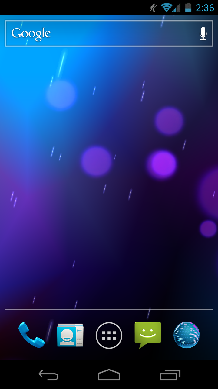
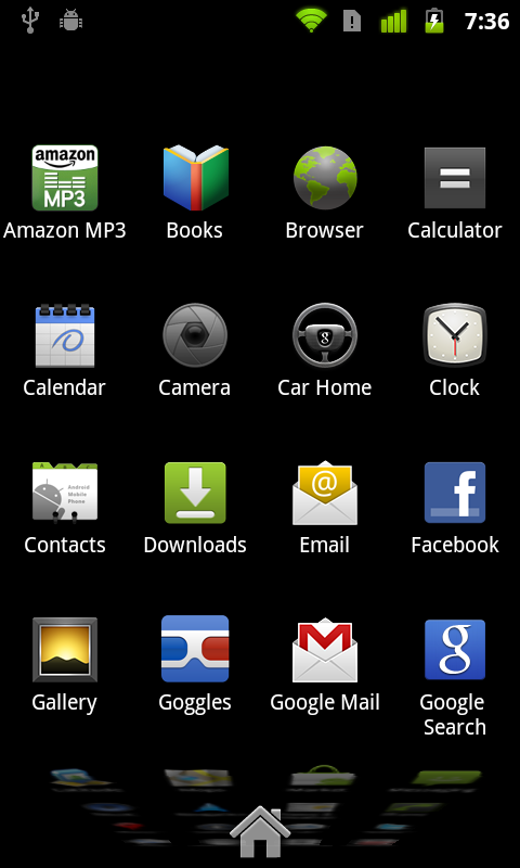
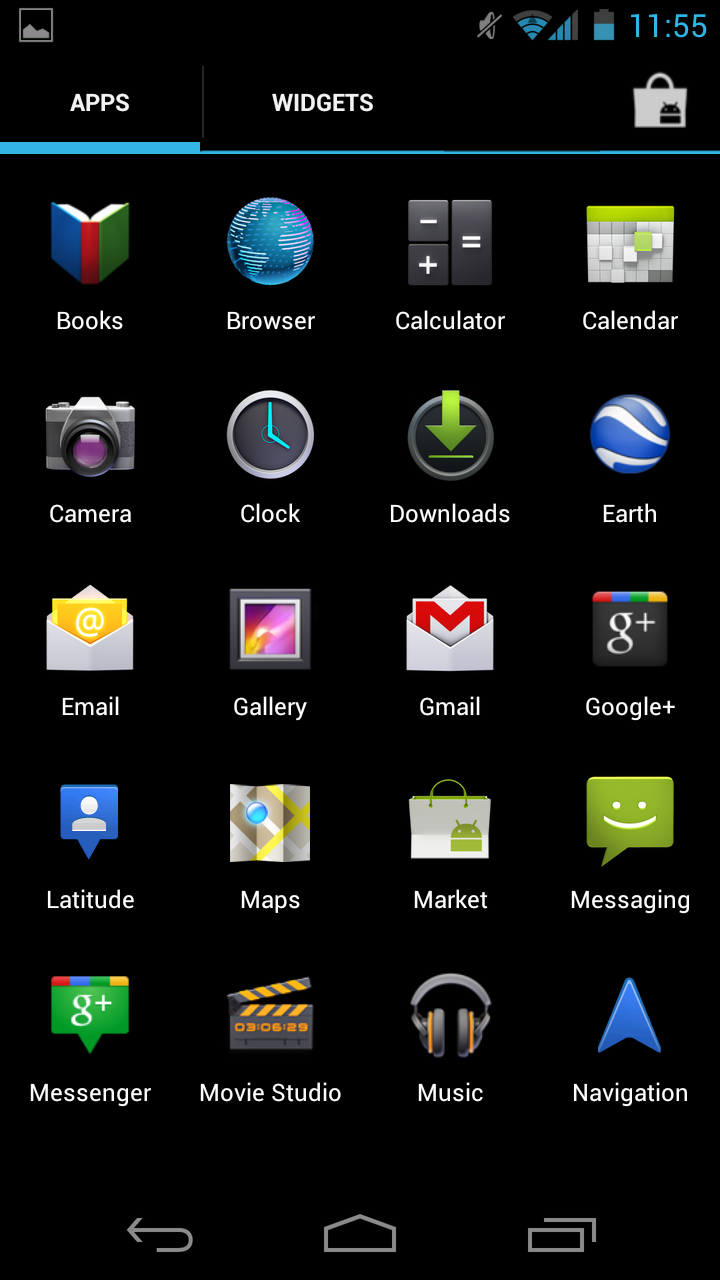
The core of Android remains unchanged. You get multiple home screens (five by default) that you can populate with shortcuts, widgets or folders. Widgets are resizable just as they were in Honeycomb. Shortcuts work the same way they always have, while Folders get a nice update in ICS. Drag any icon on top of another one and they'll create a folder. Folders are quick to open and easy to rename, just tap on the name of any open folder and type away.
The app launcher gets a bit of a facelift. Instead of an endless scrolling cube, you get pages of apps that you flip through. Once you've reached the end of your pages of apps you'll start flipping through widgets. All of this is smoother than it has ever been on Android.
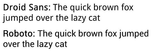
| Gingerbread vs. Ice Cream Sandwich | ||||
| Gingerbread | Ice Cream Sandwich | |||
| Lock |
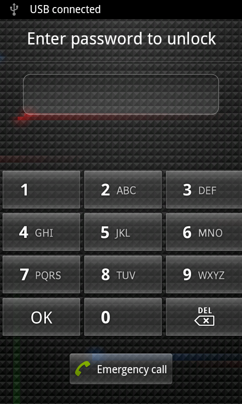 |
 |
||
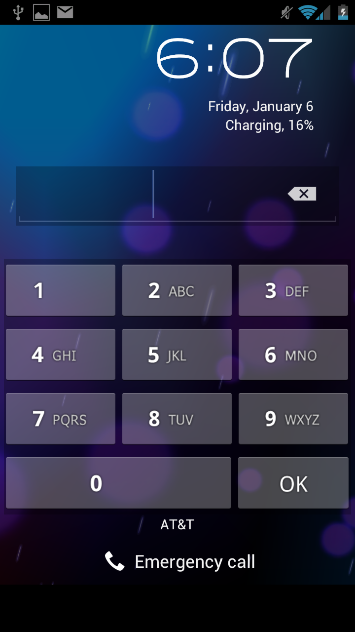
| Home |
 |
 |
||
| Launcher |
 |
 |
||
The New Contextual Menu Button
Play around with ICS for a little bit and you'll quickly pick up on a new UI element that appears inspired by Windows Phone:
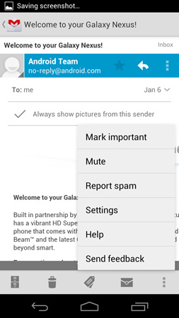
These vertically oriented ellipses will appear at either the top or bottom of an app and reveal additional menu options.
In Gingerbread you had the fixed Android menu button, but with that gone you have to rely on these contextual menu buttons to bring up additional actions. I'm honestly pleased with the move because all too often I'd forget to tap the menu button to see whether or not there were additional options in Gingerbread. ICS makes it very obvious when there's more you can do.
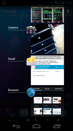
The Task Switcher
A cornerstone of any good operating system is a good task switcher. I still believe that webOS dealt with the concept of individual apps and switching between them better than any other mobile OS, but it looks like that platform is pretty much dead with little chance of making it into the top three mobile OSes.
Google and iOS haven't traditionally focused much on task switching, although both have provided support for it. In Gingerbread, you'd switch between apps by holding down the home button, which brought up a list of up to eight of your most recently used apps. Ice Cream Sandwich implements a drawer-style app switcher menu, first introduced in Honeycomb, activated by hitting the dedicated task switcher button:
| Gingerbread vs. Ice Cream Sandwich | ||||
| Gingerbread | Ice Cream Sandwich | |||
| Task Switcher |
 |
 |
||
The Gingerbread method of switching may be quicker, but it's definitely not as useful as what ICS offers. For starters you can switch between more than just six apps in ICS. The most recent apps are located at the bottom of the list, the oldest at the top. You can also quit apps using the switcher by sliding them to the left or right. Doing so immediately frees up any memory the app was using, even if it was suspended.
Scrolling through the list of recent apps, like scrolling pretty much anywhere in ICS, is extremely smooth. The only real complaint I have here is that the task switcher takes far too long to draw initially. As I alluded to before, this is something that may get better with a faster SoC, particularly one with a faster GPU.
The Shade & Notifications
Notifications in ICS are still handled via the status bar at the very top of the screen and a pull down notification shade. The shade in ICS is partially transparent by default and once again, very smoothly animated. The network carrier string is included at the bottom of the shade rather than in the status bar at the top. You can clear notifications individually or hit the X to clear all of them.
I am surprised Google didn't borrow the quick settings options its partners usually like to stick in the shade, but there is a link to the system settings panel at the top.
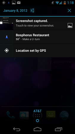
Screenshots
Android 4.x also finally enables the ability to take screenshots from within the OS. There's no necessity for OEMs to bake-in their own screenshot functionality and key press combination, no need to connect using USB and fire up ddms, and no need to root and install some application to make it work. Traditionally, those three have been the exclusive way to get screenshots taken on Android.
To take a screenshot in Android 4.x, simply hold volume down and the power/lock button at the same time. An animation plays, you get a notification, and the screenshot is saved (with a timestamped name in PNG format) in /pictures/screenshots as shown above.
I can't emphasize enough how important being able to take screenshots is for a platform in general. Without screenshots, users can only vicariously share a given OS when they're in direct contact with someone else. Being able to take screenshots without all the nonsense I've outlined above is part of what has made iOS so ubiquitous online - browse Reddit and count how many screenshots of SMS conversations (trite as they all are) are clearly from iOS versus Android. It's clear to me that Matias Duarte understands this, since webOS and even the Danger Hiptop since day 1 had the ability to take screenshots. Now Android 4.x finally joins the fray.


185 Comments
View All Comments
StormyParis - Wednesday, January 18, 2012 - link
Android should use the tried and true method of siplaying a *screenshot* of the home page as soon as the home button is pressed, and then replacing it with the live version. Btton presses are indeed way too laggy.CoryS - Wednesday, January 18, 2012 - link
I feel it is worth mentioning that custom kernels, combined with 4.03 have completely removed the task switcher lag. The latest version of Francos Kernel has increased idle battery life by an incredible margin (I lose about 1% every 10 hours on idle) and it has removed all UI lag I noticed on the stock device.dwang - Wednesday, January 18, 2012 - link
+1My gn is buttery smooth with 4.0.3 bigxie ROM and franco kernel.
Best phone I've ever used and I've owned every nexus phone (nexus one, nexus s) and the g1.
bjacobson - Wednesday, January 18, 2012 - link
this is why people go to Apple, because Google, even on their flagship phone, can't make it out better than the modding community.dwang - Wednesday, January 18, 2012 - link
what exactly are you babbling about. 4.0.3 is responsible for most of the performance improvements and thats from google.phantomash - Thursday, January 19, 2012 - link
If Apple did such a good job on iOS then why is there the term "jailbreak"?doobydoo - Thursday, January 19, 2012 - link
For the minority of users who want to use a different OS to iOS?A number, which you should take note, is far lower than the percentage of Android users who want to 'root' their phone (the equivalent).
Tetracycloide - Thursday, January 19, 2012 - link
Of course it's far lower, the people that want to customize like that avoid Apple because it's not as customization. It's an intellectually dishonest self-fulfilling statement that demonstrates absolutely nothing.Blackened144 - Thursday, January 19, 2012 - link
That goes both ways.. If Google did such a good job on Android, why is there the term "root"?Tetracycloide - Thursday, January 19, 2012 - link
Your response to a post highlighting the strengths of a partially open platform vis a vis third party kernel development is that that is the reason people go with a completely closed platform? That makes no sense at all...