Apple iOS 5 Review
by Vivek Gowri, Andrew Cunningham, Saumitra Bhagwat & Brian Klug on October 18, 2011 3:05 AM ESTNotifications and the Notification Center
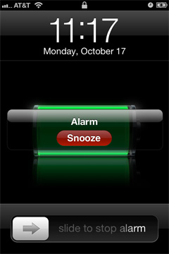
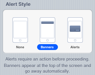
At first glance notifications on a locked iOS device appear to be simply restyled. Instead of a blue popup with white text you get a black popup with white text - and an app icon. Unlike previous versions of iOS however, multiple notifications now appear in a list on the lock screen rather than simply replacing the notification that was there previously.

The list of notifications can get very long (we didn't test to see if it would ultimately stop, but you can now display at least 30 notifications on the lock screen) and iOS 5 allows you to scroll through them:
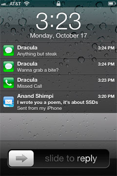

This feature alone is worth the upgrade to iOS 5 as it's a huge improvement in usability. You can now quickly get the gist of any SMS conversation and ensure there are no urgent emails that need tending to with a quick glance at your locked phone. Interacting with notifications from the lock screen is also improved, you can now slide over any notification to address it specifically:

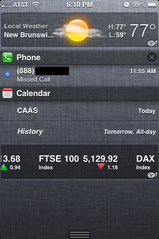
Swiping a finger down from the top of the screen reveals the new Notification Center, where your active notifications are all listed (some apps, like Weather and Stocks, can also display permanent widgets here if desired). Notifications are listed by app, and will disappear from the Notification Center once addressed or cleared manually by the user.
Pulling down the notification shade in a full screen app is a two-step process: pull once to reveal a tab and pull twice to reveal the shade. Apple does this to avoid any accidental shade activation.

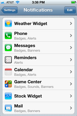
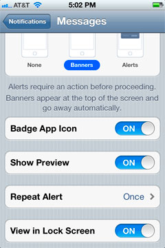
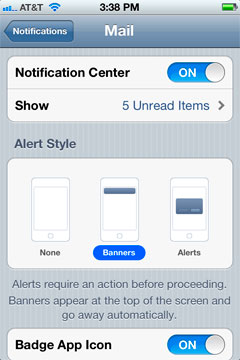
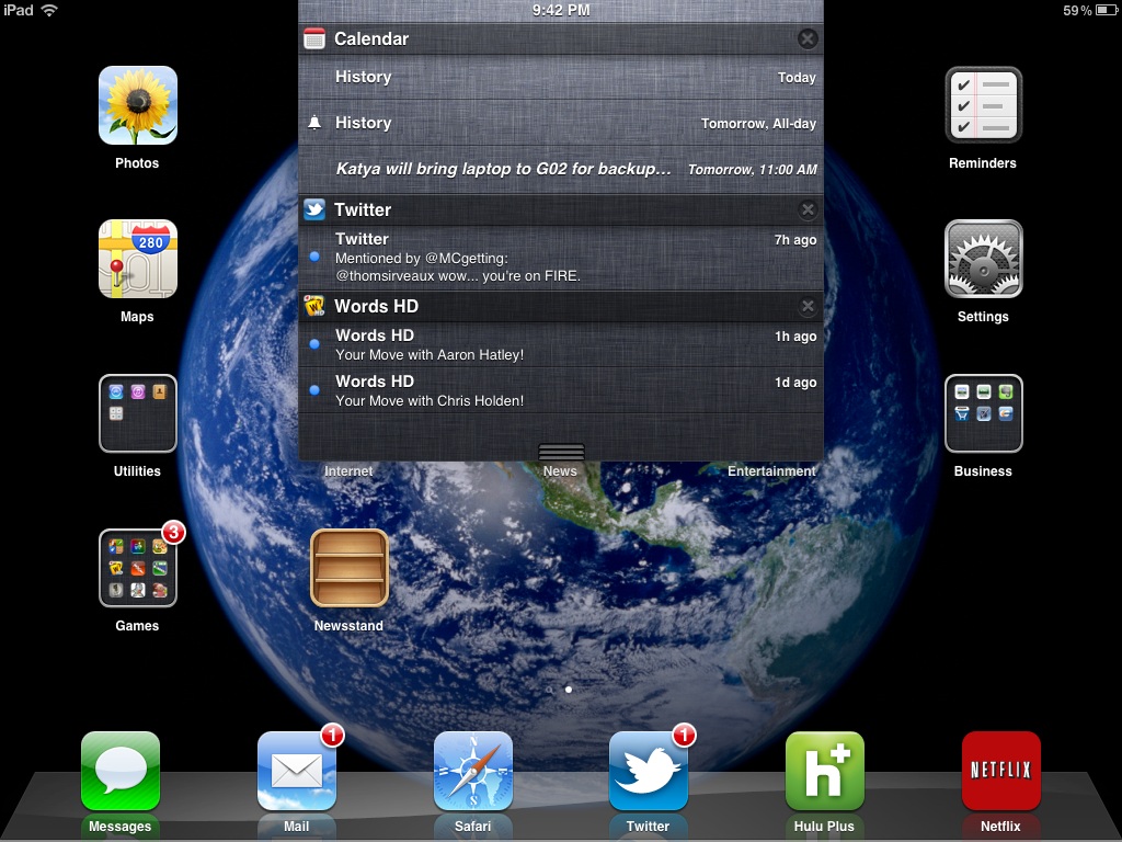
The number of notifications per app in the Notification Center is customizable:
On the iPad, Notification Center works mostly like it does on the iPhone - although obviously occupying less of the screen:
The impact of the revamped notification system is arguably even more pronounced on the iPad as the previous system was a significant burden to productive use of the tablet.
The verdict? None of these features are exactly new to smartphones (Android users, especially, will note many similarities to the notifications shade) but the implementation is smooth and it really goes a long way toward making iOS more pleasant to use - the best software upgrades make you wonder how you got by without the improvements they bring, and the notification improvements achieve that goal.


86 Comments
View All Comments
name99 - Friday, October 21, 2011 - link
Let me just point out that obsessing about numbers can be counterproductive. Let me give you an example:No phone reviews (yet, anyway) measure the speed of the file system, the speed of launching apps, that sort of thing. But we all know from desktops that, for most purposes, what makes a machine feel fast or slow is not the speed of the CPU, it is the speed of the disk.
So, suppose one is using a phone where most of the storage is an SD card (which are, or at least can be, quite a bit slower than the internal flash storage iPhone uses). That's not going to show up in benchmarks like Linpack, or Sunspider, or how fast the GPU is --- it's not going to show up on ANYTHING that current reviews benchmark.
Now, does this make any sense? The single most important determinant of perceived performance is not being mentioned? You can either close your eyes and say "la la la, I don't care", or you can face reality and accept that slowness in IO leads to general complaints about "feels sluggish".
And, look, it is STUPID of Android fans to ignore these complaints. Presumably you want your phones to feel fast, right? So what is more likely to get manufacturers to install faster flash in their phones?
- a bunch of people saying "what performance problem? The speed of our phones is perfect in every way. Heck, don't change anything ever"
OR
- a bunch of people saying "yeah, the phone is nice in a lot of ways, bnut damn it feels slow when I perform the following operations"
?
_tangent - Wednesday, October 19, 2011 - link
That blog illustrates Apple's greatest achievement in technology: convincing people that choice only serves to complicates matters. The browser comparison is a perfect example. There are browsers available which perform far better than the stock android browser. On an SGS2 (7 month old handset), firefox comprehensively beats the new 4S is JS benchmarks. Yet the blogger behaves as if visiting the market and downloading a third party browser is a complication too far for the average smartphone owner.I wish people would stop evangelizing the dumbing down of technology. There's nothing wrong with engaging your brain a little to get the best out of your tech. Too many people are bought into Apple's belief that we're all a little too stupid or too busy to think. iOS is to technology what pop is to music: instant gratification for very little investment of time or effort. But ultimately the same rules apply to everything: you get out what you put in. And on that topic, the author of that blog can't have put much effort at all into looking for apps, because i have never struggled to find quality games/widgets/etc on the android market.
steven75 - Monday, October 31, 2011 - link
Do you know what my friend's favorite thing about switching from Android to iPhone is?How much better the browser is.
So much for benchmarks, eh?
TEAMSWITCHER - Tuesday, October 18, 2011 - link
Products like smart phones, tablets, and computers are multi-faceted beasts. An overall evaluation of each is what reviewers typically strive to determine. Apple is not perfect by any stretch, but taken as a whole the products are quite good. What you perceive as media bias, is actually just Apple making great products.windywoo - Tuesday, October 18, 2011 - link
No, what Apple make are products which are simple, and pleasing to the eye. They "just work" because they restrict the user in how much they can do, and therefore limit the amount of mistakes they can make.They usually trade off on other features such as customisation and flexibility. Then they add in the missing pieces as they go along. Why is this Apple method so beloved of reviewers? Why handle them with kid gloves for such obvious flaws that have just now been fixed? No-one applauds Fisher Price for simplifying things. Do Apple really deserve such praise for putting stabilizers on a bike and then taking them off when their users are suitably indoctrinated?tbutler - Tuesday, October 18, 2011 - link
Because, just maybe, Apple designs products primarily for people who are willing - and often even *happy* - to trade maximum customization and flexibility in return for simplicity, fewer hassles, and limiting the possibility for mistakes? Heck, I've been using computers since the late 70's and consider myself a fairly experienced user, and I still like having a platform I can just pick up and use with a minimum of fuss.To answer a point further upthread: Benchmarks and feature checklists are suitable metrics for people who view benchmarks and feature checklists as the primary reason for using a platform. For those who think UX trumps raw performance or features*, not so much. And how do you quantify UX?
*(A feature with a UX that makes it more trouble to use than the benefit you get from the feature is a null feature in my book.)
For example, let's talk about the PlayBook, which I was able to grab for $200 recently. To back out of an application and return to the launcher/task switcher, you swipe up from the bottom of the screen. This leaves your finger in a good position to either swipe between apps, or tap an icon to launch. Offscreen controls are typically located in a toolbar you reveal by swiping down from the top of the screen; again, the gesture leaves your finger in position to do what you want.
Compare this to Honeycomb, where the home icon and app drawer controls are on complete opposite corners of the screen; the same sequence requires going to the lower-left corner to return to the home screen, upper-righte corner for the app drawer, then back to the center to select an app.
One platform feels fluid, with one action naturally leading into another; the other feels interrupted, with your finger jumping all around the screen. How do you reduce this to metrics for a review? Measure the number of inches your finger has to travel across the screen?
Daniel Egger - Tuesday, October 18, 2011 - link
I have just read the one linked article and I must say I have to agree quite a bit save for the "Sharing" experience. I do have a Gingerbread phone and only an iPod Touch on the IOS side (besides my main phones are a Palm Pre for the "business" stuff and a Nokia 6310i for the phoning part).The Android phone, while allowing for a hell of flexibility, just feels clumsy compared to the other smart devices: animations are not fluid, the UI of all non-Google applications feel like design by blender; about every single app looks vastly different and most don't provide any classy feel, save for Wunderlist, which must be the most wonderfully crafted Android application out there.
Apps get swapped out erratically while other uninteresting tasks stay in -- why the heck does CSipSimple get swapped out several times a day while Maps launches itself? Managing running apps is a royal PITA on Android while it is supposed to be a "don't care".
The Android market is utterly swamped with crap; it's about impossible to find decent apps and even more so without annoying ads all over the map. There really needs a separate right "Displays Ads" rather than "Full internet access". Also the market is not really helpful in finding good apps compared to the App Store. I've literally hundreds of very good apps and games, about 90% of which didn't cost me anything, on the iPod while I'm really struggling to hit 10(!) solid ones on the Android device.
Then there's the standby time. The Pre and the iPod have SIP accounts XMPP registrations over WLAN up for over 2 days, the Pre even with UMTS on. The Android phone will need a recharge after less than one day, without cell or GPS reception on yet it has the largest battery of all devices.
Then there's usability issues, maybe caused by vendor modifications (but fragmentation is also another con rather than a pro), like when you plug in USB while the phone is locked is will display the USB selector but you can't select anything until you use the hardware buttons to get to the hidden lock screen and disable the lock first...
I was about as psyched to get the Gingerbread thingy as much as I was to get the Pre and and my iPod but I really hoped for a *lot* more than I received. There're so many inherent problems in the Android platform that I'm certainly not going to let me lure into trying Android another time soon...
Jeff7181 - Tuesday, October 18, 2011 - link
Repeat alerts indefinitely until read or dismissed.Set ringer based on location and date/time.
Set WiFi & Bluetooth based on location and date/time.
name99 - Friday, October 21, 2011 - link
I agree. Have you reported them as bugs to Apple?I've submitted maybe 30 bug reports and feature requests regarding iOS5 and iCloud over the past few days.
Having worked at Apple for ten years, I know: engineering is DRIVEN by bug reports. If you submit a bug, especially if lots of other people are submitting the same bug, it's pretty likely to get handled before the next release. Feature requests --- maybe handled --- sometimes they agree, sometimes not, sometime it's just a low priority.
But random rants on blogs --- unlikely to change anything unless some Apple engineer happens to read your comment and think "fantastic idea".
steven75 - Monday, October 31, 2011 - link
"Repeat alerts indefinitely until read or dismissed."This is a feature, not a bug, to everyone else in the world that doesn't want to hear your phone make noises endlessly because you aren't in the room.
"Set ringer based on location and date/time."
Agreed, this would be nice.
"Set WiFi & Bluetooth based on location and date/time."
I find this unnecessary. I leave both of those on 24/7 and always make it through the day on a single charge. Push notifications and location uses far more battery than those two and having them turn on/off based on location is going to cause more battery usage than just leaving them on all the time.