Apple iOS 5 Review
by Vivek Gowri, Andrew Cunningham, Saumitra Bhagwat & Brian Klug on October 18, 2011 3:05 AM ESTFind My Friends
Yet another feature, that Apple’s included under iCloud’s umbrella is called Find My Friends. It is a standalone app that allows you to share your current location with other iOS users without any further interaction on your behalf. One a friend is allowed access to your location information (by "following" you) he/she can request your current location at any time. The process is simple: you submit a follow request through the Find My Friends app, and your friend either accepts or declines your request.
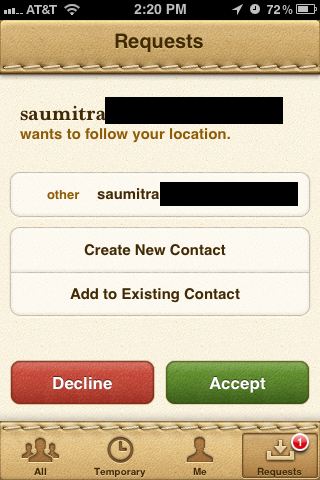
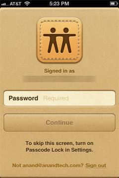
Once accepted, there's nothing more for you to do. Note that the process isn't automatically two-way: just because you let someone follow you it doesn't mean you can follow them, you have to initiate a request and be accepted to follow anyone - period. Access can be revoked at any time as well. If you don't have a passcode set on your phone you'll also be required to type in your password every time you launch the app. Requiring authentication at launch guarantees that no one can simply pick up your phone and spy on the locations of your friends. Despite the obvious scariness of the idea, it seems like the FMF app is a reasonable way to share your current location with people you trust.


The app is invariably tied to your Apple ID, which is currently the only means to find an invite other people. It is nice to see Apple steadily increasing the number of services that are tied to an Apple ID. With Find My Friends, it brings the grand total to 7 with the iTunes Music Store, App Store, iBookstore, Home Sharing, iMessage and iCloud, if we consider it as one service.
Find My Friends has several built-in privacy settings that let users control whether they can receive follow requests. A “Hide from Followers” option lets users snoop around without advertising their locations; sort of like an incognito mode if you don’t want to let your gym instructor know you were at McDonald’s. The temporary sharing feature allows you to share your location with a group of people, (who don’t necessarily have to be your followers), only for a specified period of time. Once the set deadline has elapsed, your location is no longer shared, and life returns to a state of normalcy.
The app also lets users assign labels to frequently visited places, so your followers don’t rack their brains too hard trying to figure out where you are. Currently, the only way to add friends is to manually type their email addresses, a la Mail or Messages. It would be great if Apple could let the app scan your contacts and automatically invite people with email addresses. There are also built-in parental controls, which can be accessed from Restrictions under General Settings. The app has a slick interface, much like the new Address Book in Lion. It is tightly integrated with Maps, Contacts and iMessage.
Maps

The biggest improvement to the Maps app in iOS 5 is that you can finally choose between multiple routes, same as in the Google Maps web app. It still doesn't display some of the useful information you can get from Google directly - for example, which roads have tolls and which do not? - but it's handy if you come up against traffic or closed roads on your way from Point A to Point B.
Spellcheck and Autocorrect

The iOS spellchecker can now suggest multiple words to correct your misspellings, similar to spellcheckers in most word processors and web browsers on the desktop. The pop-up you use to make these corrections is also slightly larger than before, allowing for easier tapping.


86 Comments
View All Comments
name99 - Friday, October 21, 2011 - link
Let me just point out that obsessing about numbers can be counterproductive. Let me give you an example:No phone reviews (yet, anyway) measure the speed of the file system, the speed of launching apps, that sort of thing. But we all know from desktops that, for most purposes, what makes a machine feel fast or slow is not the speed of the CPU, it is the speed of the disk.
So, suppose one is using a phone where most of the storage is an SD card (which are, or at least can be, quite a bit slower than the internal flash storage iPhone uses). That's not going to show up in benchmarks like Linpack, or Sunspider, or how fast the GPU is --- it's not going to show up on ANYTHING that current reviews benchmark.
Now, does this make any sense? The single most important determinant of perceived performance is not being mentioned? You can either close your eyes and say "la la la, I don't care", or you can face reality and accept that slowness in IO leads to general complaints about "feels sluggish".
And, look, it is STUPID of Android fans to ignore these complaints. Presumably you want your phones to feel fast, right? So what is more likely to get manufacturers to install faster flash in their phones?
- a bunch of people saying "what performance problem? The speed of our phones is perfect in every way. Heck, don't change anything ever"
OR
- a bunch of people saying "yeah, the phone is nice in a lot of ways, bnut damn it feels slow when I perform the following operations"
?
_tangent - Wednesday, October 19, 2011 - link
That blog illustrates Apple's greatest achievement in technology: convincing people that choice only serves to complicates matters. The browser comparison is a perfect example. There are browsers available which perform far better than the stock android browser. On an SGS2 (7 month old handset), firefox comprehensively beats the new 4S is JS benchmarks. Yet the blogger behaves as if visiting the market and downloading a third party browser is a complication too far for the average smartphone owner.I wish people would stop evangelizing the dumbing down of technology. There's nothing wrong with engaging your brain a little to get the best out of your tech. Too many people are bought into Apple's belief that we're all a little too stupid or too busy to think. iOS is to technology what pop is to music: instant gratification for very little investment of time or effort. But ultimately the same rules apply to everything: you get out what you put in. And on that topic, the author of that blog can't have put much effort at all into looking for apps, because i have never struggled to find quality games/widgets/etc on the android market.
steven75 - Monday, October 31, 2011 - link
Do you know what my friend's favorite thing about switching from Android to iPhone is?How much better the browser is.
So much for benchmarks, eh?
TEAMSWITCHER - Tuesday, October 18, 2011 - link
Products like smart phones, tablets, and computers are multi-faceted beasts. An overall evaluation of each is what reviewers typically strive to determine. Apple is not perfect by any stretch, but taken as a whole the products are quite good. What you perceive as media bias, is actually just Apple making great products.windywoo - Tuesday, October 18, 2011 - link
No, what Apple make are products which are simple, and pleasing to the eye. They "just work" because they restrict the user in how much they can do, and therefore limit the amount of mistakes they can make.They usually trade off on other features such as customisation and flexibility. Then they add in the missing pieces as they go along. Why is this Apple method so beloved of reviewers? Why handle them with kid gloves for such obvious flaws that have just now been fixed? No-one applauds Fisher Price for simplifying things. Do Apple really deserve such praise for putting stabilizers on a bike and then taking them off when their users are suitably indoctrinated?tbutler - Tuesday, October 18, 2011 - link
Because, just maybe, Apple designs products primarily for people who are willing - and often even *happy* - to trade maximum customization and flexibility in return for simplicity, fewer hassles, and limiting the possibility for mistakes? Heck, I've been using computers since the late 70's and consider myself a fairly experienced user, and I still like having a platform I can just pick up and use with a minimum of fuss.To answer a point further upthread: Benchmarks and feature checklists are suitable metrics for people who view benchmarks and feature checklists as the primary reason for using a platform. For those who think UX trumps raw performance or features*, not so much. And how do you quantify UX?
*(A feature with a UX that makes it more trouble to use than the benefit you get from the feature is a null feature in my book.)
For example, let's talk about the PlayBook, which I was able to grab for $200 recently. To back out of an application and return to the launcher/task switcher, you swipe up from the bottom of the screen. This leaves your finger in a good position to either swipe between apps, or tap an icon to launch. Offscreen controls are typically located in a toolbar you reveal by swiping down from the top of the screen; again, the gesture leaves your finger in position to do what you want.
Compare this to Honeycomb, where the home icon and app drawer controls are on complete opposite corners of the screen; the same sequence requires going to the lower-left corner to return to the home screen, upper-righte corner for the app drawer, then back to the center to select an app.
One platform feels fluid, with one action naturally leading into another; the other feels interrupted, with your finger jumping all around the screen. How do you reduce this to metrics for a review? Measure the number of inches your finger has to travel across the screen?
Daniel Egger - Tuesday, October 18, 2011 - link
I have just read the one linked article and I must say I have to agree quite a bit save for the "Sharing" experience. I do have a Gingerbread phone and only an iPod Touch on the IOS side (besides my main phones are a Palm Pre for the "business" stuff and a Nokia 6310i for the phoning part).The Android phone, while allowing for a hell of flexibility, just feels clumsy compared to the other smart devices: animations are not fluid, the UI of all non-Google applications feel like design by blender; about every single app looks vastly different and most don't provide any classy feel, save for Wunderlist, which must be the most wonderfully crafted Android application out there.
Apps get swapped out erratically while other uninteresting tasks stay in -- why the heck does CSipSimple get swapped out several times a day while Maps launches itself? Managing running apps is a royal PITA on Android while it is supposed to be a "don't care".
The Android market is utterly swamped with crap; it's about impossible to find decent apps and even more so without annoying ads all over the map. There really needs a separate right "Displays Ads" rather than "Full internet access". Also the market is not really helpful in finding good apps compared to the App Store. I've literally hundreds of very good apps and games, about 90% of which didn't cost me anything, on the iPod while I'm really struggling to hit 10(!) solid ones on the Android device.
Then there's the standby time. The Pre and the iPod have SIP accounts XMPP registrations over WLAN up for over 2 days, the Pre even with UMTS on. The Android phone will need a recharge after less than one day, without cell or GPS reception on yet it has the largest battery of all devices.
Then there's usability issues, maybe caused by vendor modifications (but fragmentation is also another con rather than a pro), like when you plug in USB while the phone is locked is will display the USB selector but you can't select anything until you use the hardware buttons to get to the hidden lock screen and disable the lock first...
I was about as psyched to get the Gingerbread thingy as much as I was to get the Pre and and my iPod but I really hoped for a *lot* more than I received. There're so many inherent problems in the Android platform that I'm certainly not going to let me lure into trying Android another time soon...
Jeff7181 - Tuesday, October 18, 2011 - link
Repeat alerts indefinitely until read or dismissed.Set ringer based on location and date/time.
Set WiFi & Bluetooth based on location and date/time.
name99 - Friday, October 21, 2011 - link
I agree. Have you reported them as bugs to Apple?I've submitted maybe 30 bug reports and feature requests regarding iOS5 and iCloud over the past few days.
Having worked at Apple for ten years, I know: engineering is DRIVEN by bug reports. If you submit a bug, especially if lots of other people are submitting the same bug, it's pretty likely to get handled before the next release. Feature requests --- maybe handled --- sometimes they agree, sometimes not, sometime it's just a low priority.
But random rants on blogs --- unlikely to change anything unless some Apple engineer happens to read your comment and think "fantastic idea".
steven75 - Monday, October 31, 2011 - link
"Repeat alerts indefinitely until read or dismissed."This is a feature, not a bug, to everyone else in the world that doesn't want to hear your phone make noises endlessly because you aren't in the room.
"Set ringer based on location and date/time."
Agreed, this would be nice.
"Set WiFi & Bluetooth based on location and date/time."
I find this unnecessary. I leave both of those on 24/7 and always make it through the day on a single charge. Push notifications and location uses far more battery than those two and having them turn on/off based on location is going to cause more battery usage than just leaving them on all the time.