Apple iOS 5 Review
by Vivek Gowri, Andrew Cunningham, Saumitra Bhagwat & Brian Klug on October 18, 2011 3:05 AM ESTCamera Application Improvements
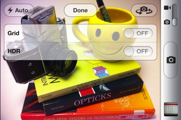
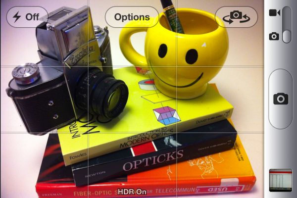
The default iOS camera application also gets some love with new improvements and features. The changes are initially pretty subtle. Under options at the top is a new toggle for a grid overlay which helps you optionally compose photos using rule of thirds, and on the iPhone 4 the HDR toggle is here. Of course on the 3GS the only toggle is for grid. Next, pinch to zoom brings up the digital zoom toggle at the bottom.
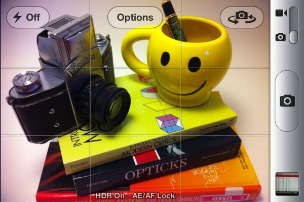
Another new (and more subtle) feature is AF/AE lock. Just like the normal tap to AF/AE, except hold down. The target square flashes twice, then on release you're shown AF/AE lock.
Last but not least, the volume up button now triggers image capture. This feature was famously added by Camera+, which then resulted in the application being pulled from the App Store, and now the feature resurfaces in the official camera application. While capturing using the volume up button is useful, it also makes the iPhone 4 form factor a much less stable shooting platform thanks to the volume button's spring preload. Pay attention to good DSLR camera buttons - the spring preload isn't that much at all, and the shutter button "break" only takes a few newtons of force. This is very important because it doesn't result in the shooting platform moving right at capture trigger. Unfortunately in this regard the iPhone 4's beefy buttons make shooting blur-free images difficult, the result is that shooting with the volume button still feels like something of an afterthought. Interestingly enough, the iPhone 3GS' much less preloaded volume button makes for a much more stable shooting platform when using the button.
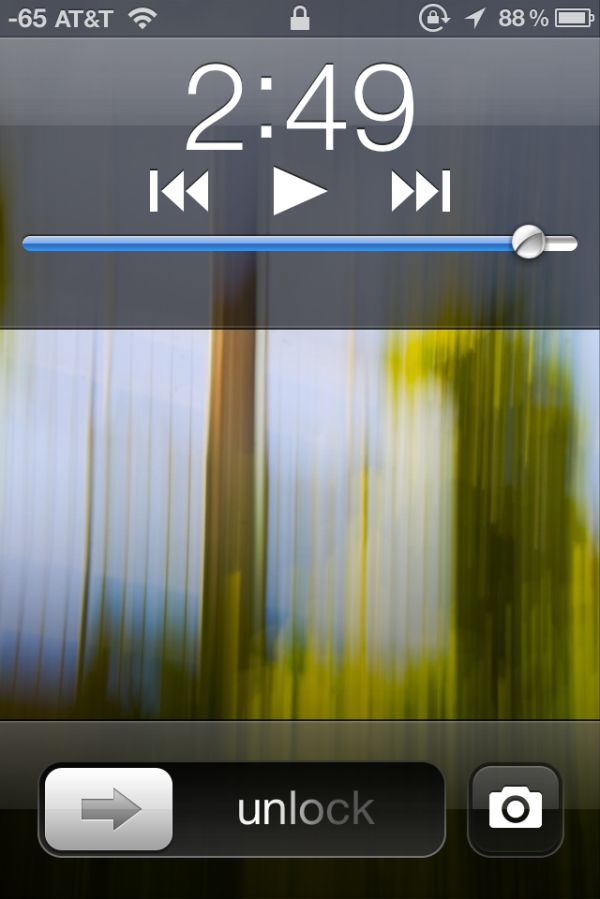
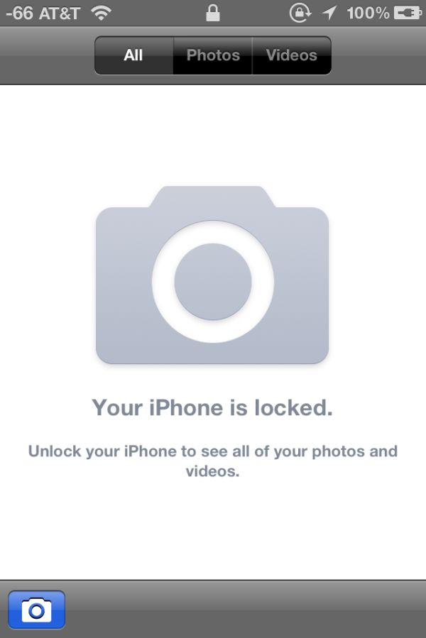
On the lock screen, double tapping the home button brings up the new camera button. This enables you to take photos pretty quickly, and even with the a passcode you can shoot photos. Apple has done a pretty good job making sure you can't escape from here either, we tried force quitting the camera application or gallery after entering the capture mode through the lock screen. Further, you can't view photos in the gallery from this secure camera application. Things seem pretty locked down (as they should be) so far.
The last subtle feature is a camera button which appears in the bottom left if you enter the gallery from the camera app. This button brings you, as expected, right back into the camera application.




86 Comments
View All Comments
myxiplx - Tuesday, October 18, 2011 - link
Just a note, my 3GS is far more responsive since installing IOS 5 than it's been for years. It's not just application launch times, popups, and notifications are a lot snappier, there's a definite reduction in the lag that's been creeping up over the last year.lurker22 - Tuesday, October 18, 2011 - link
Wow, I have found it lags a bit more than ios4kmmatney - Tuesday, October 18, 2011 - link
I'm still running iOS 4.0 (can't upgrade easily due to jailbreak for tethering) and its not all that bad once you disable Spotlight search. I'm hoping they have an untethered Jailbreak for iOS 5 soon, though.lurker22 - Tuesday, October 18, 2011 - link
Anand,Surprised you missed this large flaw. iPads will not receive iMessages sent to your cellular number, just iMessages sent to the email addresses setup in the iMessage account.
This is a huge flaw. What has already happened to me is people using their iPads have missed messages for many hours since they were addressed to the cell number and this then isn't devlivered to the iPads.
Why would apple miss this huge functionality gap? It means now I have to remember to send iMessages to email addresses to be sure the person will see it in a timely fashion.
Aikouka - Tuesday, October 18, 2011 - link
That explains why I never saw any of the "iMessages" that a friend sent me the other day. I was wondering why they didn't show up when I poked around the Messaging app on my iPad. I assumed all you had to do was sign into the same iMessage account to share everything.Brian Klug - Tuesday, October 18, 2011 - link
That's all you have to do for things to work, however there's a catch that I mention - both devices have to be configured to have the same iMessage "Caller ID." This is why the default Caller ID is set to the iMessage "Apple ID" email account, and also the other catch is that your sender has to then be talking with that contact.-Brian
windywoo - Tuesday, October 18, 2011 - link
If Apple is just now implementing features that have been around on other phones why do their products always get such high scores in reviews? Why is it acceptable for Apple to trail in features while Android handsets will be marked down if there happens to be a flicker in the animations? Don't tell me it's because Apple does it so much better because that's subjective at best, and to my mind dishonest.All the features implemented here fix major usability flaws in iOS that really contradict the general view that Apple's products are the easiest to use, but for some reason Apple has got a pass from reviewers like some favoured, hobbit haired child.
I would like to see fewer double standards. We are talking about a capitalist, profit driven corporation, I think they can stand to be handled a little less gently.
lurker22 - Tuesday, October 18, 2011 - link
Here's whyhttp://dinnerwithandroid.tumblr.com/post/115710967...
windywoo - Tuesday, October 18, 2011 - link
That article is a prime example of what I'm talking about. Subjectives passed off as objectives. Until recently the android browser was ahead in any benchmarks yet he claims it's slow. And in any case, Android gives a choice of browser if there are any rendering errors. Safari is not without its own flaws, and when it does go wrong you're stuck, because Apple doesn't allow other browsers.He finds Widgets useless, but doesn't appreciate that other people might not and Android allows them the freedom to spend battery juice on trinkets like live wallpaper if they so choose. Why is it that Apple users always consider it an advantage to have Apple make decisions for them and will pay over the odds to be nannied?
The market argument is almost entirely irrelevant. Let's leave aside the fact that he can't have looked very closely if he thinks there is no software on the Android market, the same argument used to be addressed at Macs. Apple fans would claim then that the quantity didn't matter so long as the major functions were there. Apps are a con anyway. If consumers weren't so gullible, many of them could be written as web apps, making platform irrelevant. But consumers are dumb. They like being fed nuggets of code like junk food.
He lists the good things at the end so why does he consider them less important than what he sees as faults? The answer is of course, fawning subservience to the mighty Apple.
Phynaz - Tuesday, October 18, 2011 - link
Who told you Apple doesn't allow other browsers. I've tried at least three alternatives, and my current browser is Atomic.