ASUS VG236H 23-inch 3D Display Review: 120Hz is the Future
by Brian Klug on August 7, 2010 2:48 AM ESTColor Quality
Now let’s get to the meat of the display characteristics. As usual, we report two main quality metrics: color accuracy (Delta-E) and color gamut. Color gamut refers to the range of colors the display is able to represent with respect to some color space. In this case, our reference is the AdobeRGB 1998 color space, which is larger than the sRGB color space. So our percentages are reported with respect to this number, and larger is generally better.
Color accuracy (Delta E) refers to the display’s ability to display the correct color requested by the GPU and OS. The difference between the color represented by the display, and the color requested by the GPU is our Delta-E, and lower is better here. In practice, a Delta E under 1.0 is perfect - the chromatic sensitivity of the human eye is not great enough to distinguish a difference. Moving up, a Delta E of 2.0 or less is generally considered fit for use in a professional imaging environment - it isn’t perfect, but it’s hard to gauge the difference. Finally, Delta E of 4.0 and above is considered visible with the human eye. Of course, the big consideration here is frame of reference; unless you have another monitor or some print samples (color checker card) to compare your display with, you probably won’t notice. That is, until you print or view media on another monitor. Then the difference will no doubt be apparent.
As I mentioned in our earlier reviews, we’ve updated our display test bench. We’ve deprecated the Monaco Optix XR Pro colorimeter in favor of an Xrite i1D2 since there are no longer up-to-date drivers for modern platforms.
For these tests, we calibrate the display and try to obtain the best Delta-E we can get at both 200 nits of brightness for normal use, and 100 nits for print brightness. We target 6500K and a gamma of 2.2, but sometimes the best performance lies at native temperature and another gamma, so we try to find what the absolute best performance could be. We also take an uncalibrated measurement to show performance out of the box using either the manufacturer supplied color profile, or a generic one with no LUT data. For all of these, dynamic contrast is disabled.
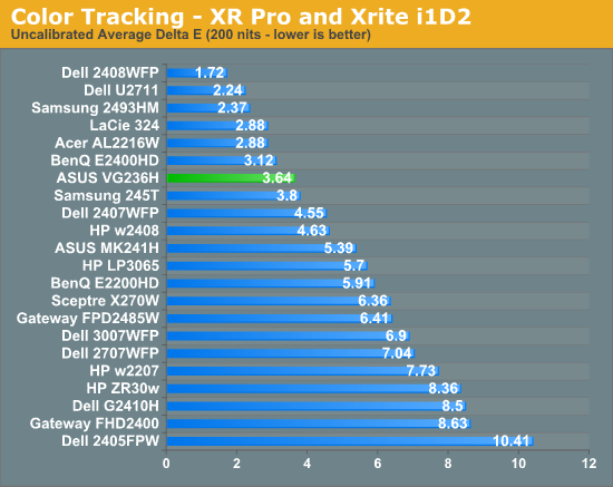
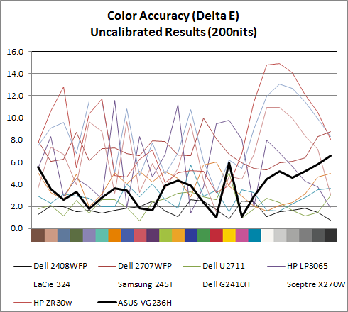
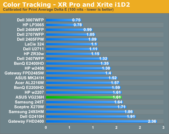
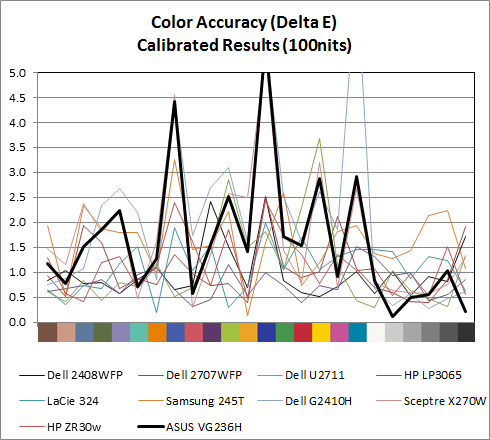
Performance uncalibrated, entirely out of the box is actually very good, at a respectable 3.64. When I first started working on the VG236H I didn’t notice any color tints or weird hues, and upon measuring the display, found the white temperature to be almost exactly 6600K, very close to our 6500K target for calibration. This is nice to see out of the box. For gamers interested in ballpark color reproduction but not professonal level absolute colormetric reproduction, this is adequate.
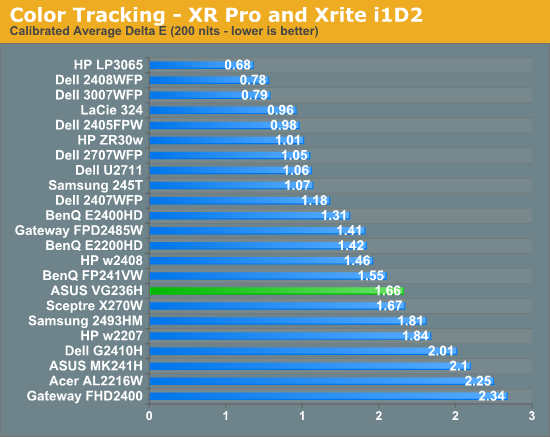
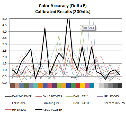
Moving on, at 200 nits the VG236H gets a bit more accurate, down to 1.66, but still isn’t quite as good as an IPS panel. Still, not bad for a TN. Going down to 100 nits, we get a bit better, moving down to 1.61, but still not that elusive sub 1.0 the highest quality displays can deliver. What about gamut?
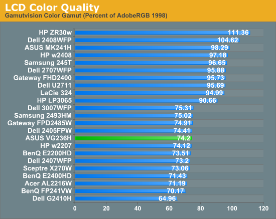
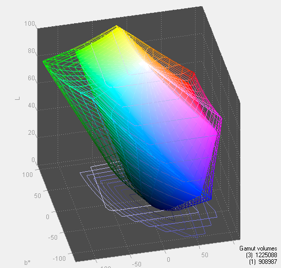
As expected, gamut is right around where we’d expect it to be for the TN, sRGB display. Interestingly enough, the OSD controls do have an sRGB mode, though I don’t think it’s as necessary as it would be on say a wide gamut display. But it’s there for certain.




121 Comments
View All Comments
mino - Tuesday, August 10, 2010 - link
.. reasonable 1920x1200 ..dingetje - Saturday, August 7, 2010 - link
I will immediately get one....when 1920 x 1200 models are available.A 1920 x 1080 screen is just not acceptable for me, even when it's 120hz goodness.
Looking forward to more 120hz screen reviews....thx
Taft12 - Saturday, August 7, 2010 - link
How long can you hold your breath? I don't think 1920x1200 is coming back on the market ever again.ZoZo - Sunday, August 8, 2010 - link
You may have to wait a long time.It appears that 16:10 is being abandoned.
DarkUltra - Sunday, August 8, 2010 - link
For now, yes but if there is a market for it it will hopefully return. The 23" 16:9 we have at works is just too wide for me; the 1920x1200 24" my father have is really much higher, it can fit an entire Windows 7 double-sized task bar and a ribbon menu more than 1080.martin5000 - Saturday, August 7, 2010 - link
16:9 is absolutely horrible for computers. Its so disappointing that this is the current trend.Glossy is also terrible, maybe the colours do look a bit more vibrant, but at the cost of not actually be able to see the screen unless you're in the perfect light conditions, no thanks!
medi01 - Saturday, August 7, 2010 - link
I second that. Basically it's all about marketing:1) glossy screens probably look better in shops
2) X inches monitor with 4:3 ratio has 12% more pixels than 16:9 => it's cheaper to produce
Mr Perfect - Saturday, August 7, 2010 - link
I imaging that being able to put "FULL 1080P HD!" on the box doesn't hurt sales either.So, to recap, change this into a 16:10, matte finish, IPS panel.
BansheeX - Sunday, August 8, 2010 - link
You're both nuts. No aspect ratio inherently gives more resolution than any other. Case-in-point, 3200x1800 is a 16:9 resolution that is much higher than 1600x1200 (4:3) or 1920x1200 (16:10). The reason 1920x1080 is so common for 16:9 is mainly the result of established manufacturing processes and 1:1 scaling of HD material.Quidam67 - Sunday, August 8, 2010 - link
I genuinely don't understand why some people are showing such a strong reaction against 16:9 monitors. I must be missing the point, or is it really just the slightly different aspect ratio + slightly less pixels that has them all worked up?!?