Anand's Google Nexus One Review
by Anand Lal Shimpi on April 3, 2010 3:40 AM EST- Posted in
- Smartphones
- Mobile
It’s Mac vs. PC All Over Again
Until Windows Phone 7 arrives, Palm fixes its issues or MeeGo starts shipping in earnest, the inevitable comparison is between Android and the iPhone OS. And in my weeks of using Google’s Nexus One, I can honestly say that the differences really boil down to much of the same things that separate PC and Mac users.
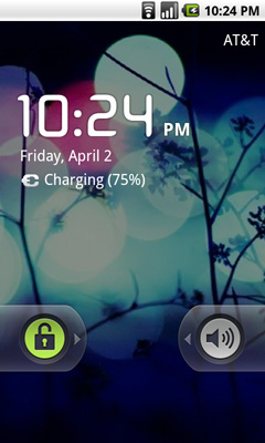
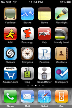
The Mac vs. PC analogy starts as soon as you look at the unlock screen for the phone. Here’s what you see on Apple’s iPhone vs. Google’s Android:
|
Google Nexus One
|
Apple iPhone 3GS
|
 |
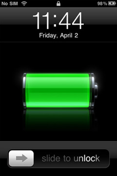 |
The iPhone allows for a single interaction: unlock the phone. The Nexus One gives you two: unlock or toggle sound on/off. The divergence continues once you unlock the phones:
|
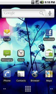
Google Nexus One
|
Apple iPhone 3GS
|
 |
|
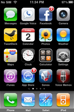
Apple’s home screen is a structured list of icons. Each swipe reveals another page that looks the same. You can customize placement of the app icons, and control what appears in the bottom row of four, but ultimately you’re flipping through a virtual index of your applications.
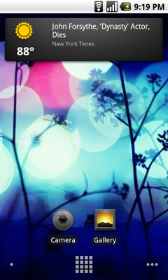
The Nexus One’s home screen is much more configurable/versatile. You start out with a u-shaped arrangement of icons. At the top, a Google search widget. Your home screen starts in the middle, you can swipe two screens to the right or left. On the iPhone you’re basically reading a book, on the Nexus One you’re navigating a field.
Swipe right to left and you’ll see a Gmail and Gtalk icon. Swipe left to right instead and you’ll see a weather widget and some more icons. The weather widget tells you the weather wherever you’re currently located (GPS/cellular network triangulation ftw) as well as gives you the latest news headlines all updated in real time.
 |
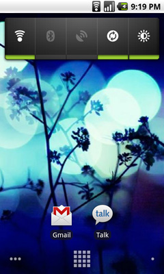 |
Apple’s predictable UI allows no room for quick ways to disable things like Bluetooth or 3G. The Nexus One ships with a Power widget that lets you quickly toggle WiFi, Bluetooth, GPS, auto syncing and auto brightness control. The only thing that’s missing is a quick way to disable 3G.
The remaining pages ship barren. It’s up to you to add items to them. You can do so by hitting the Nexus One’s contextual menu button and then clicking Add. You can add shortcuts to applications or interactive widgets. On the iPhone the only way you get something onto one of the home screens is by downloading/installing the app. There are no widgets, no concept of shortcuts, Apple abstracts all of this from the underlying software. As far as the user is concerned you install apps to the home screen and that’s how you access them. That’s your file system. Point, touch, access.
 |
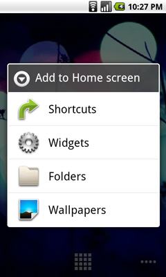 |
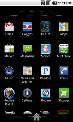
In Android it’s all a little less abstracted. Your home screens are like virtual desktops. True, you don’t run applications on them, but the widgets are similar enough. You create shortcuts to applications for easy access. If you want a list of all of the apps on your phone, just click the virtual button at the bottom of your home screen:
This is more of the traditional iPhone presentation, except instead of swiping to see more pages of apps you scroll down. As you scroll the vanishing list wraps around an imaginary cube to give the UI more depth.
|
Google Nexus One
|
Apple iPhone 3GS
|
 |
 |
The fundamental difference in approach to UI really shows how Google and Apple view the smartphone. Apple views it as a passive extension to the desktop/notebook. You use it when you want to make a call or quickly access a program or application. Your primary sources of information consumption are in other forms (e.g. desktop, notebook, tablet).
Google’s view is a bit more ambitious. Not having a desktop/notebook platform (yet) to rely on, Android’s role is understandably more pronounced. You get more customization and personalization options. The focus isn’t on simplicity, but rather customizable functionality. The sort of flexibility you’d expect out of a larger computing device, but on your smartphone. Again, it makes sense because Google doesn’t currently offer a larger computing device.
Those who cried foul when Apple tied everyone’s hands with the iPhone OS, those who listed everything that Windows Mobile could do that Apple couldn’t, if you are one of these people then Android is a far more natural fit. Those who wanted the focused simplicity the iPhone offered on the other hand, will probably feel a bit uncomfortable with Android.


95 Comments
View All Comments
coolVariable - Saturday, April 10, 2010 - link
Oh, STFU you fanboy.1. No calendar sync. Buggy Contact sync (e.g. contact pics, birthdays, ...). Buggy e-mail sync (just stops randomly). STFU since you have no clue what you are talking about.
3. A phone that can't even make calls. GREAT!!!! I don't fvcking care what the reason for the problem is. A $600 phone should be able to make a fvcking phone call!!!!!!
4. Love your little walled garden? Why don't you get an Apple phone if you are soooooo in love with a company locking down the functionality of your phone???????? Anand bad-mouthes Apple for its walled garden and ignores this "walled garden"???
5. Walled garden! Walled garden! Walled garden! Walled garden!
All of the above are pretty big problems with android per se and the Nexus One specifically!
It's pathetic that they weren't even mentioned during this review.
Not to mention the myriad of other (often cosmetic) problems and bugs with android (e.g. contact sort, etc).
And a tech-savy reviewer would have also mentioned the hypocrisy that you need to "jailbreak" android to do a lot of things. While that is fine, it pretty hypocritical that you can't "un-jailbreak" the Nexus One for a warranty exchange (something that is pretty easy to do with the iphone).
ruzveh - Sunday, April 11, 2010 - link
Anand nice article and m also looking fwd to buy one phone in near future from GoogleFrom my point of view is that 1GHz processor with 65nm is draining the battery life. Imagine if u insert 1GHz processor with 32nm (todays std) or even less will boost ur battery life almost double. I dont understand so called this chip company why not jumping onto 32nm bandwagon or to somewhat 25nm or even less?
i just feel these cos r wasting so called resources and time for money / profits. Dont they knw resources r limited and so purchasing power.
Thats secondary thing. Ohh what? r u thing i forgot to mention primary issue? lolz
Well its obvious.. Innovation in Battery power. What i hate in mobiles are speed and battery life for which i m ending up using my cell ph for only calls & ofcourse sms since past 8yrs 6630 and not willing to change untill they come up with good phones..
coming back to battery life i really dont understand why these cos r not doing something in batter life when there is lot of room for improvement in it like todays model feature only 1500mah battery power wheres a small pencil cell can go all the upto 3000mah or even more. We definitely want to see double the capacity then what they r featuring today.. Anand can u clear me on this prospect?
I am v much sure if v give proper attention in this area we can do wonders. Comon someone has to do something sooner or the later...
7.saturnine - Wednesday, April 14, 2010 - link
I don't understand the trend of putting as few physical buttons on a device as possible. How do you skip or pause music when the device is in your pocket? Pull it out, unlock the screen, find the music app & press the button? That is ridiculous.On my HTC Touch (WinMo6) it has hardly any buttons either, but at least one programmable physical button (that I have programmed to open the camera from any app I am in) & a directional pad/enter button. Sometimes I just like using the directional pad to go through menus & select something rather than moving my thumb all the way up the screen. Yes that sounds incredibly lazy, but aren't these devices all about ease of use, simplicity & speed? Programmable hardware buttons do just that. They are focusing too much on the aspect of a touch screen.
Affectionate-Bed-980 - Thursday, April 15, 2010 - link
This seems to be a forgotten thing. I spent 2 hrs playing around writing probably pages worth of notes just to test it out on Android.You say the iPhone lackED it? I have an iPod Touch 1G and I guess I'm used to multitouch by now, but how long did it take for Apple to add it? I notice how ridiculously fast I can type on it and not skip words/keys. On Android, it's a totally different thing.
A few tips from me as I've investigated this for a long time and I've made cries out on Android forums with very little sympathy:
1) HTC's IME keyboard that is modded on XDA is a LOT better. The developer tried to implement a little pseudo multitouch so it is more used to you pressing the next key before releasing the previous. This is a HUGE issue with the space bar and if you use the stock android keyboard, you're going to be skipping words like mad if you type too fast.
2) Smart Keyboard Pro has multitouch. It also features a debug mode that you can look at your touch points. It definitely picks up multitouch flawlessly. Is it as good as the iPhone keyboard? Somehow I was still typing faster on my iPod than on my Android phone with Smart Keyboard Pro.
However, with the mods the modders have made on the HTC IME Keyboard, I've decided to stick with it. It's getting better and it's handling multitouch somewhat even though it's not a true multitouch implementation.
But you're right. It's night and day without multitouch. For people who haven't used the iPhone enough, they fail to appreciate the keyboard. Most people just go "Oh I type fine on my Nexus One. I type pretty fast." Obviously you can't type THAT fast if it lacks multitouch. Maybe they should look at what "fast" means on the iPhone :D
rossmandor - Monday, August 30, 2021 - link
nice one