Dell 2407WFP and 3007WFP LCD Comparison
by Jarred Walton on March 2, 2007 11:30 AM EST- Posted in
- Displays
Color Accuracy
Something far more important than contrast ratio or brightness is the accuracy of the colors that are produced. A bright display with a high contrast ratio could still have terrible color reproduction, and it's not always possible to correct this. Most people will simply "eyeball" the display output to try and determine what looks best, and there are various color charts available online that can help. Outside of image professionals, that is often sufficient, and most users will find that their eyes adapt to whatever display they use and it is only when doing side-by-side comparisons that differences become apparent.
Monaco Optix XR Pro was used to generate reports of color accuracy, after performing initial calibration using the software. 24 color patches are sent to the display with the colorimeter measuring the resulting values. The difference between what is requested and what the LCD actually shows is known as Delta E, with lower values being better. Any score less than one is basically "perfect" - the naked eye is not going to be able to tell the difference - and scores less than 2.0 are very nearly perfect. Ideally, you would want all of the tested colors to have a Delta E of less than 1.0, but almost no one is likely to have problems with anything scoring below 2.0. From 2.0 to 4.0, most people still won't notice the slight inaccuracies in the color palette, but when comparing displays side by side it might be noticeable -- multimedia professionals would prefer something a bit better. Anything above 4.0 begins to represent a more significant deviance, and numerous scores above 6.0 will almost certainly be noticeable by just about anyone using the display.
The problem with calibrating a display is that it doesn't help all applications. Specifically, the video overlay used when watching DVDs or other movies completely bypasses any color correction, so you are essentially stuck with the uncalibrated colors. It is possible to tweak things slightly on some LCDs using the OSD, but the amount of color correction that can be done via the OSD pales in comparison to color profiles, and on models like the Dell 3007WFP there is no option to adjust colors outside of software. Ideally, we would like to see video drivers begin to apply color profiles to the overlay output as well, but we're not sure how much work that would require -- or if it's even possible.
We'll start with the uncalibrated results, as that is closer to what many people will experience. We should also note that color accuracy can vary from panel to panel even within the same model, so the results we are reporting are only from looking at a single LCD.
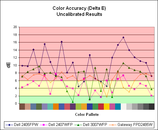
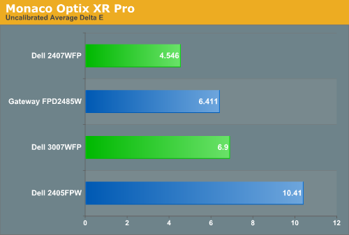
Without any form of color correction, the color accuracy of all of these displays is pretty poor. The good news is, for a lot of people it won't matter all that much. As we mentioned before, your eyes and brain tend to adapt to whatever you see, and for a lot of people they might notice a difference between displays but they would have difficulty quantifying one as substantially better. Subjectively, the only display out of these four that was discernibly worse was the old 2405FPW. While our instruments are able to measure extremely small Delta E differences, anything less than 3.0 is usually good and up to around 6.0 is "good enough".
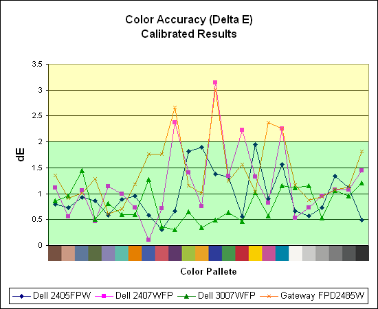
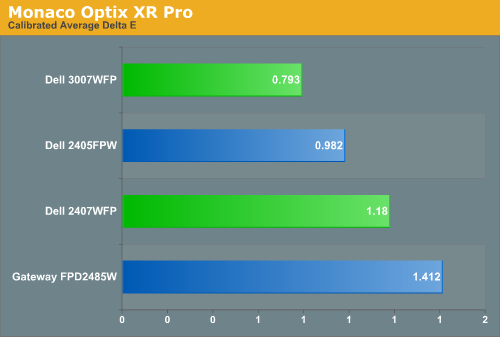
If the uncalibrated results are disconcerting, at least the good news is once you calibrate any of these displays you end up with very good results. Of the four displays we've looked at so far, the 3007WFP ends up having the best color accuracy. This could very well be attributed to the use of an S-IPS panel as opposed to the S-PVA panels used in the other three LCDs. Surprisingly, the 2405FPW still comes in second place once calibrated, although differences of a few tenths generally amount to splitting hairs. We should also note that the variation between calibration runs tends to be about 0.2, and over time you will need to adjust the color profile in order to maintain accurate colors. Basically, if having accurate colors is important to you, you will probably want to invest in some hardware to help out.
Update: Additional information on viewing angles and color calibration for print work with these displays is available in our Acer AL2216W review.
Something far more important than contrast ratio or brightness is the accuracy of the colors that are produced. A bright display with a high contrast ratio could still have terrible color reproduction, and it's not always possible to correct this. Most people will simply "eyeball" the display output to try and determine what looks best, and there are various color charts available online that can help. Outside of image professionals, that is often sufficient, and most users will find that their eyes adapt to whatever display they use and it is only when doing side-by-side comparisons that differences become apparent.
Monaco Optix XR Pro was used to generate reports of color accuracy, after performing initial calibration using the software. 24 color patches are sent to the display with the colorimeter measuring the resulting values. The difference between what is requested and what the LCD actually shows is known as Delta E, with lower values being better. Any score less than one is basically "perfect" - the naked eye is not going to be able to tell the difference - and scores less than 2.0 are very nearly perfect. Ideally, you would want all of the tested colors to have a Delta E of less than 1.0, but almost no one is likely to have problems with anything scoring below 2.0. From 2.0 to 4.0, most people still won't notice the slight inaccuracies in the color palette, but when comparing displays side by side it might be noticeable -- multimedia professionals would prefer something a bit better. Anything above 4.0 begins to represent a more significant deviance, and numerous scores above 6.0 will almost certainly be noticeable by just about anyone using the display.
The problem with calibrating a display is that it doesn't help all applications. Specifically, the video overlay used when watching DVDs or other movies completely bypasses any color correction, so you are essentially stuck with the uncalibrated colors. It is possible to tweak things slightly on some LCDs using the OSD, but the amount of color correction that can be done via the OSD pales in comparison to color profiles, and on models like the Dell 3007WFP there is no option to adjust colors outside of software. Ideally, we would like to see video drivers begin to apply color profiles to the overlay output as well, but we're not sure how much work that would require -- or if it's even possible.
We'll start with the uncalibrated results, as that is closer to what many people will experience. We should also note that color accuracy can vary from panel to panel even within the same model, so the results we are reporting are only from looking at a single LCD.
Without any form of color correction, the color accuracy of all of these displays is pretty poor. The good news is, for a lot of people it won't matter all that much. As we mentioned before, your eyes and brain tend to adapt to whatever you see, and for a lot of people they might notice a difference between displays but they would have difficulty quantifying one as substantially better. Subjectively, the only display out of these four that was discernibly worse was the old 2405FPW. While our instruments are able to measure extremely small Delta E differences, anything less than 3.0 is usually good and up to around 6.0 is "good enough".
If the uncalibrated results are disconcerting, at least the good news is once you calibrate any of these displays you end up with very good results. Of the four displays we've looked at so far, the 3007WFP ends up having the best color accuracy. This could very well be attributed to the use of an S-IPS panel as opposed to the S-PVA panels used in the other three LCDs. Surprisingly, the 2405FPW still comes in second place once calibrated, although differences of a few tenths generally amount to splitting hairs. We should also note that the variation between calibration runs tends to be about 0.2, and over time you will need to adjust the color profile in order to maintain accurate colors. Basically, if having accurate colors is important to you, you will probably want to invest in some hardware to help out.
Update: Additional information on viewing angles and color calibration for print work with these displays is available in our Acer AL2216W review.


62 Comments
View All Comments
mongo lloyd - Saturday, March 3, 2007 - link
As for the .303mm pixel pitch, keep in mind that a 19" 4:3 1280x1024 screen that I would wager is the most common LCD in use right now is like .295mm and I never heard anyone complaining about the 19" displays...Well, you've heard one now. Out of ALL LCDs (minus the IBM T221, since that one is... a bit... special), the only panels I could ever begin to consider (and that's ignoring all the other faults with LCDs -- CRTs still beat them, and probably always will, if you ask me (at least as long as they use DVI with crappy refresh)) are the 30" 2560x1600 and 20.1" 1600x1200 monitors. I consider 1600x1200 on a good 19" CRT to be the optimal resolution, and the dot pitch on pretty much all LCDs are pitiful in comparison -- and the dot pitch is even more important on LCDs since the pixels are square and thus very sharp.
Also, you probably meant 5:4, not 4:3.
exdeath - Monday, March 5, 2007 - link
I love my F500R 21" .22mm AGP @ 1600x1200 CRT.But when it dies... there is no getting a replacement.
I have dual 1905FP Dell 19" LCDs at work, 1280x1024 5:4 .295 pitch and its quite sharp. They seem to be the standard by which I judge other LCDs by since that is what I am used to staring at all day. The higher pitch doesn't bother me at all.
In fact, being a graphics programmer and having a close up eye for pixel perfect detail, I tend to prefer images with sharp square pixels.
kmmatney - Saturday, March 3, 2007 - link
They do make laptop screens that are 15.4" and 1920 x 1200 resolution, which is a pretty amazing pixel pitch. So LCD dektop monitors are easily capable of better pixel pitch, there must just not be a market for them yet.Everytime I try 1600 x 1200 on a 19" CRT, it looks like crap, and I;'ve tried quite a few CRTs.
JarredWalton - Saturday, March 3, 2007 - link
Funny thing is, I go the other way. Laptop LCDs tend to have text that gets a bit difficult for me to read now. Oh, I can do it, but even 17" 1920x1200 displays are a bit tiny text/icons. I don't think I'd like a 15.4" 19x12 LCD. To each their own, of course.As for the rest, I fully agree that 1600x1200 on a 19" CRT looks pretty lousy - too small again, and I *love* the perfectly square pixels of LCDs. 20" (viewable) CRTs are required for proper 16x12 resolution, in my opinion. Refresh rates are definitely the one issue I have with LCDs - running CRTs at 100 Hz made it so I wouldn't notice shearing due to vsync, and you can't do that with LCDs. To counter that, though, all the pincushion, stretch, rotate, etc. necessary to get a CRT to properly fill the screen always irritated me. Heck, I'd even take an analog connection LCD over CRTs!
exdeath - Friday, March 2, 2007 - link
"Its a 27" compromise between the wider range of capabilities of the 30" and the smaller size of the 24" "Oops that should have been "limited range of capabilities of the 30"
JarredWalton - Friday, March 2, 2007 - link
I haven't used a 2707WFP yet, but I will see if I can get one sent for review.Take care,
Jarred Walton
Editor
AnandTech.com
lash - Friday, March 2, 2007 - link
First of all, thank you for the review. Does anyone know if this monitor suffer from input lag, like most of the 24" models ? Would it be hard to include a input lag test of the monitors reviewed ? Personally I think of it as a big problem when playing fps or online.Resh - Friday, March 2, 2007 - link
Thanks for the review, particularly the section on colour accuracy where you use objective measurement in the form of a colorimeter. Thanks!However, I note that I can't find the calibration targets you used. For example, when I calibrate my display, I'm targetting about 80 - 120 cd/m2 (depends on display type; brighter for LCD) for brightness, gamma 2.2, and a colour temp of 6500K or D65. This is important as it affects, particularly on LCDs, the display's ability to render colour accurately. For example, my Dell 2407FPW can perform with the level of accuracy that the review describes, but only when its brightness is allow to rise close to 300 cd/m2. While this is great for colour accuracy, it isn't very good for screen to print matching as the screen is far too bright for the print to match. Also, that kind of brightness is retina-searing!
In my case, my HP CRT is capable of astonishing accuracy at 80 cd/m2 -- the brightest it can go. If I screen match and make the drop the 2407FPW to that level, suddenly it isn't so accurate -- acceptable, but no match for the HP.
So it would be great if you could calibrate and profile to targets that are relevant for photographers and also make your targets known. Failing that, at least let us know what your targets were and how the eventual profile compared. For example, I asked ColorEyes Display to target 80 cd/m2 on my 2407FPW and the eventual result was 74 cd/m2.
Thanks!
JarredWalton - Friday, March 2, 2007 - link
I used the default (6500K 2.2 gamma), but I'll have to check on the white point value. Obviously, post-calibration it was still very bright (see page 6), so I may need to run calibrations for a lower white point. The Dell's can manage that, but the Gateway is sort of up a creek, since it couldn't get lower than 356 cd/m2 by adjusting the brightness. With contrast set lower, it might be able to get below 200 cd/m2, but probably not while providing any reasonable amount of accuracy. Sorry to say that I don't do anything with print, so that aspect of testing just didn't occur to me.strikeback03 - Monday, March 5, 2007 - link
I bought the Gateway over the weekend. It can go much lower than 356 cd/m^2 if you go to User color and lower the color channels all by the same amount. They ship set to 100, I lowered them all to 60 or so, which allowed me to set brightness to 120cd/m^2.I have some interesting calibration results, I'll post them in the Gateway comments when I get home from work.