Gateway FPD2485W: 24" LCD Beauty or Beast?
by Jarred Walton on February 22, 2007 10:00 AM EST- Posted in
- Displays
Color Accuracy
Something far more important than contrast ratio or brightness is the accuracy of the colors that are produced. A bright display with a high contrast ratio could still have terrible color reproduction, and it's not always possible to correct this. Most people will simply "eyeball" the display output to try and determine what looks best, and there are various color charts available online that can help. Outside of image professionals, that is often sufficient, and most users will find that their eyes adapt to whatever display they use and it is only when doing side-by-side comparisons that differences become apparent.
Monaco Optix XR Pro was used to generate reports of color accuracy. 24 color patches are sent to the display with the colorimeter measuring the resulting values. The difference between what is requested and what the LCD actually shows is known as Delta E, with lower values being better. Any score less than one is basically "perfect" - the naked eye is not going to be able to tell the difference - and scores less than 2.0 are very good. Ideally, you would want all of the tested colors to have a Delta E of less than 1.0, but few people are likely to have problems with anything scoring below 2.0. From 2.0 to 4.0, most people will be able to detect a slight inaccuracy in the color palette when comparing displays side by side, but it's not too irritating. Anything above 4.0 begins to represent a more significant deviance, and numerous scores above 4.0 will almost certainly be noticeable by just about anyone using the display.
The Gateway FPD2485W includes EZTune software to help users calibrate their displays, although this will at best provide moderately accurate results. We started out with the EZTune software, checked the results, and then proceeded to use the Monaco Optix software to calibrate the display. Unless you have a colorimeter and the necessary software, you can expect your results to be closer to the EZTune values, but outside of image/video editing that is often sufficient.
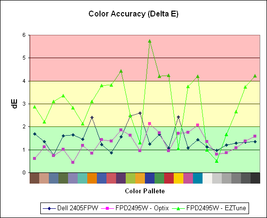
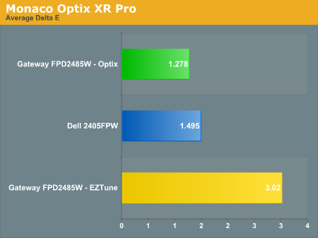
Both displays perform very well when calibrated by Monaco Optix, but not surprisingly the out of box experience from the Gateway isn't nearly as accurate. Uncalibrated results for the 2405FPW were not recorded because it is only intended as a baseline measurement and is not being reviewed. The Dell 2405FPW is about two years old now, but it still performs about the same as the newer 2407WFP and the Gateway FPD2485W when it comes to reproducing accurate colors. We will be taking a closer look at the 2407WFP in the near future, but outside of the most demanding users any of these three displays will work very well. That's not too surprising, considering all three of them are based off of PVA panels.
The second aspect of color accuracy that we need to address is the color depth. The FPD2485W can produce a resulting color pretty close to the requested value, but how does it do in terms of gradient scales? This was something we neglected initially, and after further investigation there is definitely a lot of banding when viewing gradient scales, to the point that we would almost question whether or not this is a true 8-bit panel or if it's really a 6-bit panel. Attempts to capture the results of the banding with a camera have been unsuccessful so far, but needless to say the Dell 2405FPW shows less banding while the 2407WFP doesn't show any noticeable banding. In normal use, the banding usually isn't a serious problem, but graphics editors are likely to notice the effect. Any gradients created in Photoshop or other similar programs have definite problems in regards to producing a smooth color scale on the FPD2485W, and for some people that is a big enough concern that they will want to look elsewhere.
Note: Our review sample is from the first run of these LCDs and was manufactured in November 2006. Later models have apparently improved on some aspects of the display, but unfortunately we can't say whether the color gradients have gotten any better. Again, if colors are important to you, try to check out a display in person and bring up some gradient images to see whether or not you notice any issues.
Update: Additional information on viewing angles and color calibration for print work with these displays is available in our Acer AL2216W review.
Something far more important than contrast ratio or brightness is the accuracy of the colors that are produced. A bright display with a high contrast ratio could still have terrible color reproduction, and it's not always possible to correct this. Most people will simply "eyeball" the display output to try and determine what looks best, and there are various color charts available online that can help. Outside of image professionals, that is often sufficient, and most users will find that their eyes adapt to whatever display they use and it is only when doing side-by-side comparisons that differences become apparent.
Monaco Optix XR Pro was used to generate reports of color accuracy. 24 color patches are sent to the display with the colorimeter measuring the resulting values. The difference between what is requested and what the LCD actually shows is known as Delta E, with lower values being better. Any score less than one is basically "perfect" - the naked eye is not going to be able to tell the difference - and scores less than 2.0 are very good. Ideally, you would want all of the tested colors to have a Delta E of less than 1.0, but few people are likely to have problems with anything scoring below 2.0. From 2.0 to 4.0, most people will be able to detect a slight inaccuracy in the color palette when comparing displays side by side, but it's not too irritating. Anything above 4.0 begins to represent a more significant deviance, and numerous scores above 4.0 will almost certainly be noticeable by just about anyone using the display.
The Gateway FPD2485W includes EZTune software to help users calibrate their displays, although this will at best provide moderately accurate results. We started out with the EZTune software, checked the results, and then proceeded to use the Monaco Optix software to calibrate the display. Unless you have a colorimeter and the necessary software, you can expect your results to be closer to the EZTune values, but outside of image/video editing that is often sufficient.
Both displays perform very well when calibrated by Monaco Optix, but not surprisingly the out of box experience from the Gateway isn't nearly as accurate. Uncalibrated results for the 2405FPW were not recorded because it is only intended as a baseline measurement and is not being reviewed. The Dell 2405FPW is about two years old now, but it still performs about the same as the newer 2407WFP and the Gateway FPD2485W when it comes to reproducing accurate colors. We will be taking a closer look at the 2407WFP in the near future, but outside of the most demanding users any of these three displays will work very well. That's not too surprising, considering all three of them are based off of PVA panels.
The second aspect of color accuracy that we need to address is the color depth. The FPD2485W can produce a resulting color pretty close to the requested value, but how does it do in terms of gradient scales? This was something we neglected initially, and after further investigation there is definitely a lot of banding when viewing gradient scales, to the point that we would almost question whether or not this is a true 8-bit panel or if it's really a 6-bit panel. Attempts to capture the results of the banding with a camera have been unsuccessful so far, but needless to say the Dell 2405FPW shows less banding while the 2407WFP doesn't show any noticeable banding. In normal use, the banding usually isn't a serious problem, but graphics editors are likely to notice the effect. Any gradients created in Photoshop or other similar programs have definite problems in regards to producing a smooth color scale on the FPD2485W, and for some people that is a big enough concern that they will want to look elsewhere.
Note: Our review sample is from the first run of these LCDs and was manufactured in November 2006. Later models have apparently improved on some aspects of the display, but unfortunately we can't say whether the color gradients have gotten any better. Again, if colors are important to you, try to check out a display in person and bring up some gradient images to see whether or not you notice any issues.
Update: Additional information on viewing angles and color calibration for print work with these displays is available in our Acer AL2216W review.


77 Comments
View All Comments
Aquila76 - Thursday, February 22, 2007 - link
Chizow,Did you run the gradient test from xtknight's website (linked above)? I'm curious to see how yours fares. I handpicked a Dec '06 model from Best Buy, but it still borked that thing badly no matter what bright/cont/R/G/B etc. I had it set to. I got most of my settings from the thread over at , but none seemed to eliminate the transition issues / color accuracy for me. :(
chizow - Thursday, February 22, 2007 - link
Ok, I applied the color profile Jarred provided (thanks again!) and colors do look much better, a lot more like the 2407WFP out of the box. Ran the gradient tests in full and windowed mode. In windowed, there is no significant banding or gradients although there is some faint gradient lines and banding on the straight color strips at the transition between the corresponding 1st and 2nd blocks. Seem to be uniform vertically through the pattern although they're unnoticeable on the magenta strips.In full screen mode, the banding is more obvious but again, its limited to the lower dark areas and don't extend past the 3rd block. After the 3rd block, the transitions are flawless. I wish I ran these before I calibrated the settings to see if its my panel or the calibrated settings.
Unfortunately, it looks like these settings will only apply under WinXP.
Jarred did you change the OSD/EzTune settings at all? Also, if you're really bored, would you mind calibrating the panel using EzTune or the OSD? Lol, well was worth a shot at least. Thanks again for the help and review.
Aquila76 - Thursday, February 22, 2007 - link
Heh, somehow clipped the last phrase off....from the thread over at HardForums.
Aquila76 - Thursday, February 22, 2007 - link
WTF? I used a BRACKET H BRACKET and it hides the text?
Aquila76 - Thursday, February 22, 2007 - link
Sorry for all the quotes of myself.The first one should have ended with:
...the thread over at HardForums.
chizow - Thursday, February 22, 2007 - link
I haven't run any extensive tests, but I'll check out Xtknights later when I get home. The few tests I have run were just html-based static images, and I can honestly say I saw very little gradient issues on the 2 panels I had (DEC annd current JAN). Banding was another issue though and pretty severe depending on content, source resolution/quality, and colors etc. I'll have to look over the definitions to make sure they're not mutually exclusive, so I'll have to get back to you on that one.JarredWalton - Thursday, February 22, 2007 - link
Beware the open-bracket H close-bracket abbreviation used for a certain other site! :DWe use brackets for our pseudo-HTML, and that one just happens to correspond to turning on white text. It comes up now and then, but thankfully you figured it out before the thread was very long. LOL We had a thread a year or two back where about 20 people responded trying to figure out WTF happened to the text. I think a guy had posted a comment where he used {H} five or ten times, which only served to make things more difficult to "fix".
Aquila76 - Thursday, February 22, 2007 - link
Eeks. I'll have to keep that in mind! Another cool test on xtknight's site (www.lcdresource.com) is a Dark Grayscale test. It's in the same section as the gradient. Mine just showed all black unless I cranked the brightness up to eyeball-melting. Granted, this is difficult for any LCD to display properly due to the issue of backlighting.I think what really pushed me over the edge on this monitor is that the last few bands of the grayscale showed up on my HP L1706 at work and the gradient shows flawlessly on it. A ~$700 display beaten handily by a ~$150 display hurt much more than my wallet. That was the final deciding factor on my returning the Gateway. I don't know how they managed to screw up this panel so badly. AFAIK, the Dell and Samsung 24" (same panels) had this resolved before the Gateway was released.
JarredWalton - Thursday, February 22, 2007 - link
I believe my sample is an earlier run from around November, but I didn't notice any issues with PSU buzzing. Could be that the color banding was a result of the early run - I don't know for sure. As for settings, I set contrast to 60% and ended up with brightness at 61%. The color profile will of course vary somewhat from panel to panel, so I'm not sure how helpful providing my particular profile will be, but if you want to give it a look, here you go:http://images.anandtech.com/reviews/monitor/2007/g...">FPD2485W Calibrated Profile
Caveat Emptor! :)
chizow - Thursday, February 22, 2007 - link
Wow that was fast! thanks :) A lot of 2485W owners will be happy. I think a lot of people got the brightness/contrast settings similar to yours, but color accuracy is a whole different monster, like whack-a-mole almost. Solve one color problem only to make one much worst. For me, its like tuning a guitar. I know what doesn't sound right, I just don't know how to fix it. :) That profile should help a ton though, thanks again!