A Month with a Mac - Part II: The Mobile Experience
by Anand Lal Shimpi on January 24, 2005 12:01 AM EST- Posted in
- Mac
OS X: The Second Time Around
Immediately after I was dropped into OS X, there were a few things that I definitely noticed were off. This time around, I didn't mind that the desktop icons were large, but I did realize that the dock was far too big and it was not animated. Quickly resizing the dock and turning on its hover animation fixed my issues there.Having used the G5 for quite a while, I was also much more comfortable in customizing the applications listed on the Dock. With the G5, I had no idea what I'd be using or even if I'd find the Dock useful, so I was more hesitant to remove applications from it. With the PowerBook, I knew exactly what I needed and in what order I wanted to place them. The Dock became infinitely more useful the second time around.
Similarly, I also knew what applications to remove from the system now that I knew from which ones I benefitted and which ones I could do without. These last two changes helped a lot considering that I had far more limited screen real estate on the PowerBook than on the G5, meaning that the fewer things I had to scroll through or contend with for screen space, the more productive I could be.
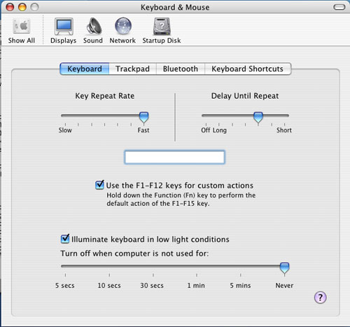
The mouse tracking speed needed some work as well as it was far too slow to begin with. Unfortunately, unlike on the G5 desktop, I had no option, but to use a one-button mouse with the Powerbook. This was going to be interesting.
The keyboard repeat rate was far too slow for my liking - the same problem I had on the G5. Again, tweaking it wasn't a problem, but it's a healthy reminder that you shouldn't accept anything at face value. If Apple hadn't given me the options to personalize OS X, then I wouldn't be here writing this article; yet despite common belief, Apple doesn't seem to just cater to the lowest common denominator of computer users.
The biggest annoyance to me was the fact that function-lock was turned on by default, meaning that the keyboard acted as if I always had the "fn" key depressed. The reason this was an issue for me is because of Exposé. I am used to having the F9 - F11 keys activate Exposé, but on the PowerBook, only F11 doesn't have a secondary fn-activated function. So F9 and F10 wouldn't, by default, be Exposé activators - they would simply adjust the brightness of the keyboard illumination. Luckily, it wasn't too hard to change. Just launch System Preferences (the equivalent of Windows' Control Panel) and uncheck the appropriate box.
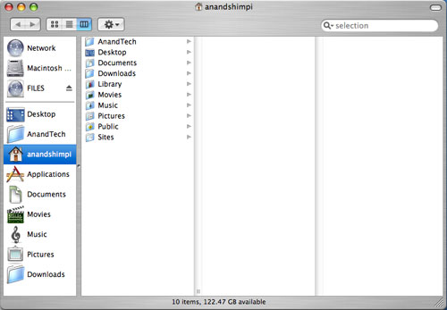
Finder (the OS X equivalent of Windows Explorer) offers three ways of viewing your files and folders: the standard icon view, list view (similar to the details view in Windows) and column view. When I first started using OS X, everyone heralded the column view as this wonderfully useful feature. I tried it out, hated it and never touched it again. With the PowerBook and my more limited screen real estate, I gave it a try. Surprisingly enough, open mindedness pays off - I actually ended up liking the column view quite a bit.
What is the column view? First, a screenshot:
All of your items are organized in a list. Everytime you hit a folder, clicking on it or hitting the right arrow key will show its contents in the column to the right of the present column. Opening nested folders displays their contents in the column to the right of the previous column until you run out of space for columns, at which point the Finder window activates a horizontal scroll bar and now you can scroll left to see folders higher up in the hierarchy.
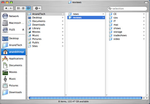
Like all things Mac, column view is something that needs to be used to be appreciated. It's great for folder navigation, especially using the keyboard (remember my appreciation for keyboard shortcuts in OS X?), since all it takes are the left and right arrow keys to navigate up or down a folder tree.
|
| Here's a Quicktime video of column view in action - right click and save the movie to your computer. Quicktime for the Mac isn't the abomination of an application; it is on the PC, just in case you were wondering. The application that I used to make these videos by default outputs in Quicktime mov format. |
I mentioned that the OS X folder structure was foreign to me in my first encounter with it on the G5. Now that I've been using it for a while, everything feels a whole lot more natural. The trick to keeping organized in OS X (sounds like a good book title) is to actually make use of each user's home directory. Although Microsoft tried to encourage users to put things into their own home directories with later versions of Windows, I inevitably always created new folders on my drive outside my home directory all the time. With OS X however, everything revolves around your home directory and you rarely touch the root of your drive. I found that doing two things in OS X really helped me feel more comfortable with the file system: 1) Creating a downloads directory and telling Safari to put all my downloads there instead of on the desktop, and 2) Creating all of my custom directories in my home directory instead of in the root of the drive.
The results of my two simple changes were as follows:
For starters, my desktop finally became clean. Everything downloads itself nicely into the downloads directory, and I purge it every so often to keep things running smoothly. The nice thing about OS X is that once I tell Safari to save all my downloads in the downloads directory, other applications also know to use that directory in which to save items. For example, when saving attachments in Mail (OS X's email client), I have the option of saving directly to my Downloads directory - which is the same directory I set in Safari. It's nothing major, but as I pointed out in the first article, it's the hundreds of simple things in OS X that really seal the deal - it's about things working the way that you'd want them to work.
Also by organizing my disk with my home directory as my "root", it's a lot easier to know where everything is. Before, I was using a hybrid of keeping items in the root and in my home directory, which was just a mess.
At first glance, all that I've talked about here may seem trivial because after all, the type of organization that I'm discussing isn't exclusive to OS X; you can do the same basic things in Windows. The difference, I believe, comes down to how applications are handled. In Windows, as a user, you know that all applications go in C:\Program Files, whereas in OS X, you know that all applications go in the Applications Folder. Sure, the Applications Folder is nothing more than the equivalent of C:\Applications, but to the end user, there is a slight level of separation between the drive's root and the user. This is mostly useful from the standpoint of a multi-user system where you don't want any of your users tampering with anything other than what's in their home directory. Understanding the organization helped me and my single user system in that it kept me from staring at the contents of my root and not knowing what everything under /System/Library/ was. Over time, I'm learning about the OS' important files, where they are located, and so on and so forth, but until I'm as comfortable with them as I am under Windows, I appreciate the motherly shield of the home user directory. If you're a fan of *nix file systems, OS X will make you feel right at home.


60 Comments
View All Comments
jsares - Tuesday, January 25, 2005 - link
Here's what I wrote on my blog:http://macmini.blogspot.com
Anand Lal Shimpi of AnandTech has a great second article about his experiences with switching to the Mac.
If you could say he liked the Mac in his first article you could say he loves the Mac in this article.
Some great quotes and my comments in italics:
"It took a lot of convincing (as well as some executive privilege) for the establishment of the Mac section, and then came the ... article "
Some of Anand staff didn't want him to write about the Mac.
"Within the first three days of publication, that little Mac article skyrocketed to becoming one of the all-time most popular articles ever published on AnandTech."
Windows enthusiasts are dying for something new.
"One problem with these types of articles is that they inevitably take much longer to put together, simply because there are no structured tests to run and analyze."
That's why this article is so good."
"At the end of the first Mac article, I came to the realization that what attracted me most to OS X was the way everything just worked the way that you'd expect it to."
Welcome to the Mac, Anand.
I don't want to give away too much so go read the article and give the guy some credit in the comments section and send him some nice emails.
Great article Anand!
CrankyTodd - Tuesday, January 25, 2005 - link
Hi Anand,Regarding Expose, especially on a laptop, you'll find yourself enjoying Expose MUCH, MUCH more if you dont use the function keys to launch it.
Under System Preferences, choose Expose, and use "Active Screen Corners" to activate Expose functions. I was reluctant to try it at first, but I was hooked within minutes, and cant imagine going back. I Set the lower left corner of the desktop to activate the "Application Windows" function, and the upper right corner of the desktop to activate the "All Windows" function. So as I'm using my Mac, as soon as I want to switch applications or windows within the current application, I just throw my mouse into one corner or the other, instead of having to actually go hit a button to activate either function. Once you try it, you'll see that its an incredible seamless way of navigating the system.
ugly - Tuesday, January 25, 2005 - link
"OS X Tiger...as well as the fact that in Tiger, every single pixel on the screen will ac-tually be rendered by the graphics card."
I thought some image "things" (I couldn't come up with a better word for what was in the core image demo) could be offloaded to the graphics card, but this statement makes it sound as if Tiger will be Quartz Extreme like it should have been.
Dualboy24 - Tuesday, January 25, 2005 - link
I loved the article. I was waiting for a new Mac read at anandtech. It seems like ages since the first one... I recently made a jump to a Mac Powerbook 17" a few months before the first article. The funny thing is I build/sell PCs on the side... but my main system is now the mac and of course I have 5 PCs running every MS-Linux but I must say that the Mac OS is the most advanced OS in terms of interface and it seems multitasking. Expose is a wonderful feature (I use an MX500 mouse with the exposes features mapped)Oh. Also you shouldn't forget the system wide spell checker. Such common sense I wonder if MS does not include this in windows in order to push some of their other products?
Anyway looking forward to the Mac mini review I am probably going to get one for the low noise and power factor.
miniMUNCH - Monday, January 24, 2005 - link
I 2nd the 5400 rpm HD for an extra $45...well worth it. Or you can upgrade the HD yourself or have MAc Shop throw in a 7200rpm HD, but for me the 5400 rpm HD is plenty.wilburpan - Monday, January 24, 2005 - link
Oops. What I meant to say was:Being a user of OS X, Linux, and Windows, I would say that the often cited lack of a two button mouse in OS X is not so much a flaw as it is a preference. Personally, I can move from the one button mouse in OS X to the two button mice of Linux and Windows and back again without much trouble. To complicate things further, two button mouse behavior is different in Windows and Linux. One can get right-click type behavior in many OS X applications by control-clicking the mouse, which does not seem to slow me at all compared to right-clicking.
Until someone can produce data or a usability study that shows that, say, editing an image in Photoshop is slower using a one button mouse than a two button mouse, this is all a matter of what one is used to. You might as well criticize a scroll mouse for the tendency for middle clicks to be interpreted as scrolling commands, or harp on the inconsistencies of menu shortcuts and menu item locations (e.g. does Preferences belong under Edit or Tools?) between applications.
pkthoo - Monday, January 24, 2005 - link
Great article!I consider myself as a neutral. This article sheds light on what I have been looking for; user experiences on using Mac.
Now, I am certain that I am going to be Mac+iPod user, hopefully by year's end.
Apple should make 512MB as minimum RAM amount, and bundle Mac mini with iPod Shuffle as a new 'wholesome' package.
wilburpan - Monday, January 24, 2005 - link
Snoozy - Monday, January 24, 2005 - link
I still think you are missing out on the complete mac experience by not using a launcher application.I run Butler (http://www.petermaurer.de/nasi.php?thema=butler&am... but there are many more: LaunchBar (http://www.obdev.at/products/launchbar/index.html)... QS as mentioned earlier, just do a search on versiontracker.com.
What these applications enable you to do is virtualy elimate the need for CMD+tab switching, using the dock, or using the Applications folder to launch things. Basically press CMD + Space (as I have it setup, you can go with whatever key combo you want!) and then type what you want - you can even teach them anacronyms for commonly used applications. For example if I do CMD+Space then type PS and hit enter it opens photoshop, or switches to it if its already open. The applications are infinitely configurable, I've got a shortcut for blog which runs an apple script that then pops open MarsEdit and opens a new post window for my blog (which is WordPress powered, MarsEdit contacts it via XML-RPC). Butler also has a built in dictonary, and multiple other widgets. Check it out.
I 2nd the suggestion on using sidetrack. I bought my PB (1st mac) in march last year and this was one of the first things that I had to have - makes it so much nicer.
hopejr - Monday, January 24, 2005 - link
#23, On OS X there is the Zoom thing in the Universal Access Pref panel, that allows everything on the screen to be zoomed at what ever zoom level is necessary. You can set it to follow the mouse, or keyboard focus. It's a nice feature. There's other good features in OS X that help with those who can't see too well.#28, I just tried that and you're right, it does (I tried in 2k3). Oh well, I use OS X more so it's more important to me there :P (although it's nice to know it works in Windows too, for the times I use it)