A Month with a Mac - Part II: The Mobile Experience
by Anand Lal Shimpi on January 24, 2005 12:01 AM EST- Posted in
- Mac
OS X: The Second Time Around
Immediately after I was dropped into OS X, there were a few things that I definitely noticed were off. This time around, I didn't mind that the desktop icons were large, but I did realize that the dock was far too big and it was not animated. Quickly resizing the dock and turning on its hover animation fixed my issues there.Having used the G5 for quite a while, I was also much more comfortable in customizing the applications listed on the Dock. With the G5, I had no idea what I'd be using or even if I'd find the Dock useful, so I was more hesitant to remove applications from it. With the PowerBook, I knew exactly what I needed and in what order I wanted to place them. The Dock became infinitely more useful the second time around.
Similarly, I also knew what applications to remove from the system now that I knew from which ones I benefitted and which ones I could do without. These last two changes helped a lot considering that I had far more limited screen real estate on the PowerBook than on the G5, meaning that the fewer things I had to scroll through or contend with for screen space, the more productive I could be.
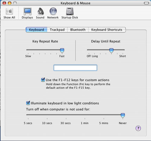
The mouse tracking speed needed some work as well as it was far too slow to begin with. Unfortunately, unlike on the G5 desktop, I had no option, but to use a one-button mouse with the Powerbook. This was going to be interesting.
The keyboard repeat rate was far too slow for my liking - the same problem I had on the G5. Again, tweaking it wasn't a problem, but it's a healthy reminder that you shouldn't accept anything at face value. If Apple hadn't given me the options to personalize OS X, then I wouldn't be here writing this article; yet despite common belief, Apple doesn't seem to just cater to the lowest common denominator of computer users.
The biggest annoyance to me was the fact that function-lock was turned on by default, meaning that the keyboard acted as if I always had the "fn" key depressed. The reason this was an issue for me is because of Exposé. I am used to having the F9 - F11 keys activate Exposé, but on the PowerBook, only F11 doesn't have a secondary fn-activated function. So F9 and F10 wouldn't, by default, be Exposé activators - they would simply adjust the brightness of the keyboard illumination. Luckily, it wasn't too hard to change. Just launch System Preferences (the equivalent of Windows' Control Panel) and uncheck the appropriate box.
Finder (the OS X equivalent of Windows Explorer) offers three ways of viewing your files and folders: the standard icon view, list view (similar to the details view in Windows) and column view. When I first started using OS X, everyone heralded the column view as this wonderfully useful feature. I tried it out, hated it and never touched it again. With the PowerBook and my more limited screen real estate, I gave it a try. Surprisingly enough, open mindedness pays off - I actually ended up liking the column view quite a bit.
What is the column view? First, a screenshot:
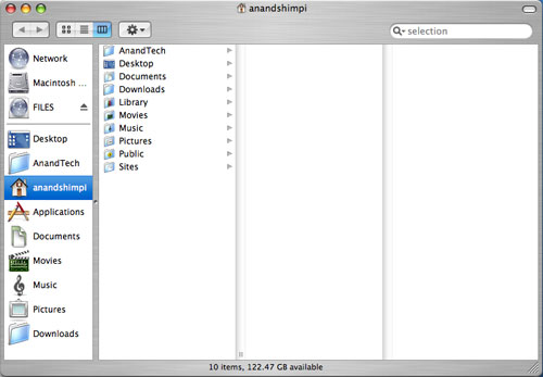
All of your items are organized in a list. Everytime you hit a folder, clicking on it or hitting the right arrow key will show its contents in the column to the right of the present column. Opening nested folders displays their contents in the column to the right of the previous column until you run out of space for columns, at which point the Finder window activates a horizontal scroll bar and now you can scroll left to see folders higher up in the hierarchy.
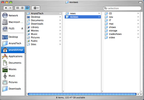
Like all things Mac, column view is something that needs to be used to be appreciated. It's great for folder navigation, especially using the keyboard (remember my appreciation for keyboard shortcuts in OS X?), since all it takes are the left and right arrow keys to navigate up or down a folder tree.
|
| Here's a Quicktime video of column view in action - right click and save the movie to your computer. Quicktime for the Mac isn't the abomination of an application; it is on the PC, just in case you were wondering. The application that I used to make these videos by default outputs in Quicktime mov format. |
I mentioned that the OS X folder structure was foreign to me in my first encounter with it on the G5. Now that I've been using it for a while, everything feels a whole lot more natural. The trick to keeping organized in OS X (sounds like a good book title) is to actually make use of each user's home directory. Although Microsoft tried to encourage users to put things into their own home directories with later versions of Windows, I inevitably always created new folders on my drive outside my home directory all the time. With OS X however, everything revolves around your home directory and you rarely touch the root of your drive. I found that doing two things in OS X really helped me feel more comfortable with the file system: 1) Creating a downloads directory and telling Safari to put all my downloads there instead of on the desktop, and 2) Creating all of my custom directories in my home directory instead of in the root of the drive.
The results of my two simple changes were as follows:
For starters, my desktop finally became clean. Everything downloads itself nicely into the downloads directory, and I purge it every so often to keep things running smoothly. The nice thing about OS X is that once I tell Safari to save all my downloads in the downloads directory, other applications also know to use that directory in which to save items. For example, when saving attachments in Mail (OS X's email client), I have the option of saving directly to my Downloads directory - which is the same directory I set in Safari. It's nothing major, but as I pointed out in the first article, it's the hundreds of simple things in OS X that really seal the deal - it's about things working the way that you'd want them to work.
Also by organizing my disk with my home directory as my "root", it's a lot easier to know where everything is. Before, I was using a hybrid of keeping items in the root and in my home directory, which was just a mess.
At first glance, all that I've talked about here may seem trivial because after all, the type of organization that I'm discussing isn't exclusive to OS X; you can do the same basic things in Windows. The difference, I believe, comes down to how applications are handled. In Windows, as a user, you know that all applications go in C:\Program Files, whereas in OS X, you know that all applications go in the Applications Folder. Sure, the Applications Folder is nothing more than the equivalent of C:\Applications, but to the end user, there is a slight level of separation between the drive's root and the user. This is mostly useful from the standpoint of a multi-user system where you don't want any of your users tampering with anything other than what's in their home directory. Understanding the organization helped me and my single user system in that it kept me from staring at the contents of my root and not knowing what everything under /System/Library/ was. Over time, I'm learning about the OS' important files, where they are located, and so on and so forth, but until I'm as comfortable with them as I am under Windows, I appreciate the motherly shield of the home user directory. If you're a fan of *nix file systems, OS X will make you feel right at home.


60 Comments
View All Comments
garote - Wednesday, January 26, 2005 - link
A note about Exposé usage on a powerbook:I know it's unorthodox, but consider using the 'Fn' key, on the lower left, for activating Exposé. It's easier to reach in general, but especially easy to use when you want to drag an icon/file _through_ an Exposé operation (via hold-release), from one window to another. Especially if you're right-handed.
You can still use Command-up/down for home/end, Command-left/right for begin/end of line, and Option-left/right for next/prev word. You'll have to invoke F6 to use the keypad, however, and you'll lose quick access to page-up/page-down.
The big difference, of course, is that you'll lose access to the regular invocation of the FN keys - however, I find that I never want to use the FN keys anyway, unless I want to embed a bunch of Photoshop macros in them.
Try it for a while. If you're a heavy Exposé user, you may find the change quite pleasing.
adespoton - Wednesday, January 26, 2005 - link
Hi Anand; just thought I'd clarify a statement you made in your conclusion:"Unless you do a lot of .NET development on the road, just about anything you use your laptop for is available under OS X...."
For anyone in this situation, Project Mono is available for OS X at http://www.go-mono.com/archive/1.0.5/macos/MonoFra...
Of course, this doesn't give you *all* the .NET bindings etc., but for basic .NET development it works quite well -- and has the added benefit that you can test the programs out under OS X as well, without resorting to emulation.
jayemcee - Wednesday, January 26, 2005 - link
Thanks for a nicely balanced article. The speed issues tend to fade a bit (especially pure cpu speed) when looking at the way the system operatesand how it helps productivity. Less downtime for the system (my uptime has been continuous except for reboots at software updates times). Drag and drop into and between applications make the system appear very elegant to me and a bonus is when I want it... there is BSD *nix underneath OS X.The hardware is as good as it gets for the price and I do not feel cheated by Apple. Of course, there is also that indefinable Apple experience that you get when opening the boxes of a new piece of apple hardware. I guess that I am addicted to that as well. :)
You write well and many PC magazines would do well to emulate your methods of testing the unquantifiable variables of all machines that they test and then write about... for public consumption.
mattfaulds - Tuesday, January 25, 2005 - link
Great article. Good to see someone weighing things from a bablanced point of view.Would like to reiterate the greatness of Sidetrack (www.ragingmenace.com)
I have an iBook G4 and have changed the button to a right click button, the corners of the tap pad to exposé functions (and a right click corner) and a scroll on the right side. It's very customisable and very stable.
Apple really really should pay him lots of money and incoporate the optional function as standard. You need it with the limited space on a laptop.
Cheerio
waterbug - Tuesday, January 25, 2005 - link
Anand,Another thing to compare between OS X and Windows is sleep/wake behavior. Try this at home:
Connect both your Wintel laptop and your PowerBook to a WiFi network with DHCP and verify connection by opening a browser. Close both lids for 5-10 seconds, until you're sure they're both asleep. Open the lids.
You should be able to click a link on the PowerBook within 5 seconds of seeing the LCD come on. If you have a static IP, it'll be even faster.
On my XP laptop, it takes anywhere from 10-45 seconds to reacquire the wireless signal, figure out the encryption, reacquire a DHCP address, and then finally be able to do anything.
It sounds trivial, but imagine this scenario: imagine you're working with your laptop in the kitchen, and you decide to move to the dining room. Do you close your laptop, or walk over to the dining room with it open? With my Dell, I walk around the house with it open. With our iBook, I close it even to rearrange things on the bed. It's not a huge issue, but it's one of those "little touches" that makes for a more satisfying ownership experience.
lookmark - Tuesday, January 25, 2005 - link
Nice article, as always. I too am slightly disappointed by my 15" PB's wireless range, and hope Apple is able to improve it in fure models.Just want to chime on the fabulousness of Quicksilver, which is like just a little taste of Tiger's Spotlight, focused on launching (or more, if you want). Well, well worth checking out.
I too started with the Applications folder in the Dock -- didn't we all? -- but Quicksilver is so much better it's quite astonishing, and considering it's completely free and open-sourced all the more so. Apple is clearly taking notice as well.... it's been reported from the latest Tiger builds that the (customizable, of course) shortcut for hitting Spotlight quickly is now command-space, a la QS.
jim v - Tuesday, January 25, 2005 - link
Actually, the ethernet port on the PowerBook is 10/100/1000bcstanding - Tuesday, January 25, 2005 - link
I am one of those guys that switched from PC to Mac (3 years ago). This article (with Part I) is one of the most insightful and unbiased articles I've ever read on the subject of the Mac User Experience. Very well done!I also thought I'd chip in an idea - if you don't have quite enough RAM, you may want to leave apps open (just hide them) instead of quitting them. OS X seems to be faster when swapping a program back into memory than starting it outright. I'm on a 3 year old PowerBook, though, so this may not be applicable for faster Macs...
davechen - Tuesday, January 25, 2005 - link
As an old school Unix programmer, I've always hated keyboards that have a large caps lock and a small control key (as most do these days). I use control a lot more than caps lock. Hell who ever really uses caps lock.So on OS X, I'd be lost without uControl. It's a little control panel that allows you to remap modifier keys (along with a lot of other things). Here' the link:
http://gnufoo.org/ucontrol/ucontrol.html
jsares - Tuesday, January 25, 2005 - link
I second and third the suggestions for SideTrack. Great shareware from a great guy.