The Apple Watch Series 2 Review: Building Towards Maturity
by Brandon Chester on December 20, 2016 8:00 AM EST- Posted in
- Wearables
- Apple
- Apple Watch
- Apple Watch Series 2
Rethinking watchOS
watchOS 1 was good as a first attempt at creating an operating system for smartwatches, especially when one considers that the idea of what a smartwatch is was still up in the air at that time. However, there were obvious issues with the interface, and when I think about the changes that Apple has made since that time it’s apparent to me that these issues stemmed from that unsureness about what would actually define smartwatches as a product. watchOS 2 didn’t really make many big improvements to the overall UI and interaction model on the Apple Watch. It only came out around half a year after the launch of watchOS 1, and much of the focus was on fixing the really serious flaws in the operating system, as well as deploying the WatchKit API so developers could design applications that actually run on the Apple Watch's hardware instead of remotely on the paired iPhone.
With watchOS 3, Apple is taking the opportunity to re-evaluate initial decisions made about how watchOS works. After one and a half years since of the Apple Watch being in the hands of consumers, there’s a better understanding of how users actually use smartwatches. It turns out that some of the big features that Apple advertised with the original Apple Watch have basically gone unused, and have been de-emphasized in the operating system as a result. In doing so, Apple has opened up parts of the interface for new features to be added based on what features users actually do utilize.

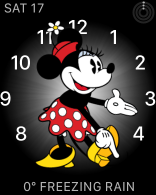

When upgrading to watchOS 3 or starting up a new Apple Watch, the interface looks just like watchOS 1 and 2. However, there are some obvious changes that Apple has made, starting with the addition of new watch faces and complications. There are two new Activity watch faces, along with a Minnie Mouse watch face to complement the existing Mickey Mouse face, and a new minimalistic watch face called Numerals. Apple has also made it easy to switch between watch faces by swiping from the edges of the display. I’ve found this to be quite useful, as I like having the Activity Digital face available, but it’s quite dense with information so I often use the Numerals watch face and swipe over to Activity in a situation where it’s more relevant. This wouldn’t be feasible with the previous model of force touching the display and swiping over to another face, which still exists but is really only useful to access the customization options for each face.
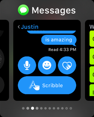
Beyond the watch faces, users will notice changes when they first try to open the old glances screen or the friends screen that was triggered by the pill-shaped button on the side of the case. Both of these functions no longer exist in their original form. In the case of the friend screen, you can now send messages and use Digital Touch to communicate with anyone via the Messages app. This definitely makes it more difficult to access these features compared to before where it was a single button press away, but in my experience the only time I ever saw that screen was by accident when the watch failed to recognize my double tap on the side button to access Apple Pay.
As for glances, the screen has been removed from the operating system, but the core idea lives on in another form. In theory, glances provided a way to quickly access relevant information from applications. In practice, they often ended up being a strange middle point between the concept of a complication and a full blown app. In some situations, they would display information relevant to the current context, like the current song in the now playing glance, or the weather in the weather glance, and you could tap them to open their associated application. Others like the heart rate glance didn’t have any associated application, and basically acted like an application that was only accessible from the glances screen. There was also the issue of applications not being loaded when tapping on a glance, which would lead to a huge delay and sometimes a loss of context when the application finally loaded.
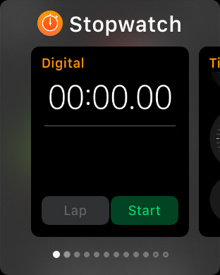
watchOS 3 introduces a new app caching model that makes glances obsolete for the most part. However, it’s still necessary to have a way to quickly access commonly used applications. To solve this problem, Apple has introduced a new app switcher called the Dock which can be accessed using the pill-shaped button that was previously used to access the friend screen. This screen can have up to ten applications which are selected by the user, plus one slot for the most recently used application that isn’t pinned in the list. These applications are kept cached in memory, which means they can be rapidly resumed when opened. This provides quick access to common applications, while also solving many of the issues that the Apple Watch has had with long app load times. In general, you’ll only use a small number of Apple Watch applications frequently, and being able to keep ten of them cached in memory with near-instant loading alleviates the load time issues for those key applications.

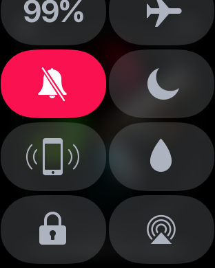
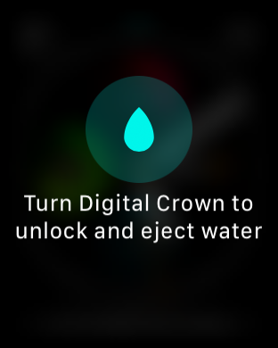
With Glances gone, Apple was able to make a new screen accessible by swiping up on a watch face. The new screen is essentially a version of Control Center for watchOS, and it expands upon a similar feature that existed in the Glances screen in previous versions of watchOS. By implementing the screen more like an application and less like a glance, Apple is able to add more functionality by making it a scrollable layout. There’s now a view that displays the current battery level, which is useful now that there’s no Glance to provide the same information. There’s also a button to manually lock the watch, and on the Series 2 a button that is used to eject water from the casing via the speaker after the watch has been submerged.
Pressing the Digital Crown still brings you to the Carousel screen, but as I mentioned above, the Dock provides access to most of the apps that a person uses frequently, so it’s not often that one has to go to the Carousel and try to tap on tiny icons to open apps. With that in mind, it is kind of odd that the button which is most analogous to the iPhone’s home button brings you to a screen that you rarely want to go to, but I suppose that the removal of the friend screen meant that putting the Dock in its place was the most reasonable decision rather than also changing how Carousel is accessed just so the Dock would be tied to the Digital Crown.
In general, the new application caching in watchOS 3 has made applications genuinely useful where they weren’t previously simply due to long load times or issues with the app never loading at all. The improvements made to the SiP in Series 2 also play a large role in speeding up app load times when apps aren’t cached in memory. However, as someone who used the original Apple Watch on watchOS 1 and 2, the awful performance back then has essentially conditioned me to not use applications on the watch, and I’ve had to actively think about using the apps on the watch now that they’re actually reliable. This won’t be an issue for new adopters, but I think anyone who is familiar with the original app experience on the Apple Watch will have the same aversion to using the apps that I do. In that sense, it’s important for Apple to maintain the quality of the user experience in order to mend the trust of users who were turned away by the problems that existed in the past.


126 Comments
View All Comments
mrvco - Friday, December 30, 2016 - link
I used an original iPhone and an iP4 and liked them very much. I've had a few iPads and still use a Mini2 and like it very much. The iWatch and smart watches in general still don't interest me. When I wear a watch, I prefer my mechanical automatic. Actually I'm surprised no one has developed a kinetic charging smart watch.yhselp - Tuesday, January 3, 2017 - link
I'd love to get one of those, but there's always something more important/practical to buy for that sort of money. I kind of wish it could drop to about $200 however unrealistic that may be. I was also hoping for an improvement to single-threaded performance courtesy of a new CPU.The original iPhone's two biggest drawbacks as I remember it were the lack of an app store for a full year (despite the vibrant homebrew scene) and its slowness. I remember trying a friend's iPhone 3G on cellular, and not finding it faster - the SoC was just not capable of loading pages fast. When I upgraded to the 3GS the difference was revelatory. Despite their drawbacks these were the two models I've had the most fun with - the App Store was an explosive hub for innovation, unlike the free-to-download money model of today, homebrew was huge, etc. The only thing I ever missed from my N82 was the camera.
The iPhone 3GS has to be *the* representative of the golden age of innovation for smartphones. Think about what Android handsets were back then. You can still use a 3GS today - I gave my old set to my s.o. when she had to replace the screen of her 6s; transferring her info from iCloud was seamless, and at first the 3GS was a bit of a shock for her, but after a day or so she came to grips with it and used the hell out of it for 10 days.
I kind of wish a similar boon of innovation would come to Apple Watch.
About sleep tracking: You would always have to charge a smart watch, even if it's once or twice a week, and the most practical time to do so would be when you're no using it, i.e. when you're sleeping. If they manage to implement a full charge that takes about 20 minutes and is safe to use in the long term, you could quickly charge your watch when you get back home from work, or when taking a shower.
richiwalt - Monday, January 9, 2017 - link
I have a question that's really puzzling to me: My series 1 is connected to my watch (and wifi is turned OFF on the phone). I leave my phone at my worstation ... and I begin to walk from one building to another, through an underground tunnel that connects the two building ... a distance of 265 feet. The watch connection breaks in the middle of the tunnel (about 150 feet from the phone) ... but when I proceed out the other side of the tunnel, the watch-phone connection is re-established. Both buildings share the same wifi SSID and password (but, remember ... wifi is turned off on the phone). So, how is the connection established from the watch to the phone on the other side of the tunnel. Not only my watch, but others in the building experience the same thing. Does the watch truly use bluetooth or wifi for a connection ? And, if wifi is turned off on the phone, how is that possible ? I'm really just wanting to understand this ...Deelron - Thursday, January 12, 2017 - link
Odds are this late you want see it (or it's moot) but what's likely happening is the watch is merely reconnecting to a wifi network your phone has been on before (not connecting to your phone, since it's wifi is off). The watch itself can do a decent amount of things on just wifi (like receive messages, make calls if the phone had wifi calling on at one point before, check the weather and use 3rd party apps that support wifi connectivity and the like).Aniklalani - Monday, July 3, 2017 - link
Brand new 24k Gold Finish Apple Digital Wrist I Watch A 42MM Aluminium Casing Projected.The Original Apple Box Includes Apple Watch,Magnetic Charging Cable,USB Power Adapter & Quick start Guide.-Make: Apple
-Model: MJ3Y2LL Stainless Steel Case with Milanese Loop
-Dimensions: Casae Width - 42 MM
-Material: Stainless Steel
-Material Fininsh: 24K Gold Plated
-Movenment: IOS Apple
-Band Material: Stainless Steel
-Band Color: Gold
-Other Details: Comes With Original Apple Box & Paper Work.
I bought this product from telemart .pk.Telemart offers you the best Apple Watch 42mm 24kt Gold Plated Price in Pakistan So what are you waiting for!
Hamm Burger - Saturday, November 4, 2017 - link
I'm amazingly late to this thread, but it's possible the blue bias in the color measurements is a result of Apple pre-calibrating to compensate for the blue pixels ageing faster than red and green.