The Corsair Gaming K70 RGB RAPIDFIRE Mechanical Keyboard Review
by E. Fylladitakis on July 1, 2016 8:00 AM EST- Posted in
- Peripherals
- Corsair
- Keyboard
- Cherry MX
- Mechanical Keyboards
- RGB
Per-Key Quality Testing
In order to test the quality and consistency of a keyboard, we are using a texture analyser that is programmed to measure and display the actuation force of the standard keyboard keys. By measuring the actuation force of every key, the quality and consistency of the keyboard can be quantified. It can also reveal design issues, such as the larger keys being far softer to press than the main keys of the keyboard. The actuation force is measured in Centinewton (cN). Some companies use another figure, gram-force (gf). The conversion formula is 1 cN = 1.02 gf (i.e. they are about the same). A high quality keyboard should be as consistent as possible, with an average actuation force as near to the manufacturer's specs as possible and a disparity of less than ±10%. Greater differences are likely to be perceptible by users. It is worth noting that there is typically variance among keyboards, although most keyboard companies will try and maintain consistency - as with other reviews, we're testing our sample only.
The machine we use for our testing is accurate enough to provide readings with a resolution of 0.1 cN. For wider keys (e.g. Enter, Space Bar, etc.), the measurement is taking place at the center of the key, right above the switch. Note that large keys generally have a lower actuation force even if the actuation point is at the dead center of the key. This is natural, as the size and weight of the keycap reduces the required actuation force. For this reason, we do display the force required to actuate every key but we only use the results of the typical sized keys for our consistency calculations. Still, very low figures on medium sized keys, such as the Shift and Enter keys reveal design issues and can easily be perceptible by the user.
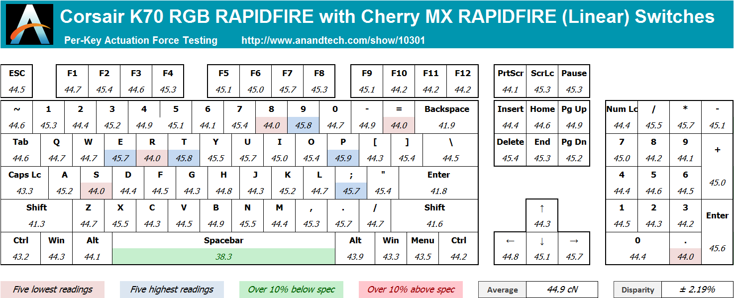
Cherry’s MX switches are of excellent quality and they always give us excellent consistency readings. We were glad to see that the new shortened “RAPIDFIRE” switch was no exception. We measured an average actuation force of 44.9 cN, just a little higher than the 45 gram-force (44.13 cN) that the switch is rated at. The disparity is very small, at just ±2.19% across the main keys, a difference that no user will be able to discern by touch.


36 Comments
View All Comments
Rhosta - Sunday, July 3, 2016 - link
The font is made this way from practical reasons. Keyboards with Cherry MX switches have very bad quality of backlight (surprisingly wasnt mentioned in review). The light is bleeding all over the place a very little light is actualy reaching the key itself, so keys are backlit pretty badly and colors are pale. This big font is put there to simply help with this issue, so letters catch more light and colors are thus more easily recognizable.ddriver - Sunday, July 3, 2016 - link
Big and Ugly are two different things. The font can be big without being ugly. Much like it can be ugly without being big.Rhosta - Sunday, July 3, 2016 - link
If you can, show us some better solutions, because I don't think there are many left.Those keys are backlit mainly in its upper half, so you want to fill this part of space, which results in what we see here - big, wide and bold font.
Felix_Ram - Monday, August 8, 2016 - link
Here's an idea, how about you keep your little bag of angry shi-te to yourself and not ruin my day.BurntMyBacon - Tuesday, July 5, 2016 - link
@inighthawki: "I'd have to side with ddriver on this one."Why side with anyone. It's a matter of preference and opinion.
Speaking of opinion, I collected several more to illustrate a point:
I think the spacing is too small for my preference. The the font is also obviously stretched, but this aspect bugs me perhaps a little less than ddriver. It's not my preference, but it also isn't the worst I've seen out of a big name brand.
My granfather really likes it. Large letters and backlighting are pluses. He would like the secondary functions to also be back lit.
My eldest sister really likes it. Again, large letters and backlighting.
My youngest sister thinks its alright. Large letters are nice. Doesn't really care for backlighting. Spacing is a little cramped, but not too bad.
My dad doesn't really care.
My nephew loves the font. Best looking font he's seen on a keyboard.
I would suppose that as people get older and their eyesight weakens, this type of aesthetic is quite suitable. Of course gamers (the target audience) tend to be a bit younger than my grandfather, but perhaps the younger generation finds the stretched look aesthetically pleasing. Point is, aesthetics are a largely opinionated subject and everyone is entitled to one. I personally don't place a lot of value on aesthetics as long as they don't hinder the practical functionality of the device. All else equal (or nearly so), however, and I'll go for the better looking option.
III-V - Friday, July 1, 2016 - link
Do you think everything that isn't Helvetica is "ugly?"Fun fact -- what is visually appealing to people is quite subjective.
theduckofdeath - Monday, July 4, 2016 - link
Exactly, III-V.The complaint that this looks like a gamer keyboard is a bit silly considering it is primarily sold as a gamer keyboard. Corsair focuses quite strongly towards that demographic. I mean, it's literally in its name. Though, I think Corsair is keeping the gamer look at an acceptable moderate level compared to a lot of other brands.
Personally I think it looks okay. The only reason I didn't get this specific keyboard when I bought a new one last year was because I wanted a more compact design, so I got the CM Quickfire TK.
Lolimaster - Saturday, July 2, 2016 - link
There is a reason this is yet another RGB keyboard :POmega215D - Sunday, July 3, 2016 - link
To me the Romer G keys feel better than cherry mx browns even with O-rings. It's alsoncalled buying, trying and if it doesn't suit my needs it goes back. I also only buy keyboards when they are on sale (which thankfully Best Buy seems to be doing lately). My last mechanical keyboard is the CM Storm trigger but it needs a new PCB and since my parents need a new keyboard I'd figure I'd fix it up and get a new toy.zeeBomb - Friday, July 1, 2016 - link
Whats a good mechanical keyboard under $80 CAD?