Sony DSC-S70 Digital Camera
by Matthew Witheiler on October 18, 2000 12:00 PM EST- Posted in
- Digital Camera
The Design
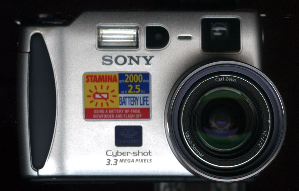
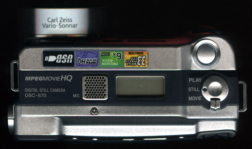
Finally not limited to the Mavica's floppy disk storage design, the S70 achieves a manageable size. Measuring 117 x 70 x 65 mm, the S70 is a bit too big for one's pocket yet too small to require a large case. We suspect that many users will opt to carry the S70 via the included neck strap or choose to just hold the camera in their hands.
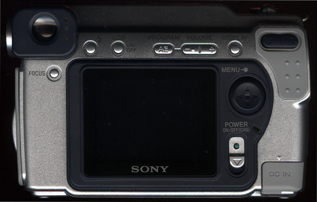
The rear facing LCD is pretty much standard on digital cameras these days. The view finder, which includes a dioptric adjustment for those who normally use glasses, is exceptionally small. We think that many will choose to sacrifice battery life to keep the rear LCD on during image capture.
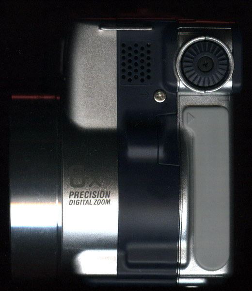
With the smaller size of the S70 also comes a decreased grip. No longer the meaty grip encountered when the camera was forced to be at least 3.5 inches high, the S70's grip feels rather dainty. Rather than falling in its suggested position, we often found our hand engulfing about half the camera in order to get a stable grip. Even after adjusting our index finger to the shutter button, we still found our thumb extending over the upper right corner of the LCD instead of its suggested spot below the rocker zoom button.
With exception to the power button, we found that the silver function buttons on the rear of the camera were a bit small to conveniently press with our thumb. The button feedback was not exceptional, however there is a slight click that is felt when depressing a button the full way.
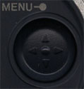 One
of the problems that originally reared its ugly head in the Mavica cameras is
also present on the S70. This problem, which Sony likes to call a feature, is
the spherical menu button. Similar to a trackball with the top cut off, the
menu button is free to move in all directions, however it only responds to the
common four directions of up, down, left, and right. Depressing a position other
than the common four results in no function at all, unless the diagonal direction
is close to one of the defined directions. The menu button feels loose to the
touch and is often hard to get good feed back from.
One
of the problems that originally reared its ugly head in the Mavica cameras is
also present on the S70. This problem, which Sony likes to call a feature, is
the spherical menu button. Similar to a trackball with the top cut off, the
menu button is free to move in all directions, however it only responds to the
common four directions of up, down, left, and right. Depressing a position other
than the common four results in no function at all, unless the diagonal direction
is close to one of the defined directions. The menu button feels loose to the
touch and is often hard to get good feed back from.
Perhaps the most annoying feature of the menu button is the center function button. Pressing the menu button in the middle causes it to act as an access button, selecting the function navigated to by the four directions. The main problem with this is a result of the menu button's play, which often causes a missing of the middle button and a depression of the down direction button. It is well past time that Sony got rid of the ball-like menu button and it is a shame that it was carried down to the S70.
In general, we think that Sony sacrificed stability and functionality for size.
We think that Sony should have opted to make the S70 body longer and less wide, allow for not only a more meaty grip but also larger buttons. Also, the menu button needs to be revamped, making it actually possible to easily access the S70's many features.


0 Comments
View All Comments