AnandTech Guide to Better Photos: Post-Processing
by Stephen Caston on March 18, 2005 3:45 PM EST- Posted in
- Digital Camera
Color Space
Color space is a topic that can and does fill entire web sites and books. In fact, it can easily give some people headaches and hours of frustration while trying to get their images to look the same on different mediums (print, screen, etc.). At the beginning of this guide, we recommended setting the color space to Adobe RGB 1998 if your images were shot in the Adobe RGB color space. Let’s say that you started out editing an image in Adobe RGB, but now you want to upload that same picture to your web site. The most common mistake that people make is to just upload the image without changing the color space to sRGB. Without giving you a headache, we are going to show you how to get your images to look right on the web.First of all, you should know that these color space issues mostly arise from the ability of some cameras (mostly higher-end) to shoot in the Adobe RGB color space. If your camera only shoots images in the sRGB color space, you should just leave Photoshop’s color space as sRGB and be done with it. By doing so, you won’t need to worry about conversion for the web.
Whenever you save an image in Photoshop or Elements, the dialog box will have an option to tag the file with the ICC (International Color Consortium) profile. The screenshot below is from Photoshop CS, but it may not be available in some earlier version of Photoshop.
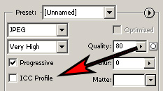
“Save for Web” dialog showing ICC option
Original image is untagged Adobe RGB
Rollover image is untagged sRGB
Hold mouse over image.

Original image is tagged Adobe RGB
Rollover image is tagged sRGB
Hold mouse over image.
Given that most browsers are not color aware, the only way to win in this color struggle is to make sure that all your images are sRGB before uploading them to the web. Fortunately, this process is very simple provided that you are not using Elements. For some reason, Adobe decided not to include the option to convert color profiles in Photoshop Elements. For that reason, the steps below will only work for the standard version of Photoshop.
1) Open up your Adobe RGB image and select “Image\Mode\Convert to Profile”.
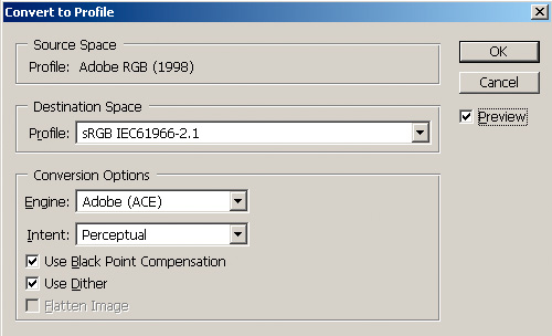
“Convert to Profile” dialog box
That’s it! Now, you can save your image and post it on the web. If you use the “Save for Web” option (to optimize the file size), you can check the “ICC Profile” box to embed the sRGB profile. This will add a little bit to the file size, but this way, you can be sure that people with color aware applications will view the image with the appropriate colors.
Hopefully, this color space thing didn’t give you too much of a headache. After familiarizing yourself with the concepts, it will become much easier to think about color space. Unfortunately, there’s no way around learning this stuff if you want to have consistent color in your images. Now that you’ve read through this guide, we are certain that you can apply some of these ideas to your own images to make them better. Even if you just apply the Levels method, you will be on your way to much more impressive results. In future guides, we have plans to cover more Photoshop techniques and tricks. As always, let us know if there is something in particular that you’d like us to cover. Happy Photoshop-ing!


20 Comments
View All Comments
Bobby Peru - Thursday, June 23, 2005 - link
Would love it if you'd describe batch processing of photos. With Photoshop or, I think the simplest way is running ImageMagick on Linux or Windows Cygwin. You can just whack a whole folder of 100 photos with one simple command line. The underlying DSP algorithms are basically identical to Photoshops's.buttwhacker - Wednesday, April 13, 2005 - link
good article, very informative and i hope u can add to this article.THEJUICE - Tuesday, March 29, 2005 - link
Useful article and enjoy the series. Thanks.vladik007 - Thursday, March 24, 2005 - link
wouldnt it be better just using selection , feather , and adjusting color channels insidethat selection ?red is usually 100% , so you take it down to 5- 10 % , green and blue are best at 50 % in red channel...
never really liked burn tool for red eye ...
stephencaston - Monday, March 21, 2005 - link
#15,I assure you the original image was not doctored. That would defeat the purpose of post-processing ;-) We've updated the page to include a link to the original file. To get the brush to the right size, use the "[" and "]" keys to increase and decrease the brush size. In our example, the Color Replacement Tool is actually desaturating whatever you paint. So, if you can't get the brush to the exact size, it is best to select a smaller brush and paint around inside the pupil until the red-eye is gone. Good luck!
E Scott Channell - Monday, March 21, 2005 - link
I'm curious how the red-eye sample photograph was obtained... the red-eye region appeared to match the paint-brush shape perfectly... Sometimes getting good results takes a wee bit of fiddling so if this was a doctored "good photo" used for illustration it would provide unreasonable expectations as to what a "quick fix" can achieve.Also, if this is a doctored photo the article should make mention of that.
jeffbui - Sunday, March 20, 2005 - link
Good article as well. An amateur has to start somewhere.Gatak - Sunday, March 20, 2005 - link
Actually. Have you tried to do basic stuff like levels, curves and channel mixer with Gimp? The results are inferior to that of Photoshop, especially when you use 16bit/channel mode.AnandTech, you should do a article where you compare photoediting steps between Photoshop and Gimp.
PrinceGaz - Sunday, March 20, 2005 - link
Nice article if you use Photoshop [Elements]. Did Adobe sponsor this article, Stephen?Everything you told people how to do with Photoshop can be done just as easily with Paintshop Pro, the full version of which costs only slightly more than Photoshop Elements, but isn't a cut down version like Elements is. Unless it came free with the camera, or a scanner, you'd have to be crazy to go the Photoshop route just for tweaking your pictures when much cheaper and equally good options are available.
Even splashing out for Paintshop Pro is probably unnecessary for the vast majority of people who will find everything they need available in the freeware image program 'The Gimp'. It might have been better to assume people were using The Gimp rather than Photoshop, as everyone can download The Gimp free of charge (legally).
unhaiduc - Sunday, March 20, 2005 - link
great article, i read every one of your photo tutorials and loved every bit of it!cant wait for the next one :)