The OnePlus One Review
by Joshua Ho on November 19, 2014 8:00 AM EST- Posted in
- Smartphones
- Android
- Mobile
- OnePlus
Software
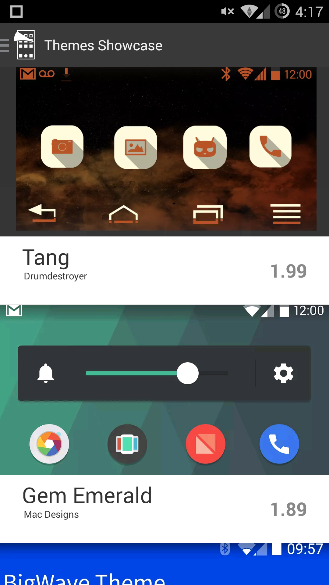
While software tends to be a bit of a side note in reviews, it really is a crucial part of the experience. Without a good UI, the entire experience can be ruined as a result of these issues. This leads us to CM11S, the first official UI released by Cyanogen. For the most part, this UI really is just a lightly re-touched version of what we see in Nexus devices, but with a large number of extra features. For example, we see a revamp of the quick settings menu, with horizontal quick settings in the notification drawer along with a large number of available quick settings tiles in the quick settings menu.
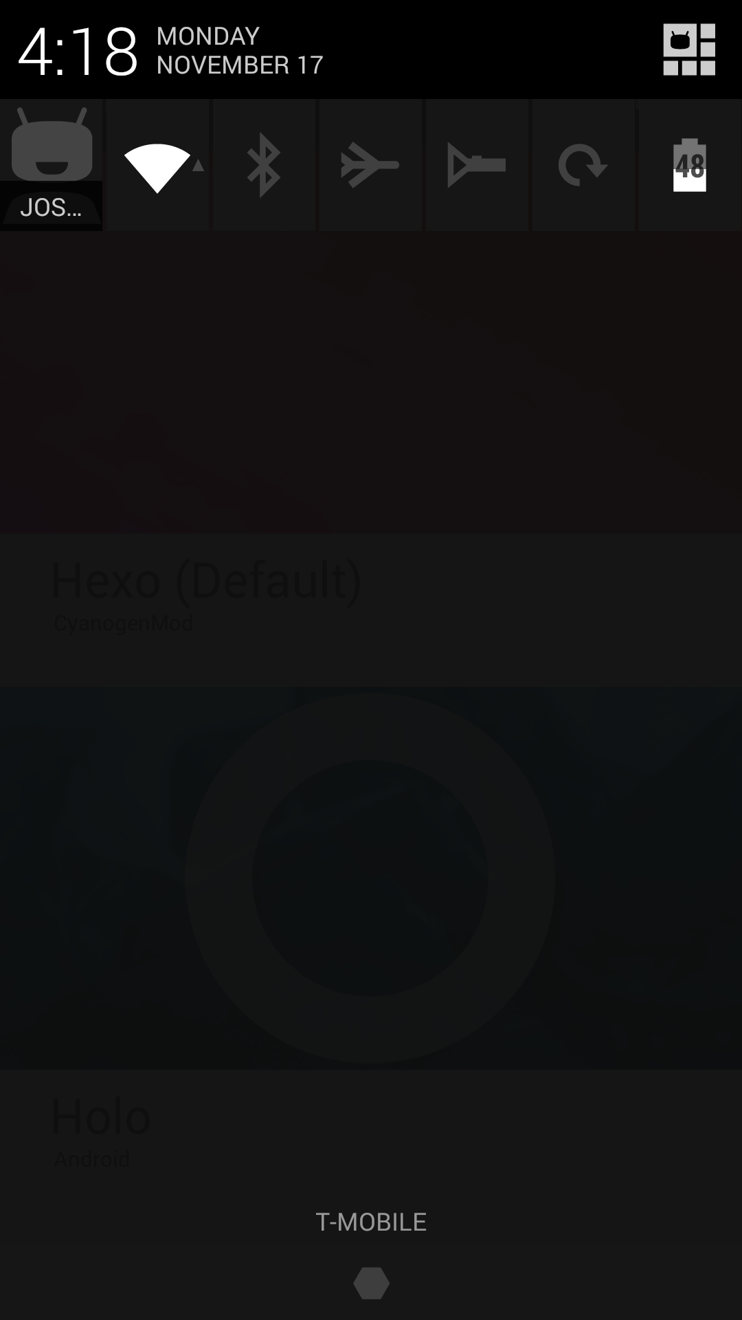
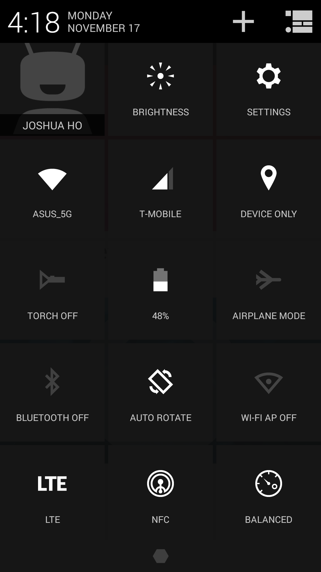
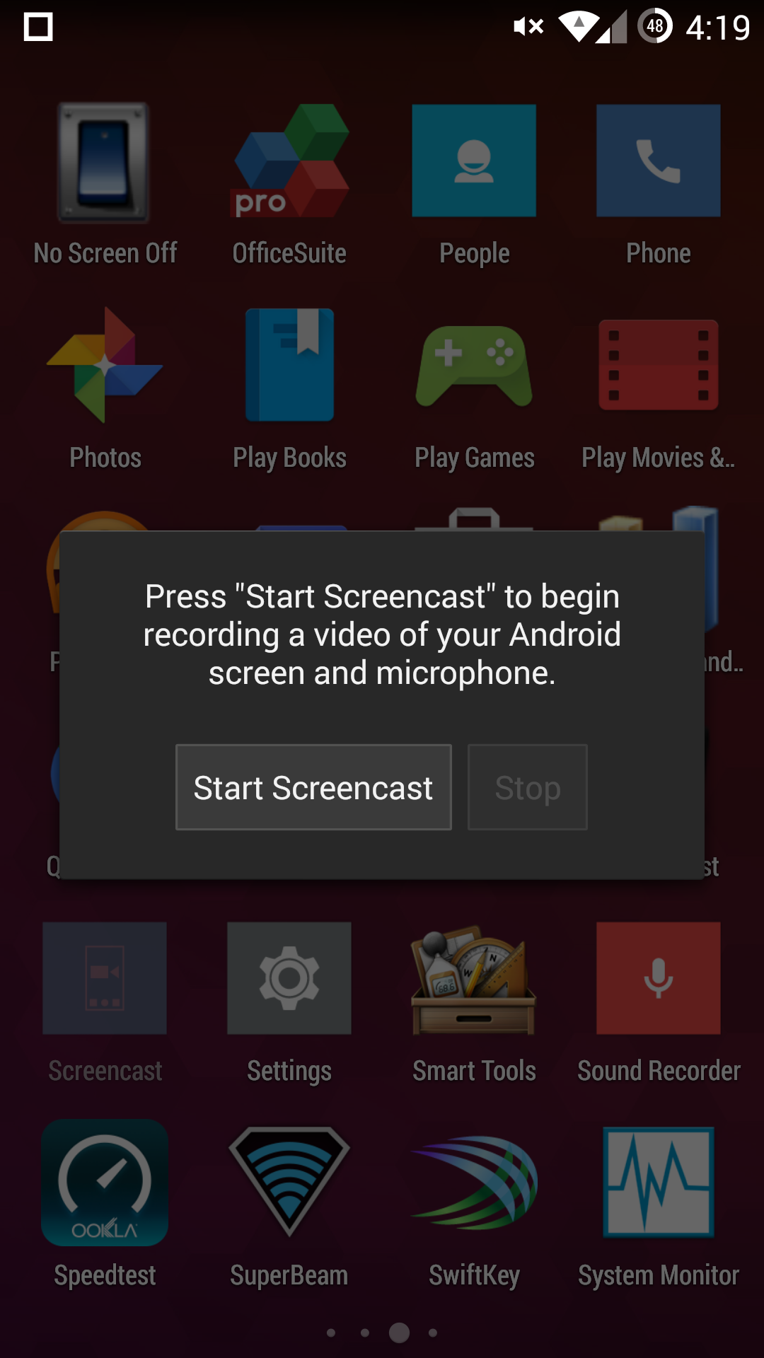
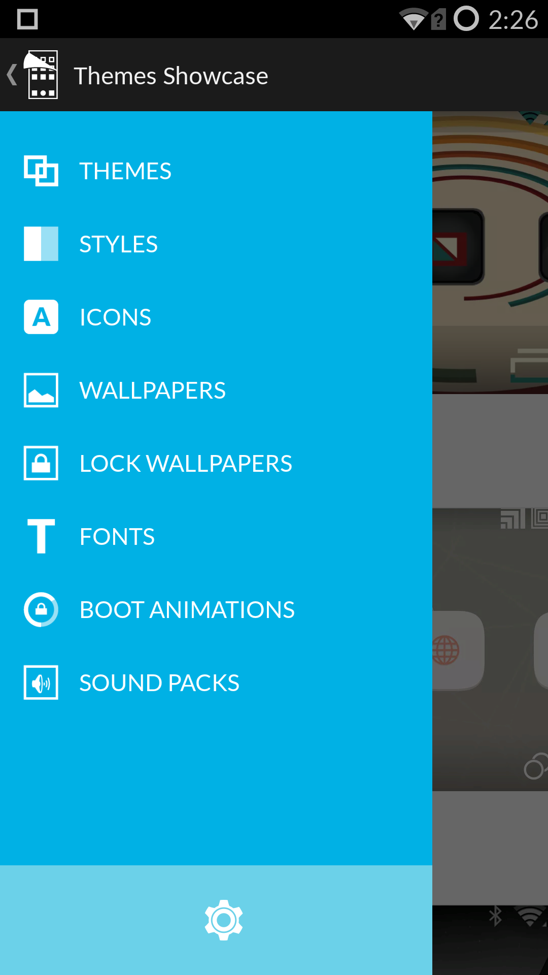
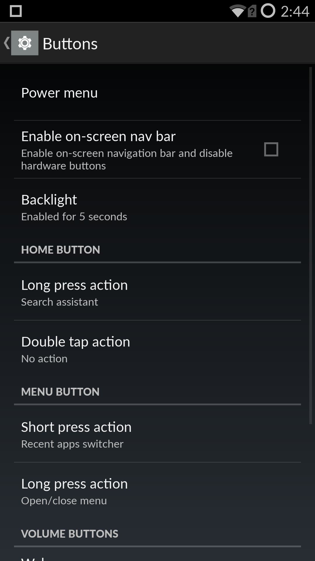
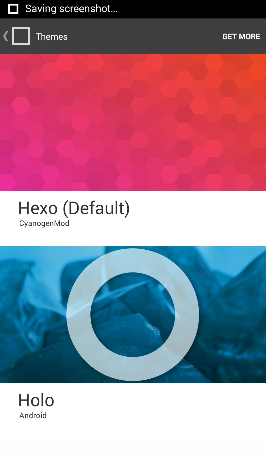
Of course, CM11S goes much deeper. There really is an immense amount of customization available to the end user, from a custom boot animation to new icons, fonts, wallpapers, sounds, and overall system UI themes. While Holo is the official AOSP UI, CM11S ships with Hexo which is largely similar to Holo, but with a strong emphasis on hexagons throughout the UI. Many of the modifications that one might be used to from a custom ROM are present here, such as the ability to dynamically change the battery icon in the status bar, the way that the clock is displayed, reception representation, gestures to turn on the flashlight or the display, re-mapping the rather dim capacitive buttons, enabling or disabling on screen buttons, permissions management, changing the size of a pattern unlock, changing the lock screen altogether, and similar customizations.
While one can spend their time defending choice for the sake of choice, I definitely question the value of all of these additions. While some will value the ability to deeply customize their OS, for anyone that is even remotely unfamiliar with the idiosyncrasies of CyanogenMod and Cyanogen they will find their experience to be deeply frustrating. While I've already detailed some of the usability issues present in the camera application, many of these features fundamentally don't make sense. The notification drawer's "quick access ribbon" out of the box is simply a row of icons that can have very little meaning at times. While one can guess that an airplane is for airplane mode and a flashlight is for the torch, a circular arrow is utterly ambiguous in nature. Given the quick access nature of this menu, one might guess that this is a rotation lock toggle but for one reason or another it's actually the auto-sync toggle.
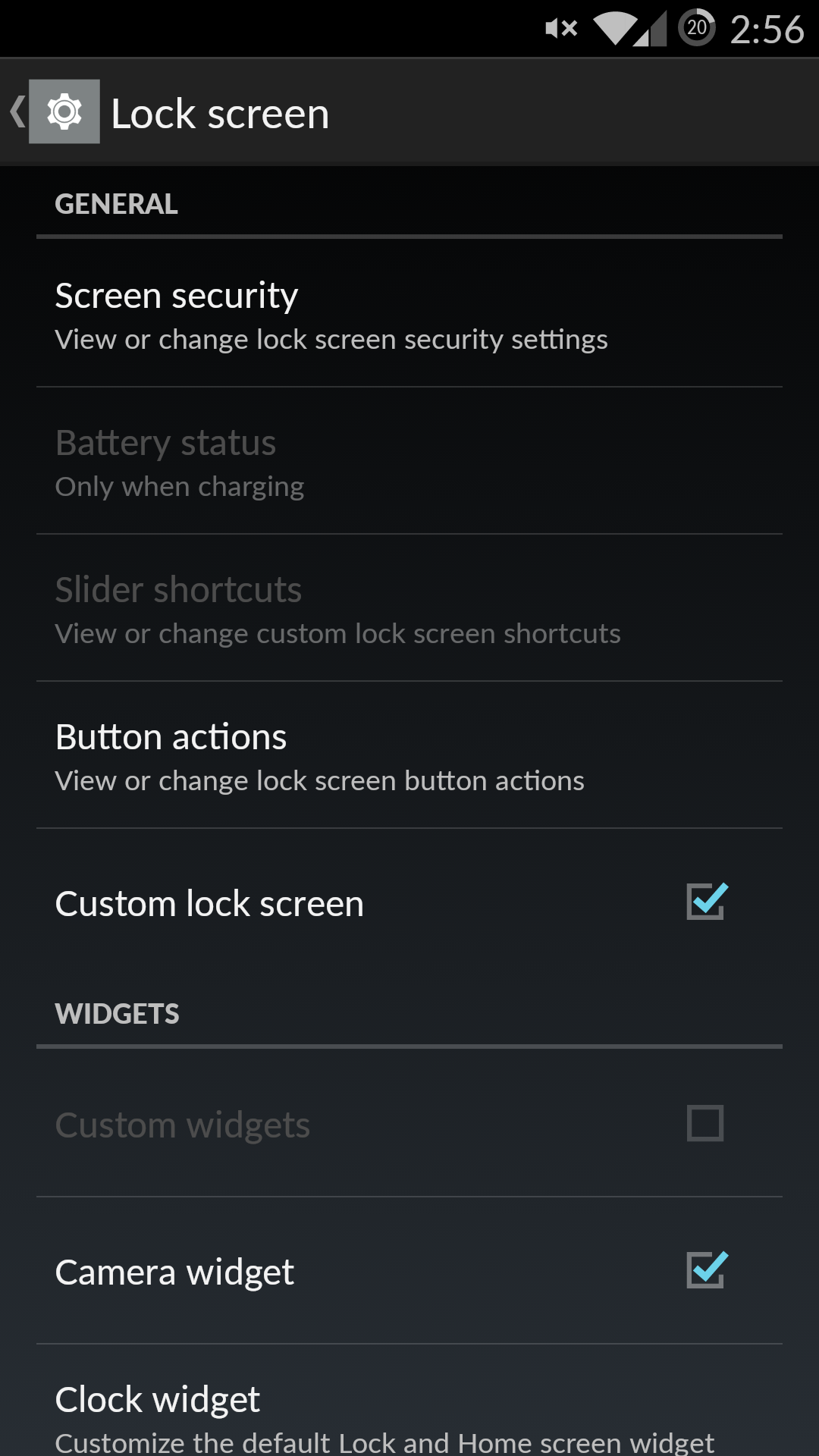
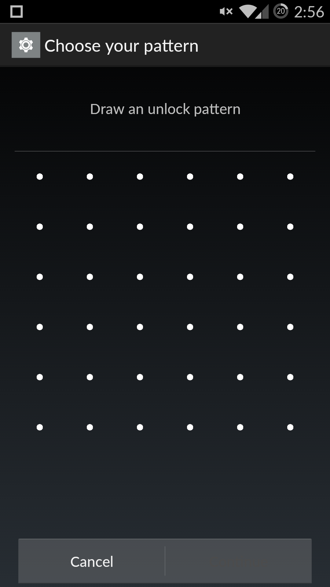
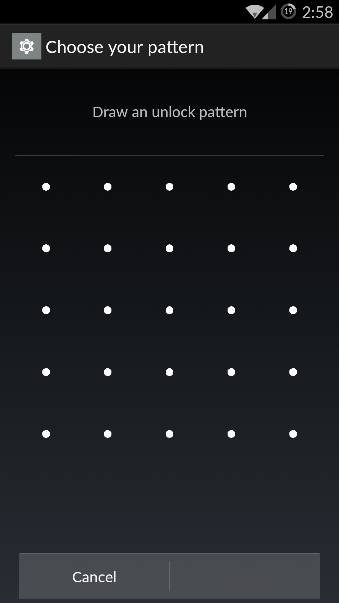
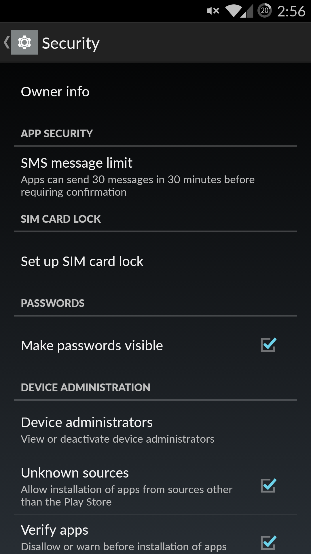
These issues extend to the point of being outright frustrating for average users. While one might guess that setting up lockscreen protection through the security menu as with almost every other UI, CM11S places it in the lockscreen menu which definitely can make for some level of difficulty in adapting from other devices. Something as simple as the pattern lock becomes complicated as one is given an almost ridiculous amount of choice from a 3x3 to 6x6 pattern. While a 4x4 or 3x3 pattern makes sense, 5x5 or 6x6 is almost guaranteed to be wholly unnecessary for an OS that's supposed to target a large number of users that may or may not be accustomed to the Cyanogen UI experience.
Finally, it's hard to argue for extensive customization of most visual aspects, as it's really far too easy for themes to rapidly diverge from meshing with Google design lines quite rapidly. While I'm sure that there are people out there that will like whatever themes are available using the CM11 theme engine, it's really hard to argue that this is a good thing for cohesive experience. The sheer number of issues with the camera alone is enough to question whether this level of customization is worth dealing with the likelihood of buggy releases.
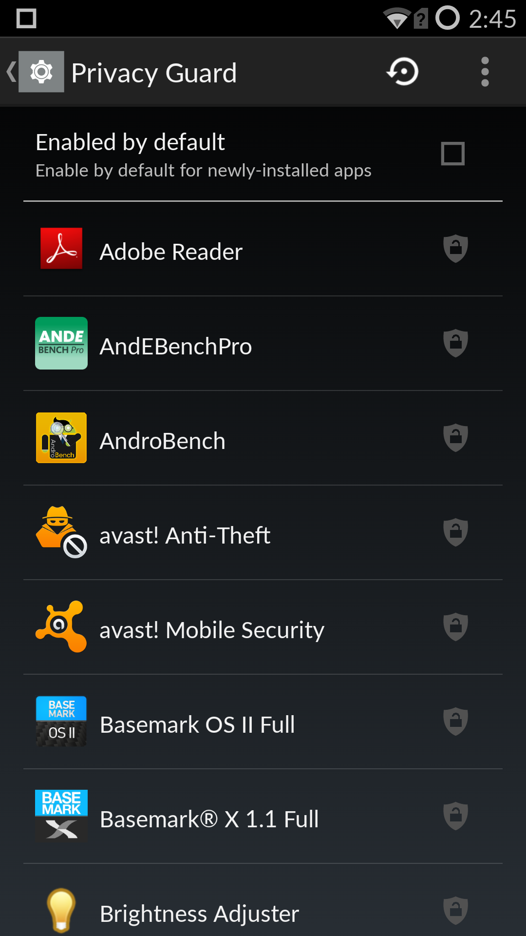
While there are a lot of issues with Cyanogen's approach of throwing every possible option to the user, to their credit a great deal of the experience does come out quite enjoyable once one has spent enough time actually figuring out what each option does. For example, while on most phones it's pretty easy to fill the status bar with an NFC indicator, WiFi, cellular reception icons, battery icons, battery percentage text, and the time, this can be avoided on the OnePlus One. Various elements can be removed if desired, and things like the privacy guard application allow for a great deal of fine-tuning to ensure that applications don't have more permissions than necessary, although this could cause unintended behavior in an application. In addition, the overall experience has been consistently smooth and performant, with no real lag. The real issue here is that CM11S has taken the kitchen-sink approach to UI design, to the detriment of the user.


148 Comments
View All Comments
Harry_Wild - Thursday, November 20, 2014 - link
I saw many interviews were Android App developers were ask what personal phone they are using responded shyly - "iPhone #*". So, that explains many things here!grayson_carr - Thursday, November 20, 2014 - link
I am an iOS developer and my current phone of choice is the Nexus 5.Conficio - Friday, November 21, 2014 - link
Care to link to at least three of these "interviews"coburn_c - Wednesday, November 19, 2014 - link
Why do your custom screen and battery tests never line up with gsmarena? Their screen results always have different white brightness levels then yours, and their battery tests are always more in line with synthetic scores than yours. They put the contrast of this things screen at 800:1 and the battery life below the G3.2kfire - Wednesday, November 19, 2014 - link
Re: battery, GSMArena uses 50% instead of a fixed luminance.Cinnabuns - Wednesday, November 19, 2014 - link
Just to add to what 2kfire pointed out, the author states:"200 nits on a phone can be as low as 50% and as high as 90%, so setting a standardized brightness percentage would not be an effective method of controlling for display brightness."
I would not trust GSMArena's battery tests as they do not understand how to perform a controlled test.
coburn_c - Thursday, November 20, 2014 - link
Their test was in-line with what the synthetic said here and in line with the common sense of less throttling and less software optimization don't make for more battery life.Master_Sigma - Wednesday, November 19, 2014 - link
Very pleased to see Anandtech coming around to reviewing this phone. While I disagree with the opinion that too many options are a negative, especially given the target audience for this device, I pretty much agree with the assessment of the hardware and software.FreakTM - Wednesday, November 19, 2014 - link
I think the opinion was more towards the fact that the options were causing some sacrifice on the user-friendliness of the experience, which I think is a fair opinion. Many options, good; many options presented in a confusing way, bad.mrex - Wednesday, November 26, 2014 - link
Better to have options than not having them. You dont need to use them if you dont want to, but if they dont exist at all, you could only dream about them... the phone is very user friendly, imo.