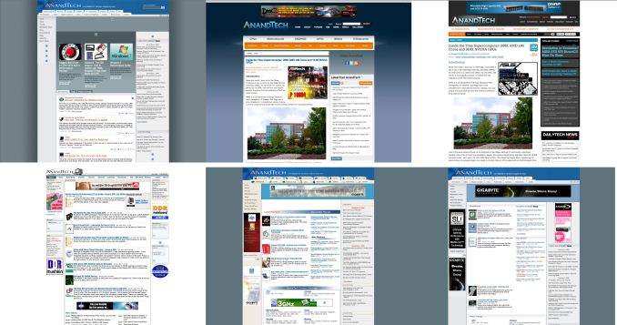
Welcome to AnandTech's 2013 Redesign
by Anand Lal Shimpi on March 9, 2013 1:16 PM EST- Posted in
- Site Updates

In 2010 we went through the single largest redesign in AnandTech history. We modernized the site, finally moved to a tag based architecture and made a number of other tweaks. The web moves a lot quicker than it did even just 3 years ago, so last year we started working on another significant redesign. Today marks the debut of that design.
Going into the redesign we wanted to accomplish three major goals. First, we wanted to have a design that put our smartphone and tablet coverage on equal footing with our traditional PC roots. The redesign consolidates our coverage areas into four major categories: PC Components, Smartphones & Tablets, Desktops & Notebooks and finally Enterprise. The super categories are largely self explanatory and you can drill down into each one of them for more specific navigation.
It's important that our site design reflects our internal focuses. We are as committed as ever to our PC component coverage, but we also devote an equal amount of time to what we're doing in the new mobile space. From my perspective, whether it's a smartphone or a server, we're still talking about some form of computer - just in a different case.
Our second major goal with the redesign was to more prominently feature Pipeline, our short form content section. We launched Pipeline in late 2011 as a way of dealing with content that either didn't demand our full review treatment or that we didn't have time to dedicate deep analysis to. Since then Pipeline has become a very important part of the site, and we wanted to elevate its position on the front page as a result. Pipeline stories on the right are ordered from newest to oldest, with even older pipeline stories appearing under the 2x2 grid of featured articles.
Finally, we wanted a design that would be more accessible and speak to the broader nature of our audience. While you all know why you come to AnandTech, it's very important to our continued success and ability to remain independent that the site accurately reflects the diverse audience. Whether you're coming to us for motherboard reviews, analysis of the latest microprocessor architectures or to figure out which smartphone or tablet to buy, you're likely a person relied on by dozens of others for recommendations. We remain an independent website, which comes with its own challenges when it comes to proving our worth to the agencies and marketing organizations that help keep us operational. Looking the part is just as important as having the content to back it up.
We made sure not to take away any features with the redesign. We still include our well used Print View on all articles, but now allow you to use it both for single page reading as well as for actual printing. The previous Print View didn't have all of the styling of our article pages since it was purely optimized for printing, now we have both modes.
Other features have been enhanced as well. The View All Comments button now actually lets you view all comments on a single page, rather than just showing you 50 comments per page. You can also now permalink to individual comments. I'm always humbled by just how awesome your comments are, now we can finally link directly to individual ones.
We now support larger images inline (we will be adding site-wide retina/hi-DPI support soon!) and our graph style has been updated as well, which you'll start seeing us take advantage of with all new content going forward. The review body text is also larger and hopefully easier to read, which should help when we post some of our ultra long form content.
The Podcast now has a permanent link at the top of the page as well - thanks to all you who have been asking for that.
The Twitter feed on the front page now includes tweets from a number of staff members including Brian, Ganesh, Jarred and myself. We've also made it easier to follow us on Twitter and Facebook with direct links in our header (hint: it helps us tremendously if you do). Our most recommended content on Facebook is also nicely streamed in to the right of the site as well.
There are more functional changes that we'll be introducing throughout the new year. We just had to get the redesign out of the way first so we could start building on it.
I hope you all enjoy the site redesign. I know big changes aren't always easy to get used to, and as always you have my commitment to fix/improve anything that truly needs it. I'd love to hear your feedback on the design in the comments below.
I'd like to close with a thanks to all of you for continuing to read and support the site. I've always said that AnandTech is your site and I do firmly believe that. We are here to serve you and you are what make this site possible. Thank you for reading, and thanks for making the past 16 years possible. If you are a relative newcomer, please be sure to check out our About page that helps explain the philosophies that drive us.


465 Comments
View All Comments
Andunestel - Monday, March 11, 2013 - link
Agree. I prefer the [darkest] grey to the other options, and especially to the current implementation.ClockHound - Monday, March 11, 2013 - link
Another trendy re-design - rounded corners are dead. Again. The new 'modern' right angle boxes from a previous century are hip again. Gotta love screen fashion trends.I know white is the new black and all, but for for the love-of-large-format-monitors, even #f6f6f6 is too hot. Where is the dark grey option?
AwesomeAD - Monday, March 11, 2013 - link
Here:http://userstyles.org/styles/84286/anandtech-com-2...
On a semi-related note:
For a website that caters to the supposed tech-elite, you'd think users would be a bit more pragmatic and a bit less whiny when it comes to small issues like this. :)
Daneel_ - Tuesday, March 12, 2013 - link
I have to agree with the following:"I rarely post to comment on site layout, but when I logged into AnandTech today I was quite unpleasantly surprised. Quite frankly the redesign looks _awful_. The look and feel I could probably get used to, but what really kills the design for me is that I find it much more difficult to quickly scan through the main page of the site. Going from a main article header that is a tile two columns wide representing a picture with embedded text to a secondary area that is two columns wide with each 'tile' being comprised of a picture on top with text underneath to then a two-column-wide list of information to then (omigod how many times to we need to change the format???) another two column list were each entry is two columns wide with a (too large) picture on the left and text on the right ... W-T-F?!? Honestly it seems like an exercise in how many ways can we mash up content given two columns"
It feels extremely disjointed. I used to use the Anandtech site as a style-reference which I pointed other people to. Now, however, it has become the very type of site I try to avoid. The colour scheme is neither here nor there (I prefer the dark grey, for reference), it's more that the layout doesn't lend itself to quickly figuring out important information. If I just want to check whether a new article has been posted I have to scroll an inordinately large way down the page (it's off screen, even on a 2560x1440 screen). Please Anand, at least relegate the 'trending' stories to the sidebar - that's a much better use of the space and keeps the main area free for the primary purpose of the site - quality articles.
Thank you very much for your time - I've been a reader for many many years now (before the last redesign) and thank you for your fine efforts. Here's hoping the site may regain more usefulness.
Mugur - Tuesday, March 12, 2013 - link
I don't like it. At least, bring back the white background for the main content area. This very light blue/grey is feeling like I've set wrong the color temperature on my monitors...tbonesteak6666 - Tuesday, March 12, 2013 - link
I have been a lurker for a long time. But this new design pushed me above the edge to register. I think it's too flat and ugly. My display resolution is 1920x1200. When I click on e.g. "Pc Components", the menu takes a lot of real estate, it's not good. Also, please don't use capital letters in menus, it's like shouting. If I would write in capital letters, would you read it? Wouldn't you be annoyed? Because of courtesy, I decided against it.You make the menu's much more appealing by making them smaller, so you don't loose much real estate.
jramskov - Tuesday, March 12, 2013 - link
You use gray text on a gray background for the older stories in the pipeline - that's quite difficult to read.Jhlot - Tuesday, March 12, 2013 - link
It is not as aesthetically pleasing as the old site because there is too much white now.Silenux - Tuesday, March 12, 2013 - link
Hi.There is something bad with the fonts.
I see a lot of pixelation on Chrome.
Also the password reset email links to
http://www.anandtech.com/Account/ChangePassword
And that doesn't work.
To change the password you have to go to
http://www.anandtech.com/Account/Details
Omega215D - Tuesday, March 12, 2013 - link
I'll just say even though I don't have a phone with AMOLED display the extreme white background would kill the battery life of those who do.The display on my Rezound is a bit on the warm side so the site redesign isn't blinding but the margins are a bit large, especially for those with 5 - 5.5" display phones. Then again I can narrow my browser window and fit something else on the desktop monitor. Ugh.. life is full of compromises.