Three Months with Microsoft's Office 365
by Vivek Gowri on January 31, 2013 11:59 PM EST- Posted in
- Microsoft
- Cloud Computing
- Office 2013
- SkyDrive
Word 2013 has a couple of nice features worth calling out. One is a viewing mode designed specifically for reading, which is pretty similar in theory to Reader mode in Safari, with text reflowing in columns to fit the display and all navigation and editing tools being hidden to present the document in a consumption-centric manner. The other is much better handling of PDFs - Word 2013 can now open PDFs and treat most content (text, tablets, formatting) exactly the same as standard Word docs. If you’ve ever had to deal with the nightmare of copying content from PDFs to Word, this is wonderful news. Unfortunately, now I’m done with college; it’s unfortunate that Microsoft didn’t decide to implement this in Word 2007 when it would have been legitimately useful to me. (Sidenote: perhaps this is a sign that I’m getting old, but I’ve had a number of moments in the first month of this year when I see new tech products and think to myself “Damn, I would have killed for that 5 years ago when I was an undergrad.”)
PowerPoint comes with significantly better audio and video media support, the ability to add pictures from online directly to the presentation instead of having to save and insert them, a new presenter view when you have a second screen (which is done automatically), more (and better) themes, some cool new transitions (in a category called “Exciting”), and better sharing and editing tools.

Excel’s improvements are primarily related to new charting options, but also a couple of new data tools. The new chart object styles are awesome, and the customizability of the data point styles and transparencies is much easier than it used to be. Other than new content and the visual refresh, the way you interact with the software hasn’t fundamentally changed much with the added features, which is why I’m kind of glossing over Excel and PowerPoint. They’re evolutionary improvements that don’t radically alter the user experience.
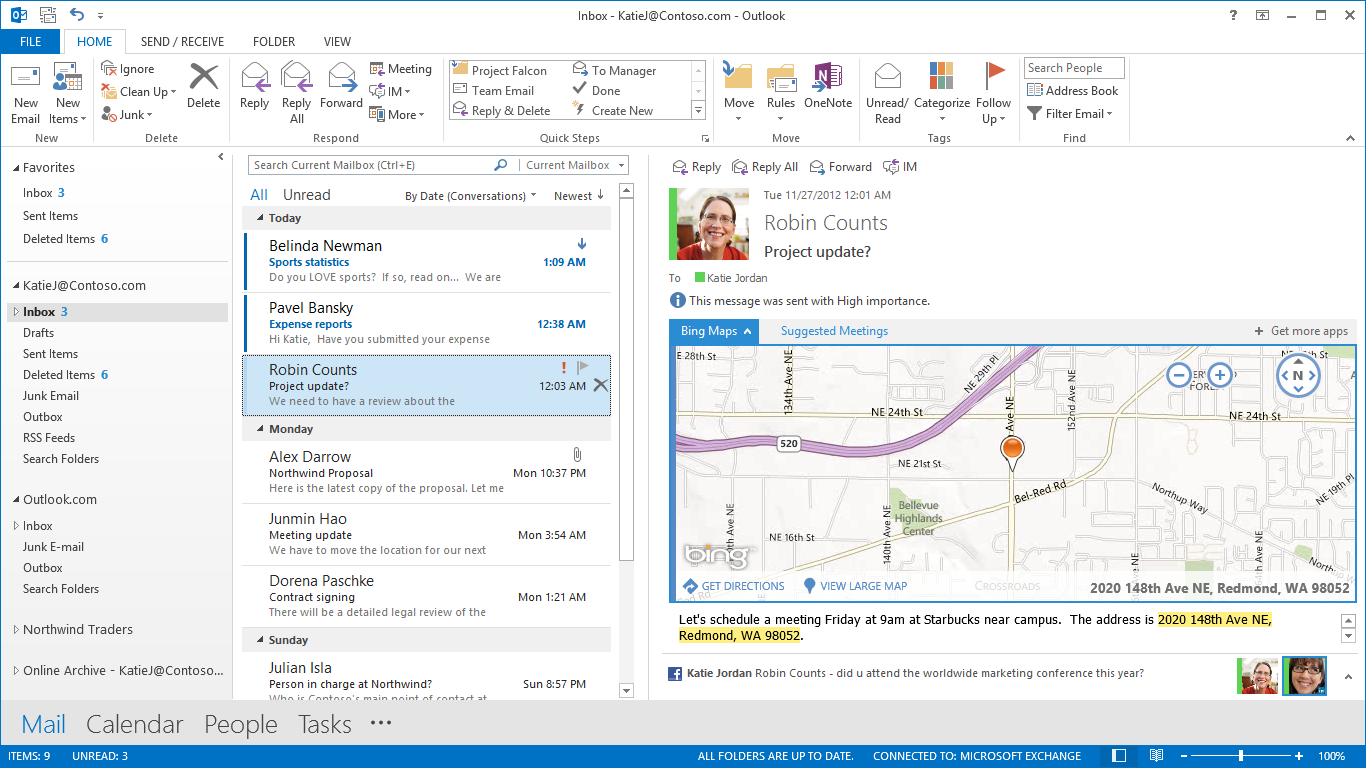
Outlook has been redesigned to look like a much more powerful version of the Windows 8 Mail application, with a colour scheme change from gold to blue. Inline replies are now the default, there are plenty of animations, and social networking integration is being touted as one of the more important new features. Clearly, this is not my father’s Outlook we’re talking about. It takes some of the better features from current mobile mail applications and integrates them into what was already the gold standard in desktop mail programs. There are new flyover boxes (called Peeks) to quickly show you schedule, calendar, or contact details without switching windows. The contact manager also does a better job of consolidating multiple contact details into a single card to reduce duplicates. Faster search, better filtering, and new views and in-line attachment and Bing map previews make the 2013 edition the sleekest and easiest version of Outlook yet. After using Outlook for a few days, going back to the Mail app is just a painful and torturous exercise.
With Office 2013, OneNote is making the jump from interesting and useful Office application to really being a vital component of the Office suite. With the rise of tablet computing and the touch-centric nature of Windows 8, this is understandable, particularly since most of the Intel-based tablets are coming with Wacom, N-Trig, or other active (pen-input) digitizers and even the Windows RT slates work well when paired with capacitive styli. That most Windows RT slates don’t come with capacitive pens out of the box is a failing of the device manufacturers, since the platform really lends itself to pen input.
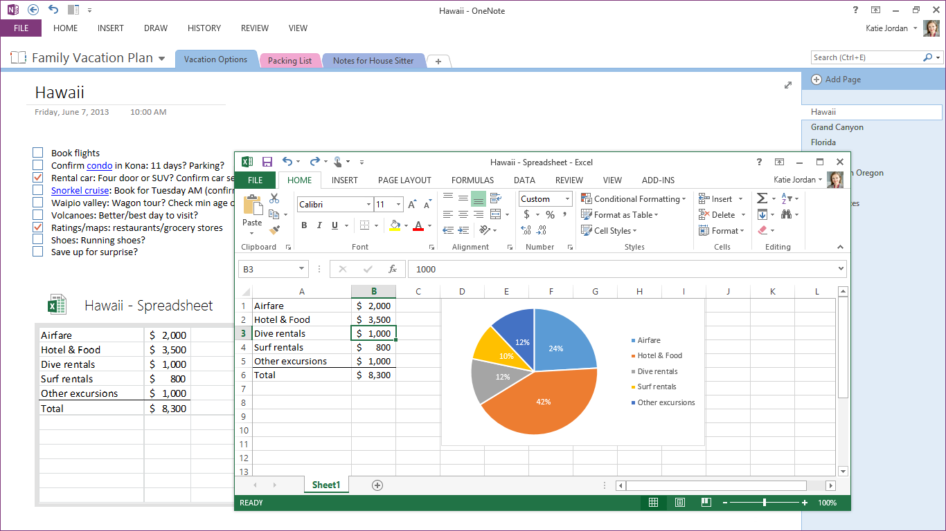
OneNote 2013 features a lot of cross platform integration, with easily embedded objects and Office files (which automatically update when changed). So, if I was to put an Excel grocery list file into OneNote, any changes I made to it in Excel would be reflected in OneNote as well. Outlook meeting integration gives OneNote much more scope in the business realm than it previously had, particularly when combined with the improved search and linked audio features. Better inking, photo snipping, auto-save, and a full-page reading view just improve what OneNote was already great for.


113 Comments
View All Comments
guidryp - Friday, February 1, 2013 - link
Totally disagree.Monochrome icons all look the same on first glance. You need to waste more time deciphering them.
The flat featureless crap was windows in the early 1990's.
It is also totally ridiculous that you like Aero more, but you are willing to give it up and defend flat monochrome because Microsoft is pushing that fashion.
Talk about sheep.
Tetracycloide - Friday, February 1, 2013 - link
It's ridiculous that you can't make a coherent argument about UI design without calling someone a sheep because they don't agree with your position...Parhel - Friday, February 1, 2013 - link
You must be new to tech sites. This is where the socially maladjusted come to call everyone who disagrees with them 'Sheep'.guidryp - Friday, February 1, 2013 - link
I am not calling him a sheep for disagreeing with me.I am calling him sheep because he is willing to abandon what he actually likes better, to follow the latest fashion MS dictates.
"... althoguh I like windows 7 aero style more, but...."
Nothing quite as sheep like as abandoning what you actually prefer to follow a new corporate directive.
FunBunny2 - Friday, February 1, 2013 - link
C'mon. The Great God Steve refused to make a color-tubed machine and one with a hard drive. Events caught up with him, but he was convinced.Wolfpup - Thursday, March 7, 2013 - link
This has nothing to do with "old-fashioned". This has to do with useability. Shadows and the like weren't introduced randomly or for fashion, they were introduced because they're more FUNCTIONAL. Removing them for fashion's sake is insane and incompetent.Cygni - Friday, February 1, 2013 - link
Agreed. The UI is absolutely terrible. The flat monochromes and ALL CAPS TEXT in 1998 era fonts. Just looks horrifically bad.steven75 - Sunday, February 3, 2013 - link
It's so bad if my employers forced this version of Outlook in me I'd be tempted to retreat to the web access version.crispbp04 - Friday, February 1, 2013 - link
Chrome and useless flash is JUNK. Are you also impressed by old Honda civics with fart pipes, a 4 foot wing, and a crappy paint job?Maybe it's time to look in mirror and ask why yourself "Why am I a cynical hater?" It's possible that it will expose the core reasons why you're being an unoriginal bandwagon hater drone, instead of someone who backs up their rants with facts and examples.
I understand that "haters gon' hate" and try to invent bogus reasons to support their ignorance, but at the end of the day, it shines through nonetheless.
colonelpepper - Friday, February 1, 2013 - link
you're hilarious....look at your own screed.