Apple iPhone 4S: Thoroughly Reviewed
by Anand Lal Shimpi & Brian Klug on October 31, 2011 7:45 PM EST- Posted in
- Smartphones
- Apple
- Mobile
- iPhone
- iPhone 4S
Camera Quality
So we’ve gone over the details of improvements on the sensor, optical system, and finally ISP, and now the question is what this translates to in terms of actual image quality. To get to the bottom of this, we’ve turned to our usual smartphone camera bench locations and taken photos with the iPhone 4S at those locales. In addition I’ve taken photos with the 4S in our light box test with the lights on and off.
Anand mentioned that the smartphone battery life test needs some tweaking, the same also applies to the smartphone camera bench. To that end, we’re doing a few new things here in addition to the same old stuff. I recently started taking video samples side by side with the device under test alongside another reference camera - we’re going to start doing that more for stills now as well, and I’ve done this with the 4S alongside the 4 and an SGS2. I’ve always felt that our photo tests could be a lot more rigorous, and we will be coming up with some much more objective tests, but for now I have a preview with three new controlled tests. These sample photos are taken in another smartphone camera mount on a tripod 1.5 feet away from a test target. If we were being really scientific we’d be using an optical track and such, this is just a tripod with the phone on top some distance away. The goal is to have some objective testing, some subjective/qualitative testing.
The first is a distortion grid which is pretty straightforward. We’re all familiar with distortion, which is a strongly field dependent magnification error. Put another way, rays at different field angles get different magnifications, and the result is either barrel or pincushion. It’s actually easy to qualitate how much distortion there is present based on a sample like this, which we’ll do in the future. In addition, it’s also possible to correct out distortion computationally.


The 4S subjectively has much less distortion than the 4, though both appear to have some barrel going on. Interestingly enough you can immediately tell that the 4S and 4 have close to the same field of view, with the 4S being just a tad wider. The SGS2’s wide field of view becomes readily apparent as well in the fourth image, and it suffers from a non-negligible amount of barrel distortion. I tossed in the other android handsets I have on hand as well as the 3GS to show how far things have come.
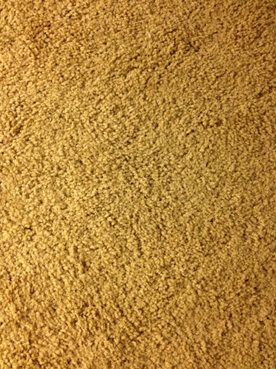
Another noteworthy thing is that the 4S minimizes but doesn’t entirely eliminate the colored spot in the center. The 4 had an incredibly distinctive green spot in the center that was so notable you could spot images online and instantly tell they came from an iPhone 4. You can see a magenta circle in the 4’s sample, but it’s a bit harder to detect on the 4S image. It’s an aberration that crops up whenever you’re not looking for it, but seems to elude me when I try and track it down. Oddly enough I managed to find it in my carpet, where the 4S has no such green circle, but the 4 does. We talked earlier about the improved IR filter possibly mitigating this issue, and that does seem to be the case somewhat.
| iPhone 4S | iPhone 4 |
Apple spent a lot of time in the keynote discussing their auto white balance functionality in the H4 ISP - the question is how well does it stack up? Onward on to our next test, which is a GMB/Xrite color checker classic card and the Kodak color control patches. I took a reference image with my D300s and configured white balance manually using an 18% grey card for comparison purposes, and then samples with the same phones again.


It’s interesting that the iPhone images have been getting less saturated with each generation. The 4 image looks absurdly oversaturated and almost cartoonish compared to either the reference, the 4S, or the SGS2. I’d say that the SGS2 and 4S are pretty much tied here and look close to but not exactly in line with the reference. Going down the line you can see some of the other vendors have a long ways to go with their own white balance.
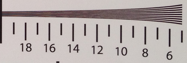
The third new test for right now is an industry standard ISO 12233 chart test. I see a lot of people taking pictures of this, but then offer little interpretation of the results. There are a bunch of different components in this chart - the thick 30 degree lines are for use with very popular slant MTF analysis algorithms, there are some patterns for distortion computation, and finally line pairs with ever increasing spatial frequency. Analyzing these requires looking at the full size samples, then finding the point at which the contrast between line pairs goes to zero - essentially, the point where you can’t visually distinguish the pattern from irresolvable grey - in both vertical and horizontal. The numbers on the chart simply correspond to hundreds of line widths per picture height.


The gallery images of the full size charts are good but to really make conclusions you need to look at size crops of those tangential and saggital frequency regions. These are all taken with the same illumination, unfortunately the huge differences in white balance between cameras are just a reflection on how far the industry needs to go.


The difference between the frequency response of the 4S and the 4 is pretty huge. The disclaimer before you run into all of this data and start analyzing is that choosing the cutoff frequency is something of a science in and of itself (especially because there’s a contrast reversal that tricks people up), plus unfortunately all smartphone cameras export lossy compressed images (JPEGs) and not raw data, and there’s all kinds of sharpening and processing routines at play here. That said, I’d put the 4S cutoff in tangential around 17, and the 4 at 13. I threw the 3GS in as well to show how far things have come in such a short period - that camera barely makes it to 10. The results from the SGS2 put it around 15 or 16, though that camera is doing visible sharpening as evidenced by halos at the edge and an interesting spatial frequency response plot. If you look at contrast between 14 and 16 you can see the 4S narrowly edge out the SGS2 without any sharpening.
| iPhone 4S | iPhone 4 | Galaxy S 2 |
I tossed in images from HDR mode from the 4S and 4 as well. These are made from computationally recombining three differently exposed images stored in a buffer. When you tap the capture button, those last three images get recombined into an image with more dynamic range. Interestingly enough, Apple does some sharpening in HDR Mode - again you can see halos and a big uptick on an SFR plot, but it isn’t subjectively that bad, and we can distinguish lines up to arguably between 17 and 18. In the saggital direction, we can see lines down to about 17.5 on the 4S, 13 on the 4, and around 16 on the SGS2. It’s hard to pick cutoffs when sharpening and nose reduction messes with the image, but clearly the 4S performance is very good. If you want to compare yourself, the original images cropped to tangential and saggital frequency areas is here (2 MB) and the full size charts images are here (19 MB).
Now for the subjective side by sides, which were taken in a bracket holding two smartphones at a time some distance apart horizontally. It’s impossible to take the same exact photo from the same place in space and time, but we’ve done our best to offer a comparison with only a small amount of horizontal shift.
| iPhone 4S | iPhone 4 |
The first 14 test images compare the iPhone 4 to the 4S and are at our test locations downtown, and from a few new angles. Then images 15–19 compare the 4 and 4S HDR performance, followed by 20–24 and 31 which compare the 4 and 4S in low light conditions. Last, 25–30 compare the 4S with the SGS2 which a lot of people have asked for.


The test charts we’ve shown so far tell the story, but seeing real world images makes the difference immediate. The 4S has vastly improved dynamic range over the 4 - you can see many more details in shadows and highlights, thanks in part to increased well depth between the two sensors. The difference between the 4 and 4S white balance is immediately visible as well in sample 4 where the 4S looks more like the actual bridge, and in 7 of a fountain.
In low light tests, the difference is even more dramatic and visible. The neon lit grill sign in 21 on the 4 is something of a blurry mess, while you can actually see the individual tubes in the 4S sample. I also shot a low light test in our light test box, number 31 where you can see a huge difference in noise between the 4S and 4.
The comparison with SGS2 is a little harder to make visually given the difference in field of view between the two. Aligning the two cameras also proved a challenge again thanks to this big difference in field of view, but you can see the effects of Samsung’s sharpening when you look for it. Subjectively, however, the two are quite close.
| iPhone 4S | iPhone 4 | Galaxy S 2 |
I’ve also included the 4S images in our usual lightbox gallery with and without flash, and the normal smartphone camera bench.


I mentioned earlier that I intentionally avoided using the LED flash on the 4, and the same continues with the 4S. If you’re under 2 feet away from the subject, the tiny little fresnel lens on top of the LED flash continues to not be good enough at spreading light around evenly. There’s also a nice bleeding effect that happens on the white model that doesn’t affect the image but just casts a huge weird light pattern on the wall from light bouncing around inside the glass plate. In addition, Apple still doesn’t illuminate the scene when focusing in the dark, so often you’ll entirely miss focus if it’s too dark.
With the lights on inside the box you can see how much better the 4S’ white balance is than the 4, which has an almost red colored background in this test. Oversaturation is also gone, thankfully. I also tossed in images from HDR mode with the lights on. I haven’t touched on it as much but the 4S also shows a big improvement in brightness uniformity with essentially no unwanted vignetting.
The front facing camera on the 4S is unchanged from the 4 (still just VGA), however this offers an interesting opportunity to compare that ISP-enhanced whitebalance. If you look at the sample from the 4S and compare to the 4, the difference is pretty shocking.
To conclude the still image analysis section, we can safely say that Apple has gotten serious about image quality with the 4S. Before the iPhone 4, the iPhone camera largely felt like a commodity cameraphone solution tacked onto otherwise great hardware. With complete control over almost the entire imaging chain on the 4S - custom optics, ISP, and software - we’re starting to see some of Apple’s vertically controlled influence spill over into this arena as well. Nokia has built an incredible reputation for itself by using glass optics and building phones around high performance cameras (like the N8 which is still in a different category entirely), and for the first time we’re starting to see Apple venture into that category as well.


199 Comments
View All Comments
robco - Monday, October 31, 2011 - link
I've been using the 4S from launch day and agree that Siri needs some work. That being said, it's pretty good for beta software. I would imagine Apple released it as a bonus for 4S buyers, but also to keep the load on their servers small while they get some real-world data before the final version comes in an update.The new camera is great. As for me, I'm glad Apple is resisting the urge to make the screen larger. The Galaxy Nexus looks nice, but the screen will be 4.65". I want a smartphone, not a tablet that makes phone calls. I honestly wouldn't want to carry something much larger than the iPhone and I would imagine I'm not the only one.
Great review as always.
TrackSmart - Monday, October 31, 2011 - link
I'm torn on screen size myself. Pocketable is nice. But I'm intrigued by the idea of a "mini-tablet" form factor, like the Samsung Galaxy Note with it's 5.3" screen (1280x800 resolution) and almost no bezel. That's HUGE for a phone, but if it replaces a tablet and a phone, and fits my normal pants pockets, it would be an interesting alternative. The pen/stylus is also intriguing. I will be torn between small form factor vs mini-tablet when I make my phone upgrade in the near future.To Anand and Brian: I'd love to see a review of the Samsung Galaxy Note. Maybe Samsung can send you a demo unit. It looks like a refined Dell Streak with a super-high resolution display and Wacom digitizer built in. Intriguing.
Rick83 - Wednesday, November 2, 2011 - link
That's why I got an Archos 5 two years ago. And what can I say? It works.Sadly the Note is A) three times as expensive as the Archos
and B) not yet on Android 4
there's also C) Codec support will suck compared to the Archos, and I'm pretty sure Samsung won't release an open bootloader, like Archos does.
I'm hoping that Archos will soon release a re-fresh of their smaller size tablets base on OMAP 4 and Android 4.
Alternatively, and equally as expensive as the Note, is the Sony dual-screen tablet. Looks interesting, but same caveats apply....
kylecronin - Monday, October 31, 2011 - link
> It’s going to be a case by case basis to determine which 4 cases that cover the front of the display work with the 4S.Clever
metafor - Monday, October 31, 2011 - link
"Here we have two hypothetical CPUs, one with a max power draw of 1W and another with a max power draw of 1.3W. The 1.3W chip is faster under load but it draws 30% more power. Running this completely made-up workload, the 1.3W chip completes the task in 4 seconds vs. 6 for its lower power predecessor and thus overall power consumed is lower. Another way of quantifying this is to say that in the example above, CPU A does 5.5 Joules of work vs. 6.2J for CPU B."The numbers are off. 4 seconds vs 6 seconds isn't 30% faster. Time-to-complete is the inverse of clockspeed.
Say a task takes 100 cycles. It would take 1 second on a 100Hz, 1 IPC CPU and 0.77 seconds on a 130Hz, 1 IPC CPU. This translates to 4.62 sec if given a task that takes 600 cycles of work (6 sec on the 100Hz, 1 IPC CPU).
Or 1W * 6s = 6J = 1.3W * 4.62s
Exactly the same amount of energy used for the task.
Anand Lal Shimpi - Monday, October 31, 2011 - link
Err sorry, I should've clarified. For the energy calculations I was looking at the entire period of time (10 seconds) and assumed CPU A & B have the same 0.05W idle power consumption.Doing the math that way you get 1W * 6s + 0.05W * 4s = 6.2J (CPU B)
and
1.3W * 4s + 0.05W * 6s = 5.5J (CPU A)
metafor - Monday, October 31, 2011 - link
Erm, that still presents the same problem. That is, a processor running at 130% the clockspeed will not finish in 4 seconds, it will finish in 4.62s.So the result is:
1W * 6s + 0.05W * 4s = 6.2J (CPU B)
1.3W * 4.62s + 0.05 * 5.38s = 6.275J (CPU A)
There's some rounding error there. If you use whole numbers, say 200Hz vs 100Hz:
1W * 10s + 0.05W * 10s = 10.5W (CPU B running for 20s with a task that takes 1000 cycles)
2W * 5s + 0.05W * 15s = 10.75W (CPU A running for 10s with a task that takes 1000 cycles)
Anand Lal Shimpi - Monday, October 31, 2011 - link
I wasn't comparing clock speeds, you have two separate processors - architectures unknown, 100% hypothetical. One draws 1.3W and completes the task in 4s, the other draws 1W and completes in 6s. For the sake of drawing a parallel to the 4S vs 4 you could assume that both chips run at the same clock. The improvements are entirely architectural, similar to A5 vs. A4.Take care,
Anand
metafor - Tuesday, November 1, 2011 - link
In that case, the CPU that draws 1.3W is more power efficient, as it managed to gain a 30% power draw for *more* than a 30% performance increase.I absolutely agree that this is the situation with the A5 compared to the A4, but that has nothing to do with the "race to sleep" problem.
That is to say, if CPU A finishes a task in 4s and CPU B finishes a task in 6s. CPU A is more than 30% faster than CPU B; it has higher perf/W.
Anand Lal Shimpi - Tuesday, November 1, 2011 - link
It is race to sleep though. The more power efficient CPU can get to sleep quicker (hurry up and wait is what Intel used to call it), which offsets any increases in peak power consumption. However, given the right workload, the more power efficient CPU can still use more power.Take care,
Anand