The HP TouchPad Review: webOS on the Big Screen
by Anand Lal Shimpi on July 17, 2011 11:11 PM ESTSearch
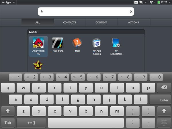
As we mentioned in our Veer review, the newer versions of webOS now have a system-wide search bar on the home screen. On the Veer you just have to start typing to bring your search, but on the TouchPad you'll need to tap in the search bar first to bring up the virtual keyboard.
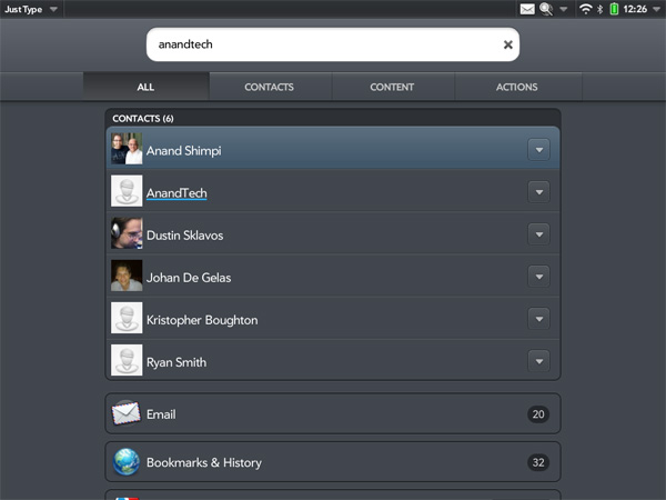
Once activated, the system wide search on the TouchPad works just like it does on the Veer. Although not quite instantaneous, you do get search results as you type. Remember we're dealing with a couple of mainstream NAND die behind a controller that's only good for a couple hundred random read/write IOPS at best so performance isn't going to be as good as search on a desktop or in the cloud backed by much faster I/O.
Despite the initial lag, once you get results they tend to be quite good. You can use the Just Type interface to launch applications, search contacts, search your bookmarks and web history, spawn a web search and even create a new message (email, IM, Facebook status update) from the text of your search automatically.
Even if you don't have a lot on your TouchPad to search, it's a great way of spawning a Google search if you don't have a browser card open already. Just type your search query, tap on Google Search and webOS will automatically launch a browser card with your search string.
I typically don't use search functions on smartphones or tablets but this is actually very well done. If it were a bit faster I'd be in heaven.
My only complaint here is although webOS does search your bookmarks and web history, it doesn't search the contents of web pages in your cache - just their titles/URLs. I suspect this is a limitation of the available storage and processing power, but it's something I would like to see HP address in future iterations of the TouchPad.

Individual apps also leverage webOS' excellent search functionality. You can quickly search through emails and contacts, unfortunately there's no way to search through the contents of IM conversations.


67 Comments
View All Comments
Conner_36 - Monday, July 18, 2011 - link
because its a free marketkmmatney - Monday, July 18, 2011 - link
I agree - at this price there isn't much incentive. At this time, it seems like the iPad 2 is still the better device. I don't think WebOS gives you any more "freedom" than iOS.bpgd - Monday, July 18, 2011 - link
This is the review I have been waiting for. As always Anand's review is gold standard. He goes into details and really tells how the thing works.NeoReaper - Monday, July 18, 2011 - link
I feel bad writing this comment because this is actually the first time I've ever posted anything on Anandtech and I've been coming to this site since its inception. I have a lot of respect for virtually every article I have ever read on this site written by Anand with the exception of this one. This is only an opinion but I feel like this review isn't nearly as critical as it should be. Based on what I've read in regards to performance, battery life, bugs, etc.. this device doesn't deserve the pass that you gave (at least that's the impression I get from reading this) This device has too many underlying flaws that haven't been addressed, mainly being the OS performance issues that have existed since the original Pre. Why criticize Skype performance when the screenshot you have cleaerly shows a large number of system services sapping CPU usage for no good reason? I mean, really? Pulseaudio is using almost 27% CPU usage. Maybe I'm interpreting this review incorrectly... I just feel that you were hoping for this device to deliver but reality it doesn't and you're simply hoping that OS updates will resolve the performance issues. If you want to believe that, why not expect the competition to make an update to the OS which boasts features that will make it better for office productivity? Hope is for fanboyism, a reviewer should be deliver facts without twisting it with what could be. Your final words are completely contradictory to itself. I hope you re-examine your review. As I've said already, I have great respect for you, Anand, and I've praised virtually every article you have ever written, but this article I cannot.lunarx3dfx - Tuesday, July 19, 2011 - link
One thing you might want to keep in mind though, is that while pulseaudio was using 27% of CPU resources, is that necessarily HP's fault? I would be more inclined to believe that the fault lies with the developers of pulseaudio for not making a well optimized app.Now, I'm not excusing the glaring flaws with the Touchpad, however I have not noticed the majority of the performance issues reviewers have seen with my personal TP. That's why in an earlier comment I wanted to know what build of the OS Anand's unit is running. I think reviewers got an earlier build that may not be as optimized as the release build.
I was in Staples the other day, and the demo unit was running build 16 whereas the release models are running build 41.
NeoReaper - Tuesday, July 19, 2011 - link
i see your comment regarding the build number now, it would be very interesting to hear back from Anand regarding the build he was running and whether or not any performance issues have really been fixed. as for the pulseaudio thing, pulseaudio is a linux audio service so the state of its optimization would be HP's fault. It is not a third party application. As I said, my main gripe with the review is that even in the final words portion of his article, many statements are contradictory. How productive can it be when he states that the unit is runs slower than its main competitors in virtually every aspect? How can you justify weight and size with such poor battery life and performance? Maybe I'm being a bit too harsh but the problem is, all the underlying "performance" issues that he states are in the Touchpad are the same problems that plagued the Pre, Pixi, and Pre2. I would love for HP to "fix" the performance issue, but maybe its not really that easy to "fix".lunarx3dfx - Tuesday, July 19, 2011 - link
I forgot about pulse being a linux service. Whoops. lol. I can expplain the extra weight and thickness of the device though. Well, HP did. The reason it is so much thicker and heavier according to them, which makes sense to me, is the inclusion of the inductive charging coils.NeoReaper - Tuesday, July 19, 2011 - link
ahh, ok ok, that makes sense.Leonick - Monday, July 18, 2011 - link
The keyboard is actually pretty impressive compared to the competitors, having both a numbers row with special characters and a tab key.I also like how it handles the settings compared to iOS, having settings in the individual apps make a lot more sense in my mind that a centralized app, still iOS apps can do this if the developers choose to and when there are any settings you might want to change more than once or while running the app the generally do so.
Seems they got notifications pretty right for a tablet too. Pretty similar to how honeycomb does it it looks like. I think the system coming with iOS 5 will do fine for the iPad but it's still not perfect, it seem to be lacking statusbar icons to show that you have notifications and it would be neat if it could display upcoming calendar events and not just events with reminders (like the cydia app Lockinfo does).
Also, it was mentioned how the system was similar to notifications on a PC, well that's understandable, they do have plans to put WebOS on PCs.
Belard - Tuesday, July 19, 2011 - link
I agree with you on the keyboard. When I played with the Playbook, I noticed the keyboard right away and LOVE it... iOS and Android should COPY this onto their own devices... ah, let the lawsuits fly.When you have passwords that are combos of numbers and letters, going back and forth can through you off (it does me).
I'd give HP/WebOS a 10 for the keyboard. I'd give Android and iOS a 6 in comparison.
The Settings Icons for WebOS are a pain.... You have to open one after the other, and if you DON'T close the, they'll stay in memory - constantly running.