The Apple iPad 2 Review
by Brian Klug, Anand Lal Shimpi & Vivek Gowri on March 19, 2011 8:01 PM ESTThe Cameras
If there’s one thing that people were waiting for with the iPad 2, it’s the inclusion of cameras. CPU and GPU performance improvements with the iPad 2 are dramatic, but it’s the cameras that will drive both existing and new iPad customers to the device. For being probably the single most notable difference between the iPad 2 and its predecessor, the camera execution and experience on the iPad 2 is actually surprisingly bad.
I could pretty much sum up the iPad 2 cameras with one word: mediocre. The interface, the physical placement of the rear camera, and finally actual quality all leave room for considerable improvement. If you want a video overview of the entire iPad 2 camera situation, check out our video review.
The front facing camera is actually about where it should be, in fact. VGA is standard fare for iOS devices because right now FaceTime is just 320x240 from iDevices. My issue isn’t with the front facing camera, it’s the back camera that really under-delivers, and for that reason the iPad 2 feels like it’s a device saddled with two front-facing cameras. The fact that they’re better than nothing (e.g. iPad 1) is small consolation for how seriously underwhelming the rear camera is.
Both cameras are identical to what comes in the iPod Touch 4th generation, a device that starts at $229. At $499, it doesn’t seem like a completely unreasonable thing to expect cameras that are at least somewhat better.
Let’s start with the camera user interface. At first glance, it’s the exact same as the camera interface on the iPhone and iPod Touch. Capture button in the center, a link to the photo application with thumbnail of the last captured photo in the bottom left, a digital zoom slider after a tap, and a switch between video and still at right. Up in the top right is the switch-front-back camera button as well. The iPad has no HDR options, and obviously no LED flash options either. Tapping on the preview exposes for the tapped region, but since the rear camera is fixed focus, focus doesn’t change.
What’s really annoying about this interface is that it rotates.
I’ve spent every second since first picking up the iPad 2 wondering what possessed Apple’s UI designers to make this decision, asking myself what possible benefits this choice could have. The only possible one is that this is an equalizer for left-handed users, but then why not simply make an option in settings to change the location of the bar from the left to the right side?
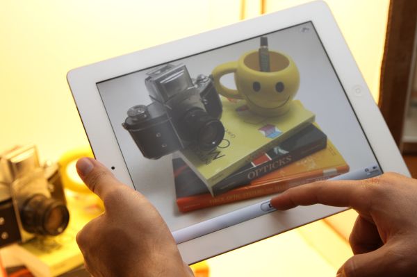
The problem with keeping the capture/switch bar at the bottom of each orientation is that it puts the capture button in the absolute worst possible place.
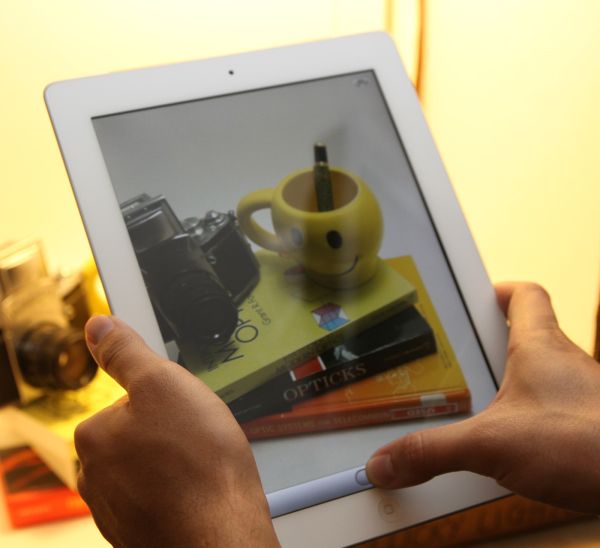
At each orientation, the capture button is dead center at the bottom. The result is that to tap capture, you need to either stretch your thumb all the way to reach it, or remove your hand and tap with the index finger.
Both of those result in a much less stable grip position and add to shake. Moreover, it’s a downright fatiguing position to have to hold the iPad in for any length of time. It’s somewhat annoying in portrait, but downright frustrating in landscape.
Putting the capture button here is painful. Were it left closest to the home button like it is on smaller iDevices, the capture button would be right near where the thumb naturally rests. Tap it with your thumb, and boom, no problem. Maybe a transparent button would also make sense.
The other problem with the capture interface is that if you have relatively large palms or tightly grip the iPad 2 to brace it and reduce shake, you run the risk of causing an unintended touch on the lower right or left corners. Numerous times, I went to hit capture and found that nothing happened. When that occurred, generally it was because I was touching the bottom left or right with my palm inadvertently. Touch filtering or heck, maybe some of that multitouch wizardry would go a long way here, Apple.
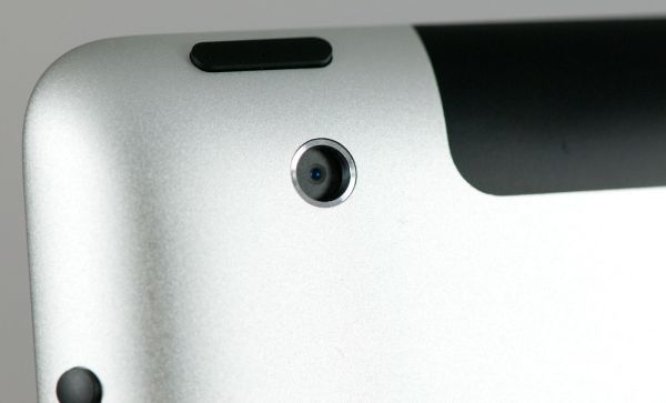
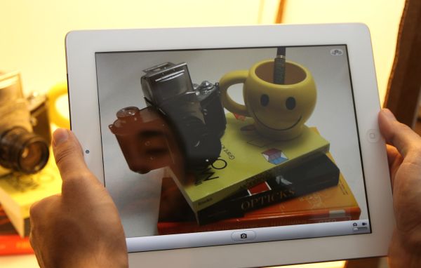
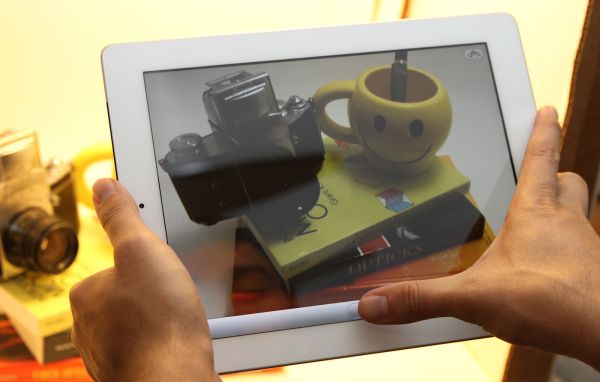
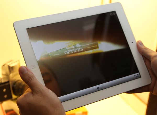
The final problem is with placement of the actual camera. Because of its position in the extreme top left (viewed from the back), the only viable way to hold the iPad 2 for landscape capture is with the home button on the right side. Hold it naturally with the button on the left side, and you'll end up blocking the camera with your hand like this:
The image preview in still mode is cropped to 4:3 and upscaled to XGA. The native resolution of the rear camera is 1280x720 (16:9). To get to 960x720 (4:3) Apple simply cuts off 160 pixels on the left and right. The fact that the image preview in still capture mode is upscaled to the full size of the iPad 2 display accentuates its underwhelming and noisy quality dramatically. It doesn’t look awesome. The front facing VGA camera blown up to XGA is even less impressive.
The only positive side effect of all this is that image capture is insanely quick. You can literally mash the capture button on both the front and rear cameras and capture essentially as fast as you can tap. No doubt some of that is the A5's impressive speed gains, but the other part of it is just the low resolution of those two cameras.






189 Comments
View All Comments
synaesthetic - Sunday, March 20, 2011 - link
Touchscreens are the very antithesis of good ergonomics. Unless haptic feedback can defy physics or we get some deformable/flexible screens, devices with actual buttons will always be superior.The human brain simply reacts better to physically pushing a button. Touchscreens have horrible ergonomics--a tiny bit of vibration is not really much haptic feedback. It feels like a lot to us (and it certainly helps me on my phone) but it only feels like that beccause a touchscreen is so far away from any semblance of "natural use."
Touchscreens should be used when they are REQUIRED--such as on smartphones, where the number of controls, commands and options far outstrip the physical size of the device and the physical space to place buttons.
I don't think tablets will ever stop being a toy.
stephenbrooks - Saturday, March 19, 2011 - link
Page 2, final picture. The iPad 2 is on the BOTTOM not the top there.Anand Lal Shimpi - Saturday, March 19, 2011 - link
Fixed! Thanks :)Omid.M - Saturday, March 19, 2011 - link
"There's also the idea of synergy among devices. Even if you play within the Apple universe and own a Mac, an iPhone and an iPad, there's no magical way of sharing data and applications between them. I should be able to work on my Mac, step away and have my apps/data come with me. Your best bet is something like Dropbox but that's no where near the type of cohesive solution I'm talking about. Think HP's webOS touch-to-share but on steroids and you're on the right track."Anand/Brian/Vivek:
I'm sure that's what Apple is planning with NFC-enabled iOS devices, but then wouldn't that require a saved state to be stored in the cloud and then re-downloaded on demand on the next device used? I would imagine that "lag" in the UX would be a problem. How long would you feasibly have to wait for stuff to download the first time you sit down with a new device (new as in rotation) ?
Also, would this be limited to stock-Apple stuff only? It would be a bear for Apple to save the state of arbitrary 3rd party software from one device to the next (assuming both devices have the client installed). Right?
Next...
"So if you're actually torn between the iPad 2 and the Xoom my best advice is to wait. Apple needs to update iOS in a major way and Honeycomb needs a hardware update. Whichever gets it right first should get your money."
This is really the money statement of the review. I think Android tab makers need to NOT simply look at the iPad 2 to figure out their next move, but to pave their own path, not for the path to be a RESPONSE to the competition. The Xoom should have higher quality display for sure, and Honeycomb needs faster incremental updates. I really liked it but it just lacks so much in terms of functionality and compatibility, at least if we're considering it for productivity.
None of the tabs on the market right now are really meant for editing/creating content--even if you're able to with a handful of apps--but simply consuming existing content (iTunes music streaming, sharing videos, social networking--and I think that's the biggest issue with tablet to replace netbooks or become devices taken seriously.
Please, please cover the WebOS tablet when it comes out.
Thanks for the review, guys. Great work. The technical section on glass, for instance, is one reason with AT does the best reviews.
Worth the read. Will tweet for others to check it out!
-Omid
clb - Monday, April 4, 2011 - link
I agree on both, but the point on #1 is missed. It is not the need for the cloud on NFC, but the fact that you cannot actually sync the device:>I should be able to work on my Mac, step away and have my apps/data come with me.
Even if you are going from a Mac to the iPad (1 or 2), there is no sync feature that covers everything. A note created on the iPad has to be emailed to your Mac; Apple will not let you read a note created on the iPad on a Mac unless you email it to yourself! And there is no way to get a note into the Likewise, using DropBox is great, but now files have to be loaded up, then you must reconnect, then load down. You cannot simply have the Mac send to the iPad or vice versa.
This is because unlike the early iPods, the iPhones and iPads do not allow the user to move files. Early iPods could be treated as FireWire drives. Not the iOs devices. Everything must go through iTunes or via the cloud (i.e., third-party sites). If I'm at a beach house with no cloud connection, and want to move content from my PC/Mac to my iPad, I'm SOL in many cases.
This is bad.
Adam Chew - Saturday, March 19, 2011 - link
Judging from your review of the iPad, its competitors will stand no chance of ever gaining traction in everyday use.So get a Macbook Air.....LOL
The problem is the everyday user is not a tech blog blogger, the iPad is ideal for consumption of everything of the net and not like some tech blogger who needs to blog unnecessarily with a laptop when an iPad is at hand.
nickdoc - Sunday, March 20, 2011 - link
Loved your contribution! The geek talk was getting really boring and repetitive. Hello! Normal people have needs, too. This is what the reviewers often forget. Not everyone needs to create content to be consumed by other creators of mostly the same content. Lol!stephenbrooks - Saturday, March 19, 2011 - link
OK, why where you joining *two iPads* together with magnets and buying a "smart vase" from Apple? :D"The iPad aligns and attaches to the body of the iPad 2 using six magnets along its side that line up with a similar set of magnets on the device. When I acquired the smart vase at launch, I [...]"
Anand Lal Shimpi - Saturday, March 19, 2011 - link
Fixed again :)tipoo - Saturday, March 19, 2011 - link
How the f does it work?