Motorola Xoom Review: The First Honeycomb Tablet Arrives
by Anand Lal Shimpi on February 23, 2011 11:57 PM ESTCharging
Motorola advertises that the Xoom can fully charge in half the time of its leading competitor, requiring only 3.5 hours to charge completely. I will say that the Xoom does indeed charge very quickly, but the quick charging comes at a price.
The iPad charges over USB, although on the iPad end it’s exposed as a standard Apple dock connector. Connect it to a USB port that supports the battery charging spec and you’ll be able to charge the iPad slowly, and only when locked. Otherwise you’ll need to rely on the Apple supplied 10W power adapter. The benefit to this finicky approach is that you only need to carry one cable to sync and charge your device. Obviously it’d be even better if the cable in question were a standard micro USB but presumably if you’re an iPad/iPhone owner you’ve got at least some Apple dock cables laying around.
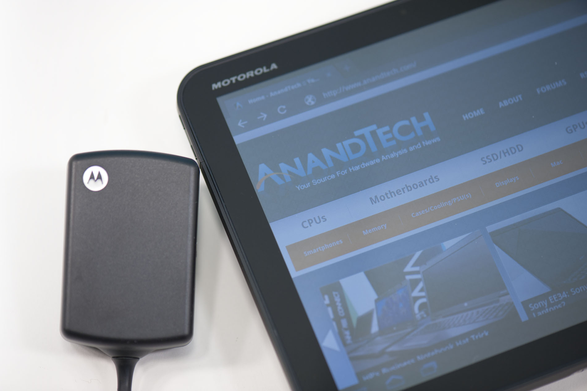
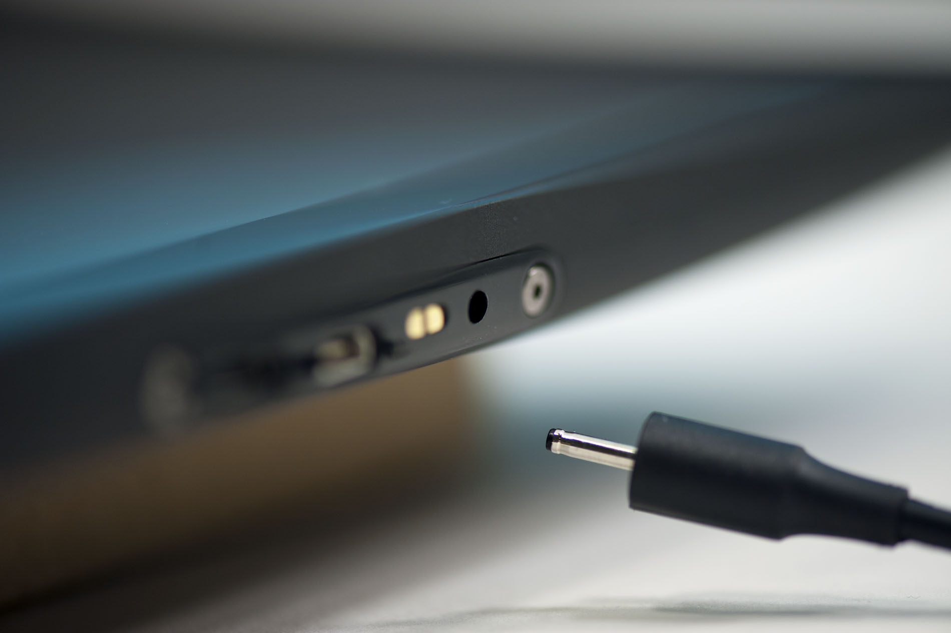
Motorola went a different route. There’s a standard micro USB port on the Xoom but it can’t be used for charging, only for data. Opposite the micro USB port is a very tiny power connector for the bundled 18W power adapter. When charging an empty battery the power adapter will draw up to 16.5W to help charge the Xoom as quickly as possible. The downside is obvious - you have to carry a much larger charging apparatus than just a cable with the Xoom.
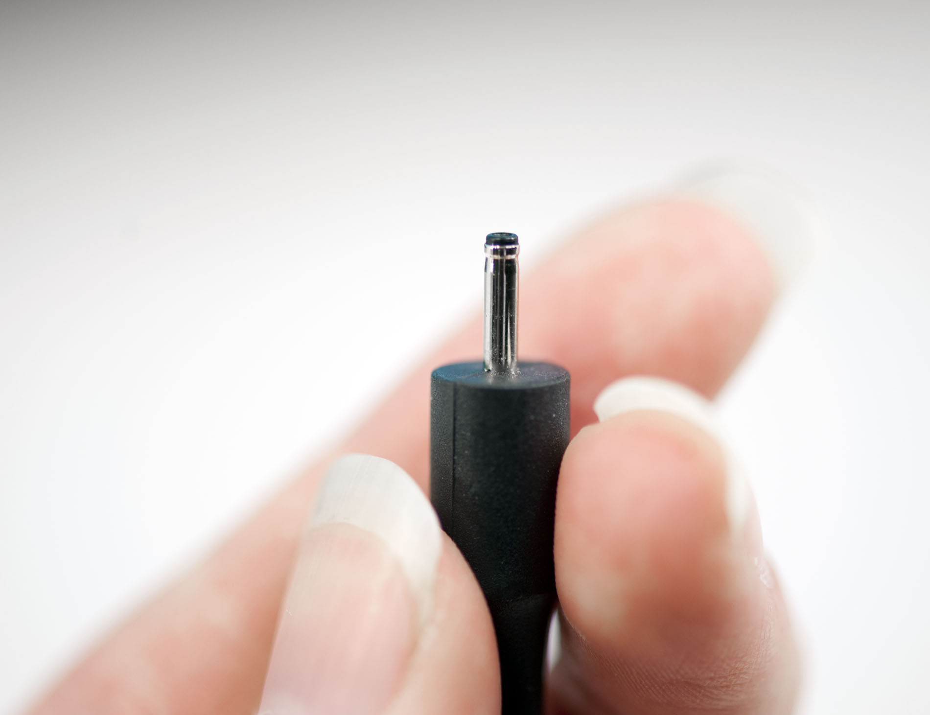
I’m also concerned about the connector tip, it’s extremely tiny and is very flimsy (not to mention non-standard). I just worry about breaking it as it will require a completely new power adapter as a replacement.
The Display
I’ve got some good news and bad news. The good news is that the 1280 x 800 resolution on the Xoom’s 10.1-inch display is very nice. While I’m not sure that we’ve figured out the perfect tablet form factor/display resolution just yet, I will say that I hope it’s not 1024 x 768. The move to 1280 x 800 is at least a step in the right direction.
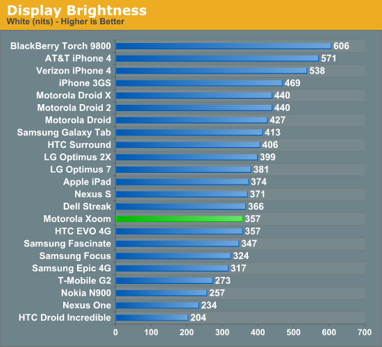
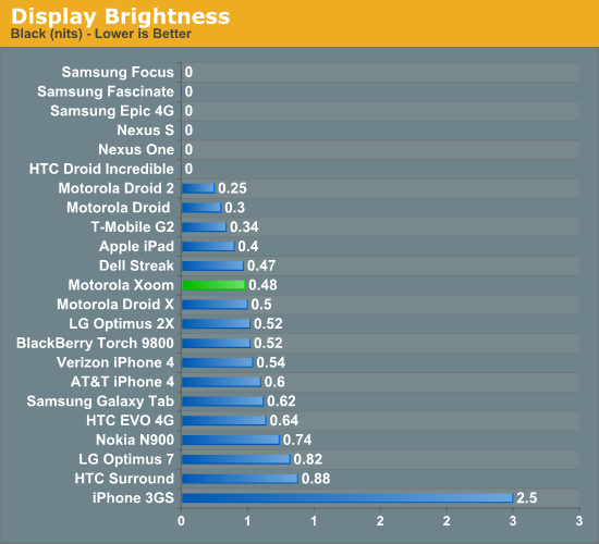
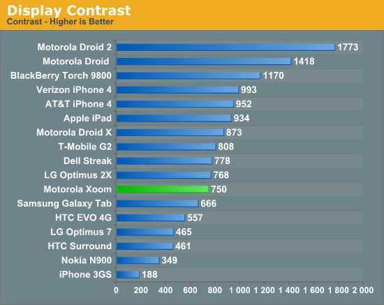
The bad news is the screen isn’t all that impressive. On my sample I measured a peak brightness of 356 nits and a black level of ~0.48 nits, resulting in a 750:1 contrast ratio. This puts the Xoom near the iPad in terms of brightness and lower contrast. In practice the lower contrast ratio is noticeable:
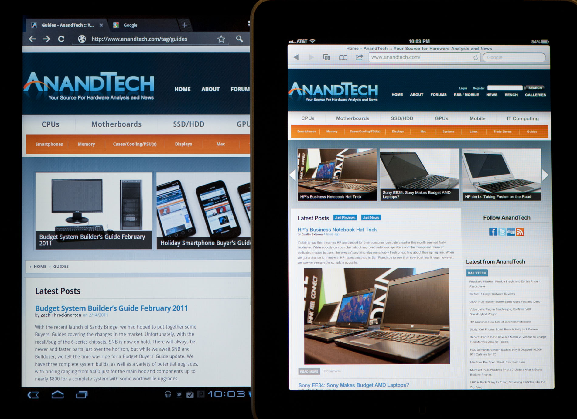
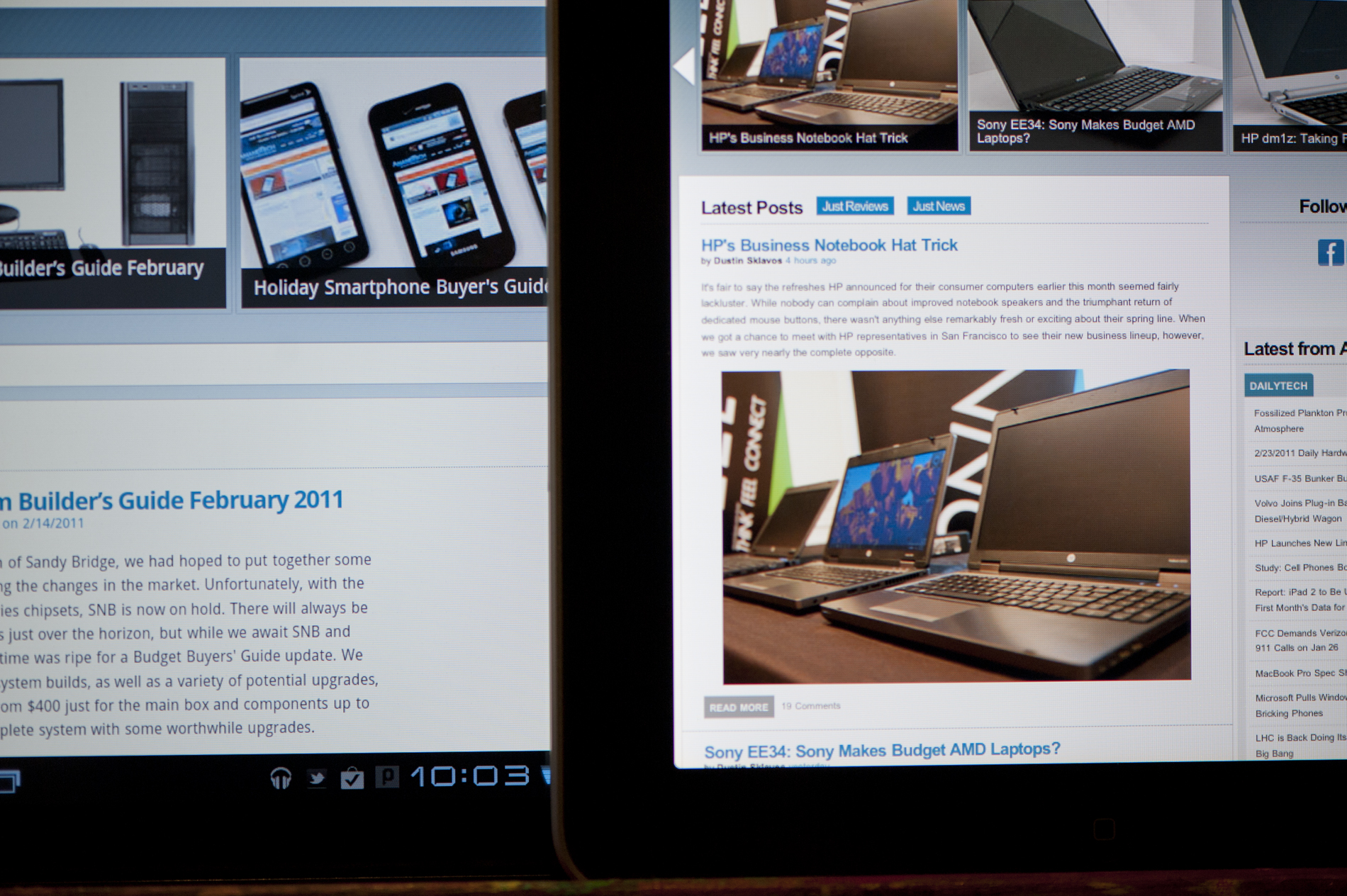
Motorola Xoom (left) vs. Apple iPad (right)
Motorola Xoom (left) vs. Apple iPad (right)
In practice the lower contrast ratio makes the Xoom almost completely unusable in daylight. If you can shadow the screen with your head it’s less of a problem but it’s still a pain to use outdoors in the daylight particularly if you’re staring at a dark colored background. Web pages and the email apps are easier thanks to their white background.
Motorola Xoom (front) vs. Apple iPad (back)
The iPad in particular has better color reproduction at off-center viewing angles. Alone, the Xoom looks acceptable. Not great, but not horrible either.

Finger prints and glare are issues on the Xoom display just like they were on the iPad’s display. You’re going to want to carry around a microfiber cloth with you at all times.


112 Comments
View All Comments
softdrinkviking - Thursday, February 24, 2011 - link
anand writes... "I suspect the ideal tablet UI is probably not too far off what modern desktop OSes have become. While a smartphone’s UI must be dramatically different due to the lack of screen real estate, a tablet UI just needs to be more efficient than its desktop counterpart - not necessarily very different."this is an interesting thought, and I am wondering if you are considering the, potentially, drastically different usage models that tablets need to be built for.
not only will people be using these things on the run, but the ways I see people using them now are really different from desktops.
tablets really lend themselves to task integration, where you have a specific reason to use it over and over.
for example, I have seen the subway/train information officers using them here in Japan to give people directions, and I see store clerks using them to implement inventory management software.
that kind of usage demands quick access to a limited number of functions and a low level of file maintenance.
If anything, I would have guessed it the other-way around, where tablets will need to be closer to a smartphone OS, but adjusted for the larger screen real estate.
mlambert890 - Thursday, February 24, 2011 - link
100% spot on. This is where the enthusiast niche that follows forums, and the reviewers and bloggers that server them, can't seem to "get it"For tech geeks, a slightly tweaked desktop metaphor is what they want from a tablet (for the ones that even want one at all). For the vast majority of the target audience, this absolutely misses the mark which is why iOS on iPad, despite all of the nerd rage towards it, has done so well.
I'm as geek as geek gets with 20+ years in this industry, but these days as an old guy, I am also a mobile professional. On the road, which is all the time, for work, i need exactly what you describe. Quick, efficient, task focused access.
I'm not geeking out at a Starbucks or doing proofs of concept (WoW on emu on Android on Xoom!!!) for YouTube. I'm doing email, note taking, Webex and reading/presenting on the go.
If google inches towards a tweaked desktop UX paradigm they will be making the same mistake MSFT did (and continues to) with their tablet efforts.
The hardcore tech crowd might be happy, but they are a micro percentage of this market.
bplewis24 - Thursday, February 24, 2011 - link
Did you miss the part of the review where Honeycomb was better in all of those areas? Or did you just focus on a quote taken out of context which compares this OS to a desktop OS?Never mind, I already know the answer.
Brandon
ccrobopid - Thursday, February 24, 2011 - link
I was waiting for your review of the Xoom. Goog job on your part, but I must say I'm a little disappointed with the hardware. On a tablet the screen quality sure is one of the most important elements, and at this price point I don't think I'll buy it. I also don't get the 16:10 aspect. Widescreen had sense in BIG screens because we have more degrees of vision sidewards, but at this screen size I prefer a 4:3 format because I feel it's more useful for web browsing, reading and apps in general.ccrobopid - Thursday, February 24, 2011 - link
Complementing my post, if it wasn't for the too boxed experience, I still feel like iPad is the device to have. Let's see if iPad2 launches and throws away some of that "boxeness" :Dmacs - Thursday, February 24, 2011 - link
Honeycomb needs:- an update to solve the youth problems
- great screen (at least as good as iPad)
- 16gb and wifi only for 499$
Apple needs:
- to catch up Honeycomb on software side (multitasking,browser,... I don't think that an iPad 2 still running iOS 4.x would be enough...)
- faster SoC (A5 dual core)
- Facetime Camera
- Video Out
Shadowmaster625 - Thursday, February 24, 2011 - link
I have a great idea. Let's all go spend $800 (+ $50 in tax) to have a tablet that crashes constantly and cant be viewed outside. Crackhead.Mr Alpha - Thursday, February 24, 2011 - link
I would really like to see minimum brightness numbers. The ability to turn the back-light way down is important in order to avoid a headache when reading something in a low light situation. The iPad for example has a too high minimum brightness.josephandrews222 - Thursday, February 24, 2011 - link
...you wrote this:"Things like this combined with the instability I mentioned earlier makes me feel like Honeycomb was a bit rushed, perhaps to hit the streets before one other major tablet announcement coming this year?"
...you referring to the iPad2 or HP's 'Pad'?
I really enjoyed this review. A lot. Thanks.
Jinded - Thursday, February 24, 2011 - link
On the Multitasking page, you mention the following about widgets:"In Gingerbread and prior version of Android, widgets were fairly constrained and two dimensional. You could display information within the widget but there was no depth and no concept of scrolling."
I don't think this is quite true, as several launchers (like LauncherPro) support vertically scrolling widgets. I myself use Agenda Widget as a scrollable 1x4 calendar widget. The Samsung TouchWiz interface (and I'm sure others as well) also comes with several widgets set up rolodex-style, displaying maybe the last 10 or so notifications/pictures/events that can be scrolled using up/down buttons. Not quite the same thing as a scrollable widget, but I think it counts as having depth.