Motorola Xoom Review: The First Honeycomb Tablet Arrives
by Anand Lal Shimpi on February 23, 2011 11:57 PM ESTWelcome to Honeycomb
The first Android tablets were laughable. Without changes to the UI Android doesn’t scale well to a larger screen, not to mention the lack of tablet specific apps Oh but what’s this? Android’s all grown up:
It doesn’t look like iOS but it surely doesn’t look like any version of Android we’ve seen before. Honeycomb is Google stating plainly that it can tear up blueprints and reinvent itself with the best of them.
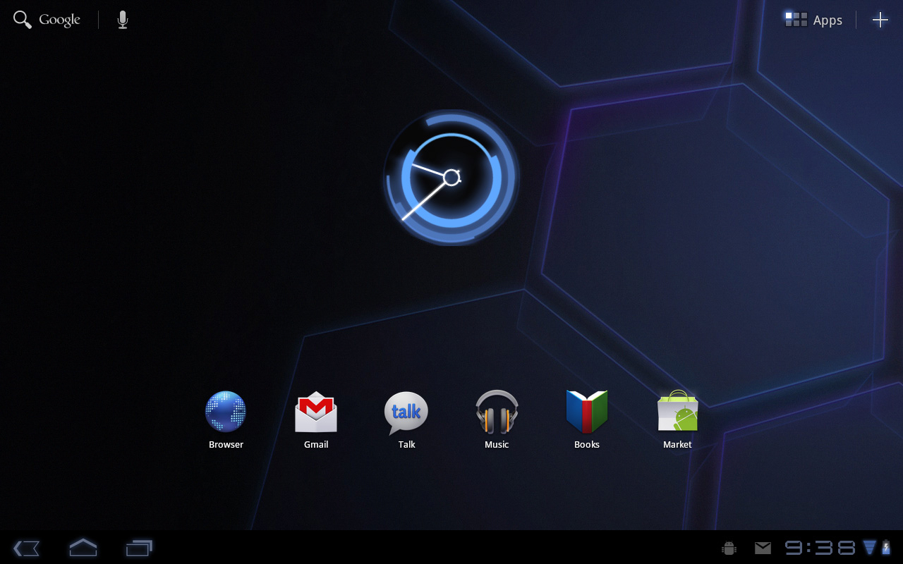
Pick up any Android phone and you’ll see four buttons, either capacitive touch or physical switch, along the bottom of the front face: Home, Menu, Back and Search. The order was up to manufacturer interpretation but all four had to be present. Honeycomb nixes two (Search and Menu) and adds one (Tasks). Google also moved the buttons from the screen bezel to on the screen itself - the buttons aren’t just capacitive, they are a part of the OS.
![]()
Back, Home, Tasks
The order is fixed: Back, Home and Tasks. As of now there’s no customizing the Honeycomb UI - say goodbye to Motoblur, Sense and TouchWiz. The location is also fixed: bottom left. My biggest complaint here are the icons themselves, they are unnecessarily ambiguous at first sight and do take some getting used to for Android and iOS users alike.
The entire UI motif is Tron meets Robocop. Swipe between home screens and you’ll get a thin blue outline of the previous/next screens as you move. The fonts used for links at the top of the page are more expected, while everything along the bottom of the screen is a bit more 80s sci-fi. I don’t personally believe this is ultimately what Google will settle on for tablet UIs, but it shows a willingness to try something new and different, which is the quickest way to ensure that Android will remain relevant as this market evolves.
I suspect the ideal tablet UI is probably not too far off what modern desktop OSes have become. While a smartphone’s UI must be dramatically different due to the lack of screen real estate, a tablet UI just needs to be more efficient than its desktop counterpart - not necessarily very different.
I believe Google is beginning to realize this as Honeycomb has some very desktop-like elements in its design. What was once a pull down shade at the top of the UI is now a notification bar in the lower right of the screen, eerily reminiscent of the Windows system tray - just not as frustratingly cluttered.
![]()
Notifications
There are also clock, WiFi and battery status indicators down there, but I’ll stop drawing parallels. The point is that this works well and I expect that we’ll continue to see a lot of convergence between the desktop and tablet OS UIs (and eventually the OSes themselves, isn’t evolution fun?).
Overall the UI is amazingly clean and very well done. It's not perfect, but I'm pleasantly surprised - all this time I thought Android was just super functional, who knew it could look great as well?


112 Comments
View All Comments
Impulses - Thursday, February 24, 2011 - link
You know, if this were almost any other site I'd agree... But I actually like the way Anand constantly puts things in context by looking at the big picture and comparing products to their competition in the market.Impulses - Thursday, February 24, 2011 - link
Oh and just for the record, I'm a big fan of Android, my phone's an EVO, and the only Apple product I've ever had is an iPod touch (16GB - 2nd gen)... I liked it as a music/video player, and a gaming device; but I don't see myself buying anything Apple in the foreseeable future.Azethoth - Thursday, February 24, 2011 - link
Ugh. Please do not ever stop comparing a product against its competitors. I want to know that some feature sux / kills vs the corresponding feature for competitors.tiredad - Thursday, February 24, 2011 - link
Compare Anand to Engadget. Engadget compare things to Apple products in a condescending way that i find patronising. It probably comes from their desire to wip up the pro and anti camps and thus sustain interest. Anand, on the other hand, compares products in an appropriate way that is informative to the reader. Comparison gives context and without context, value judgements are meaningless; done right, comparisons are essential.I love this site because it seems to simply love good technology irrespective of who makes it. I especially love that there is no arbitrary scoring system - you can read something and make your own judgement.
wumpus - Monday, February 28, 2011 - link
As long as Apple is the competition, Anandtech should compare to it.What I'm missing (gave up on, didn't see it in the long list for battery life) is the Nook Color. Since you can replace the software with honeycomb, this is pretty much the best deal for wifi-only tablets around. I guess the question is: "how far do you want to carry it, anyway?"
Sam125 - Thursday, February 24, 2011 - link
These tablets or as I like to call them: Smartphone 2.0 is looking pretty attractive but I'm still left wondering if a tablet would be better served by using an Atom+Ion or Ontario SOC.peastham - Thursday, February 24, 2011 - link
Sure it can...works for me with a stock cable. (HDMI just passes right through the dock.)Anand Lal Shimpi - Thursday, February 24, 2011 - link
Hmm it doesn't seem to be working for me - can you share your configuration (what display/other items in the HDMI chain)?Take care,
Anand
RHurst - Thursday, February 24, 2011 - link
I actually can use my iPad outside. It's obviously not a kindle, but it's surprisingly good. The iPad is actually better than my transflective Tablet PC (Motion LE 1700), exactly because it has tons of contrast and great viewing angles.The color shifting on the Xoom depicted in the review is shockingly bad. That it performs so bad outdoors tells me one thing: I won't buy it. I can't wait to see the LG and the Galaxy Tab 10.1.
Thanks for the review, great reading!
tekzor - Thursday, February 24, 2011 - link
moto has shocked me with the quality of this product.this is reviews reminds me of a similar experience I had on the samsung galaxy tab. The UI is updated for the tablet user but the experience is still not there yet. I will just have to stick to my ipad and if I want tegra 2 I have the viewsonic gtab and the good folks at XDA. Yes the screen is garbage on the gtab, however for the price($375), you get a tegra 2 and flash!! I feel the xoom should of costed $150 more than the gtab.