Motorola Xoom Review: The First Honeycomb Tablet Arrives
by Anand Lal Shimpi on February 23, 2011 11:57 PM ESTWelcome to Honeycomb
The first Android tablets were laughable. Without changes to the UI Android doesn’t scale well to a larger screen, not to mention the lack of tablet specific apps Oh but what’s this? Android’s all grown up:
It doesn’t look like iOS but it surely doesn’t look like any version of Android we’ve seen before. Honeycomb is Google stating plainly that it can tear up blueprints and reinvent itself with the best of them.
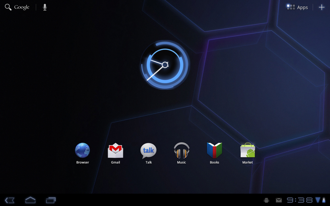
Pick up any Android phone and you’ll see four buttons, either capacitive touch or physical switch, along the bottom of the front face: Home, Menu, Back and Search. The order was up to manufacturer interpretation but all four had to be present. Honeycomb nixes two (Search and Menu) and adds one (Tasks). Google also moved the buttons from the screen bezel to on the screen itself - the buttons aren’t just capacitive, they are a part of the OS.
![]()
Back, Home, Tasks
The order is fixed: Back, Home and Tasks. As of now there’s no customizing the Honeycomb UI - say goodbye to Motoblur, Sense and TouchWiz. The location is also fixed: bottom left. My biggest complaint here are the icons themselves, they are unnecessarily ambiguous at first sight and do take some getting used to for Android and iOS users alike.
The entire UI motif is Tron meets Robocop. Swipe between home screens and you’ll get a thin blue outline of the previous/next screens as you move. The fonts used for links at the top of the page are more expected, while everything along the bottom of the screen is a bit more 80s sci-fi. I don’t personally believe this is ultimately what Google will settle on for tablet UIs, but it shows a willingness to try something new and different, which is the quickest way to ensure that Android will remain relevant as this market evolves.
I suspect the ideal tablet UI is probably not too far off what modern desktop OSes have become. While a smartphone’s UI must be dramatically different due to the lack of screen real estate, a tablet UI just needs to be more efficient than its desktop counterpart - not necessarily very different.
I believe Google is beginning to realize this as Honeycomb has some very desktop-like elements in its design. What was once a pull down shade at the top of the UI is now a notification bar in the lower right of the screen, eerily reminiscent of the Windows system tray - just not as frustratingly cluttered.
![]()
Notifications
There are also clock, WiFi and battery status indicators down there, but I’ll stop drawing parallels. The point is that this works well and I expect that we’ll continue to see a lot of convergence between the desktop and tablet OS UIs (and eventually the OSes themselves, isn’t evolution fun?).
Overall the UI is amazingly clean and very well done. It's not perfect, but I'm pleasantly surprised - all this time I thought Android was just super functional, who knew it could look great as well?


112 Comments
View All Comments
GotThumbs - Friday, March 18, 2011 - link
The platform is not that old. Apple just took their existing ois from the itouch and made it bigger. This is a whole new ballgame. Early adopters should understand their will be some hiccups...Glad to hear the WIFI only version is coming out March 27th for 599.00 This brings the competition directly to ipad and ipad2. My boss offered to buy me the ipad2 and I told him I only want an ADAM or a Xoom. An ipad would be a waste of money....I need a business tablet. Not one whose product is so proprietary...that you can't even load an app unless its through their store....how controlling is that?
Thermogenic - Thursday, February 24, 2011 - link
Samsung changed some of the basic internals of the system (I believe mainly to do with the filesystem and location of certain files). This makes it harder on them to release updates and also causes compatibility problems with certain applications.For me, I would only stick to the high end HTC and Motorola phones - they have the proven track record of updates. If you really want the latest and greatest for some reason, then you will want the Nexus line of phones.
ph00ny - Monday, March 7, 2011 - link
Not entirely true. Most custom froyo roms were based on galaxy s from overseas. Look at captivate, AT&T's froyo update just came out and the same phone offered through canadian carrier had froyo for quite some time nowchocks - Thursday, February 24, 2011 - link
"Android however did it the simplest way possible: tap home and run what you want to run next." Pre-Honeycomb Android has press-and-hold on the Home button which brings up a list of recently-used apps and can be used to switch between running tasks. Has had this since the first release I think.Anand Lal Shimpi - Thursday, February 24, 2011 - link
Woops, you're right :) That's very much a precursor to what Google did in Honeycomb, and tap-and-hold home is now out.Updated!
Take care,
Anand
Thermogenic - Thursday, February 24, 2011 - link
It's not a true tablet, but the NOOKcolor is a nice device for the money. If you are willing to do a little dirty work (mainly writing to a microsd card and booting it - very easy), you get a very basic tablet with a very nice screen for $250.I imagine for most users who use their tablet for web browsing, facebook, twitter, and youtube, that's plenty and a great bargain.
I guarantee there will be a usable version of Honeycomb running on it within six weeks. There is already a functional version, although with a decided lack of applications and very unoptimized.
wumpus - Monday, February 28, 2011 - link
I can't imagine anyone else competing with a wifi only tablet. My guess is that there are two reasons to avoid releasing such: First, you can overcharge and let the consumer pay the subsidy (and then some) back to the carrier. Second: nobody tries to compare it to the nook.Enormously Hatworthy - Thursday, February 24, 2011 - link
I read so many of those tech blogs that sometimes I forget what a real review looks like. Good work.Some of those benchmark results are pretty odd.
I wonder if the disparity between the Optimus 2X and the Xoom might in some way be related to the dual-core support in Honeycomb? The optimus is running on 2.2 which I understand has limited (if any) support for multiple cores.
Maybe the benchmark apps are showing some measure of incompatibility with the new code? Just a wild guess.
cj100570 - Thursday, February 24, 2011 - link
Just once I'd like to read a review of any piece of mobile tech where the reviewer stuck to reviewing the hardware in his/her hands instead of constantly comparing it to an Apple product. For Christs sake, enough is enough already! And don't give me that "Apple Set The Bar" BS. I'm not buying what you're selling! I've owned 3 generations of iPhones, an iMac, and 2 MacBooks so I'm very familiar with Apple products and I have great respect for them. But the simple fact of the matter is that not everyone wants to live the iOS/OS X lifestyle and when they read a review of non Apple products I'm quite sure they don't want to see Apple brought up every other sentence.Enormously Hatworthy - Thursday, February 24, 2011 - link
It is annoying but whether we like iOS/iPad or not (and I don't, to be honest) it is the market leader in tablets right now. It's the frame of reference for buyers.I think they'd be doing their readers a disservice if they didn't make the comparison.
Notice that in laptop/desktop reviews you'll see scarcely a mention of Apple products (unless they're talking about size and weight).