The Windows Phone 7 Review
by Anand Lal Shimpi & Brian Klug on October 20, 2010 7:00 PM EST- Posted in
- Smartphones
- Windows Phone 7
- Microsoft
- Mobile
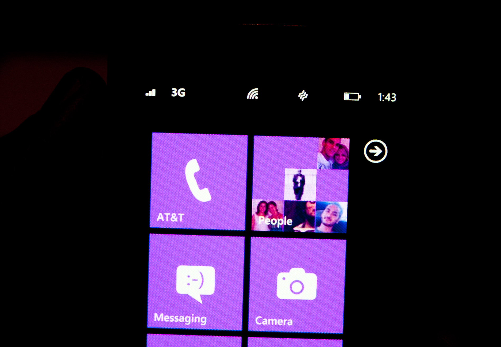
Minimalist, Even Down to the Status Bar
When Apple introduced the iPhone, Steve Jobs made the point that a virtual keyboard was preferable to a fixed keyboard because you shouldn’t always be stuck with the same keyboard layout. Some applications would require a slightly different layout and other applications wouldn’t need it entirely. A physical keyboard requires you to pay the space penalty regardless of what you’re doing with the phone.
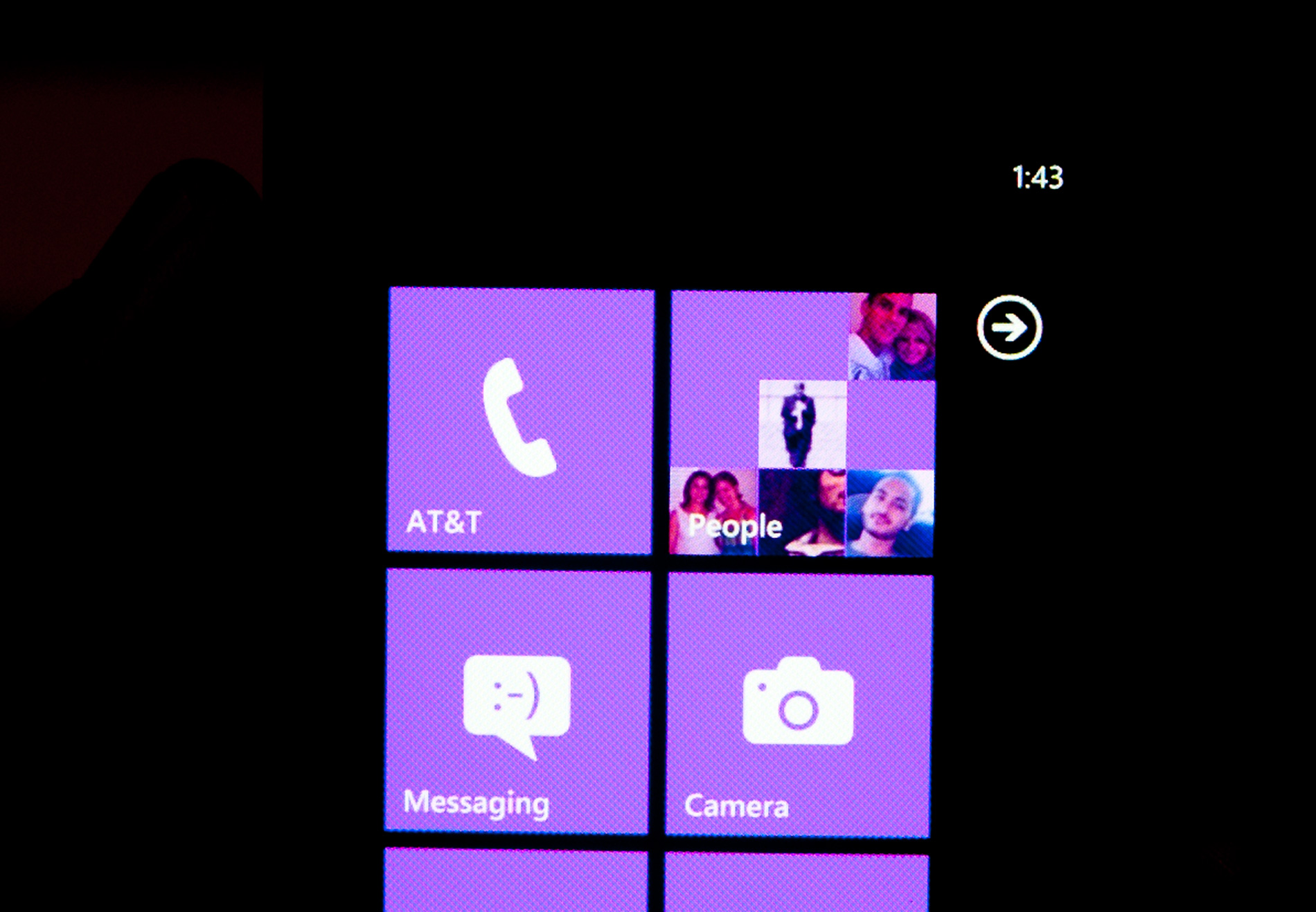
Microsoft takes that same argument even further with Windows Phone 7. The status bar present on all smartphones indicates things like signal strength, WiFi reception, Bluetooth status, remaining battery life and the current time. On a Windows Phone, the status bar remains hidden most of the time. The only element that’s nearly always present is the current time. The rest stay hidden unless you tap the top of the screen to reveal them for a short period of time.
Microsoft views these items as only useful for short period of time. All that’s necessary is a quick glance to check on their state, they don’t need to be a permanent part of the OS.
When you first wake your phone up you’ll see the full status bar, but the moment you unlock it the bar disappears leaving only the clock (of course the disappearing animation is very well done).
Elements of the status bar will appear on their own if something significant has happened. For example if you walk into range of known WiFi you’ll see the WiFi icon appear as the phone connects.
This is one of those features that you’ll either love or hate. Microsoft tried to do what it thought was best across the OS and you’re not always going to agree with its decisions. In this case, there were a few times when I wished the status bar was permanent. If my phone was loading a webpage slowly and I wanted to know if poor reception was to blame, or to just find out how much battery life I had left. Both of these problems go away if we eventually get faster/better network coverage and phones with significantly longer battery life, but today they are concerns. Despite the obvious limitations, the auto hiding status bar paves the way for what is ultimately the cleanest smartphone UI on the planet today. All that’s visible on the screen is what you’re ultimately trying to do with the phone. If it’s email, that’s all you see, if it’s a web page that’s pretty much it.
Even the URL bar in IE is thinner than what you’d find on Android or iOS. It’s almost uncomfortably thin. But Microsoft believes it’s worthwhile to always display it (rather than hide it as you scroll down) and there’s no need to make it bigger than it needs to be. Tap on the URL bar and you’ll get a slightly bigger version for text input (but still not too big).
The App Bar
Some applications need more functionality than can reasonably be provided by Windows Phone 7’s very minimal interface. For those applications Microsoft uses the app bar. The app bar is a group of buttons (up to 4) at the bottom of the screen. The app bar in IE mobile has three buttons: add (to favorites), favorites and tabs.
All app bars have an ellipses in the far right corner. Tapping the ellipses will not only reveal more options, but it will also reveal the text labels for the buttons on the app bar to help new users learn the ropes. To keep the app bar as simple as possible no buttons on any app bar are labeled, you’re supposed to eventually just know what they mean.
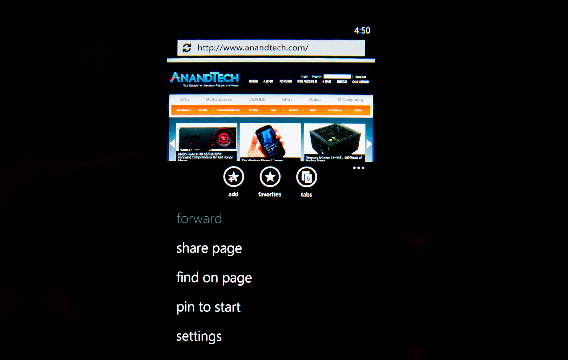
I found myself tapping the ellipses to figure out what certain buttons did but the longer I used the phone the less I needed the labels. The space savings worked, good job Microsoft.


125 Comments
View All Comments
Lapoki - Thursday, October 21, 2010 - link
I think WP7 has potential and could very well be my next purchase. Great article guys, it was long but very detailed.. got me through a boring afternoon.One thing seems missing though... the infamous signal strength comparison that you have been doing for all other phones ever since iPhone 4.
wht1986 - Thursday, October 21, 2010 - link
One of the most informative WP7 reviews I have read. I actually didn't skip to the end just to read the conclusions. I read it all and enjoyed every page. Well done.epyon96 - Thursday, October 21, 2010 - link
Did I read that right?Only Mp4 and WMVsupport?
strikeback03 - Friday, October 22, 2010 - link
I'm guessing that is the audio codecs allowed for videosTanclearas - Thursday, October 21, 2010 - link
"When Apple introduced the iPhone, Steve Jobs made the point that a virtual keyboard was preferable to a fixed keyboard because you shouldn’t always be stuck with the same keyboard layout. Some applications would require a slightly different layout and other applications wouldn’t need it entirely. A physical keyboard requires you to pay the space penalty regardless of what you’re doing with the phone."Really? So, by that argument, Google/Android is the better choice of phone. You shouldn't always be stuck with a single choice of phone layout. I use my hardware keyboard regularly on my G1. As for "applications requiring a slightly different layout", that's a load of crap. When typing, I always want letters and numbers, and I want QWERTY with number keys above. I don't want an on-screen QWERTY with a separate button to press to switch back-and-forth between letters and numbers.
The "applications that require a slightly different layout", perhaps like the phone keypad, can still use an on-screen keypad when necessary.
DP-16D - Thursday, October 21, 2010 - link
Windows 7 Phone must be absolutely phenomenal given the writers' incredible Mac-centric slant (especially with the Windows 7 desktop non-sequitor at the end of the review). Furthermore: The e-mail and messaging pages don't include comparisons to Blackberry, the de-facto standard for communication on smartphones. In fact, I cannot recall that line of phones being mentioned at all. As an existing Blackberry user considering a switch to Windows 7 Phone your review is nearly worthless, because 99% of my phone experience is about functionality and not whether or not my handset can sing and dance better or worse than iOS and Android.Normally I enjoy reading Anand for very thorough reviews, but this review's omission of the essential and inclusion of the irrelevant will make me reconsider reading any future submissions by these two writers.
beefnot - Thursday, October 21, 2010 - link
C'mon man, although Blackberry is a mkt share leader, it is a 20th century platform with very little innovation. It is walking dead with respect to consumer devices, which is the segment that Windows Phone 7 is currently targeting. I own a blackberry for work, but there is no way in hell I would consider it for my personal mobile device, and I don't give a rat's ass that it is excluded from comparison.Reven - Thursday, October 21, 2010 - link
I'm happy with my iphone 4 for now, but I will seriously consider getting the next generation of Windows Mobile phones when I eventually upgrade.anona6 - Thursday, October 21, 2010 - link
Hey I live in Tucson, and I was wondering if anandtech was based out of Tucson or something.This article made it a little more exciting for me just because it was local to me, and you have
one of my favorite coffee shops there that's nearby my University.
Zstream - Thursday, October 21, 2010 - link
Do you know what the talk time is for the LG? It's not showing on the graph