The Windows Phone 7 Review
by Anand Lal Shimpi & Brian Klug on October 20, 2010 7:00 PM EST- Posted in
- Smartphones
- Windows Phone 7
- Microsoft
- Mobile
Final Words
There's a lot of good to say about Windows Phone 7. Far more than I expected going into this review, to be honest.
The Facebook integration is the best I’ve seen on a smartphone. The Zune integration is similarly perfect. If you’re used to spending a good amount of money on iTunes every month you’ll have a better overall experience with Zune Pass on a Windows Phone. Exchange support, Office and the Email app are great too, it all just works. And unlike previous Microsoft OS launches, there’s no caveat necessary. Windows Phone 7 is both functional and attractive.

The UI is a thing of beauty. Microsoft got the style, customization and performance one hundred percent right on this thing. It makes iOS feel old and utilitarian. It’s funny to think that Microsoft was the one to out-simplify Apple in the UI department.
Microsoft made great use of GPU acceleration throughout the OS. Scrolling, panning, zooming, everything is ridiculously smooth. The OS is so polished in this regard that almost none of the third party apps I tried seemed to clear the bar Microsoft has set. It’s going to take a while for developers to do the right thing on this platform.
It’s not only third party developers at fault. Microsoft itself clearly has a lot to work on. The Xbox Live Extras app is inexcusably slow. And then there’s IE mobile.
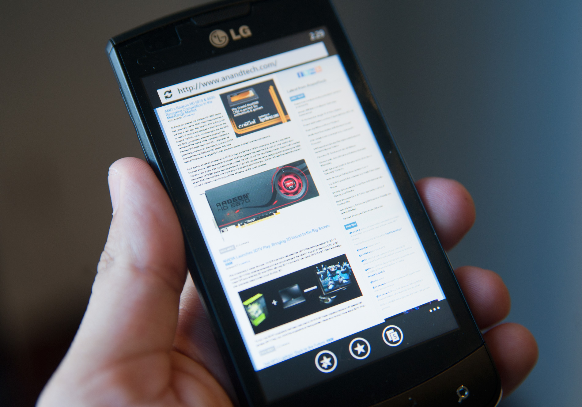
With JavaScript performance much lower than iOS and Android, IE mobile is measurable slower at loading web pages. The browser doesn’t actually feel much slower because of how smooth actually navigating around web pages is, but the web page loading performance must be improved. On top of that, web page legibility when zoomed out suffers due to a lack of font smoothing on very small fonts.
The application history and associated back button work well enough to make getting around WP7 pretty easy. Proper linking of addresses, phone numbers and web pages is nice and plays well with the back button. Ultimately adding copy & paste (coming in early 2011) will help but I’m not sure Microsoft can get around not having an actual way to switch between apps rather than just going back all the time.
From a hardware standpoint I have to say that I believe Microsoft got the formula right. Windows Phone 7 is launching a lot like a gaming console that Microsoft allows other companies to manufacture. Microsoft dictates the hardware, and it’s up to the handset manufacturers to implement it as stylishly as possible. If the manufacturers want to provide additional features, they can do so through their own apps that can come preloaded on the device.
Some handset makers are undoubtedly upset that they won’t be able to use UI as a differentiation vector, but I believe this is a better option for general consumers. You get a consistent experience across all Windows Phones and you force the handset guys to deliver better hardware, rather than attempt to compete out of their realm of expertise with software.
Buying a Windows Phone is going to be a lot like buying a PC. Except this time around the pre-installed software will be a lot easier to get rid of and hopefully a lot less intrusive.
Of course, this approach only works if the OS is good enough from the get go, and in this case, it is.
I’ve always liked Microsoft as an underdog. It isn’t afraid to spend money to deliver a good user experience and the company has the talent to do some amazing things. It’s only when Microsoft becomes a monopoly that things go wrong. But in the fight to reach that point, we get great products and healthy competition.
With Windows Phone Microsoft is in underdog mode. The OS isn’t perfect but aside from the lack of apps, it’s competitive today. While I’m traveling I need the apps you can only get with a mature platform like Android or iOS (e.g. Yelp, BART app, etc...), but while home I don’t use those apps as much. Instead my smartphone behaves more like an SMS, phone, email, camera and web browsing device, and it’s in those areas that Windows Phone is easily just as good as the competition.
The app story and lack of conventional task switching are the two biggest issues facing Windows Phone 7 today. Both of which look to be very fixable problems. If you don’t own a modern smartphone, you probably won’t view either as an issue today and you can bide your time until Microsoft introduces them. If you’re migrating from an Android device or iPhone, depending on your app usage, Windows Phone may be too young for you.
If you’re looking for a feature replacement to an Android phone or Windows Mobile device, WP7 will disappoint. Windows Phone is more like the iPhone than it is anything else. If you don’t like the iPhone (for reasons other than an inherent dislike for Apple), you probably won’t like Windows Phone. If your sole reason is disdain for Apple, then pick up a Windows Phone.
What I’m most excited about isn’t the fact that we’ll have another good competitor in the smartphone space, but rather the hope this gives me for Microsoft’s future products. Windows 7 was a nice OS, but it was nothing earth shattering and clearly did nothing to fend off Apple’s erosion of PC market share. Windows Phone 7 is a beacon of hope for Microsoft. If Windows Phone 8 and Windows 8 are designed with similar focus and clarity of thought as WP7 was, we may be looking at the beginning of Microsoft’s return.


125 Comments
View All Comments
bplewis24 - Thursday, October 21, 2010 - link
You call it smooth running and functional, which is fine. That doesn't dissuade me and the OP from feeling it is ugly and off-putting. You even say it doesn't have to be cluttered eye candy, but the review claims it is the most beautiful UI he has ever seen. The thing is big blue blocks. It is exactly what he explained on the first page that Windows typically does with any refresh of their OS: "make it bigger and bluer."It is definitely ugly, but if you only care about how functional and fast it is, then you will love it. I admit that I can't stand iOS cluttered eye-candy style either, so I'm with you on that. Give me functional, customizable and sleek and I'm in heaven. Glad somebody already figured out how to do that.
Brandon
geniekid - Thursday, October 21, 2010 - link
In my opinion, it's quite good looking and better than the default home screen on my HTC Incredible.Like you said, it's all a matter of taste. I will put myself out there and say the guy who thinks the "6 year old crackberry looked better" probably has poor taste.
Smilin - Monday, October 25, 2010 - link
It is the most beautiful UI I've seen. Mind you I've SEEN it. Have you? Screenshots don't do it justice. You have to see it moving and the text shifting in parallax. It's eerily 3D.iPhone and Android are beautiful too....if you're a Windows 3.1 progman.exe fan.
gstrickler - Friday, October 22, 2010 - link
It may be simple and functional, but that doesn't mean it has to be boring and ugly. I'm a huge proponent of simple and functional, but that screen looks like something out of the late 80's or early 90's. The tiles have too little to differentiate them from each other. A little use of color and better contrast would make it a lot clearer and faster to identify the icons, and it would look better.Note to MS, hire a usability consultant and put some of your graphic designers to work (I know you have graphic designers). It shouldn't look like just like Windows 7, but it definitely shouldn't look like it comes from Windows 2.0
inighthawki - Thursday, October 21, 2010 - link
That "ugly" home/start screen interface is one of the main reasons I'm interested in WP7. The other smartphone interfaces I've seen from others like iOS and Android are nothing more than glorified and eye-candy enhanced versions of every other phone out there IMO. And as someone who owns a Zune HD which has a very similar interface, I can tell you that it works really well, and is very nice.bplewis24 - Thursday, October 21, 2010 - link
There is no eye candy in Android. It's basically a blank slate desktop background. And obviously it's no surprise that a Zune HD user would prefer the Windows Phone 7 UI. It's also not a surprise you use subjective and vague justifications for your preference :)inighthawki - Friday, October 22, 2010 - link
I don't see why I have to justify a subjective decision. The bottom line is "I like it" and my entire point was that just because the OP thinks it's the ugliest home screen they've ever seen, there are people like myself that not only like it, but actually dislike the style they do. I am not trying to force my opinion on anyone.Smilin - Monday, October 25, 2010 - link
I agree with you FWIW.cknobman - Thursday, October 21, 2010 - link
I agree 100%Gigantic big colored tiles? Seriously?
What a waste of space and an overly boring-bland appearance!!!
Guspaz - Thursday, October 21, 2010 - link
I agree, the WP7 UI looks horrendous to me. Giant space-wasting bland UI components.My biggest concern is how HUGE the tiles are. Anand complained about iOS/Android cluttering screens with app icons, but it seems to me like WP7 will be incredibly worse.
Reducing the number of tiles on the screen so that you can only view 6 full tiles at a time, as WP7 has done (the bottom two tiles appear cut off in pictures) is a huge limitation. The iPhone displays 20 icons.
If I've got 50 apps, and I'm not using folders, an iPhone will give you three screens to scroll through. Android, I assume is similar. Windows phone 7 seems to require something like 8... And the lack of some sort of folder or grouping support is only going to make this worse.
My prediction is that, if WP7 takes off and starts getting a decent number of apps, they're going to have to rethink the home UI or it'll be unusable.