The Windows Phone 7 Review
by Anand Lal Shimpi & Brian Klug on October 20, 2010 7:00 PM EST- Posted in
- Smartphones
- Windows Phone 7
- Microsoft
- Mobile
The First Phones: Samsung Focus
The Focus is a launch device on AT&T. It’s a Windows Phone Galaxy S. The Samsung Focus is incredibly thin and very easy to pocket. It’s very lightweight thanks to its all plastic construction. The Focus doesn’t feel like it’ll fall apart, but it doesn’t inspire the same confidence as the LG Optimus 7.
The screen is the best looking out of the three we’ve got here today. The 4-inch Super AMOLED display delivers vibrant colors (a perfect match for WP7’s color based themes) and perfect black levels. Overall brightness leaves much to be desired. We only measured 234 nits at its brightest setting. Medium is more than bright enough for indoor or use at night (thanks to the excellent contrast ratio), but outdoors during the day you need to leave the device on high.
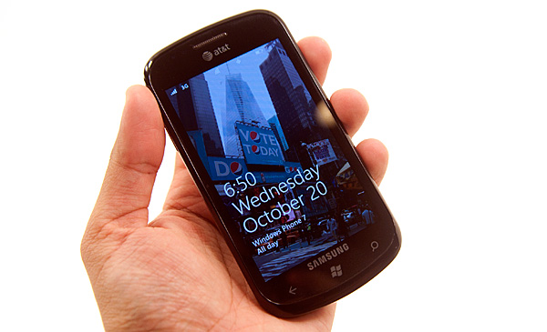
Battery life is absolutely abysmal, thanks to that Super AMOLED display. We measured 4.6 hours on WiFi, 3.75 hours on 3G but a respectable 6.4 hours of talk time (the display is shut off for our talk tests). This translates into a single charge lasting well under a full day’s worth of heavy use, or just under a day of moderate use.
Personally I prefer the 3.8-inch form factor of the LG to the 4.0-inch Focus. Unlike Android, Windows Phone 7 seems better suited for smaller displays thanks to its very simple UI and the fact that everything you need to tap on is already ginormous.
If you want more of a balance between size, screen and battery life you’ll want to look at the final phone in our trio: the HTC Surround.


125 Comments
View All Comments
bplewis24 - Thursday, October 21, 2010 - link
You call it smooth running and functional, which is fine. That doesn't dissuade me and the OP from feeling it is ugly and off-putting. You even say it doesn't have to be cluttered eye candy, but the review claims it is the most beautiful UI he has ever seen. The thing is big blue blocks. It is exactly what he explained on the first page that Windows typically does with any refresh of their OS: "make it bigger and bluer."It is definitely ugly, but if you only care about how functional and fast it is, then you will love it. I admit that I can't stand iOS cluttered eye-candy style either, so I'm with you on that. Give me functional, customizable and sleek and I'm in heaven. Glad somebody already figured out how to do that.
Brandon
geniekid - Thursday, October 21, 2010 - link
In my opinion, it's quite good looking and better than the default home screen on my HTC Incredible.Like you said, it's all a matter of taste. I will put myself out there and say the guy who thinks the "6 year old crackberry looked better" probably has poor taste.
Smilin - Monday, October 25, 2010 - link
It is the most beautiful UI I've seen. Mind you I've SEEN it. Have you? Screenshots don't do it justice. You have to see it moving and the text shifting in parallax. It's eerily 3D.iPhone and Android are beautiful too....if you're a Windows 3.1 progman.exe fan.
gstrickler - Friday, October 22, 2010 - link
It may be simple and functional, but that doesn't mean it has to be boring and ugly. I'm a huge proponent of simple and functional, but that screen looks like something out of the late 80's or early 90's. The tiles have too little to differentiate them from each other. A little use of color and better contrast would make it a lot clearer and faster to identify the icons, and it would look better.Note to MS, hire a usability consultant and put some of your graphic designers to work (I know you have graphic designers). It shouldn't look like just like Windows 7, but it definitely shouldn't look like it comes from Windows 2.0
inighthawki - Thursday, October 21, 2010 - link
That "ugly" home/start screen interface is one of the main reasons I'm interested in WP7. The other smartphone interfaces I've seen from others like iOS and Android are nothing more than glorified and eye-candy enhanced versions of every other phone out there IMO. And as someone who owns a Zune HD which has a very similar interface, I can tell you that it works really well, and is very nice.bplewis24 - Thursday, October 21, 2010 - link
There is no eye candy in Android. It's basically a blank slate desktop background. And obviously it's no surprise that a Zune HD user would prefer the Windows Phone 7 UI. It's also not a surprise you use subjective and vague justifications for your preference :)inighthawki - Friday, October 22, 2010 - link
I don't see why I have to justify a subjective decision. The bottom line is "I like it" and my entire point was that just because the OP thinks it's the ugliest home screen they've ever seen, there are people like myself that not only like it, but actually dislike the style they do. I am not trying to force my opinion on anyone.Smilin - Monday, October 25, 2010 - link
I agree with you FWIW.cknobman - Thursday, October 21, 2010 - link
I agree 100%Gigantic big colored tiles? Seriously?
What a waste of space and an overly boring-bland appearance!!!
Guspaz - Thursday, October 21, 2010 - link
I agree, the WP7 UI looks horrendous to me. Giant space-wasting bland UI components.My biggest concern is how HUGE the tiles are. Anand complained about iOS/Android cluttering screens with app icons, but it seems to me like WP7 will be incredibly worse.
Reducing the number of tiles on the screen so that you can only view 6 full tiles at a time, as WP7 has done (the bottom two tiles appear cut off in pictures) is a huge limitation. The iPhone displays 20 icons.
If I've got 50 apps, and I'm not using folders, an iPhone will give you three screens to scroll through. Android, I assume is similar. Windows phone 7 seems to require something like 8... And the lack of some sort of folder or grouping support is only going to make this worse.
My prediction is that, if WP7 takes off and starts getting a decent number of apps, they're going to have to rethink the home UI or it'll be unusable.