The Windows Phone 7 Review
by Anand Lal Shimpi & Brian Klug on October 20, 2010 7:00 PM EST- Posted in
- Smartphones
- Windows Phone 7
- Microsoft
- Mobile
Minimalist, Even Down to the Status Bar
When Apple introduced the iPhone, Steve Jobs made the point that a virtual keyboard was preferable to a fixed keyboard because you shouldn’t always be stuck with the same keyboard layout. Some applications would require a slightly different layout and other applications wouldn’t need it entirely. A physical keyboard requires you to pay the space penalty regardless of what you’re doing with the phone.
Microsoft takes that same argument even further with Windows Phone 7. The status bar present on all smartphones indicates things like signal strength, WiFi reception, Bluetooth status, remaining battery life and the current time. On a Windows Phone, the status bar remains hidden most of the time. The only element that’s nearly always present is the current time. The rest stay hidden unless you tap the top of the screen to reveal them for a short period of time.
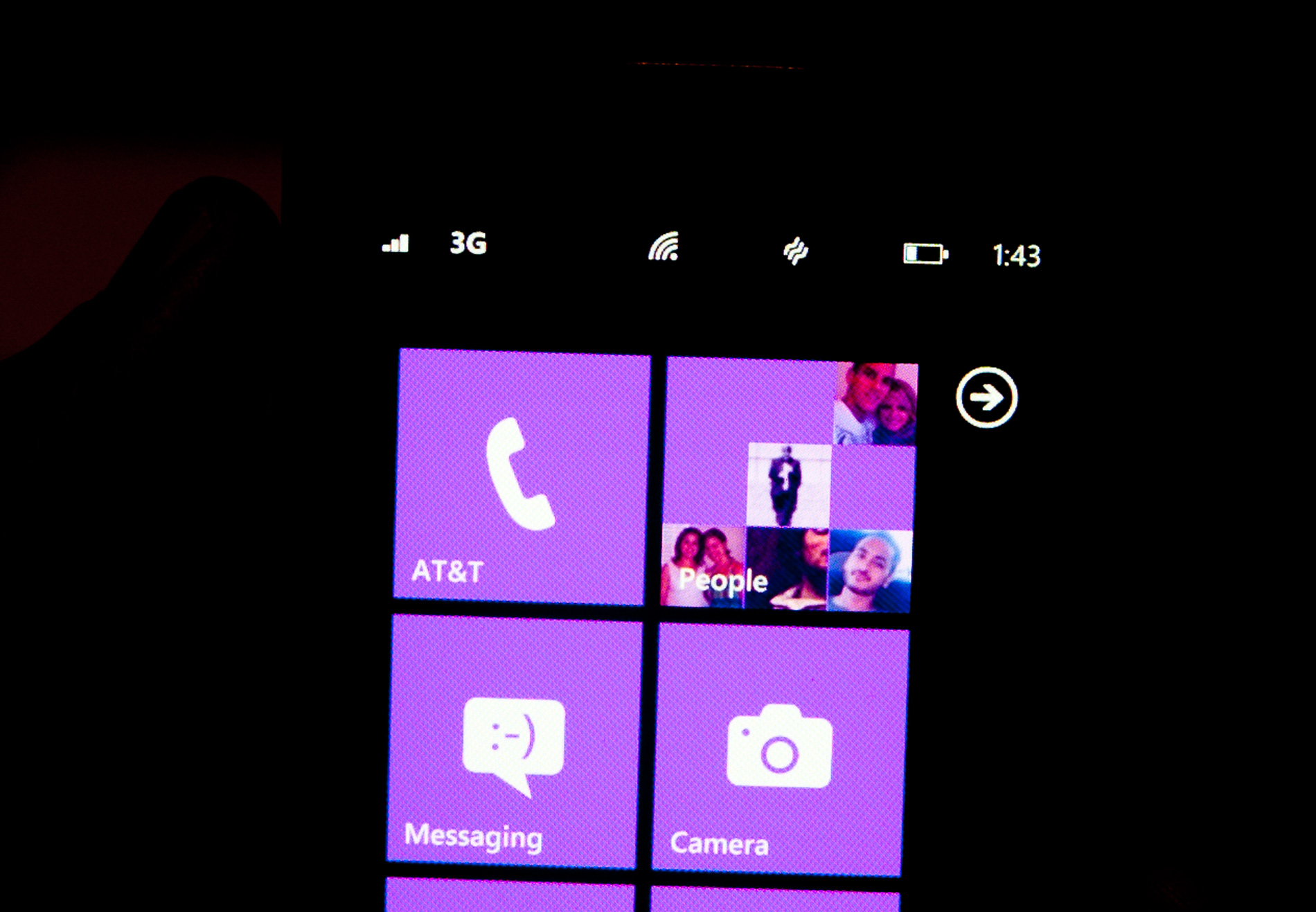
Microsoft views these items as only useful for short period of time. All that’s necessary is a quick glance to check on their state, they don’t need to be a permanent part of the OS.
When you first wake your phone up you’ll see the full status bar, but the moment you unlock it the bar disappears leaving only the clock (of course the disappearing animation is very well done).
Elements of the status bar will appear on their own if something significant has happened. For example if you walk into range of known WiFi you’ll see the WiFi icon appear as the phone connects.
This is one of those features that you’ll either love or hate. Microsoft tried to do what it thought was best across the OS and you’re not always going to agree with its decisions. In this case, there were a few times when I wished the status bar was permanent. If my phone was loading a webpage slowly and I wanted to know if poor reception was to blame, or to just find out how much battery life I had left. Both of these problems go away if we eventually get faster/better network coverage and phones with significantly longer battery life, but today they are concerns. Despite the obvious limitations, the auto hiding status bar paves the way for what is ultimately the cleanest smartphone UI on the planet today. All that’s visible on the screen is what you’re ultimately trying to do with the phone. If it’s email, that’s all you see, if it’s a web page that’s pretty much it.
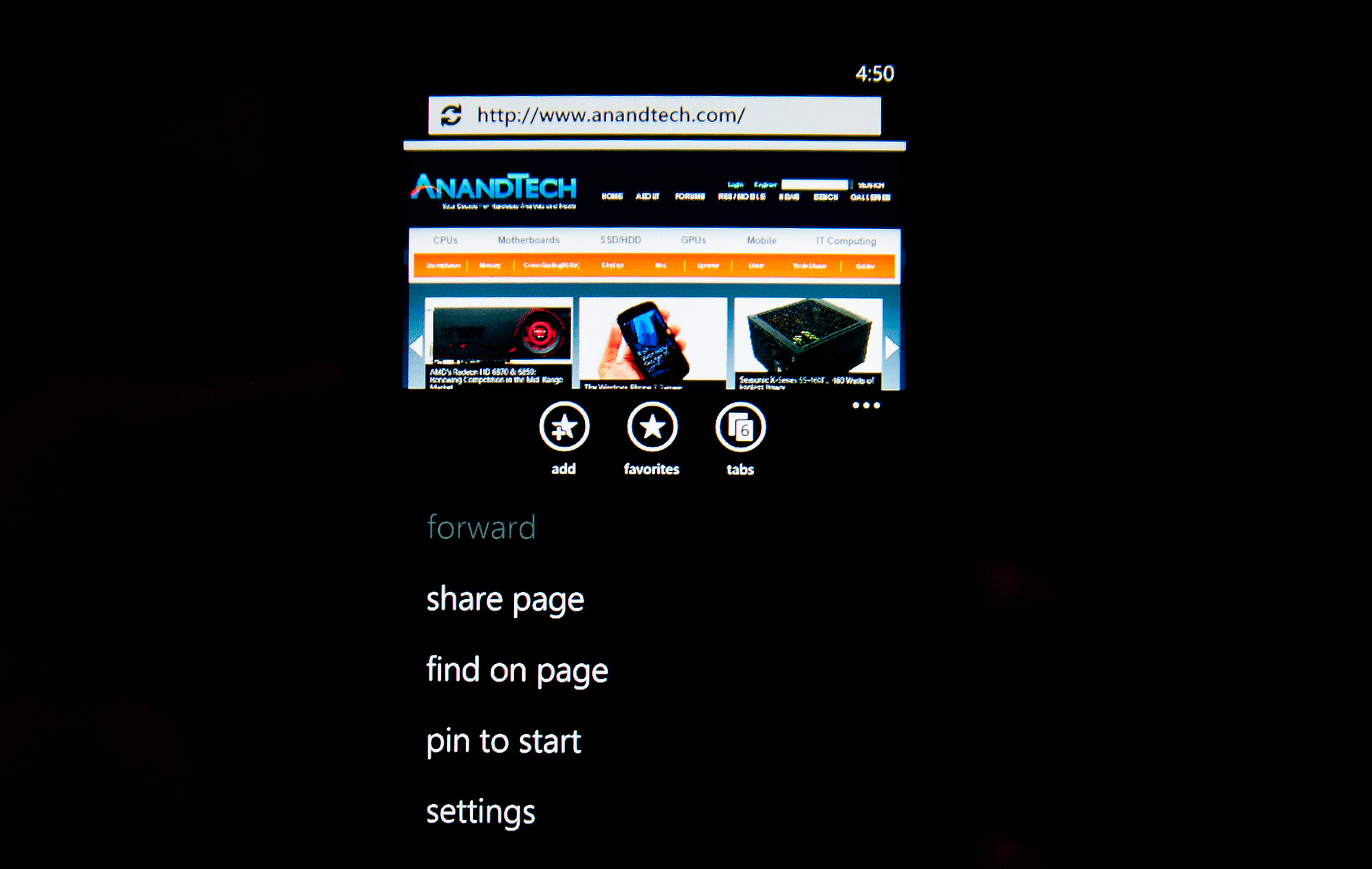
Even the URL bar in IE is thinner than what you’d find on Android or iOS. It’s almost uncomfortably thin. But Microsoft believes it’s worthwhile to always display it (rather than hide it as you scroll down) and there’s no need to make it bigger than it needs to be. Tap on the URL bar and you’ll get a slightly bigger version for text input (but still not too big).
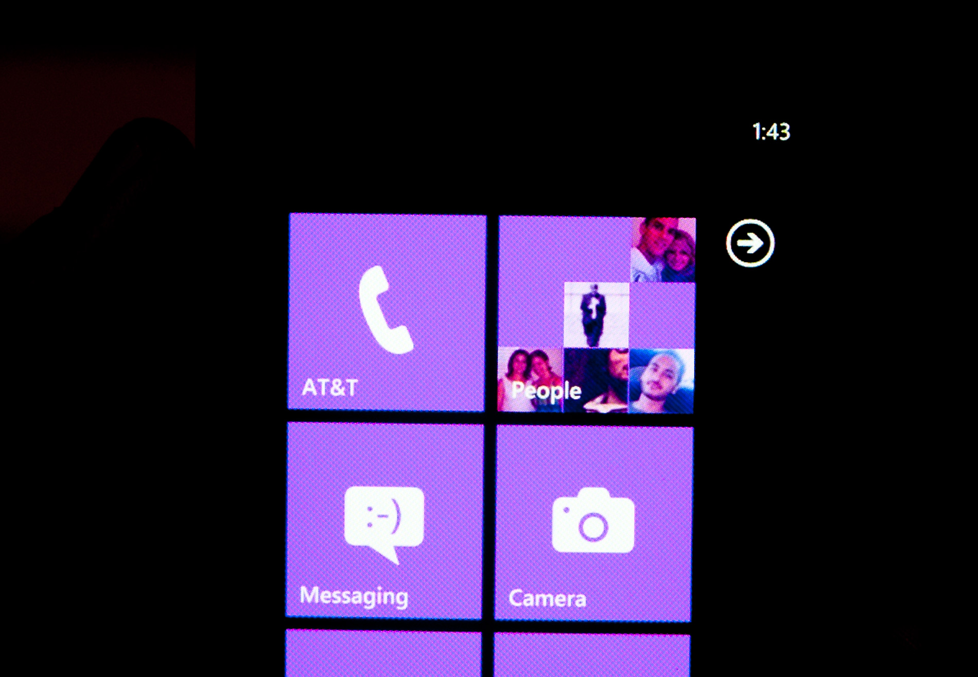
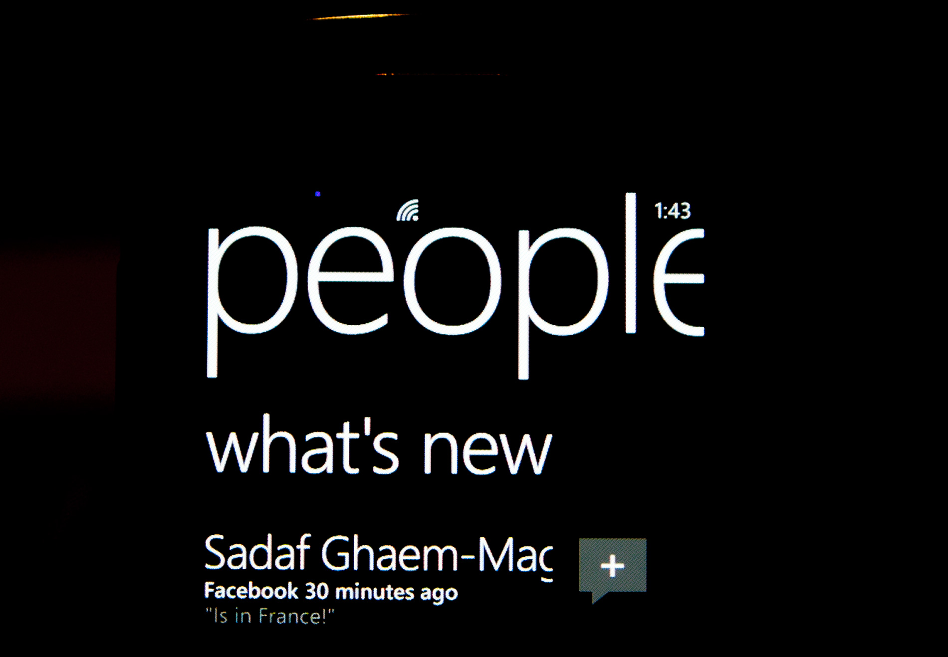
The App Bar
Some applications need more functionality than can reasonably be provided by Windows Phone 7’s very minimal interface. For those applications Microsoft uses the app bar. The app bar is a group of buttons (up to 4) at the bottom of the screen. The app bar in IE mobile has three buttons: add (to favorites), favorites and tabs.
All app bars have an ellipses in the far right corner. Tapping the ellipses will not only reveal more options, but it will also reveal the text labels for the buttons on the app bar to help new users learn the ropes. To keep the app bar as simple as possible no buttons on any app bar are labeled, you’re supposed to eventually just know what they mean.
I found myself tapping the ellipses to figure out what certain buttons did but the longer I used the phone the less I needed the labels. The space savings worked, good job Microsoft.


125 Comments
View All Comments
bplewis24 - Thursday, October 21, 2010 - link
You call it smooth running and functional, which is fine. That doesn't dissuade me and the OP from feeling it is ugly and off-putting. You even say it doesn't have to be cluttered eye candy, but the review claims it is the most beautiful UI he has ever seen. The thing is big blue blocks. It is exactly what he explained on the first page that Windows typically does with any refresh of their OS: "make it bigger and bluer."It is definitely ugly, but if you only care about how functional and fast it is, then you will love it. I admit that I can't stand iOS cluttered eye-candy style either, so I'm with you on that. Give me functional, customizable and sleek and I'm in heaven. Glad somebody already figured out how to do that.
Brandon
geniekid - Thursday, October 21, 2010 - link
In my opinion, it's quite good looking and better than the default home screen on my HTC Incredible.Like you said, it's all a matter of taste. I will put myself out there and say the guy who thinks the "6 year old crackberry looked better" probably has poor taste.
Smilin - Monday, October 25, 2010 - link
It is the most beautiful UI I've seen. Mind you I've SEEN it. Have you? Screenshots don't do it justice. You have to see it moving and the text shifting in parallax. It's eerily 3D.iPhone and Android are beautiful too....if you're a Windows 3.1 progman.exe fan.
gstrickler - Friday, October 22, 2010 - link
It may be simple and functional, but that doesn't mean it has to be boring and ugly. I'm a huge proponent of simple and functional, but that screen looks like something out of the late 80's or early 90's. The tiles have too little to differentiate them from each other. A little use of color and better contrast would make it a lot clearer and faster to identify the icons, and it would look better.Note to MS, hire a usability consultant and put some of your graphic designers to work (I know you have graphic designers). It shouldn't look like just like Windows 7, but it definitely shouldn't look like it comes from Windows 2.0
inighthawki - Thursday, October 21, 2010 - link
That "ugly" home/start screen interface is one of the main reasons I'm interested in WP7. The other smartphone interfaces I've seen from others like iOS and Android are nothing more than glorified and eye-candy enhanced versions of every other phone out there IMO. And as someone who owns a Zune HD which has a very similar interface, I can tell you that it works really well, and is very nice.bplewis24 - Thursday, October 21, 2010 - link
There is no eye candy in Android. It's basically a blank slate desktop background. And obviously it's no surprise that a Zune HD user would prefer the Windows Phone 7 UI. It's also not a surprise you use subjective and vague justifications for your preference :)inighthawki - Friday, October 22, 2010 - link
I don't see why I have to justify a subjective decision. The bottom line is "I like it" and my entire point was that just because the OP thinks it's the ugliest home screen they've ever seen, there are people like myself that not only like it, but actually dislike the style they do. I am not trying to force my opinion on anyone.Smilin - Monday, October 25, 2010 - link
I agree with you FWIW.cknobman - Thursday, October 21, 2010 - link
I agree 100%Gigantic big colored tiles? Seriously?
What a waste of space and an overly boring-bland appearance!!!
Guspaz - Thursday, October 21, 2010 - link
I agree, the WP7 UI looks horrendous to me. Giant space-wasting bland UI components.My biggest concern is how HUGE the tiles are. Anand complained about iOS/Android cluttering screens with app icons, but it seems to me like WP7 will be incredibly worse.
Reducing the number of tiles on the screen so that you can only view 6 full tiles at a time, as WP7 has done (the bottom two tiles appear cut off in pictures) is a huge limitation. The iPhone displays 20 icons.
If I've got 50 apps, and I'm not using folders, an iPhone will give you three screens to scroll through. Android, I assume is similar. Windows phone 7 seems to require something like 8... And the lack of some sort of folder or grouping support is only going to make this worse.
My prediction is that, if WP7 takes off and starts getting a decent number of apps, they're going to have to rethink the home UI or it'll be unusable.