The Windows Phone 7 Review
by Anand Lal Shimpi & Brian Klug on October 20, 2010 7:00 PM EST- Posted in
- Smartphones
- Windows Phone 7
- Microsoft
- Mobile
Updates
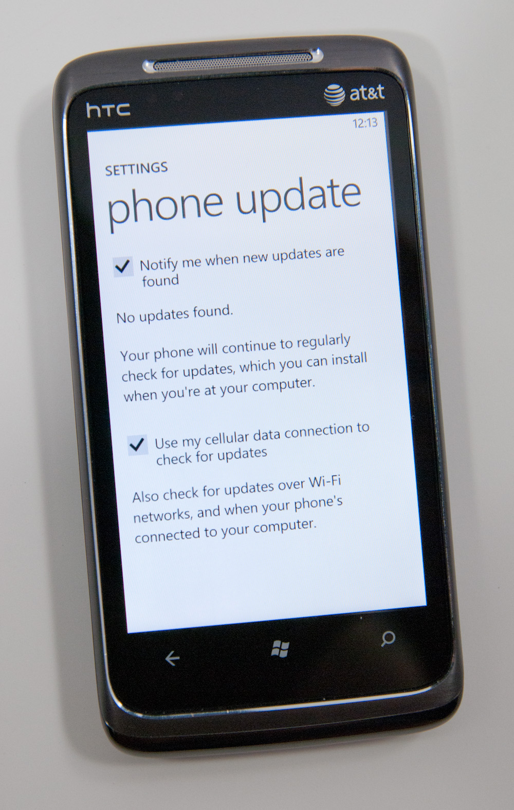
At Microsoft’s reviewer’s workshop for Windows Phone 7 the subject of software updates caused a bit of unrest among the press in attendance. To understand how Microsoft handles update delivery let’s look at how Apple and Google do it first.
When Apple updates iOS it first puts the software update through its own validation tests. These tests include regression testing to make sure that previously fixed bugs are not re-broken by the new update. The tests also include basic functionality as well as usage model tests to try and simulate real world use. AT&T also gets to test these updates, after all it is AT&T’s network. The final update is placed on Apple’s servers and delivered to you by Apple. Updates have to be installed over USB.
Google is very different. Android releases go through the same testing and validation process within Google, however given the wide variety of hardware on the market the testing isn’t done on every device. Google’s partners are provided with final code which they have to bring in and implement their customizations on top of (e.g. HTC Sense) before they’re released to customers. The OEMs and carriers have the final say on what Android versions come to their devices and when. This creates a bit of frustration as not all Android devices will get equal treatment when it comes to updates. It’s the downside to doing extensive UI customization, when Google delivers an update the OEMs have a lot of work to do in order to implement the update. Android updates can be installed by copying the update package directly to the device or downloaded over the cellular/WiFi network.
Microsoft’s update approach closely mimics Apple’s. Microsoft has its own validation that all updates must go through before release. Microsoft has even mirrored AT&T’s testing labs on its campus so that whenever an update rolls out, Microsoft already knows how it will fare on AT&T’s tests. The update code is then handed off to AT&T with a test report showing how the update did in Microsoft’s internal testing. AT&T then takes the update, does its own validation (which should mirror what Microsoft has already done) and finally pushes it out to end users.
Microsoft physically hosts the update, however it is the carrier’s call whether or not to release it to customers. Given the ban on UI customizations and the unified hardware support, there should be no technical reason for a carrier to prevent an update from going out. The fact that Microsoft will deliver, with every update, a list of how the carrier’s own validation tests will run should guarantee that any failure to push out said update would be negligence on the carrier’s part. Microsoft went on to say that while it’s possible for a carrier to prevent a Windows Phone update from going out, it doesn’t believe it’s a likely scenario. While Microsoft didn’t say it explicitly, the implication is that Windows Phone won’t have the update issues that have plagued certain Android customers.
Microsoft did state that it wouldn’t offer a direct download of updates. Similar to updating iOS, you can only update Windows Phones over USB. Updates over WiFi and the cellular network aren’t supported.


125 Comments
View All Comments
bplewis24 - Thursday, October 21, 2010 - link
You call it smooth running and functional, which is fine. That doesn't dissuade me and the OP from feeling it is ugly and off-putting. You even say it doesn't have to be cluttered eye candy, but the review claims it is the most beautiful UI he has ever seen. The thing is big blue blocks. It is exactly what he explained on the first page that Windows typically does with any refresh of their OS: "make it bigger and bluer."It is definitely ugly, but if you only care about how functional and fast it is, then you will love it. I admit that I can't stand iOS cluttered eye-candy style either, so I'm with you on that. Give me functional, customizable and sleek and I'm in heaven. Glad somebody already figured out how to do that.
Brandon
geniekid - Thursday, October 21, 2010 - link
In my opinion, it's quite good looking and better than the default home screen on my HTC Incredible.Like you said, it's all a matter of taste. I will put myself out there and say the guy who thinks the "6 year old crackberry looked better" probably has poor taste.
Smilin - Monday, October 25, 2010 - link
It is the most beautiful UI I've seen. Mind you I've SEEN it. Have you? Screenshots don't do it justice. You have to see it moving and the text shifting in parallax. It's eerily 3D.iPhone and Android are beautiful too....if you're a Windows 3.1 progman.exe fan.
gstrickler - Friday, October 22, 2010 - link
It may be simple and functional, but that doesn't mean it has to be boring and ugly. I'm a huge proponent of simple and functional, but that screen looks like something out of the late 80's or early 90's. The tiles have too little to differentiate them from each other. A little use of color and better contrast would make it a lot clearer and faster to identify the icons, and it would look better.Note to MS, hire a usability consultant and put some of your graphic designers to work (I know you have graphic designers). It shouldn't look like just like Windows 7, but it definitely shouldn't look like it comes from Windows 2.0
inighthawki - Thursday, October 21, 2010 - link
That "ugly" home/start screen interface is one of the main reasons I'm interested in WP7. The other smartphone interfaces I've seen from others like iOS and Android are nothing more than glorified and eye-candy enhanced versions of every other phone out there IMO. And as someone who owns a Zune HD which has a very similar interface, I can tell you that it works really well, and is very nice.bplewis24 - Thursday, October 21, 2010 - link
There is no eye candy in Android. It's basically a blank slate desktop background. And obviously it's no surprise that a Zune HD user would prefer the Windows Phone 7 UI. It's also not a surprise you use subjective and vague justifications for your preference :)inighthawki - Friday, October 22, 2010 - link
I don't see why I have to justify a subjective decision. The bottom line is "I like it" and my entire point was that just because the OP thinks it's the ugliest home screen they've ever seen, there are people like myself that not only like it, but actually dislike the style they do. I am not trying to force my opinion on anyone.Smilin - Monday, October 25, 2010 - link
I agree with you FWIW.cknobman - Thursday, October 21, 2010 - link
I agree 100%Gigantic big colored tiles? Seriously?
What a waste of space and an overly boring-bland appearance!!!
Guspaz - Thursday, October 21, 2010 - link
I agree, the WP7 UI looks horrendous to me. Giant space-wasting bland UI components.My biggest concern is how HUGE the tiles are. Anand complained about iOS/Android cluttering screens with app icons, but it seems to me like WP7 will be incredibly worse.
Reducing the number of tiles on the screen so that you can only view 6 full tiles at a time, as WP7 has done (the bottom two tiles appear cut off in pictures) is a huge limitation. The iPhone displays 20 icons.
If I've got 50 apps, and I'm not using folders, an iPhone will give you three screens to scroll through. Android, I assume is similar. Windows phone 7 seems to require something like 8... And the lack of some sort of folder or grouping support is only going to make this worse.
My prediction is that, if WP7 takes off and starts getting a decent number of apps, they're going to have to rethink the home UI or it'll be unusable.