The Windows Phone 7 Review
by Anand Lal Shimpi & Brian Klug on October 20, 2010 7:00 PM EST- Posted in
- Smartphones
- Windows Phone 7
- Microsoft
- Mobile
Syncing over USB and WiFi
Anand talked earlier about Zune integration on the device, I’m going to expand a bit by talking about the Zune’s desktop sync integration on Windows. One of WP7’s most touted features is WiFi sync to desktop. If you’ve got the bandwidth and the wireless network, this really makes sense. The phone doesn’t sit in a dock next to the computer like early PDAs did, they sit (for me at least) on a nightstand or wherever there’s a free charger in arm’s reach. Syncing with the desktop then becomes just a routine thing that happens nightly without having to actually go plug the device in.
To setup WiFi sync, you need to first connect the WP7 device to your computer at least once. While it’s connected, inside phone settings is an option to setup wireless sync. The phone has to be connected to the same wireless network your computer is on.
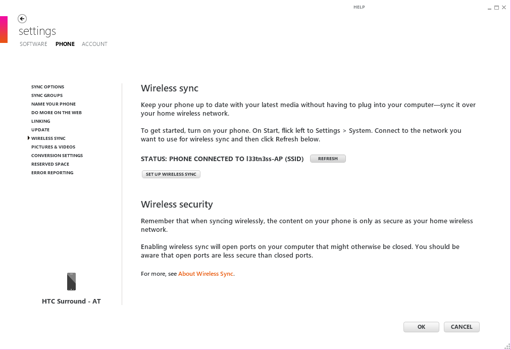
The wizard is simple and just asks whether the network you’re joined to is the appropriate one. It’ll do a simple check which I assume is provisioning the phone to only try and sync over this network, and then tell you it’s ready to go:
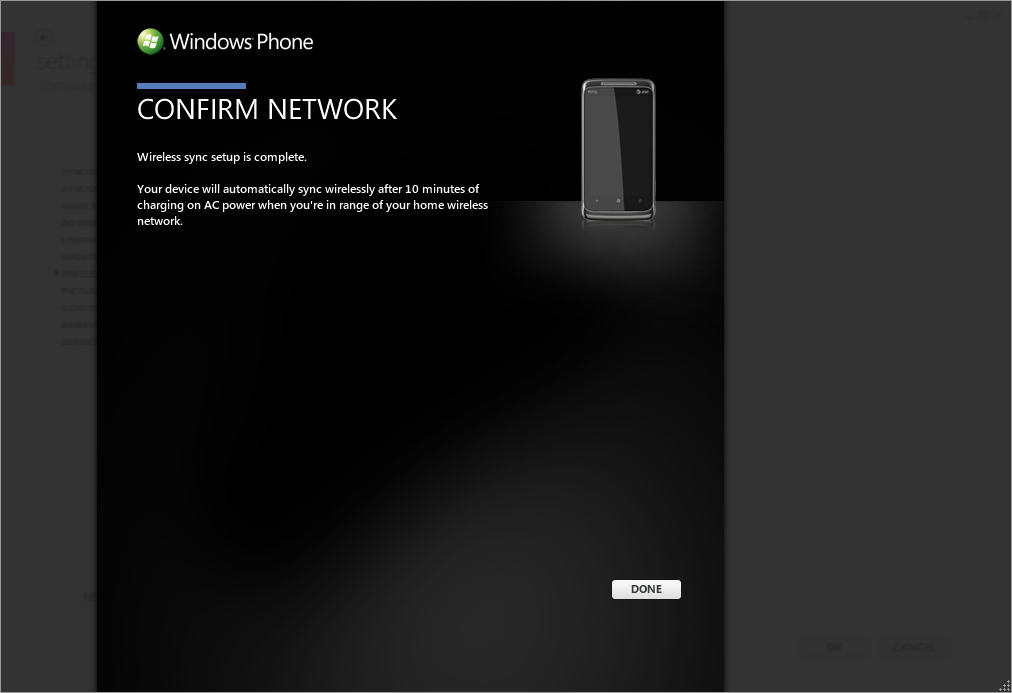
Wireless sync takes place after 10 minutes of uninterrupted charging when you’re on the right wireless network. I say uninterrupted because the first time I set this up, I waited with the device plugged in and used the phone - sync didn’t happen. It has to be idle on your desk for 10 minutes, and then sync will happen automatically.
There’s also no way to manually trigger a wireless a sync from the phone or Zune interface. It just happens on this 10 minute schedule, and by appearances checks for changes every 10 minutes or so as well while plugged in. While the device is syncing, there's little indication that a sync is in progress unless you try and fire up the Zune hub or take a photo. Unplugging the device during wireless sync seems to halt the sync elegantly.
What’s best about this process is that all same data that gets synced over USB makes it over wireless. Photos, videos, music - it all happens. There aren’t arbitrary restrictions about file size, and it’s decently speedy.
By default, Zune takes copies of all your photos and videos and backs them up inside the pictures folder on the desktop. The folder is given the same name as your phone, and the entire camera roll gets stuffed inside. Remember, this is the only way to get videos off a WP7 device.
Music gets dragged from the collection pane into the phone, and syncs the next time the device connects.
I’m pretty impressed with how well wireless sync works on WP7, and it’s awesome to see this not requiring a hack or lots of effort to get working. It’s also decently speedy - I was on HTC Surround connected at 65 Mbps with an 802.11n network, and saw throughput of about 24 Mbps peak when syncing.


125 Comments
View All Comments
bplewis24 - Thursday, October 21, 2010 - link
You call it smooth running and functional, which is fine. That doesn't dissuade me and the OP from feeling it is ugly and off-putting. You even say it doesn't have to be cluttered eye candy, but the review claims it is the most beautiful UI he has ever seen. The thing is big blue blocks. It is exactly what he explained on the first page that Windows typically does with any refresh of their OS: "make it bigger and bluer."It is definitely ugly, but if you only care about how functional and fast it is, then you will love it. I admit that I can't stand iOS cluttered eye-candy style either, so I'm with you on that. Give me functional, customizable and sleek and I'm in heaven. Glad somebody already figured out how to do that.
Brandon
geniekid - Thursday, October 21, 2010 - link
In my opinion, it's quite good looking and better than the default home screen on my HTC Incredible.Like you said, it's all a matter of taste. I will put myself out there and say the guy who thinks the "6 year old crackberry looked better" probably has poor taste.
Smilin - Monday, October 25, 2010 - link
It is the most beautiful UI I've seen. Mind you I've SEEN it. Have you? Screenshots don't do it justice. You have to see it moving and the text shifting in parallax. It's eerily 3D.iPhone and Android are beautiful too....if you're a Windows 3.1 progman.exe fan.
gstrickler - Friday, October 22, 2010 - link
It may be simple and functional, but that doesn't mean it has to be boring and ugly. I'm a huge proponent of simple and functional, but that screen looks like something out of the late 80's or early 90's. The tiles have too little to differentiate them from each other. A little use of color and better contrast would make it a lot clearer and faster to identify the icons, and it would look better.Note to MS, hire a usability consultant and put some of your graphic designers to work (I know you have graphic designers). It shouldn't look like just like Windows 7, but it definitely shouldn't look like it comes from Windows 2.0
inighthawki - Thursday, October 21, 2010 - link
That "ugly" home/start screen interface is one of the main reasons I'm interested in WP7. The other smartphone interfaces I've seen from others like iOS and Android are nothing more than glorified and eye-candy enhanced versions of every other phone out there IMO. And as someone who owns a Zune HD which has a very similar interface, I can tell you that it works really well, and is very nice.bplewis24 - Thursday, October 21, 2010 - link
There is no eye candy in Android. It's basically a blank slate desktop background. And obviously it's no surprise that a Zune HD user would prefer the Windows Phone 7 UI. It's also not a surprise you use subjective and vague justifications for your preference :)inighthawki - Friday, October 22, 2010 - link
I don't see why I have to justify a subjective decision. The bottom line is "I like it" and my entire point was that just because the OP thinks it's the ugliest home screen they've ever seen, there are people like myself that not only like it, but actually dislike the style they do. I am not trying to force my opinion on anyone.Smilin - Monday, October 25, 2010 - link
I agree with you FWIW.cknobman - Thursday, October 21, 2010 - link
I agree 100%Gigantic big colored tiles? Seriously?
What a waste of space and an overly boring-bland appearance!!!
Guspaz - Thursday, October 21, 2010 - link
I agree, the WP7 UI looks horrendous to me. Giant space-wasting bland UI components.My biggest concern is how HUGE the tiles are. Anand complained about iOS/Android cluttering screens with app icons, but it seems to me like WP7 will be incredibly worse.
Reducing the number of tiles on the screen so that you can only view 6 full tiles at a time, as WP7 has done (the bottom two tiles appear cut off in pictures) is a huge limitation. The iPhone displays 20 icons.
If I've got 50 apps, and I'm not using folders, an iPhone will give you three screens to scroll through. Android, I assume is similar. Windows phone 7 seems to require something like 8... And the lack of some sort of folder or grouping support is only going to make this worse.
My prediction is that, if WP7 takes off and starts getting a decent number of apps, they're going to have to rethink the home UI or it'll be unusable.