The Windows Phone 7 Review
by Anand Lal Shimpi & Brian Klug on October 20, 2010 7:00 PM EST- Posted in
- Smartphones
- Windows Phone 7
- Microsoft
- Mobile
Email and Exchange
Email is one of those things every smartphone has to nail. It’s an absolutely critical part of mobile productivity that there literally is no margin for error, as even small changes can make an experience either completely usable or totally awful depending on the platform. Gmail on Android is so compelling that I know many a person that use it solely because of how nicely integrated it is.
Starting off the email tile shows shows a number that doesn’t correspond to the number of total unread emails in your account, but rather how many have arrived since last you glanced at it. I actually really like this idea. It’s a simple way to notify you that new stuff has arrived since last you checked out the mail application, without overwhelming with some evil gargantuan number of unread messages. Messages read on the desktop or elsewhere still decrement the counter like you’d expect.
Jumping into the mail application itself is a bit of a shocker the first time. While the rest of the WP7 is primarily white text atop black background (unless you changed it in theme settings), the mail application is entirely black text on white background, and there’s no obvious way to change it. Not a huge deal, but it’s a bit strange that mail exists on its own outside those theme settings.
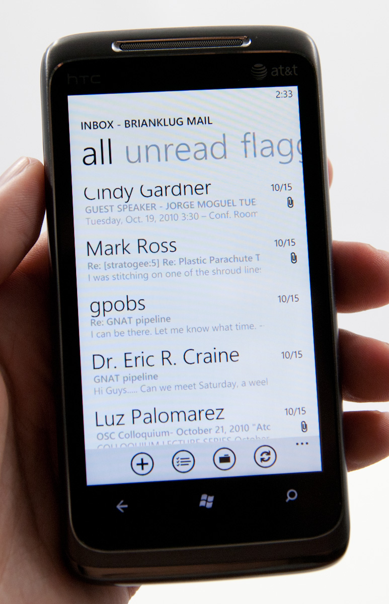
The default view is simply of all your messages in a timeline. The sender’s name is huge, followed by subject and then a one line preview of the message.
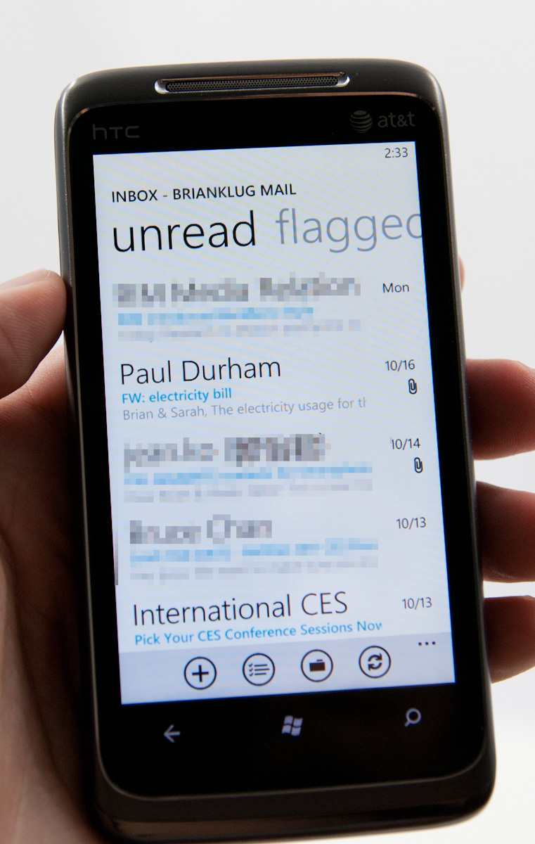
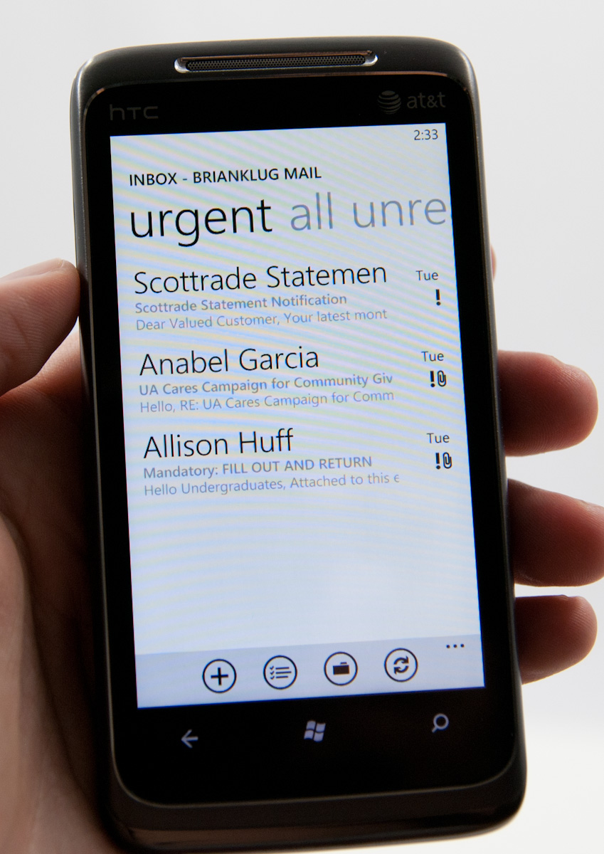
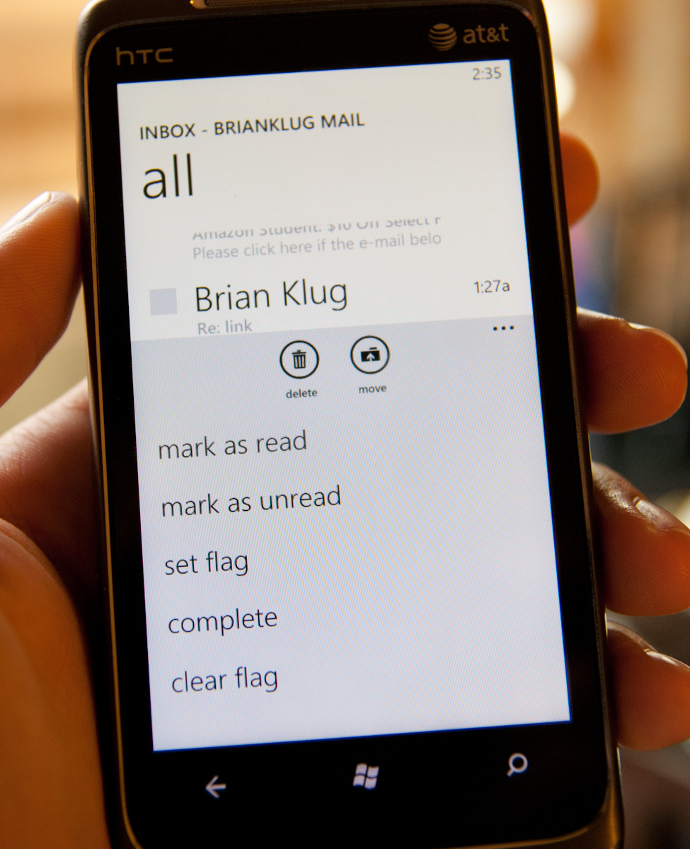
Pivoting right brings you to a view with unread messages only, followed by flagged and urgent. Unread view is very useful - I’m honestly shocked other platforms haven’t implemented something similar. Flagged and urgent aren’t as useful, just because starred doesn’t translate to flagged (at least on Google Sync exchange for me), and urgent messages are usually anything but.
Buttons at the bottom compose new email, enable multiple selection, bring up the folders view, or sync respectively. Tapping on the ellipsis for more options lets you get to more settings or add another email account.
Multiple selection on WP7 actually doesn’t require using the button, which makes me wonder - why bother including one? To do it, just tap at the far left of any message, and a small box will glow, letting you know you’re about to enable multiple selections.
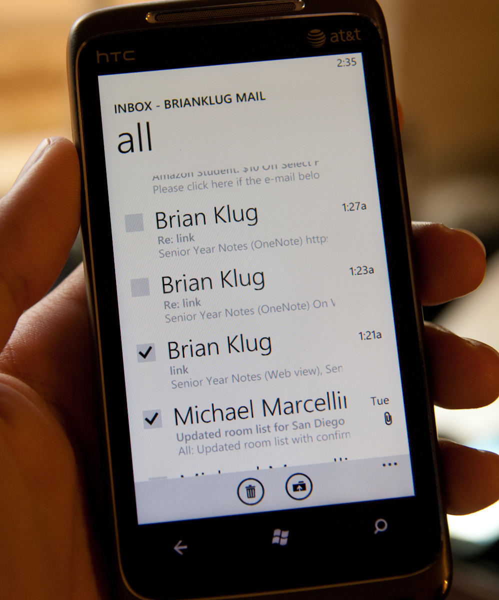
Then you can check lots of things and delete, move, mark read or unread, or flag.
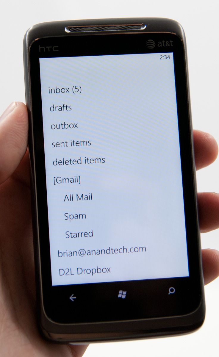
There’s also obviously landscape support for everything in the email application. Go back to the normal view, hit folders, and you can view things stored locally on the phone like drafts, or view all the folders on the exchange or IMAP account:
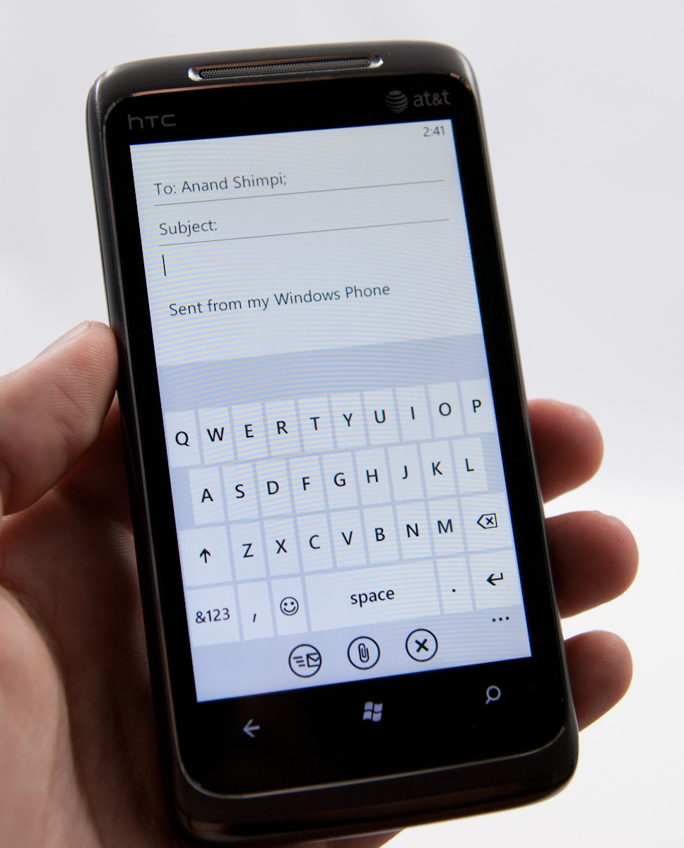
The email compose screen is spartan, but the same can be said for iOS and Android. Start typing a contact’s name or email address, and you’ll get suggestions. Interestingly enough, WP7 does elect to append a default signature to every email - “sent from my Windows Phone.”
You can expand options and set priority (if you like marking everything urgent), and get to BCC and CC fields. There’s also obviously an attach option which right now just lets you attach photos one at a time. Photos get reduced in size to 1630 × 1222, and are compressed to around 350 kilobytes. There aren’t any options to send full size images, unfortunately.
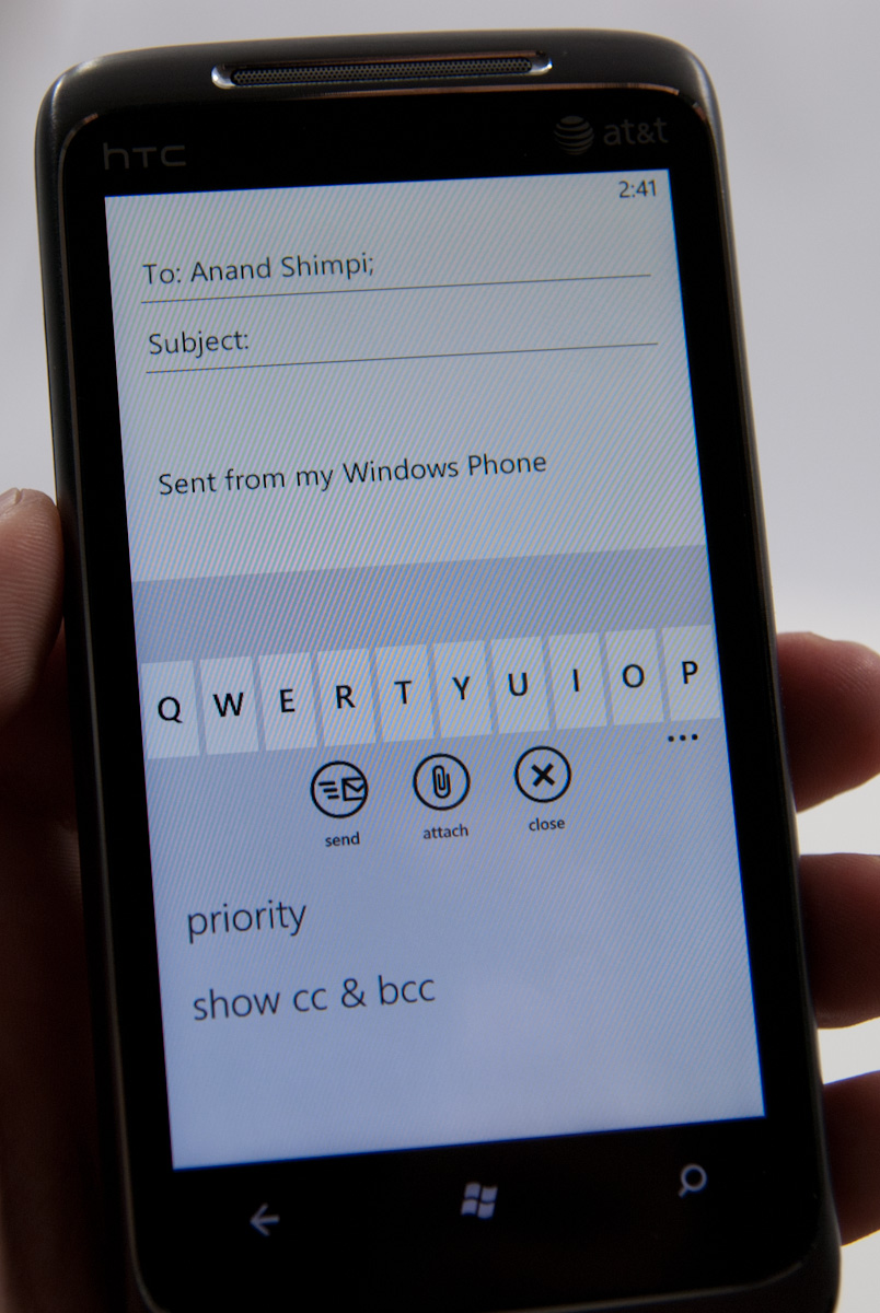
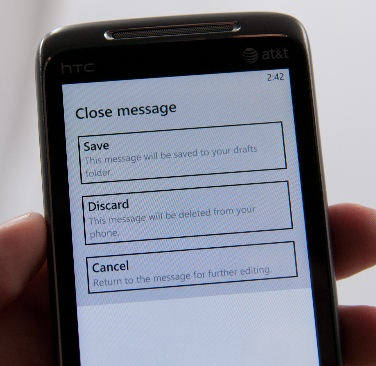
If you close or hit back, you’ll get a save, discard, or cancel dialog. Drafts go into local drafts which you can get to from folders, but not up to a folder of your choice.
All the text composed in the mail application gets typeset in Calibri, whether you like it or not. There’s no formatting options from the email compose screen. Other than that, email is just what you’d expect it to be.
One thing that’s interesting which Anand and I both noticed regarding WP7 mail is that changes like deletion aren’t immediately propagated out. Neither him on IMAP nor me on Exchange saw messages delete immediately. If you want to see those actions reflected on a desktop client, you have to force a sync immediately after making the change. This is somewhat unusual, since everyone else forces those updates to happen immediately instead of later on.
There’s setup support for a variety of common email services, including Windows Live, Outlook (Exchange), Yahoo! Mail, Google, and any POP or IMAP box. Under Exchange you can sync contacts, calendars, and email. Google does the same, and you can specify mandatory SSL. Inside the account options options for grabbing everything or just the past 3 days, 7 days, 2 weeks, or month. Download new content has settings for manually syncing on a schedule or as items arrive (pushed).
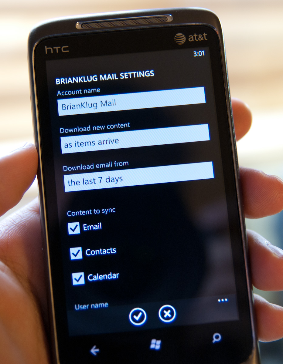
The only field I’m uncertain about is logging, which defaults to advanced but has a field marked ‘off (recommended).’ I’m not sure where these logs are going or what they’re used for, but this field is here.


125 Comments
View All Comments
bplewis24 - Thursday, October 21, 2010 - link
You call it smooth running and functional, which is fine. That doesn't dissuade me and the OP from feeling it is ugly and off-putting. You even say it doesn't have to be cluttered eye candy, but the review claims it is the most beautiful UI he has ever seen. The thing is big blue blocks. It is exactly what he explained on the first page that Windows typically does with any refresh of their OS: "make it bigger and bluer."It is definitely ugly, but if you only care about how functional and fast it is, then you will love it. I admit that I can't stand iOS cluttered eye-candy style either, so I'm with you on that. Give me functional, customizable and sleek and I'm in heaven. Glad somebody already figured out how to do that.
Brandon
geniekid - Thursday, October 21, 2010 - link
In my opinion, it's quite good looking and better than the default home screen on my HTC Incredible.Like you said, it's all a matter of taste. I will put myself out there and say the guy who thinks the "6 year old crackberry looked better" probably has poor taste.
Smilin - Monday, October 25, 2010 - link
It is the most beautiful UI I've seen. Mind you I've SEEN it. Have you? Screenshots don't do it justice. You have to see it moving and the text shifting in parallax. It's eerily 3D.iPhone and Android are beautiful too....if you're a Windows 3.1 progman.exe fan.
gstrickler - Friday, October 22, 2010 - link
It may be simple and functional, but that doesn't mean it has to be boring and ugly. I'm a huge proponent of simple and functional, but that screen looks like something out of the late 80's or early 90's. The tiles have too little to differentiate them from each other. A little use of color and better contrast would make it a lot clearer and faster to identify the icons, and it would look better.Note to MS, hire a usability consultant and put some of your graphic designers to work (I know you have graphic designers). It shouldn't look like just like Windows 7, but it definitely shouldn't look like it comes from Windows 2.0
inighthawki - Thursday, October 21, 2010 - link
That "ugly" home/start screen interface is one of the main reasons I'm interested in WP7. The other smartphone interfaces I've seen from others like iOS and Android are nothing more than glorified and eye-candy enhanced versions of every other phone out there IMO. And as someone who owns a Zune HD which has a very similar interface, I can tell you that it works really well, and is very nice.bplewis24 - Thursday, October 21, 2010 - link
There is no eye candy in Android. It's basically a blank slate desktop background. And obviously it's no surprise that a Zune HD user would prefer the Windows Phone 7 UI. It's also not a surprise you use subjective and vague justifications for your preference :)inighthawki - Friday, October 22, 2010 - link
I don't see why I have to justify a subjective decision. The bottom line is "I like it" and my entire point was that just because the OP thinks it's the ugliest home screen they've ever seen, there are people like myself that not only like it, but actually dislike the style they do. I am not trying to force my opinion on anyone.Smilin - Monday, October 25, 2010 - link
I agree with you FWIW.cknobman - Thursday, October 21, 2010 - link
I agree 100%Gigantic big colored tiles? Seriously?
What a waste of space and an overly boring-bland appearance!!!
Guspaz - Thursday, October 21, 2010 - link
I agree, the WP7 UI looks horrendous to me. Giant space-wasting bland UI components.My biggest concern is how HUGE the tiles are. Anand complained about iOS/Android cluttering screens with app icons, but it seems to me like WP7 will be incredibly worse.
Reducing the number of tiles on the screen so that you can only view 6 full tiles at a time, as WP7 has done (the bottom two tiles appear cut off in pictures) is a huge limitation. The iPhone displays 20 icons.
If I've got 50 apps, and I'm not using folders, an iPhone will give you three screens to scroll through. Android, I assume is similar. Windows phone 7 seems to require something like 8... And the lack of some sort of folder or grouping support is only going to make this worse.
My prediction is that, if WP7 takes off and starts getting a decent number of apps, they're going to have to rethink the home UI or it'll be unusable.