The Windows Phone 7 Review
by Anand Lal Shimpi & Brian Klug on October 20, 2010 7:00 PM EST- Posted in
- Smartphones
- Windows Phone 7
- Microsoft
- Mobile
Messaging
It’s easy to forget sometimes that first and foremost smartphones must perform the duties of an ordinary cell phone. That includes support SMS, MMS, and voice calls.
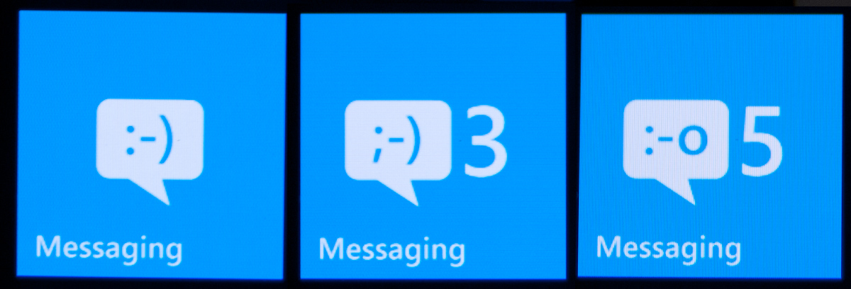
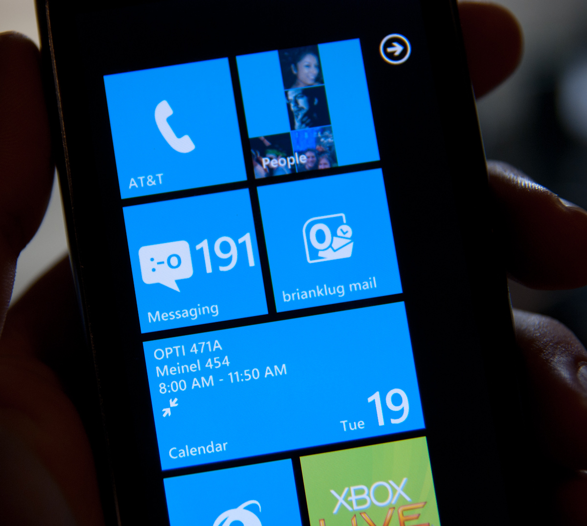
WP7’s messaging application is threaded and minimalist. On the outside, the tile shows the number of unread messages, and an emoticon that changes from a :-) to ;-) to :-o as your unread messages pile up. It’s a subtle change but funny nonetheless.
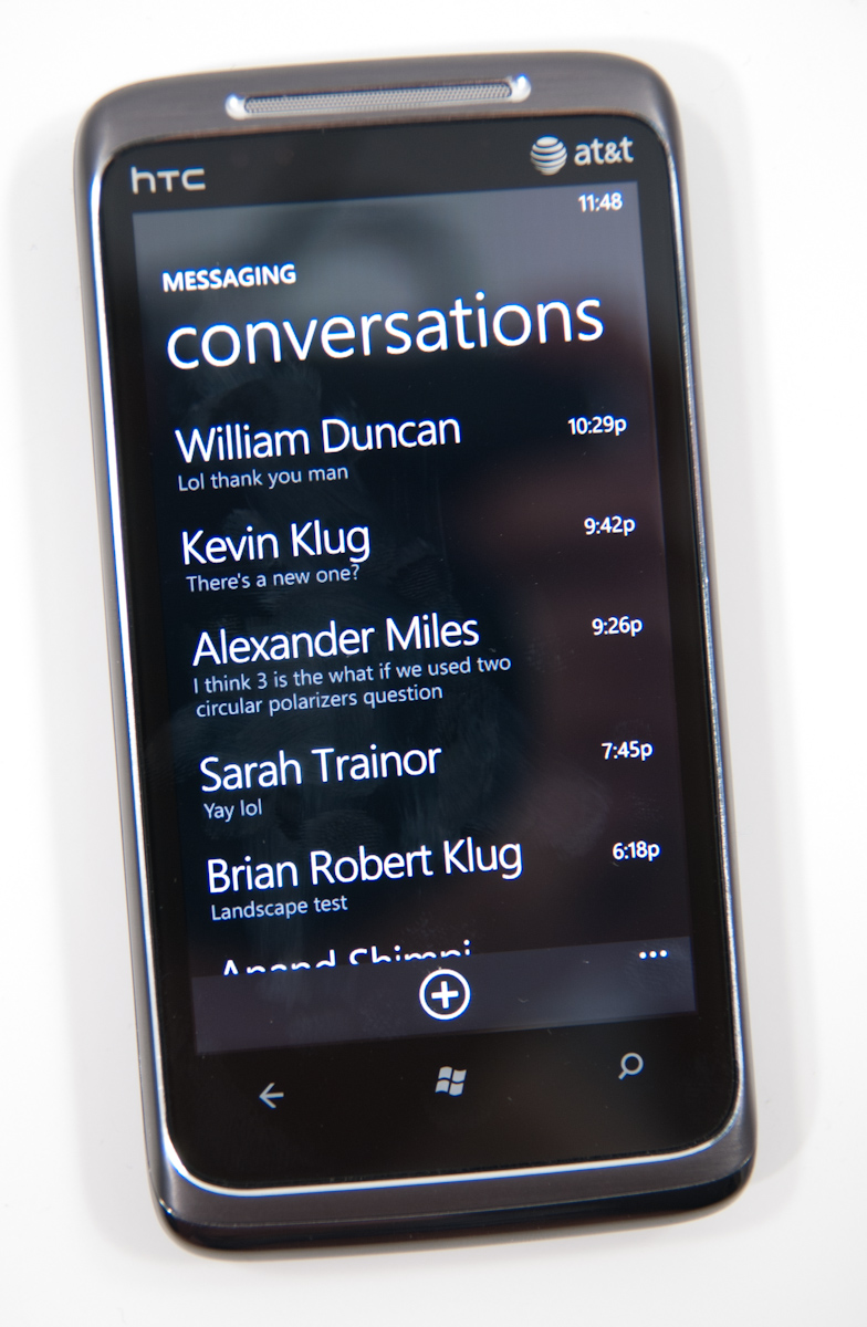
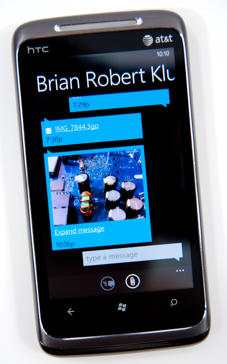
Fire up the application, and you’ll get an overview of all the conversations you’ve got going on. This is pretty standard, and it’s all Metro themed. Threads with new messages will appear in the accent color (blue by default). Long press on a conversation to delete the whole thread. Pretty standard.
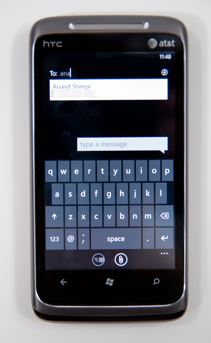
Tap the plus symbol to compose a new message, and you’ll get the compose screen. There’s multiple recipient support, and you can start typing a name and find a contact just like every other platform. There’s initially no character count, but as you pass about 140 characters, the character count appears and starts counting. As you pass 160, the interface will also tell you how many messages your SMS will be split into. It’s a nice touch that WP7 keeps this information out of the way until it comes time to need it - the result is a very clean and simple UI.
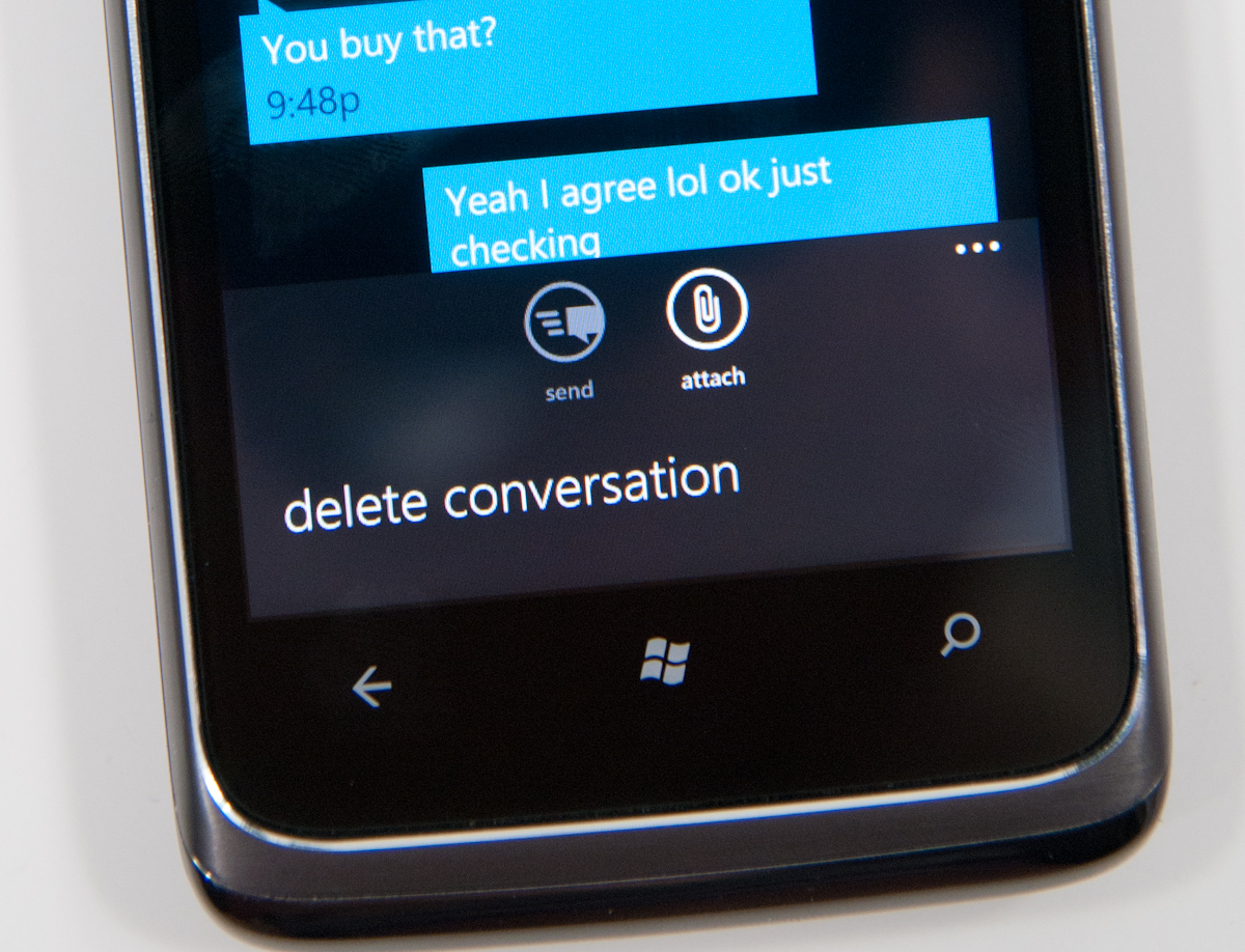
The conversation view itself is honestly quite beautiful, as are the transitions in and out of it. Just like other platforms, your messages are on the right, theirs on the left. Each message is timestamped and you can long press individual messages to delete or forward them. Forward almost mitigates lack of copy and paste, but not quite. From what I’ve seen so far, the conversation thread contains all of the messages you’ve exchanged in the dialog - I’m not sure if there’s some eventual overflow. If there is, I have yet to hit it.
Buttons at the bottom are send and attach photos (more on this in a second), and expanding the menu options lets you delete the conversation from inside it as well. There’s landscape support as well, but if you have the keyboard up, you can only effectively see two lines of a text message.
MMSes with photos thankfully show up with a thumbnail preview. Receive an MMS with more than one photo, and you’ll get a link to expand the whole thing and show everything inside. Unfortunately, videos get no such preview, just a file name and a film icon.
While WP7 supports receiving photos and videos over MMS, it only appears to support sending photos. Support for sending videos captured on the device is strangely absent. I tried recording videos in every resolution allowed and sending them, none of which would appear for attachment from the messaging application. WP7 lacking support for sending videos is a rather strange (and glaring) hole, one I hope will get filled quickly.
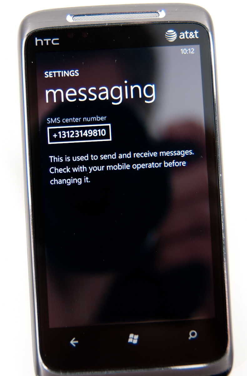
Back on the conversations page, tapping settings brings you to the messaging settings options page, which is pretty sparse. On the HTC Surround and Samsung Focus, there’s an option to change the SMSC number, which is a rather curious thing to expose at all - in general this shouldn’t be changed unless messaging isn’t working.
I’ve expressed my frustration with Android’s sometimes extraordinarily sluggish SMS database and messaging application in the past, which slows down after a few days of heavy texting. It’s something I’ve heard other users complain about, so I know I’m not alone, and even changing clients doesn’t help since they end up using the same SMS subsystem. Let’s not forget, however, that Windows Mobile was at times even more sluggish - I remember routinely out typing the compose field and experiencing dramatic lag on an HTC Touch Pro, Mogul, and even Apache.
For a lot of users, having SMS stay snappy and responsive is very important. Even more important is being able to get in and get out of the messaging application quickly so you can get back to what you were doing before. Thankfully, WP7’s messaging subsystem seems to be quite snappy. Thus far, I haven’t experienced any slowdowns of any kind like I’m used to seeing on other platforms despite regular use. Honestly, having messaging stay snappy is so important of a thing to test that I now routinely throw hundreds of SMSes at devices from different phones to see how they stand up.
I fired a little under 200 SMSes at the HTC Surround in the span of just a few minutes and didn’t experience any dramatic slowdown. There’s a tiny bit of chop scrolling through the list the first time, but subsequent viewing is completely smooth. I did this again later and tried to place a call while SMSes were coming in and managed to crash the phone subsystem so that subsequent incoming and outgoing calls were silence, but a reboot fixed it, and I've seen that on numerous other smartphones.
One of the things WP7 executes extremely well are message notifications. If you’re not in the conversation thread when a message comes in, a notification strip pops up with the number or name of the sender, and a small preview of the message. Tap on that, and you’re brought into the conversation where you can read and reply to it. What’s nice is that you can tap back after and get back to what was going on.
One of the most useful workflows for the back button is when you’re browsing a webpage, and an SMS comes in:
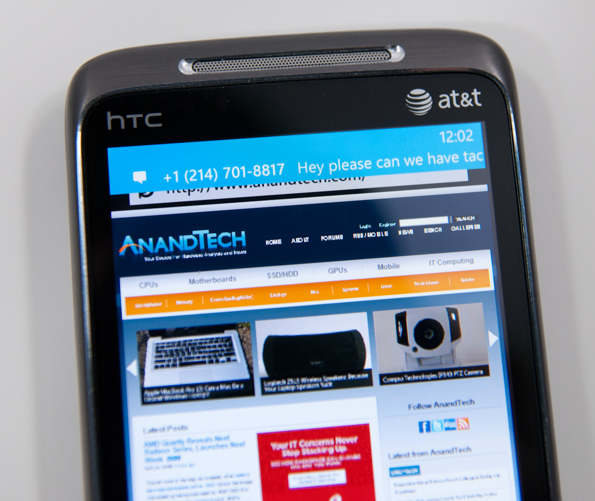
You can tap the notification, jump into the messaging application, reply, then hit back and pop right back out into the browser.
The combination of a smooth interface and an excellent virtual keyboard make messaging on WP7 a very fast experience.
No AIM Application
One thing Palm did very well was use its messaging app for virtually all communication outside of email. SMSs, IMs and Gtalk all took place over the same messaging app and the conversations were stored by contact, not by service.
This is one area where everyone else has fallen short, Microsoft included. Windows Phone 7 ships with no native support for AIM or any other messaging services, including Live Messenger.


125 Comments
View All Comments
bplewis24 - Thursday, October 21, 2010 - link
You call it smooth running and functional, which is fine. That doesn't dissuade me and the OP from feeling it is ugly and off-putting. You even say it doesn't have to be cluttered eye candy, but the review claims it is the most beautiful UI he has ever seen. The thing is big blue blocks. It is exactly what he explained on the first page that Windows typically does with any refresh of their OS: "make it bigger and bluer."It is definitely ugly, but if you only care about how functional and fast it is, then you will love it. I admit that I can't stand iOS cluttered eye-candy style either, so I'm with you on that. Give me functional, customizable and sleek and I'm in heaven. Glad somebody already figured out how to do that.
Brandon
geniekid - Thursday, October 21, 2010 - link
In my opinion, it's quite good looking and better than the default home screen on my HTC Incredible.Like you said, it's all a matter of taste. I will put myself out there and say the guy who thinks the "6 year old crackberry looked better" probably has poor taste.
Smilin - Monday, October 25, 2010 - link
It is the most beautiful UI I've seen. Mind you I've SEEN it. Have you? Screenshots don't do it justice. You have to see it moving and the text shifting in parallax. It's eerily 3D.iPhone and Android are beautiful too....if you're a Windows 3.1 progman.exe fan.
gstrickler - Friday, October 22, 2010 - link
It may be simple and functional, but that doesn't mean it has to be boring and ugly. I'm a huge proponent of simple and functional, but that screen looks like something out of the late 80's or early 90's. The tiles have too little to differentiate them from each other. A little use of color and better contrast would make it a lot clearer and faster to identify the icons, and it would look better.Note to MS, hire a usability consultant and put some of your graphic designers to work (I know you have graphic designers). It shouldn't look like just like Windows 7, but it definitely shouldn't look like it comes from Windows 2.0
inighthawki - Thursday, October 21, 2010 - link
That "ugly" home/start screen interface is one of the main reasons I'm interested in WP7. The other smartphone interfaces I've seen from others like iOS and Android are nothing more than glorified and eye-candy enhanced versions of every other phone out there IMO. And as someone who owns a Zune HD which has a very similar interface, I can tell you that it works really well, and is very nice.bplewis24 - Thursday, October 21, 2010 - link
There is no eye candy in Android. It's basically a blank slate desktop background. And obviously it's no surprise that a Zune HD user would prefer the Windows Phone 7 UI. It's also not a surprise you use subjective and vague justifications for your preference :)inighthawki - Friday, October 22, 2010 - link
I don't see why I have to justify a subjective decision. The bottom line is "I like it" and my entire point was that just because the OP thinks it's the ugliest home screen they've ever seen, there are people like myself that not only like it, but actually dislike the style they do. I am not trying to force my opinion on anyone.Smilin - Monday, October 25, 2010 - link
I agree with you FWIW.cknobman - Thursday, October 21, 2010 - link
I agree 100%Gigantic big colored tiles? Seriously?
What a waste of space and an overly boring-bland appearance!!!
Guspaz - Thursday, October 21, 2010 - link
I agree, the WP7 UI looks horrendous to me. Giant space-wasting bland UI components.My biggest concern is how HUGE the tiles are. Anand complained about iOS/Android cluttering screens with app icons, but it seems to me like WP7 will be incredibly worse.
Reducing the number of tiles on the screen so that you can only view 6 full tiles at a time, as WP7 has done (the bottom two tiles appear cut off in pictures) is a huge limitation. The iPhone displays 20 icons.
If I've got 50 apps, and I'm not using folders, an iPhone will give you three screens to scroll through. Android, I assume is similar. Windows phone 7 seems to require something like 8... And the lack of some sort of folder or grouping support is only going to make this worse.
My prediction is that, if WP7 takes off and starts getting a decent number of apps, they're going to have to rethink the home UI or it'll be unusable.