The Windows Phone 7 Review
by Anand Lal Shimpi & Brian Klug on October 20, 2010 7:00 PM EST- Posted in
- Smartphones
- Windows Phone 7
- Microsoft
- Mobile
Notifications
Notifications are still a sore spot for iOS users. Thankfully, Microsoft did a good job with notifications in Windows Phone. In general WP7 uses a small slice of the top of the screen real estate to deliver both the kind of information about phones that users need (signal, battery, and status), and also deliver ‘toast’ notifications.
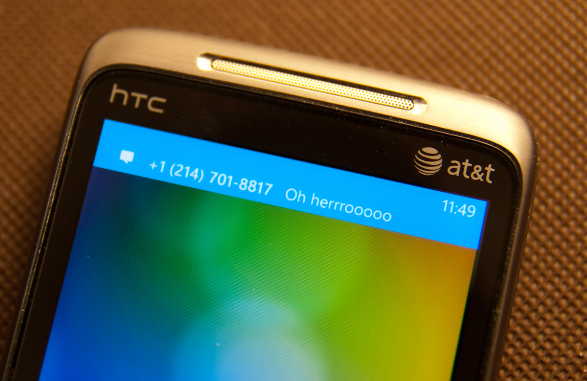
I’ve shown some of that before already. Incoming messages show up and have the contact’s name or number (depending on whether you have a contact card for them), and a snippet of the message. You can tap on that and dive into the messaging application, or swipe the message off to the side and ignore it:
It’s sort of a hybrid combination of WebOS’ notification system. The only small concern I have is that after a toast fades away, there’s no way to see it again. If you’re browsing and want to finish reading a paragraph before responding, you’ll probably miss the message toast. Then you’re forced to hop out of IE, hop into messaging, and get back. You end up missing out on the otherwise excellent IE -> messaging -> back to IE workflow enabled by the back button. It’s a tremendously minor gripe, but it’s important to differentiate that WebOS keeps those notifications at the bottom until they’re dismissed, WP7 dismisses them for you after a few seconds.
Voicemails also result in a notification the same way, popping up a simple new voicemail toast when something is incoming:

On WP7, there really are about 4 different ways to get notified about messages, missed calls, and voicemails. With toasts directly like I’ve already shown, with tiles on the start page that change and show a simple counter, and at the bottom of the lock screen:

Push notifications from applications will also show up as toasts, and there’s an in-application notification system as well. I’ve yet to encounter either of these two, but they’ll definitely be leveraged at one point or another.
I’d say in general that WP7 has struck a balance with its notification system that puts it some place inbetween the competition. iOS either freezes whatever you’re doing and pops up a big bubble right in the middle of your screen, or you can turn that off and get nothing at all. Android sticks everything in the notifications bar at the top and expects users to check that by dragging down. The result is that one gives you a ton of information at the cost of being annoying, the other keeps it all hidden away. Again, it’s obvious that WP7 takes nods from WebOS.
As we already mentioned, the top of the screen isn’t just used for toasts however. WP7 still needs to deliver basic information critical to the operation of the phone. Information like signal strength, network status, vibration status, and battery level. WP7 will drop down status indicators as appropriate, but only when it’s relevant. In a call, signal bars will drop down, but nothing else. When you’re hopping on or jumping off of WiFi, the wireless indicator will animate appropriately. It’s an interesting way of keeping the interface clean. I still prefer seeing all this information all the time, but I understand what the WP7 team was going for here.
Tap volume, and you’ll bring up another toast-like notification where you can toggle vibrate/ring and change the current volume level:

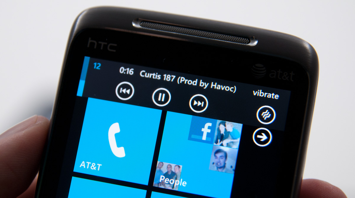
When playing music, there’s a similar kind of notification toast, except now you can skip tracks and pause:
There’s also a black on white version of all these if you change your theme settings:
Though the toasts remain the solid accent color set in themes.


125 Comments
View All Comments
bplewis24 - Thursday, October 21, 2010 - link
Check out page 26. It's dedicated completely to how the "update" process works. In short, it's more like iOS than Android....which is sounds like you'd prefer.ishbuggy - Thursday, October 21, 2010 - link
Yeah I accidentally skipped that page :PI really hope it works out as well as Microsoft hopes it will
Voldenuit - Wednesday, October 20, 2010 - link
Will AT be reviewing the Nokia N8 and E8 Symbian phones? Nokia is pretty obscure in the States (since they mainly sell direct from their website, with no carrier subsidy), but are pretty big in Europe and Asia.epyon96 - Wednesday, October 20, 2010 - link
Anand,With such a glowing review from you, it's almost enough to bump Windows 7 above my initial choice of getting a blackberry. I need a physical keyboard. I'm very picky about it. You are simply a very engaging writer.
I really hope Windows 7 mobile comes up with a superior keyboard version
VashHT - Thursday, October 21, 2010 - link
The Dell phone coming out looks like it will have a really nice keyboard, I think it is called the venue pro. Also ATT is supposed to have a keyboard phone by LG I think.heelo - Thursday, October 21, 2010 - link
The Venue Pro *looks* great, but it's somewhat of a monster in size and weight.If I weren't stuck on a T-Mobile family plan, I'd probably opt for that LG Quantum. Like Anand said, WP7's interface is extremely usable on smaller screens, and the reasonable form factor and physical keyboard likely make for a very convenient real-world user experience. The drawback is that the looks and (supposedly) build quality are sub-par.
EarthwormJim - Wednesday, October 20, 2010 - link
OMG a screenshot of me in action is on the Xbox Live page!! Woo-hoogstrickler - Thursday, October 21, 2010 - link
That's the ugliest and least interesting home/start screen I've ever seen on a smartphone. It may be functional, but even a 6 year old crackberry looked better (and I don't like the BB). The rest of the UI doesn't look too bad, but the start screen needs some work.bplewis24 - Thursday, October 21, 2010 - link
I couldn't agree more. I find it funny that people are claiming this UI is "100% right" as if everybody is going to like it. Obviously it's a matter of preference, but I just cannot see the overwhelming majority of people getting into this UI. I find it appalling to look at and couldn't imagine using it every day.Brandon
B3an - Thursday, October 21, 2010 - link
Dont know what you're smoking but most people prefer an easy to use simple looking UI thats functional rather than cluttered eye candy.From the vids i've seen it seems to be the smoothest running, most functional, fastest, and natural UI on any phone to date.