The Windows Phone 7 Review
by Anand Lal Shimpi & Brian Klug on October 20, 2010 7:00 PM EST- Posted in
- Smartphones
- Windows Phone 7
- Microsoft
- Mobile
Minimalist, Even Down to the Status Bar
When Apple introduced the iPhone, Steve Jobs made the point that a virtual keyboard was preferable to a fixed keyboard because you shouldn’t always be stuck with the same keyboard layout. Some applications would require a slightly different layout and other applications wouldn’t need it entirely. A physical keyboard requires you to pay the space penalty regardless of what you’re doing with the phone.
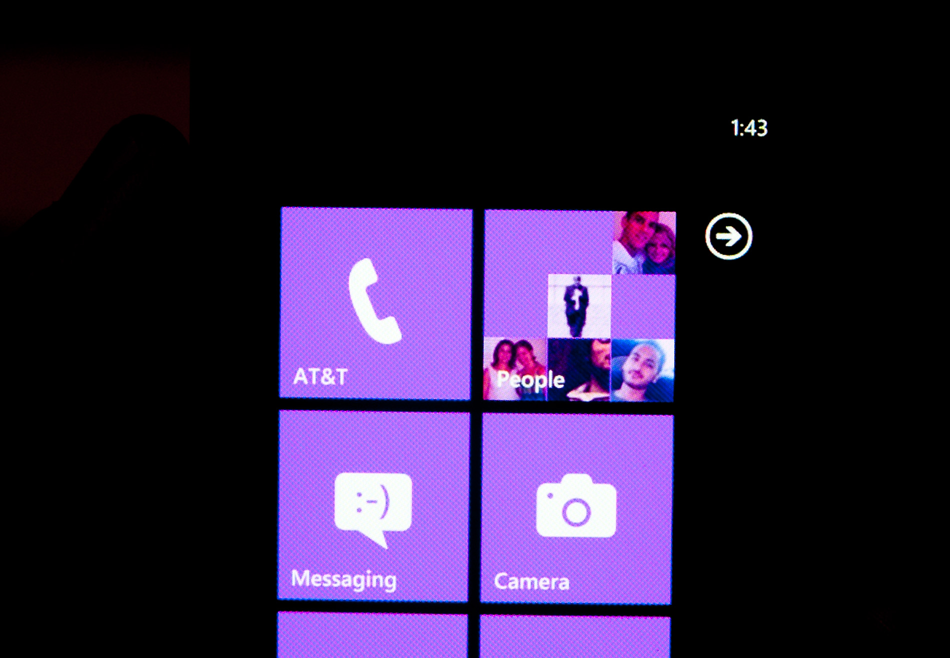
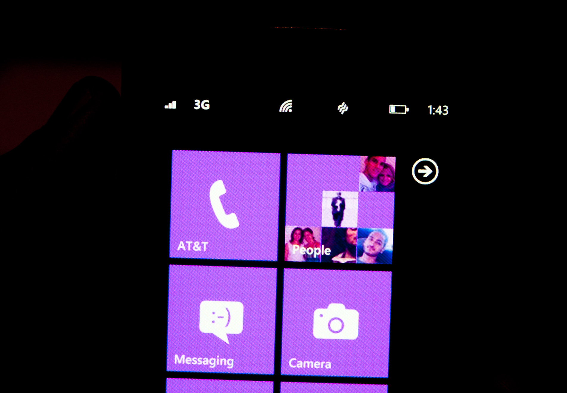
Microsoft takes that same argument even further with Windows Phone 7. The status bar present on all smartphones indicates things like signal strength, WiFi reception, Bluetooth status, remaining battery life and the current time. On a Windows Phone, the status bar remains hidden most of the time. The only element that’s nearly always present is the current time. The rest stay hidden unless you tap the top of the screen to reveal them for a short period of time.
Microsoft views these items as only useful for short period of time. All that’s necessary is a quick glance to check on their state, they don’t need to be a permanent part of the OS.
When you first wake your phone up you’ll see the full status bar, but the moment you unlock it the bar disappears leaving only the clock (of course the disappearing animation is very well done).
Elements of the status bar will appear on their own if something significant has happened. For example if you walk into range of known WiFi you’ll see the WiFi icon appear as the phone connects.
This is one of those features that you’ll either love or hate. Microsoft tried to do what it thought was best across the OS and you’re not always going to agree with its decisions. In this case, there were a few times when I wished the status bar was permanent. If my phone was loading a webpage slowly and I wanted to know if poor reception was to blame, or to just find out how much battery life I had left. Both of these problems go away if we eventually get faster/better network coverage and phones with significantly longer battery life, but today they are concerns. Despite the obvious limitations, the auto hiding status bar paves the way for what is ultimately the cleanest smartphone UI on the planet today. All that’s visible on the screen is what you’re ultimately trying to do with the phone. If it’s email, that’s all you see, if it’s a web page that’s pretty much it.
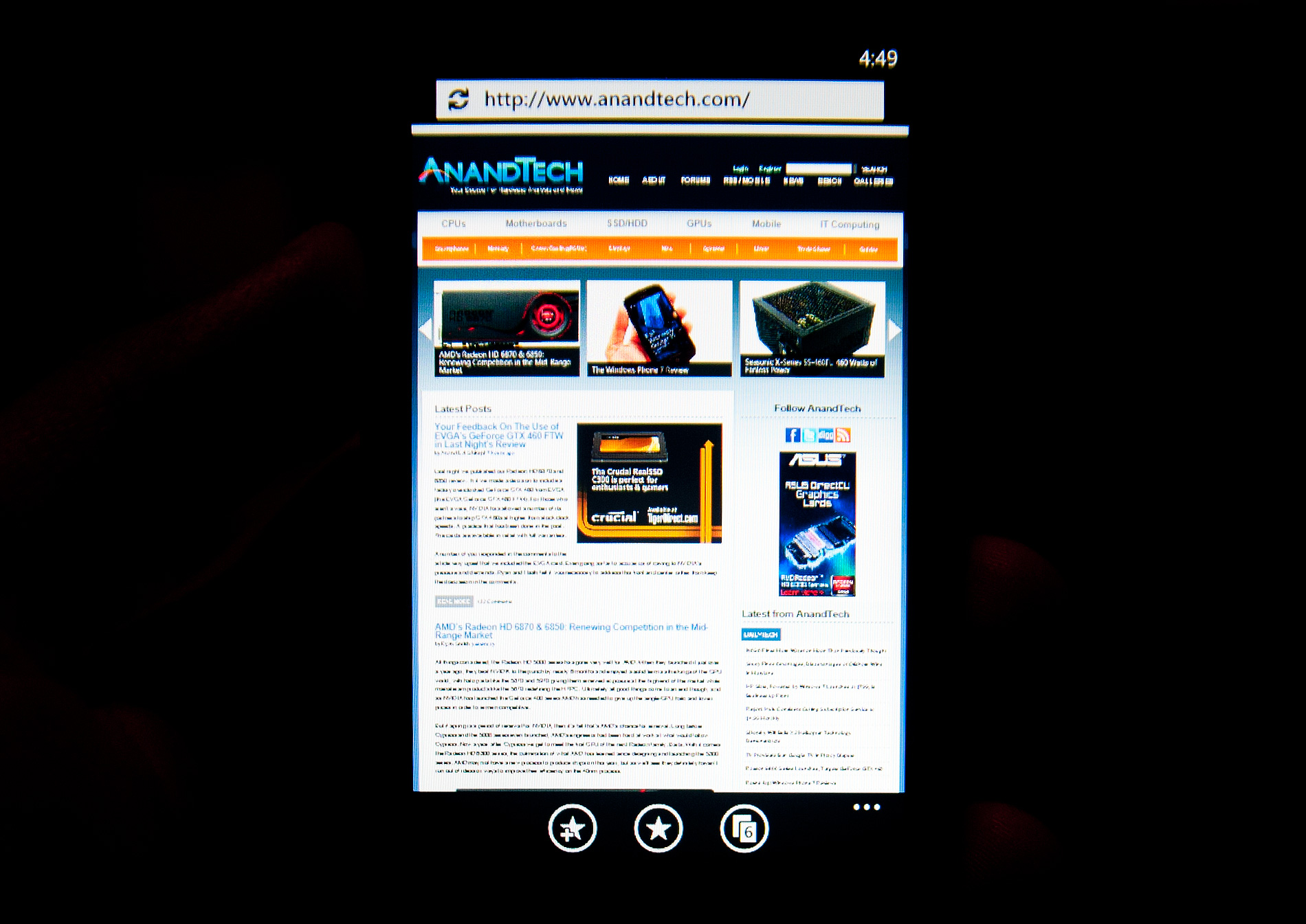
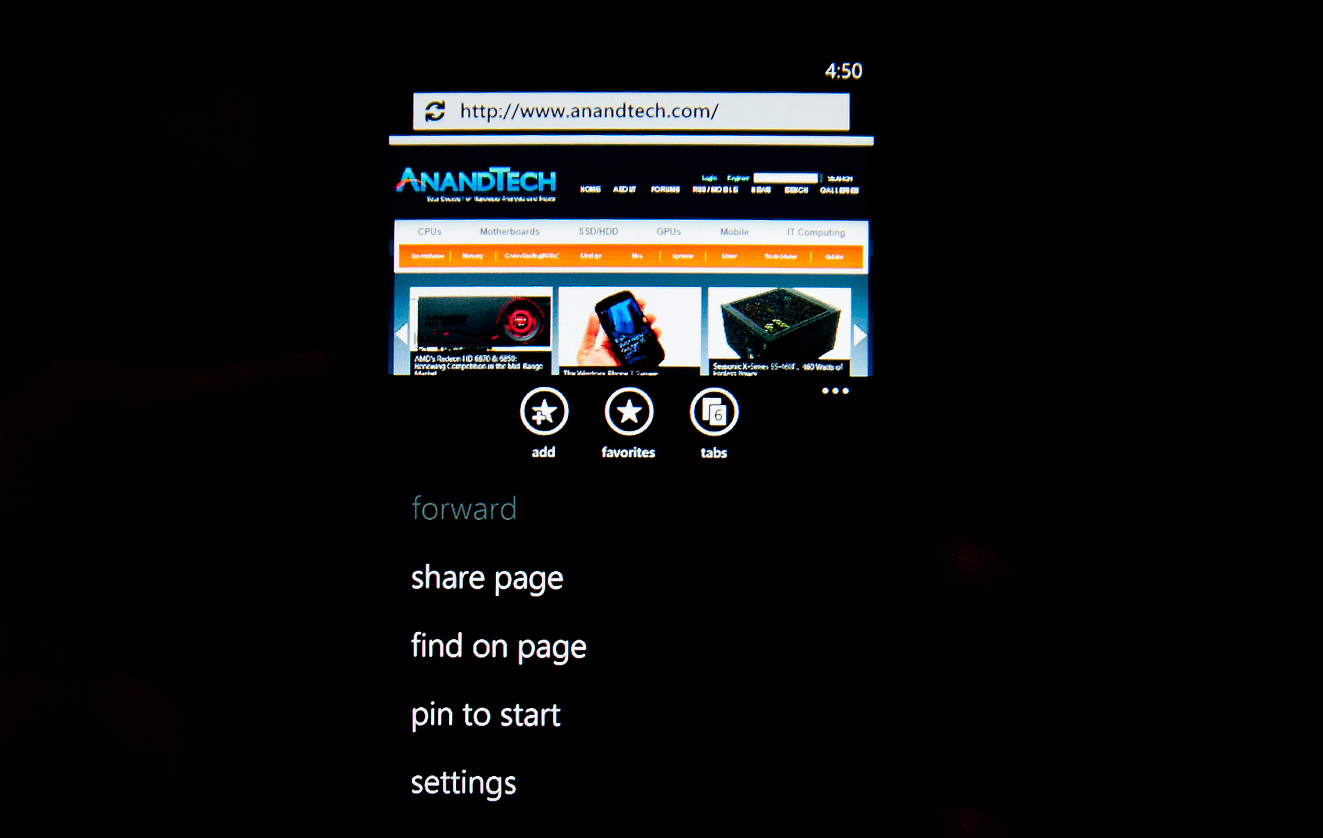
Even the URL bar in IE is thinner than what you’d find on Android or iOS. It’s almost uncomfortably thin. But Microsoft believes it’s worthwhile to always display it (rather than hide it as you scroll down) and there’s no need to make it bigger than it needs to be. Tap on the URL bar and you’ll get a slightly bigger version for text input (but still not too big).
The App Bar
Some applications need more functionality than can reasonably be provided by Windows Phone 7’s very minimal interface. For those applications Microsoft uses the app bar. The app bar is a group of buttons (up to 4) at the bottom of the screen. The app bar in IE mobile has three buttons: add (to favorites), favorites and tabs.
All app bars have an ellipses in the far right corner. Tapping the ellipses will not only reveal more options, but it will also reveal the text labels for the buttons on the app bar to help new users learn the ropes. To keep the app bar as simple as possible no buttons on any app bar are labeled, you’re supposed to eventually just know what they mean.
I found myself tapping the ellipses to figure out what certain buttons did but the longer I used the phone the less I needed the labels. The space savings worked, good job Microsoft.


125 Comments
View All Comments
Hrel - Friday, December 3, 2010 - link
Am I the only one who sees that the "brown" option for the UI color is red? Am I losing my sight? My tv is adjusted perfectly to THX standards. All the other colors look right. Or is it just the camera you used to take the shot?Hrel - Saturday, December 4, 2010 - link
As far as I'm concerned any phone that doesn't have a "fine me" feature with the ability to lock it doesn't even exist. Seriously, why has it taken SOOO long to have this? It should be standard on all phones. Now I want to be able to make my phone the key for my car.Hrel - Sunday, December 5, 2010 - link
I'm the same as your dad. I mean I want to view everything is the proper aspect ratio; but I also REALLY want usefull pixels filling the whole screen. That's why I wish everything was just filmed in 16:9. I mean, that's plenty wide. When I want movies on DVD I just zoom in once so the whole screen is filled and with the exception of far right/left text in some movies I honestly don't miss out on anything. It doesn't cut off very much on the sides and really when you're filming who's gonna point the camera so where you're supposed to be looking is at the edge of view? No one. 16:9 is the only aspect ratio visual media should be in. That way everything is uniform and just fits.Hrel - Sunday, December 5, 2010 - link
ie no trade offsnatewaddoups - Friday, December 23, 2011 - link
The article mentioned the confusing behavior of IE's back button... The confusion starts when you open IE from the start menu, because at that point IE throws away your browsing history, so that the back-button will return you to the start menu. It makes sense if you were opening IE to look at a new web page, but it's maddening if you were opening IE to resume a browsing session that had useful stuff in the web navigation history.The workaround is to switch to IE by holding down the back-button and selecting IE from the list of running apps. That opens IE without throwing away your browsing history, so that the back-button continues to work for web navigation.
I actually removed the IE tile from the start menu, just to prevent myself from accidentally throwing out the browser history. I've always got two or three tabs open in IE, with meaningful history in each tab, so it was always aggravating to press the back button and get kicked back to the start menu.
If you'd like to see this fixed in a future version of Windows Phone, please vote for it here:
http://windowsphone.uservoice.com/forums/101801-fe...