The Windows Phone 7 Review
by Anand Lal Shimpi & Brian Klug on October 20, 2010 7:00 PM EST- Posted in
- Smartphones
- Windows Phone 7
- Microsoft
- Mobile
Email and Exchange
Email is one of those things every smartphone has to nail. It’s an absolutely critical part of mobile productivity that there literally is no margin for error, as even small changes can make an experience either completely usable or totally awful depending on the platform. Gmail on Android is so compelling that I know many a person that use it solely because of how nicely integrated it is.
Starting off the email tile shows shows a number that doesn’t correspond to the number of total unread emails in your account, but rather how many have arrived since last you glanced at it. I actually really like this idea. It’s a simple way to notify you that new stuff has arrived since last you checked out the mail application, without overwhelming with some evil gargantuan number of unread messages. Messages read on the desktop or elsewhere still decrement the counter like you’d expect.
Jumping into the mail application itself is a bit of a shocker the first time. While the rest of the WP7 is primarily white text atop black background (unless you changed it in theme settings), the mail application is entirely black text on white background, and there’s no obvious way to change it. Not a huge deal, but it’s a bit strange that mail exists on its own outside those theme settings.
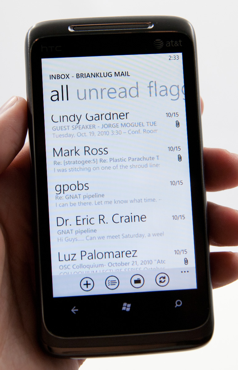
The default view is simply of all your messages in a timeline. The sender’s name is huge, followed by subject and then a one line preview of the message.
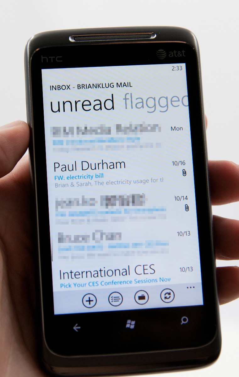
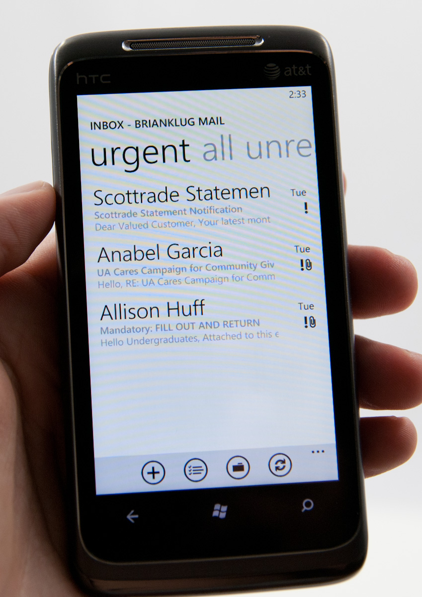
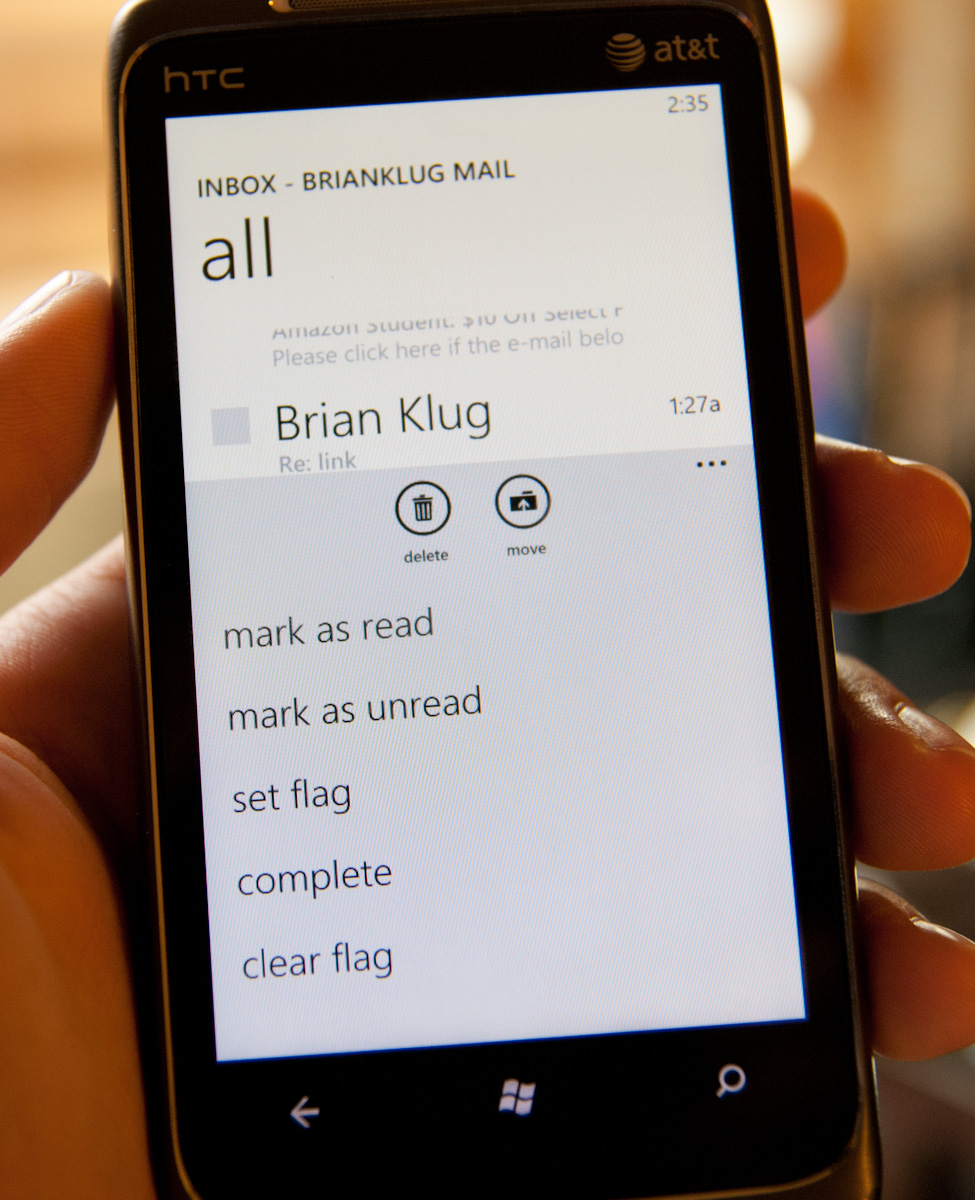
Pivoting right brings you to a view with unread messages only, followed by flagged and urgent. Unread view is very useful - I’m honestly shocked other platforms haven’t implemented something similar. Flagged and urgent aren’t as useful, just because starred doesn’t translate to flagged (at least on Google Sync exchange for me), and urgent messages are usually anything but.
Buttons at the bottom compose new email, enable multiple selection, bring up the folders view, or sync respectively. Tapping on the ellipsis for more options lets you get to more settings or add another email account.
Multiple selection on WP7 actually doesn’t require using the button, which makes me wonder - why bother including one? To do it, just tap at the far left of any message, and a small box will glow, letting you know you’re about to enable multiple selections.
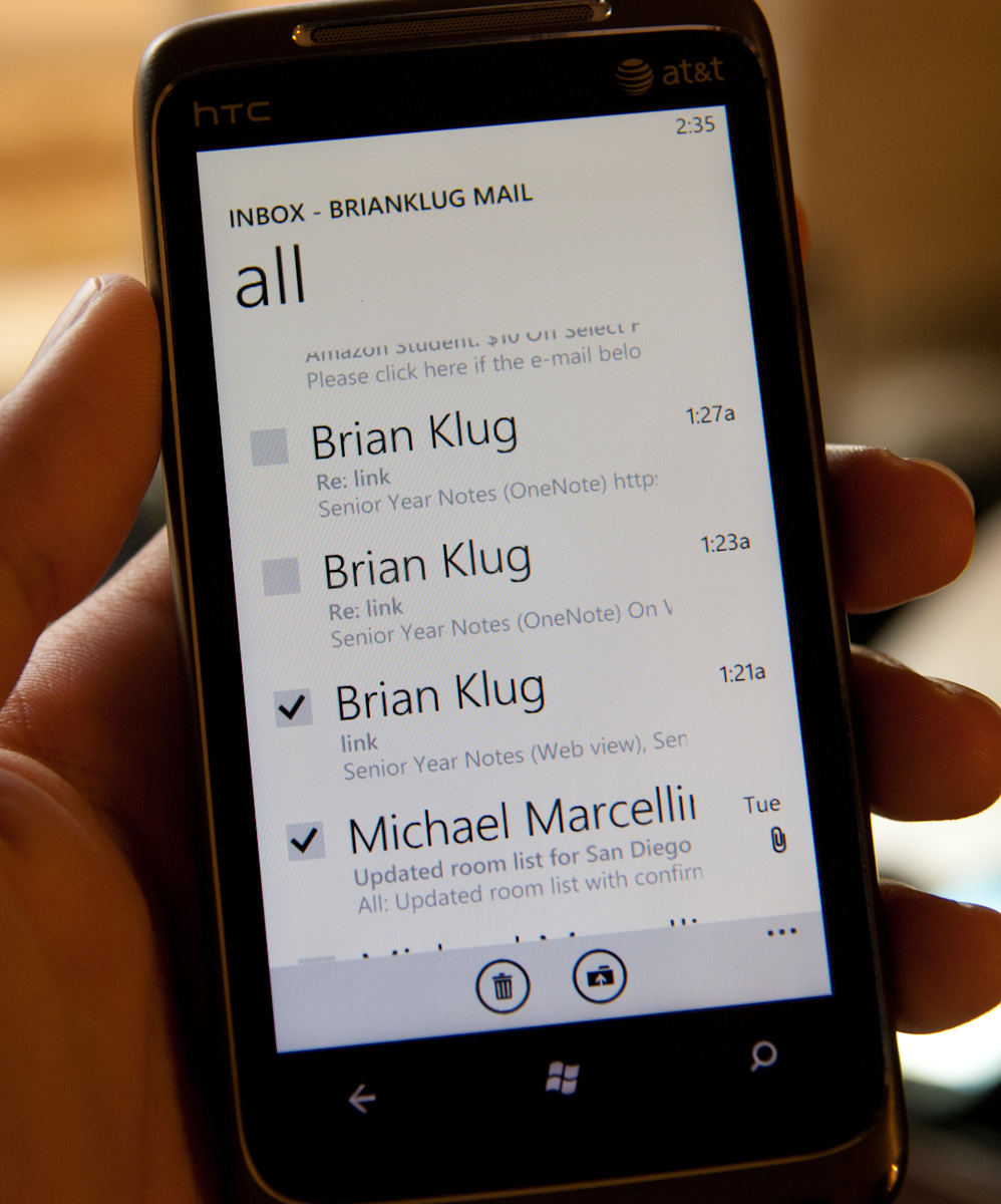
Then you can check lots of things and delete, move, mark read or unread, or flag.
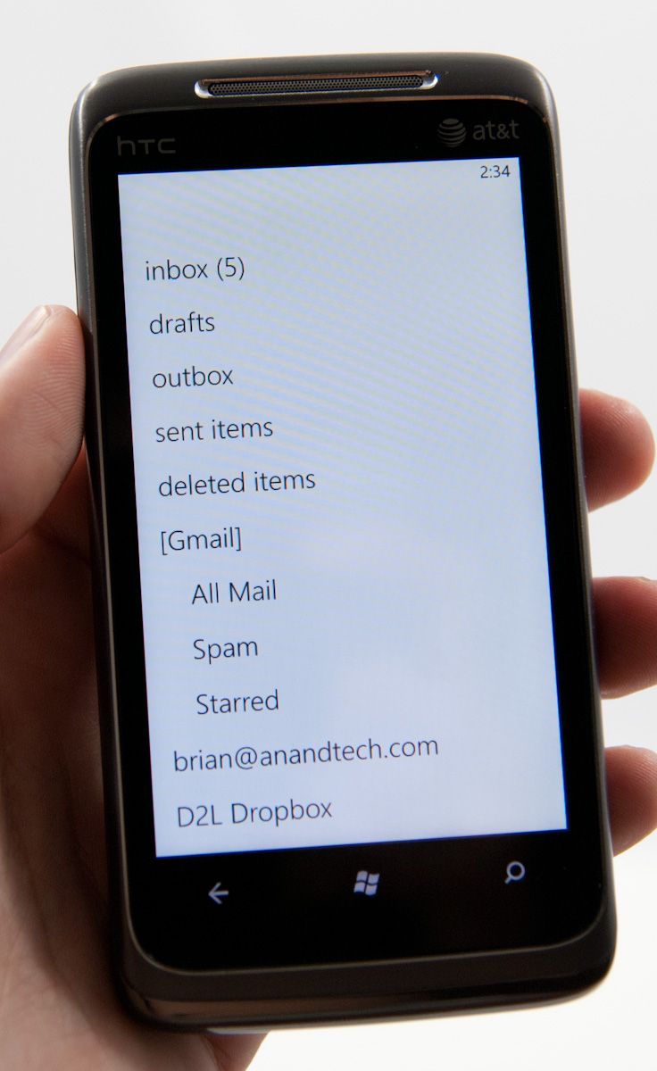
There’s also obviously landscape support for everything in the email application. Go back to the normal view, hit folders, and you can view things stored locally on the phone like drafts, or view all the folders on the exchange or IMAP account:
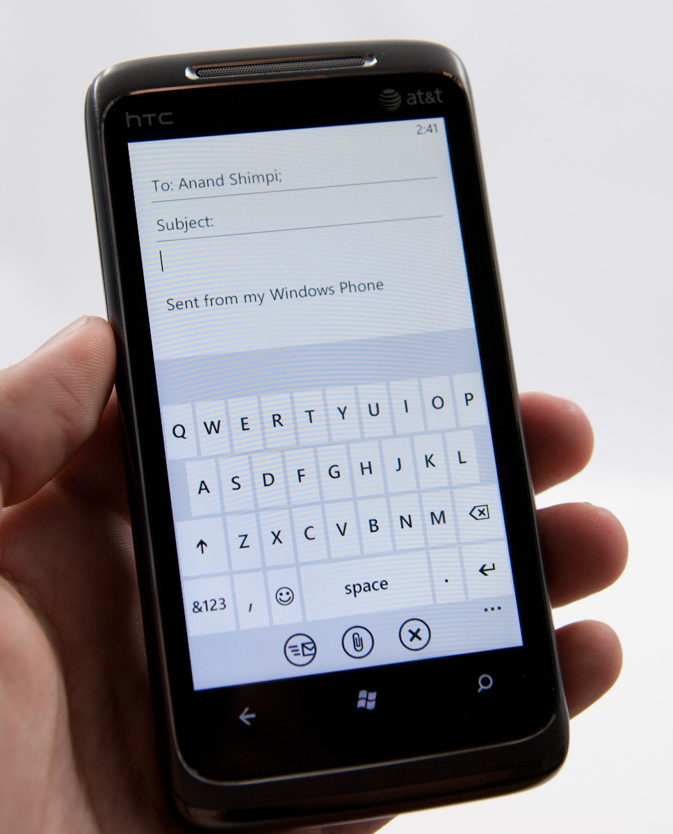
The email compose screen is spartan, but the same can be said for iOS and Android. Start typing a contact’s name or email address, and you’ll get suggestions. Interestingly enough, WP7 does elect to append a default signature to every email - “sent from my Windows Phone.”
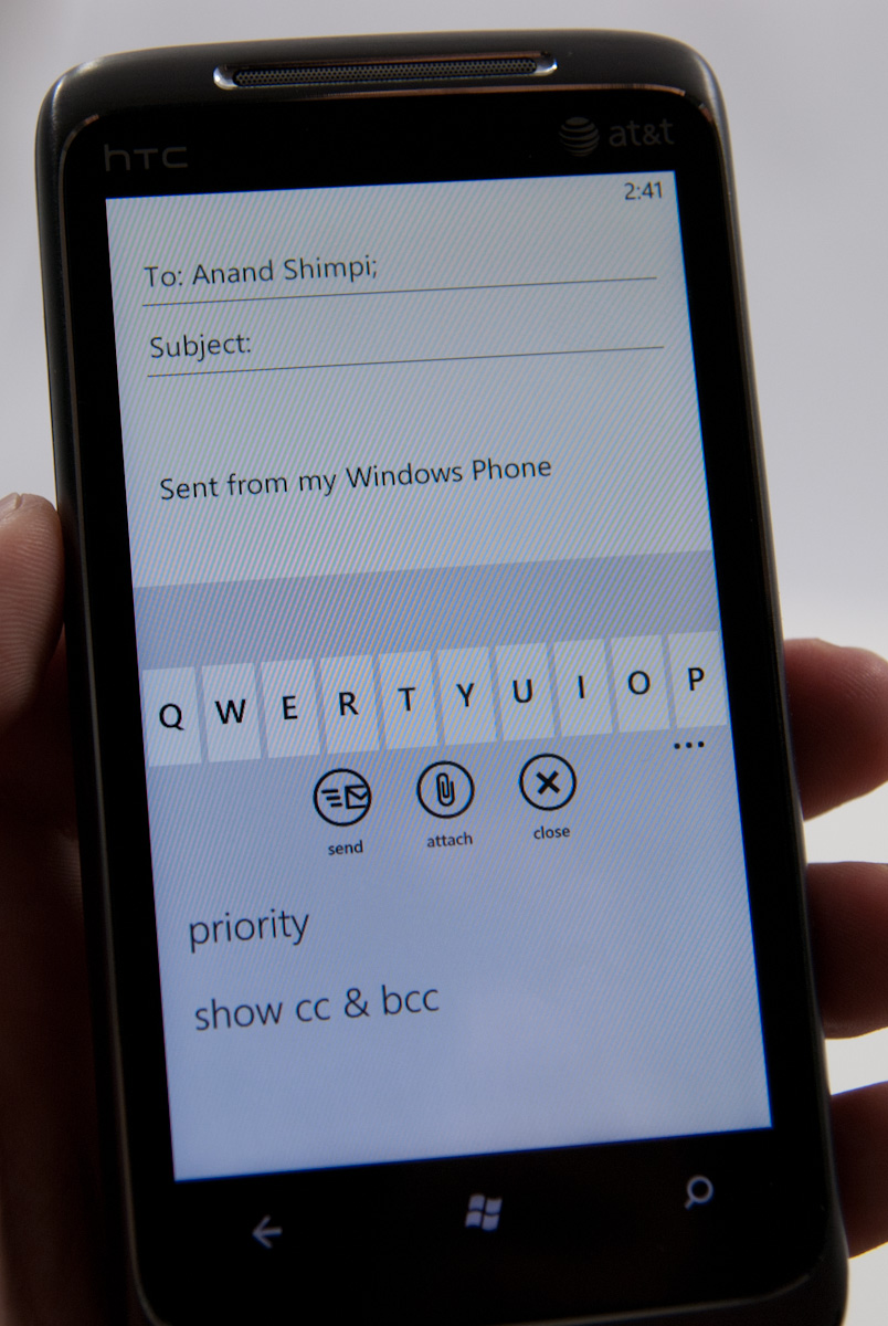
You can expand options and set priority (if you like marking everything urgent), and get to BCC and CC fields. There’s also obviously an attach option which right now just lets you attach photos one at a time. Photos get reduced in size to 1630 × 1222, and are compressed to around 350 kilobytes. There aren’t any options to send full size images, unfortunately.
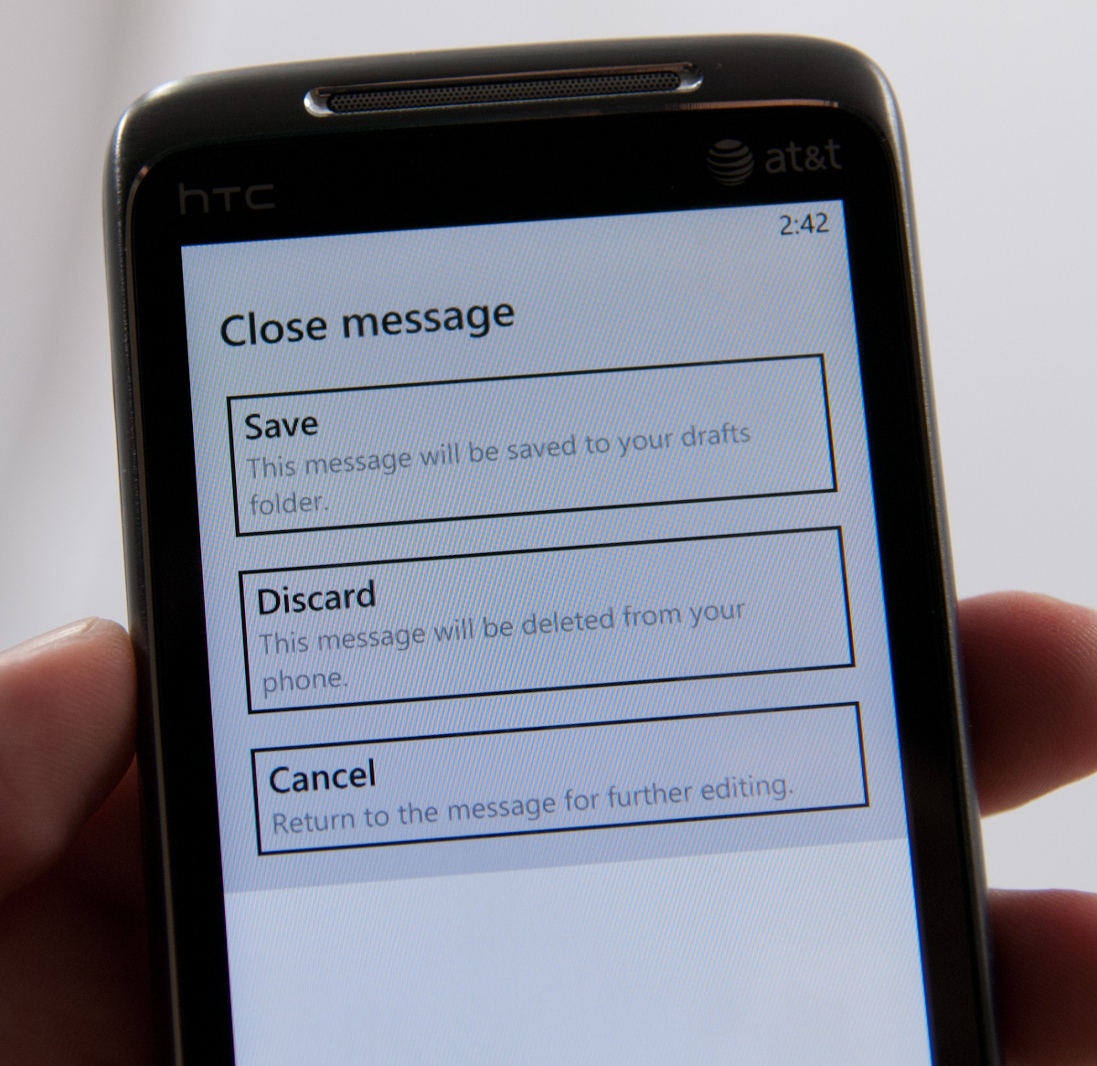
If you close or hit back, you’ll get a save, discard, or cancel dialog. Drafts go into local drafts which you can get to from folders, but not up to a folder of your choice.
All the text composed in the mail application gets typeset in Calibri, whether you like it or not. There’s no formatting options from the email compose screen. Other than that, email is just what you’d expect it to be.
One thing that’s interesting which Anand and I both noticed regarding WP7 mail is that changes like deletion aren’t immediately propagated out. Neither him on IMAP nor me on Exchange saw messages delete immediately. If you want to see those actions reflected on a desktop client, you have to force a sync immediately after making the change. This is somewhat unusual, since everyone else forces those updates to happen immediately instead of later on.
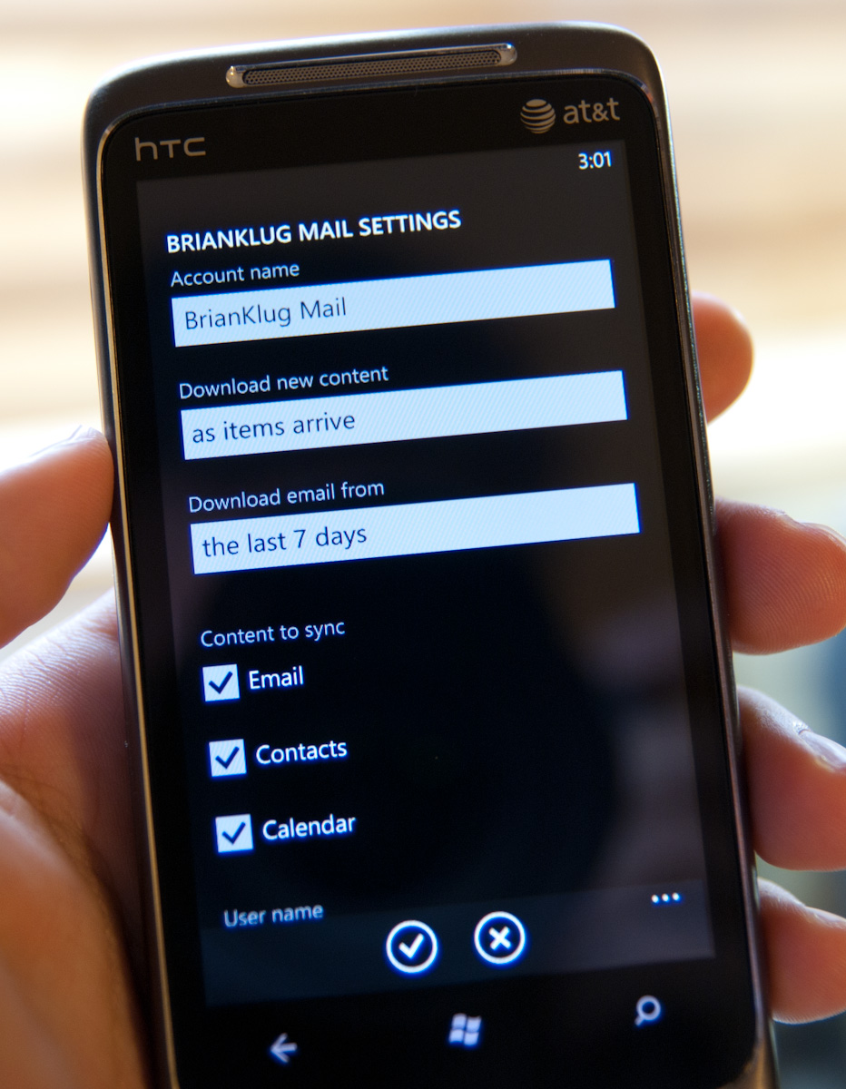
There’s setup support for a variety of common email services, including Windows Live, Outlook (Exchange), Yahoo! Mail, Google, and any POP or IMAP box. Under Exchange you can sync contacts, calendars, and email. Google does the same, and you can specify mandatory SSL. Inside the account options options for grabbing everything or just the past 3 days, 7 days, 2 weeks, or month. Download new content has settings for manually syncing on a schedule or as items arrive (pushed).
The only field I’m uncertain about is logging, which defaults to advanced but has a field marked ‘off (recommended).’ I’m not sure where these logs are going or what they’re used for, but this field is here.


125 Comments
View All Comments
Hrel - Friday, December 3, 2010 - link
Am I the only one who sees that the "brown" option for the UI color is red? Am I losing my sight? My tv is adjusted perfectly to THX standards. All the other colors look right. Or is it just the camera you used to take the shot?Hrel - Saturday, December 4, 2010 - link
As far as I'm concerned any phone that doesn't have a "fine me" feature with the ability to lock it doesn't even exist. Seriously, why has it taken SOOO long to have this? It should be standard on all phones. Now I want to be able to make my phone the key for my car.Hrel - Sunday, December 5, 2010 - link
I'm the same as your dad. I mean I want to view everything is the proper aspect ratio; but I also REALLY want usefull pixels filling the whole screen. That's why I wish everything was just filmed in 16:9. I mean, that's plenty wide. When I want movies on DVD I just zoom in once so the whole screen is filled and with the exception of far right/left text in some movies I honestly don't miss out on anything. It doesn't cut off very much on the sides and really when you're filming who's gonna point the camera so where you're supposed to be looking is at the edge of view? No one. 16:9 is the only aspect ratio visual media should be in. That way everything is uniform and just fits.Hrel - Sunday, December 5, 2010 - link
ie no trade offsnatewaddoups - Friday, December 23, 2011 - link
The article mentioned the confusing behavior of IE's back button... The confusion starts when you open IE from the start menu, because at that point IE throws away your browsing history, so that the back-button will return you to the start menu. It makes sense if you were opening IE to look at a new web page, but it's maddening if you were opening IE to resume a browsing session that had useful stuff in the web navigation history.The workaround is to switch to IE by holding down the back-button and selecting IE from the list of running apps. That opens IE without throwing away your browsing history, so that the back-button continues to work for web navigation.
I actually removed the IE tile from the start menu, just to prevent myself from accidentally throwing out the browser history. I've always got two or three tabs open in IE, with meaningful history in each tab, so it was always aggravating to press the back button and get kicked back to the start menu.
If you'd like to see this fixed in a future version of Windows Phone, please vote for it here:
http://windowsphone.uservoice.com/forums/101801-fe...