The Windows Phone 7 Review
by Anand Lal Shimpi & Brian Klug on October 20, 2010 7:00 PM EST- Posted in
- Smartphones
- Windows Phone 7
- Microsoft
- Mobile
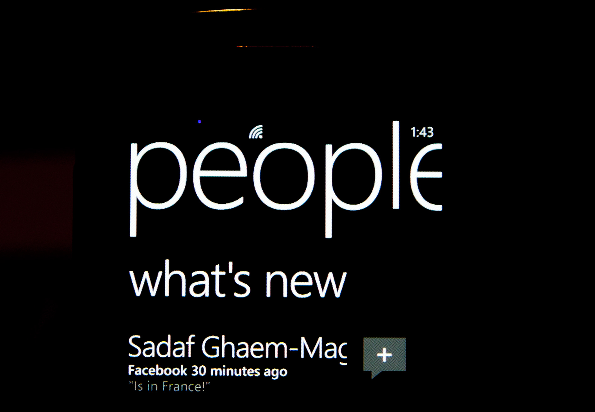
Minimalist, Even Down to the Status Bar
When Apple introduced the iPhone, Steve Jobs made the point that a virtual keyboard was preferable to a fixed keyboard because you shouldn’t always be stuck with the same keyboard layout. Some applications would require a slightly different layout and other applications wouldn’t need it entirely. A physical keyboard requires you to pay the space penalty regardless of what you’re doing with the phone.
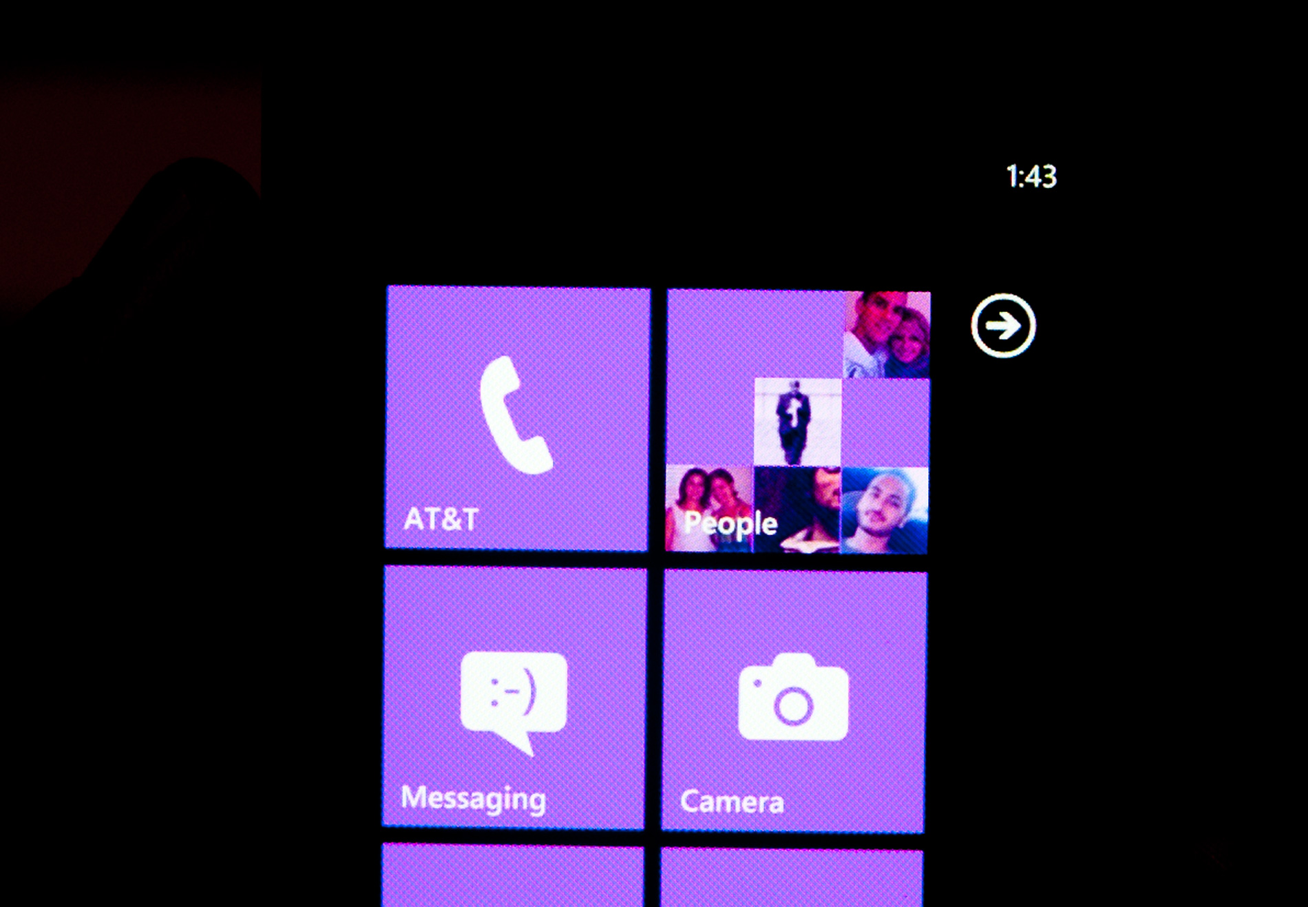
Microsoft takes that same argument even further with Windows Phone 7. The status bar present on all smartphones indicates things like signal strength, WiFi reception, Bluetooth status, remaining battery life and the current time. On a Windows Phone, the status bar remains hidden most of the time. The only element that’s nearly always present is the current time. The rest stay hidden unless you tap the top of the screen to reveal them for a short period of time.
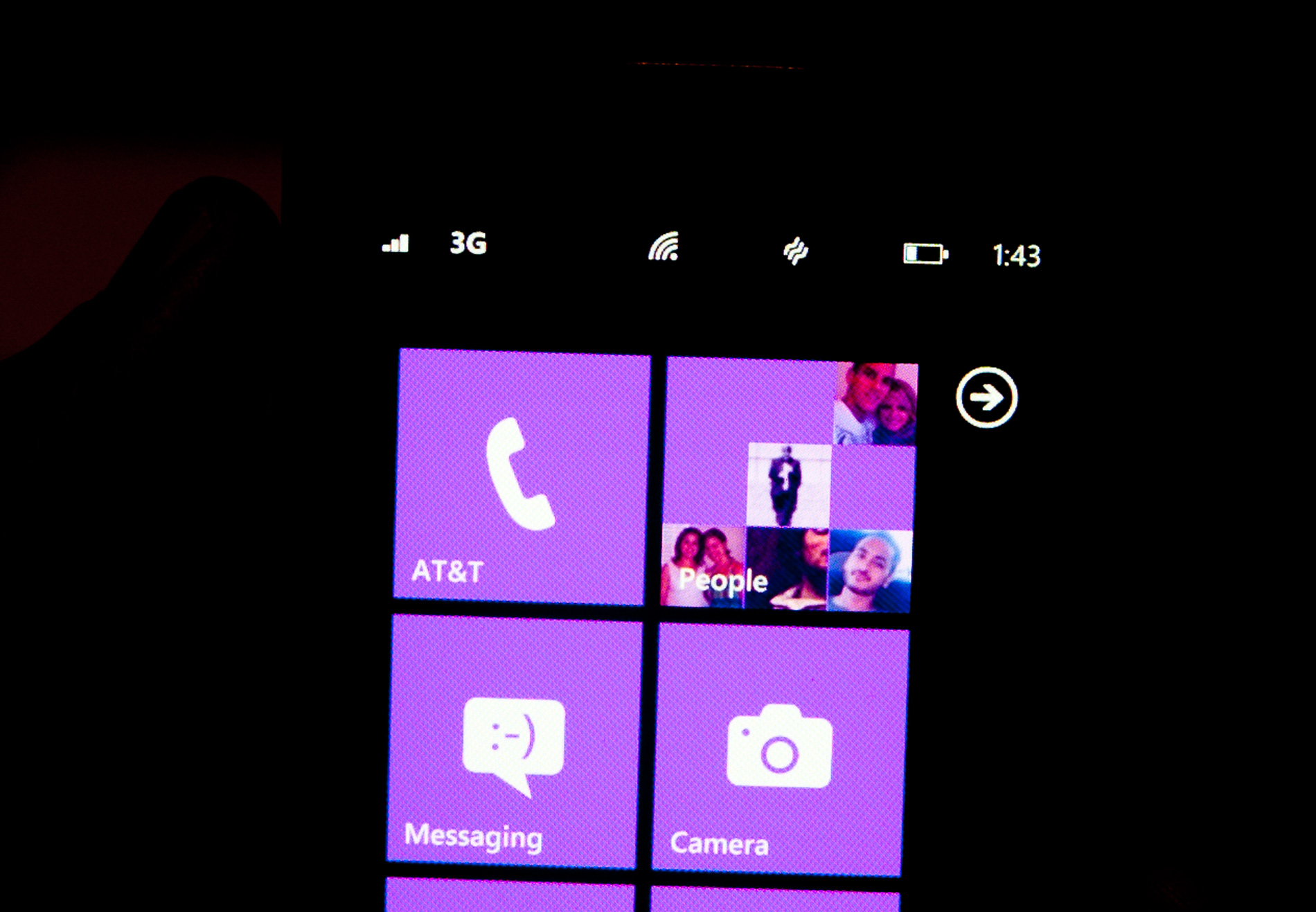
Microsoft views these items as only useful for short period of time. All that’s necessary is a quick glance to check on their state, they don’t need to be a permanent part of the OS.
When you first wake your phone up you’ll see the full status bar, but the moment you unlock it the bar disappears leaving only the clock (of course the disappearing animation is very well done).
Elements of the status bar will appear on their own if something significant has happened. For example if you walk into range of known WiFi you’ll see the WiFi icon appear as the phone connects.
This is one of those features that you’ll either love or hate. Microsoft tried to do what it thought was best across the OS and you’re not always going to agree with its decisions. In this case, there were a few times when I wished the status bar was permanent. If my phone was loading a webpage slowly and I wanted to know if poor reception was to blame, or to just find out how much battery life I had left. Both of these problems go away if we eventually get faster/better network coverage and phones with significantly longer battery life, but today they are concerns. Despite the obvious limitations, the auto hiding status bar paves the way for what is ultimately the cleanest smartphone UI on the planet today. All that’s visible on the screen is what you’re ultimately trying to do with the phone. If it’s email, that’s all you see, if it’s a web page that’s pretty much it.
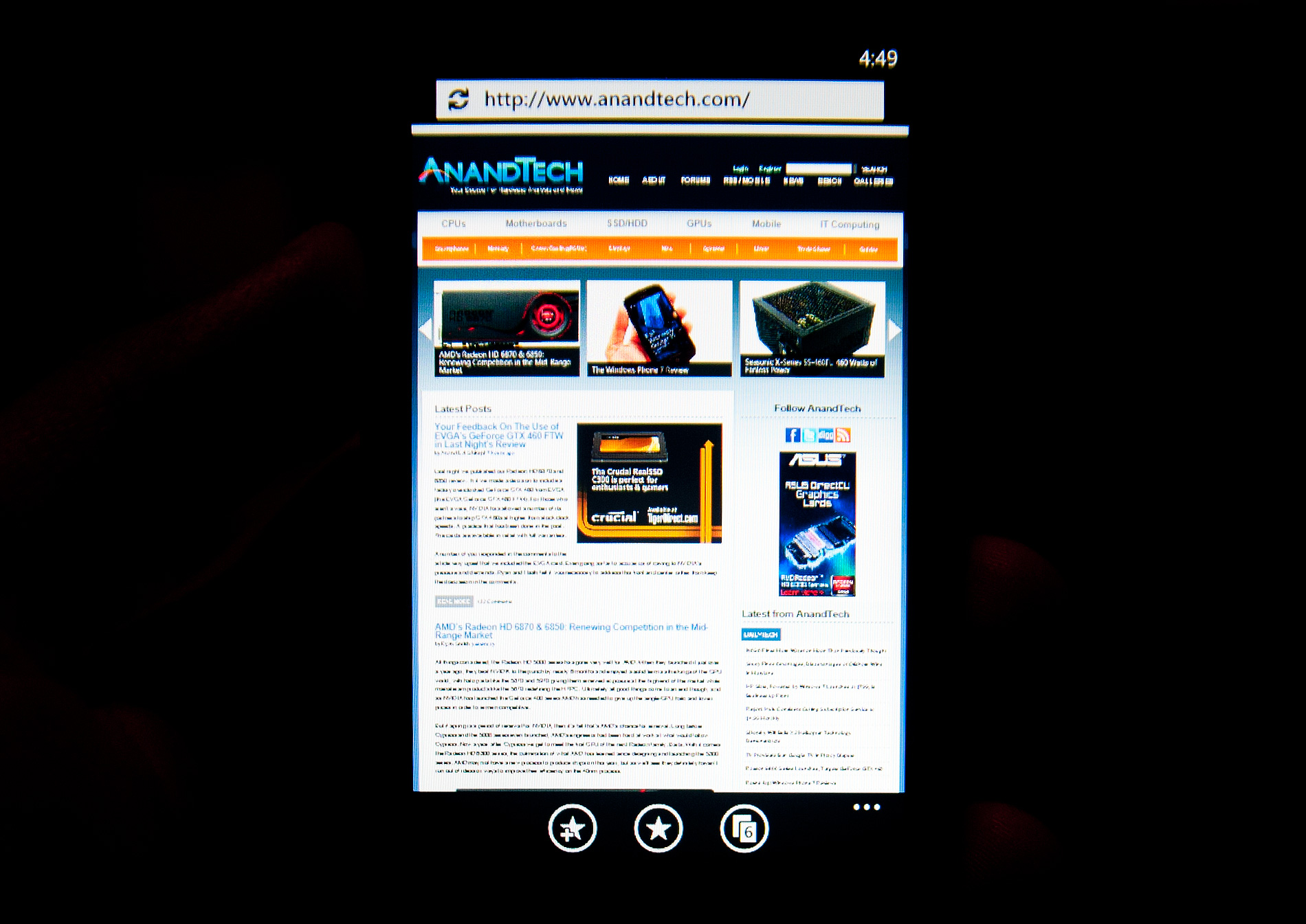
Even the URL bar in IE is thinner than what you’d find on Android or iOS. It’s almost uncomfortably thin. But Microsoft believes it’s worthwhile to always display it (rather than hide it as you scroll down) and there’s no need to make it bigger than it needs to be. Tap on the URL bar and you’ll get a slightly bigger version for text input (but still not too big).
The App Bar
Some applications need more functionality than can reasonably be provided by Windows Phone 7’s very minimal interface. For those applications Microsoft uses the app bar. The app bar is a group of buttons (up to 4) at the bottom of the screen. The app bar in IE mobile has three buttons: add (to favorites), favorites and tabs.
All app bars have an ellipses in the far right corner. Tapping the ellipses will not only reveal more options, but it will also reveal the text labels for the buttons on the app bar to help new users learn the ropes. To keep the app bar as simple as possible no buttons on any app bar are labeled, you’re supposed to eventually just know what they mean.
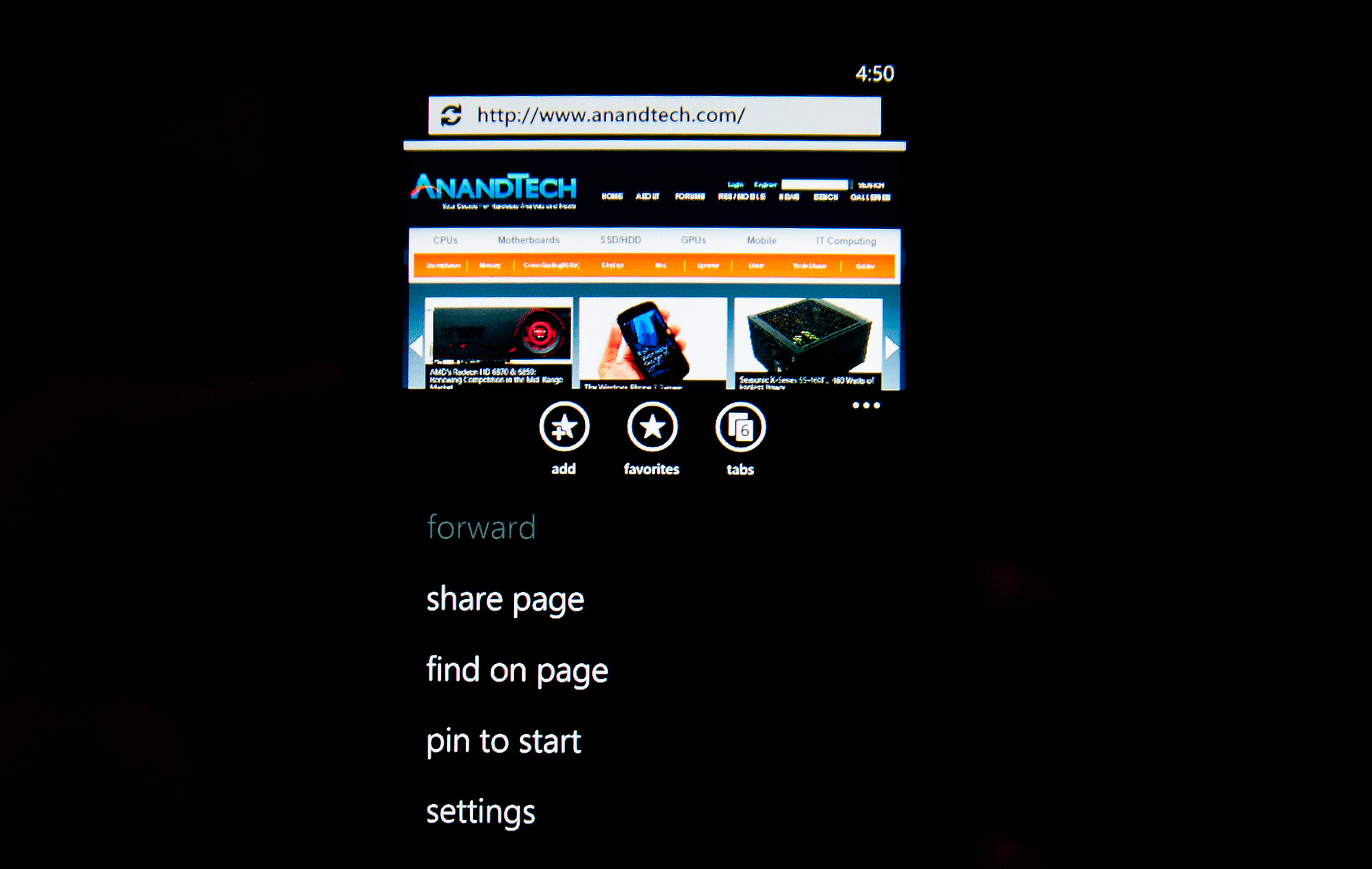
I found myself tapping the ellipses to figure out what certain buttons did but the longer I used the phone the less I needed the labels. The space savings worked, good job Microsoft.


125 Comments
View All Comments
x0rg - Wednesday, November 3, 2010 - link
To me it looks like Microsoft just needed to release something ASAP. Later they can work on interface improvement, I mean fonts, sizes, blocks, text location, easy shortcut access, backups, etc. There are tons of things to improve.landswipe - Thursday, November 4, 2010 - link
"The downside to this layout is that every time you want to enter a different URL, you’ll have to rotate to portrait, enter it, and then swap back. Same if you want to change tabs or use a favorite. That can get a bit frustrating if you’re used to viewing pages in landscape, but not totally killer. There’s an impressively fluid rotation transition between portrait and landscape, however."Same theme through the whole article...
Little Upside... bit more downside... a little frustrated?... but HEY come on we are friends!!! there is some cool animation by our designers to make up for it all :D <cheesy grin>
It stinks of slight of hand, and overall sounds like an epic fail waiting to happen... This just won't compete.
As a developer, I don't think the apps/games produced are going to cut it... With Android and iPhone you can at least write cross platform opengl games in C++. dotNet is just pure lock-in.
I hope they sell just enough of these things to put an early end to it... I have a feeling a lot of people are going to get fooled.
jeans_xp - Sunday, November 7, 2010 - link
It's bad news for us, AMOLED is not used.www.mobilegoing.com
vhx - Tuesday, November 9, 2010 - link
Only problems I have are no custom ring tones (really now...). No messenger support yet. No clue about 3rd party apps, no one is talking about it. Will it be like Android or the tight control Apple has? I couldn't find any article talking about this.DKant - Saturday, November 13, 2010 - link
I got through 15 pages and that was it. I have already decided this is my next mobile-platform anyway (unless I start hearing rumors of a hologram-projecting iPhone 5), no point reading the remaining 200. I can't imagine the amount of patience it must have taken to WRITE this behemoth! :) Of course it's your job, you've been doing this forever etc, but still.Man, finally. A "proper" competitor to iOS, which was getting a little stale. And I have too many issues with Google's approach to consider any of the quadrillion models on offer.
Well. I do hope WP7 sells and lives longer than the Palm. :_(
(And I'd never imagined I'd finish a post with this..)
To Microsoft!!
CSMR - Saturday, November 13, 2010 - link
Very informative review, but shouldn't this site be serving people who are technically minded rather than the average consumer?There is no question WP7 has a lot of excellent points.
But I'm not sure how you can accept a system that does away with files, and uses a limited sync system to move content around in approved ways.
Or call software "The Best Smartphone for Music Lovers" when:
- it believes that music consists of "songs" written by "artists" and put into "albums", when only a minor part of the history of western music is of this form
- it does not allow a folder structure for navigation, only limited tags of the above form
- gapless playback is incomplete
Microsoft needs prodding to update the system in a way that retains the new features and GUI but also implements the basic features. If it doesn't get this from tech sites, where are we left? Perhaps Windows 8 will decide Turing completeness is no longer important, people just need to be able to do x, y, and z as simply as possible. I'm sure there are a lot of people at Microsoft who want WP7 to be a real OS - without changing usability. They just need a bit of support.
Millsington - Tuesday, November 16, 2010 - link
Excellent point about folder navigation, I had forgotten about that. It is sorely missed in modern music players.Sadly, I don't see the issues you raised being addressed for some time unless WP7 really takes off.
billybarker - Tuesday, November 16, 2010 - link
Check out these Windows Phone 7 Application Icons - there are 350 icons in the set. http://goo.gl/rMk08warden6 - Friday, November 19, 2010 - link
I've had my HTC 7 Mozart for a fortnight. I like it. I like the big square icons on the Start screen (although I've toned down the colour as much as possible); I like the integration with Google Mail, Contacts and Calendar (yes it does work, set it up as an Exchange server); I like the threaded conversations for texts like the iPhone; the music player is good; oh, and it's not a bad phone either.There are some issues -- there's no Messenger client, gapless track playback is haphazard to say the least, there's a limited range of alerts/ringtones and you can't add more, and battery life is a bit short. Especially with push email. Hopefully some of those can be fixed, but they're definitely not deal-breakers for me.
What I can't figure out is how to do "Inverse" on the scientific view of the calculator. No inverse-sin, inverse-log, etc. That's not a deal-breaker either, I don't use those very often! But it's an odd omission.
anistoona - Sunday, November 21, 2010 - link
" but while home I don’t use those apps as much. Instead my smartphone behaves more like an SMS, phone, email, camera and web browsing device, and it’s in those areas that Windows Phone is easily just as good as the competition."With all my respect: If I need only the SmS, phone, email, Camera and web borwisng things form my handheld device, I would like to buy a 150$ Symbian phone, I don't need to buy an up to 700$ smartphone to do that things!!
WinMob 5, 6.x was the system which puts the definition of what " Smart Phones" should capable of, and disappointingly Microsoft chose to give up that system and replaced with a modified copy of Old, aged and discontinued competitors system ( I mean first generation of iOS ) ..
Really good choice Microsoft !