The Windows Phone 7 Review
by Anand Lal Shimpi & Brian Klug on October 20, 2010 7:00 PM EST- Posted in
- Smartphones
- Windows Phone 7
- Microsoft
- Mobile
Minimalist, Even Down to the Status Bar
When Apple introduced the iPhone, Steve Jobs made the point that a virtual keyboard was preferable to a fixed keyboard because you shouldn’t always be stuck with the same keyboard layout. Some applications would require a slightly different layout and other applications wouldn’t need it entirely. A physical keyboard requires you to pay the space penalty regardless of what you’re doing with the phone.
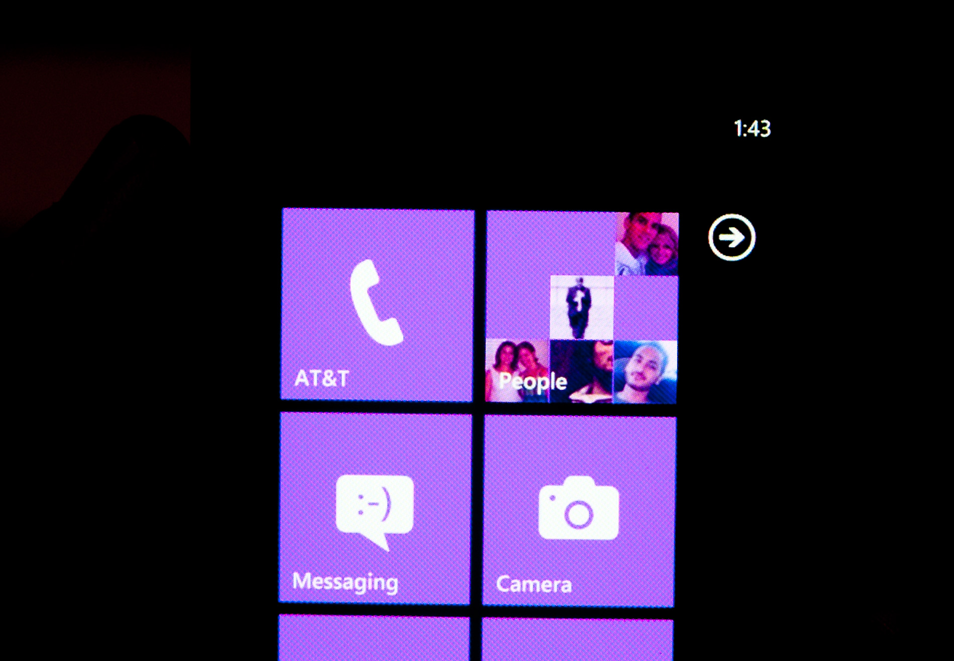
Microsoft takes that same argument even further with Windows Phone 7. The status bar present on all smartphones indicates things like signal strength, WiFi reception, Bluetooth status, remaining battery life and the current time. On a Windows Phone, the status bar remains hidden most of the time. The only element that’s nearly always present is the current time. The rest stay hidden unless you tap the top of the screen to reveal them for a short period of time.
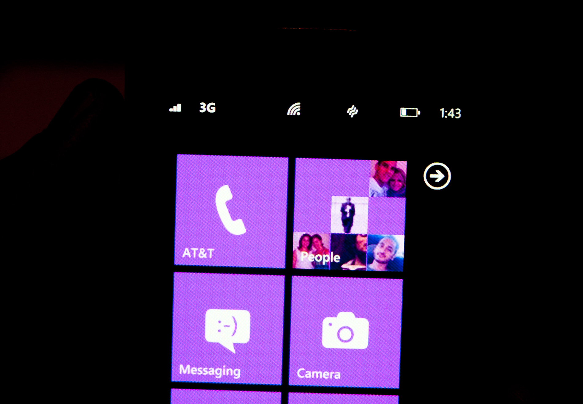
Microsoft views these items as only useful for short period of time. All that’s necessary is a quick glance to check on their state, they don’t need to be a permanent part of the OS.
When you first wake your phone up you’ll see the full status bar, but the moment you unlock it the bar disappears leaving only the clock (of course the disappearing animation is very well done).
Elements of the status bar will appear on their own if something significant has happened. For example if you walk into range of known WiFi you’ll see the WiFi icon appear as the phone connects.
This is one of those features that you’ll either love or hate. Microsoft tried to do what it thought was best across the OS and you’re not always going to agree with its decisions. In this case, there were a few times when I wished the status bar was permanent. If my phone was loading a webpage slowly and I wanted to know if poor reception was to blame, or to just find out how much battery life I had left. Both of these problems go away if we eventually get faster/better network coverage and phones with significantly longer battery life, but today they are concerns. Despite the obvious limitations, the auto hiding status bar paves the way for what is ultimately the cleanest smartphone UI on the planet today. All that’s visible on the screen is what you’re ultimately trying to do with the phone. If it’s email, that’s all you see, if it’s a web page that’s pretty much it.
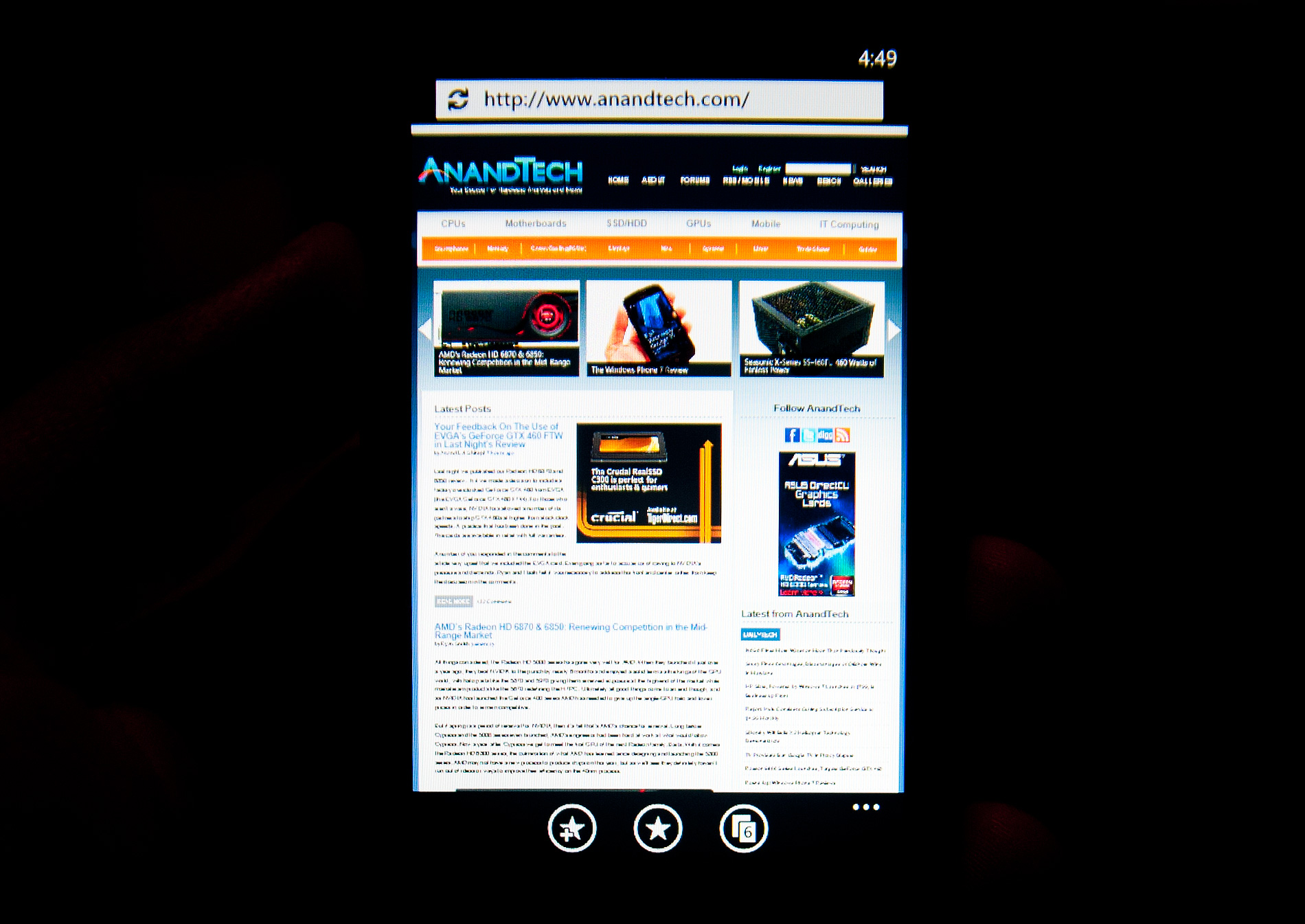
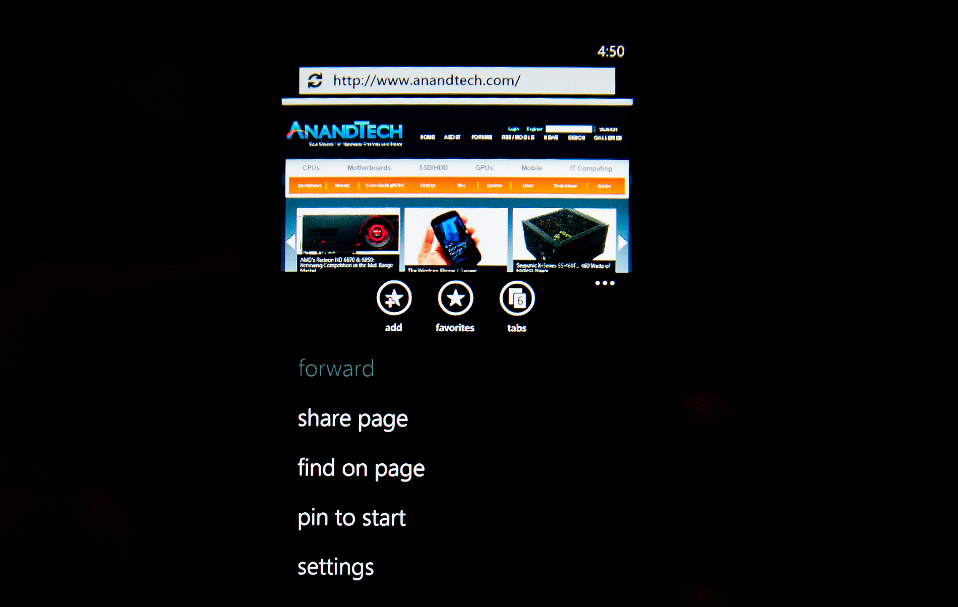
Even the URL bar in IE is thinner than what you’d find on Android or iOS. It’s almost uncomfortably thin. But Microsoft believes it’s worthwhile to always display it (rather than hide it as you scroll down) and there’s no need to make it bigger than it needs to be. Tap on the URL bar and you’ll get a slightly bigger version for text input (but still not too big).
The App Bar
Some applications need more functionality than can reasonably be provided by Windows Phone 7’s very minimal interface. For those applications Microsoft uses the app bar. The app bar is a group of buttons (up to 4) at the bottom of the screen. The app bar in IE mobile has three buttons: add (to favorites), favorites and tabs.
All app bars have an ellipses in the far right corner. Tapping the ellipses will not only reveal more options, but it will also reveal the text labels for the buttons on the app bar to help new users learn the ropes. To keep the app bar as simple as possible no buttons on any app bar are labeled, you’re supposed to eventually just know what they mean.
I found myself tapping the ellipses to figure out what certain buttons did but the longer I used the phone the less I needed the labels. The space savings worked, good job Microsoft.


125 Comments
View All Comments
Shadowmaster625 - Friday, October 22, 2010 - link
It cant play avi files? What do you call a $500 device that cant play avi files? FAIL.beefnot - Friday, October 22, 2010 - link
I'm so sick of seeing "fail" in user comments. 99% of the time, it follows a point or points being made that wouldn't have swayed them to deem it worthy anyway. YAWN.mutatio - Friday, October 22, 2010 - link
I'm glad you guys found it to be as smooth and useful as you did. Based on what you described and the corresponding pictures, however, I'm having a hard time understanding something "just works" when the UI looks like a crap sandwich and almost makes my eyes bleed. "No, we don't use those oh-so-80's icons that graphically represent what the App does. We're much too posh for that, minimalist traffic signs for everything! Brilliant!" Maybe it'll be different with hands on, but it looks like MS went out of their way to try and make this thing look clever and almost abstract. Think myspace made into a smartphone, and if you're like me and think that myspace pages more often look like pop culture chewed up, swallowed, and thrown up onto a web page, then you get where I'm coming from. If that is the case when I get my hands on one of these, I can't see how MS can get any significant traction in the smartphone market. They might get some young emo hipsters who dig the abstract layout, but the appeal thus far of iOS and Android is the overall ease of use. My impression from your review, despite your reassurances, is that MS has again made a product much more complicated than it needs to be. I hope for MS' sake that is not the case when actually using the phone.MacGyver85 - Saturday, October 23, 2010 - link
You'll just have to try it to appreciate it I guess.I can understand people when they say the interface looks bland or overly simplistic based on "screenshots" of the UI. But when you see it in person it's so much better. Really.
Likewise with how you navigate around it. It's just so intuitive you don't for a second have to think how to do something. Every time someone asks me if what it's like I always respond that they'll have to use it themselves. And everyone that does loves it. Seriously :)
Dare I use it but what the hell: it just works!
DJJoeJoe - Saturday, October 23, 2010 - link
I don't think any OS at this point can grab a drastic number of market share like we see in the phone space obviously, or even the slightly slower moving browser space. Modern Operating Systems are so mature at this point that there is really little you can do, both Win7 and Snow Leopard were just small refinements to their previous versions.I think it's doubtful that even something as force-ably drastic as Chrome OS will do anything to the landscape either, even if Google bucketed down and really nailed it. Sadly the market share is ruled by the people going to costco and grabbing up a pre made pc, or large corps running xp, and I can't see something drastic being sold to either groups in the next handful of years.
tis all in the phones these days, and I wish I had a time machine so I could get the second wave of hopefully nicer wp7 handsets and maybe a good update to the os itself. Don't got the money to spend on a 'amazing start'.
Sabresiberian - Monday, October 25, 2010 - link
Looks to me like Vista's bad press helped Apple reach 9% market share, but that's as far as they've moved up. Win 7 is sweet and everyone knows it so Apple is no longer making headway.I don't want Microsoft execs to think that way though - like was written in the article, I think Microsoft performs better as an underdog, and if they think more in terms of being threatened by Apple or someone else then perhaps they'll be more inclined to put a shining example of what they can do out on the market.
Glad to see Microsoft did produce a product with some shine.
;)
dotroy - Thursday, October 28, 2010 - link
Windows 7 phone is good ...umm ..some things not as good ..but win7 phone is good, there are somethings done better by others OS but win 7 phone is good. I never felt like this before. This is a paid advertising. Anand is making good money.pete2s - Thursday, October 28, 2010 - link
Will Windows 7 Phone store apps on the ROM partition? If so, this severely limits the number and size of apps as well as their quality.Although Android is evolving past this limitation, Android, Blackberry and Palm phones store the OS and all apps on an encrypted partition referred to in the specs as the ROM. Usually, this ROM is 512MB. After the OS is installed, the phone has less than 300MB for apps.
Initially, I thought Windows 7 Phone would not store apps on the ROM because of its unified storage system that creates a single volume. If this were the case, however, there'd be no point in having a larger ROM because the ROM would only be holding the OS + the 60MB limit of pre-installed software. Some phones, like the Samsung Focus, do have larger ROMs though (1GB compared to 512MB). The only point of having a larger ROM would be to store more apps because apps are installed to the ROM.
If the above is true, Windows 7 Phone will be severely limited in app size and thus development.
drwho9437 - Monday, November 1, 2010 - link
"It’s almost as if Microsoft is taking Apple’s approach and simply letting everyone build iPhones."Exactly and it is genius, it means the cost margin will vanish and the experience will still be as the software people want, people won't think poorly of these phones just because of a few badly designed devices they used. Let's hope it works out.
owbert - Monday, November 1, 2010 - link
best review of win7 phone amongst others. great work!